

Analyzing Likert scale data is an essential part for understanding customer feedback. It allows businesses and researchers to measure the sentiment behind responses, providing a clearer picture of satisfaction levels. In this article, we will walk you through the process of analyzing Likert scale data in Excel using four simple steps. Whether you are looking to count responses, calculate percentages, create reports, or visualize results, we have got you covered.
➤ Convert these counts into percentages by dividing each count by the total count.
➤ Create a clean summary report by transposing the data into a new sheet for easier presentation.
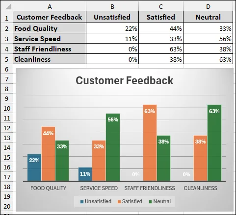
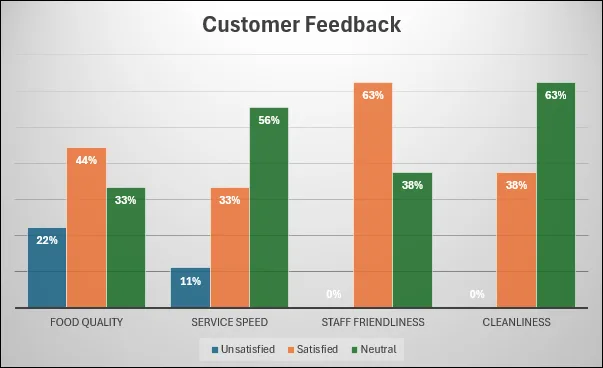
➤ Finally, visualize the results using a column chart to identify trends and compare satisfaction levels across categories.
What is a Likert Scale?
A Likert scale is a popular survey method used to measure attitudes, opinions, or perceptions across a range of statements. Respondents typically indicate their agreement or disagreement with statements using a scale, such as "Satisfied," "Neutral," or "Unsatisfied. It helps in quantifying subjective data. This is used in customer satisfaction surveys, employee feedback forms, and market research.
Steps to Analyze Likert Scale Data in Excel
In this section, we will guide you through four easy steps to analyze Likert scale data in Excel.
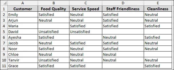
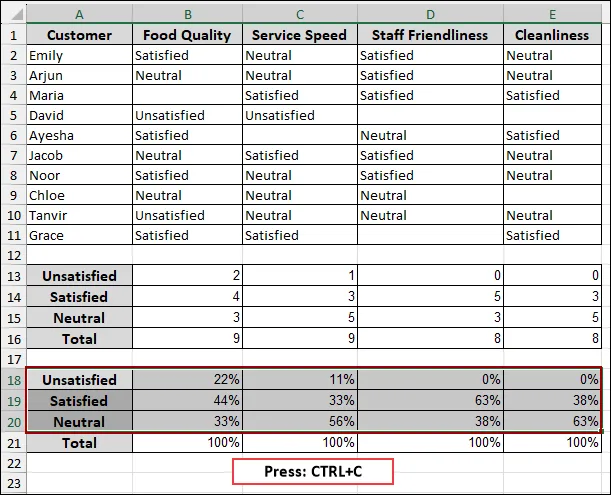
Suppose we have a sample dataset containing customer names and their feedback, categorized as satisfied, unsatisfied, or neutral, for the criteria of Food Quality, Service Speed, Staff Friendliness, and Cleanliness. Now, we will analyze the Likert scale data using the above dataset.
Step 1: Counting Feedback from the Dataset
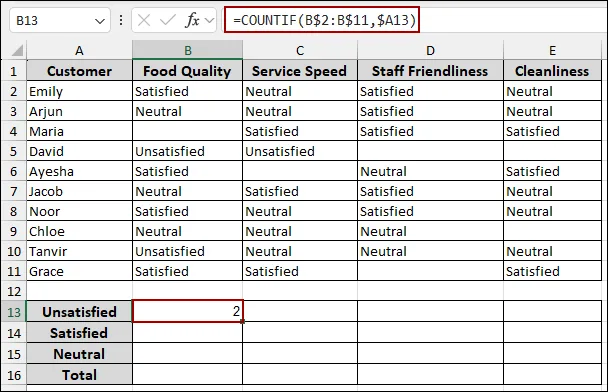
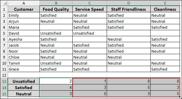
Starting with, we will analyze customer feedback to quantify satisfaction levels across different categories like "Food Quality", "Service Speed", "Staff Friendliness", and "Cleanliness". First, list the satisfaction categories you wish to count. In column A, starting from cell A13, input the categories: "Unsatisfied", "Satisfied", and "Neutral". In cell A16, input "Total" to sum up the counts.
Now, we will use the COUNTIF function to count the occurrences of each satisfaction level for "Food Quality".
=COUNTIF(B$2:B$11, $A13)This formula counts how many times the text in cell A13 (Unsatisfied) appears in the cell range B2 to B11. The $ signs ensure that when you drag the formula, the row for the category (A13) changes, but the column for the data range stays fixed.
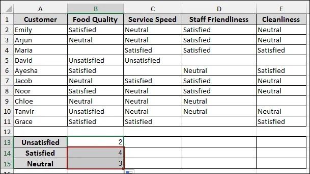
To apply this counting across all survey categories, extend the formulas horizontally.
As a result, the counts for "Unsatisfied", "Satisfied", and "Neutral" will be calculated for "Service Speed", "Staff Friendliness", and "Cleanliness" as well.
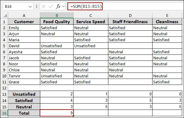
Finally, we will sum the counts for each category to get the total number of responses per category.
=SUM(B13:B15)This formula sums the counts for "Unsatisfied", "Satisfied", and "Neutral" for "Food Quality".
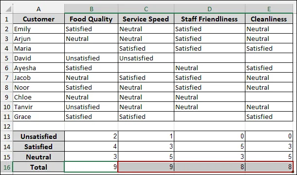
Thus, the "Total" number of responses for each survey category will be displayed, providing a complete overview of the satisfaction levels.
Step 2: Calculating the Percentage of All Feedback
In this step, we will calculate the percentage for the customer satisfaction survey analysis. To understand the proportion of each satisfaction level, we can convert the raw counts into percentages.
=B13/B$16This formula divides the count for "Unsatisfied" (B13) by the "Total" count for "Food Quality" (B16). The $ before 16 ensures that the total row reference remains fixed when you drag the formula.
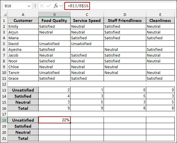
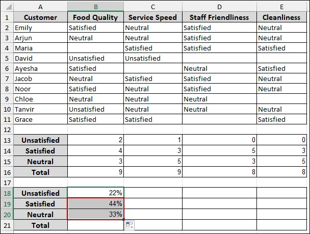
To apply this percentage calculation across all survey categories:
Finally, the percentages for "Unsatisfied", "Satisfied", and "Neutral" will be shown for all survey categories.
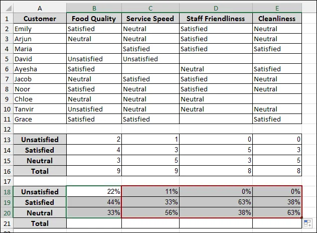
Finally, to verify that your percentages sum up correctly to 100% for each category:
=SUM(B18:B20)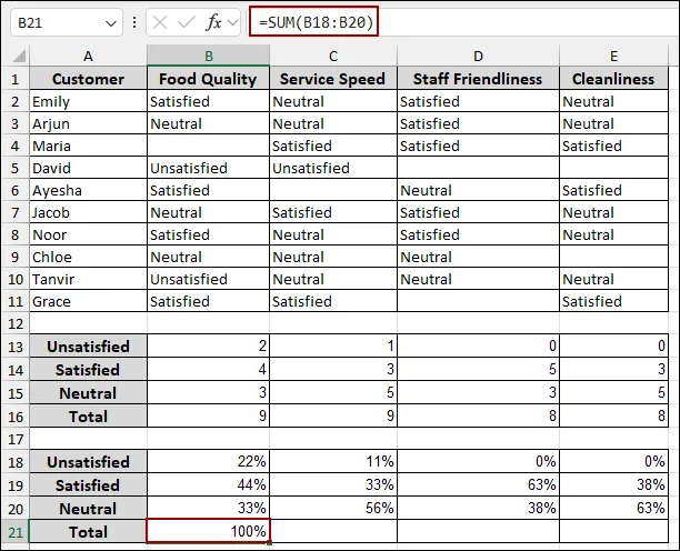
Thus, the "Total" percentage for each survey category will be displayed, confirming that all responses are accounted for.
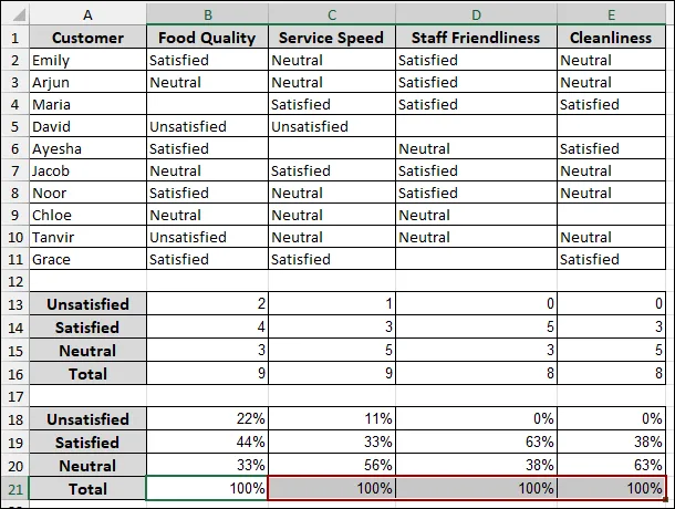
Step 3: Making a Report on the Likert Scale Analysis
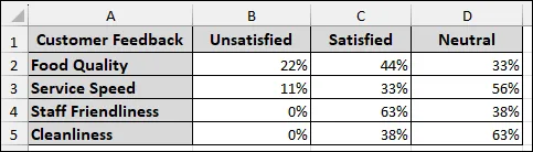
In this part, we will transpose the "Customer Feedback" categories from a column to a row into a new sheet to create a report on the Likert scale analysis.
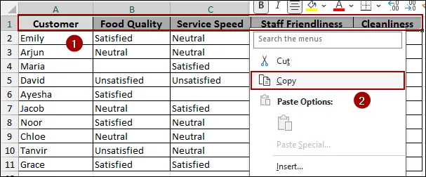
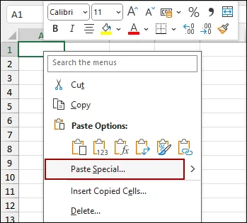
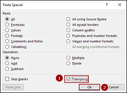
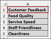
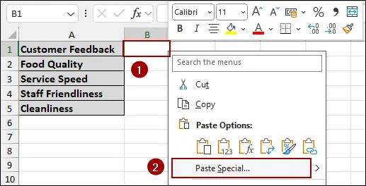
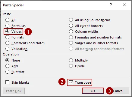
Thus, we have successfully created our report on Likert scale analysis.
Step 4: Plotting Chart to Analyze Likert Scale Report
In this final step, we will plot a chart to analyze Likert scale report.
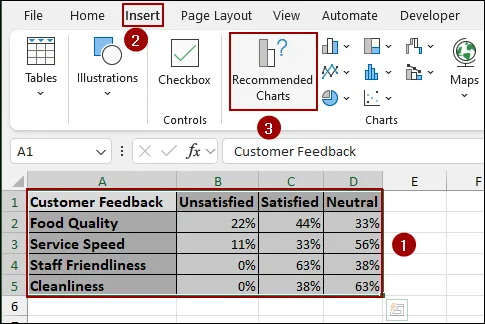
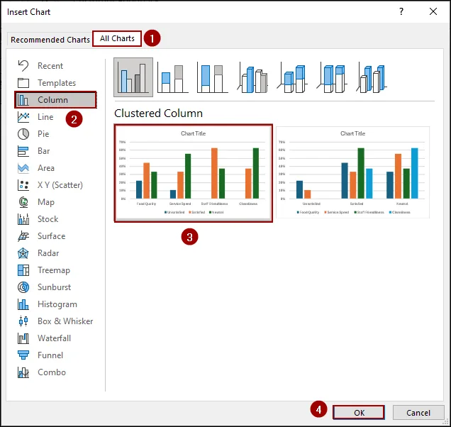
Thus, a column chart representing your customer feedback will be successfully inserted into your sheet.
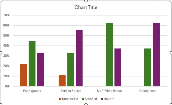
After editing the chart, we have successfully created our chart to analyze Likert scale data in Excel.
Downloadable Resources
Get our practice workbook or necessary files that we have worked with to prepare this article.
Analyze Likert Scale Data.xlsx
Practice Workbook · Excel (.xlsx)
Frequently Asked Questions
How do I find the most common response?
You can use the formula =MODE(range) to find the most frequently selected response.
How can I handle missing data in Likert scale responses?
You can handle missing data by using imputation methods to fill in the gaps. Excel allows you to filter out or replace missing values as needed.
How do I calculate the average response?
You can use the formula =AVERAGE(range) where "range" is the cells containing the responses.
Concluding Words
In conclusion, we have covered the key steps for effectively analyzing Likert scale data in Excel. Using the steps, you will get a complete analysis of your Likert scale data to uncover meaningful patterns and trends in your survey results. If you have any questions or would like clarification on any aspect, feel free to drop them in the comment section below.