A legend is a section of a chart that explains what different colors, lines, shapes, etc. mean. It is a visual guide for users to understand each series better.
It is particularly helpful for multiple data series, and when the user isn’t familiar with the data.
You can add a legend in Excel by using the Chart Element button or the Chart Design tab. Or, you can create them manually over your chart with shapes.
➤ Click on the chart to select it.
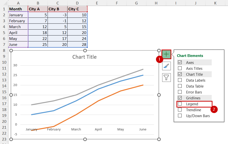
➤ Select the Chart Element Button that appears on the top-right of the chart.
➤ Check the Legend option.
Each method has its unique upsides and downsides. For example, with the first method, you can do it the quickest. With the second method, you can add legends in all versions. With the last one, you have more flexibility with design and legend position.
In this tutorial, we will go through all the methods to add a legend in an Excel chart.
Download Practice WorkbookUsing Chart Elements Button
The Chart Elements button is the plus icon button on the top-right of an Excel chart. It pops up after you select a chart.
This button allows users to quickly add or remove elements instead of going through all the options. It saves time and effort.
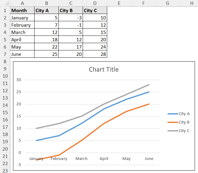
Let’s go through our dataset first before diving into the process and how we are going to create a chart from it.
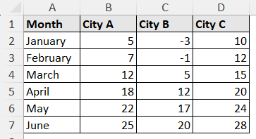
It contains temperatures of three cities across different months.
Steps to Create Chart:
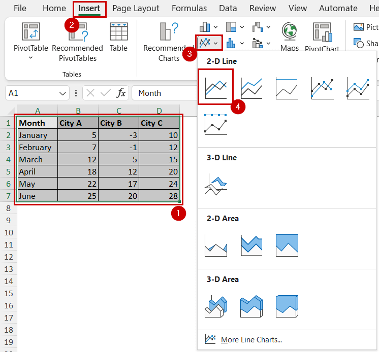
➤ Select the data.
➤ Go to Insert >> Charts. Then select the type of chart you prefer.
We are choosing the Line Graph for the presentation.
Steps to Add a Legend to the Chart:
In some cases, Excel adds legend by default. In case it doesn’t, you can follow these steps:
➤ Select the chart.
➤ Click on the Chart Elements button at the top-right of the chart.
➤ Then check Legend.
The chart will now have legends added to it.
Using Chart Design Tab
Similar to the Chart Elements button, the Chart Design tab appears on the ribbon after you select the chart.
Besides adding/removing legends, you can also work with other elements, and change the chart type and data.
It works the same as the previous one. The first method shortcuts this process.
If you don’t have access to the Chart Elements button (Excel for Mac, the web version of Excel, and some of the older versions), you must use this process.
Steps:
➤ Select the chart by clicking on it.
➤ Go to Chart Design >> Chart Layouts (group) >> Add Chart Element >> Legend.
➤ Select where you want to display your legend.
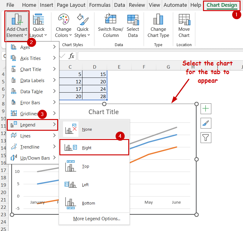
Your chart will have the legend displayed now.
Adding Legends Manually
A bit unconventional, but you can add a legend in Excel charts manually.
In the previous methods, the legend’s display style is fixed. And, it can only be in four positions.
With this method, you have more flexibility in terms of design and chart legend positions.
The goal is to create and customize shapes within the chart with text boxes to mimic a legend.
Steps:
➤ Select the chart. (You must select the chart before inserting any shapes to include them in the chart)
➤ Go to Insert >> Illustrations (group) >> Shapes.
➤ Pick a shape of your choice. We are selecting rectangles here.
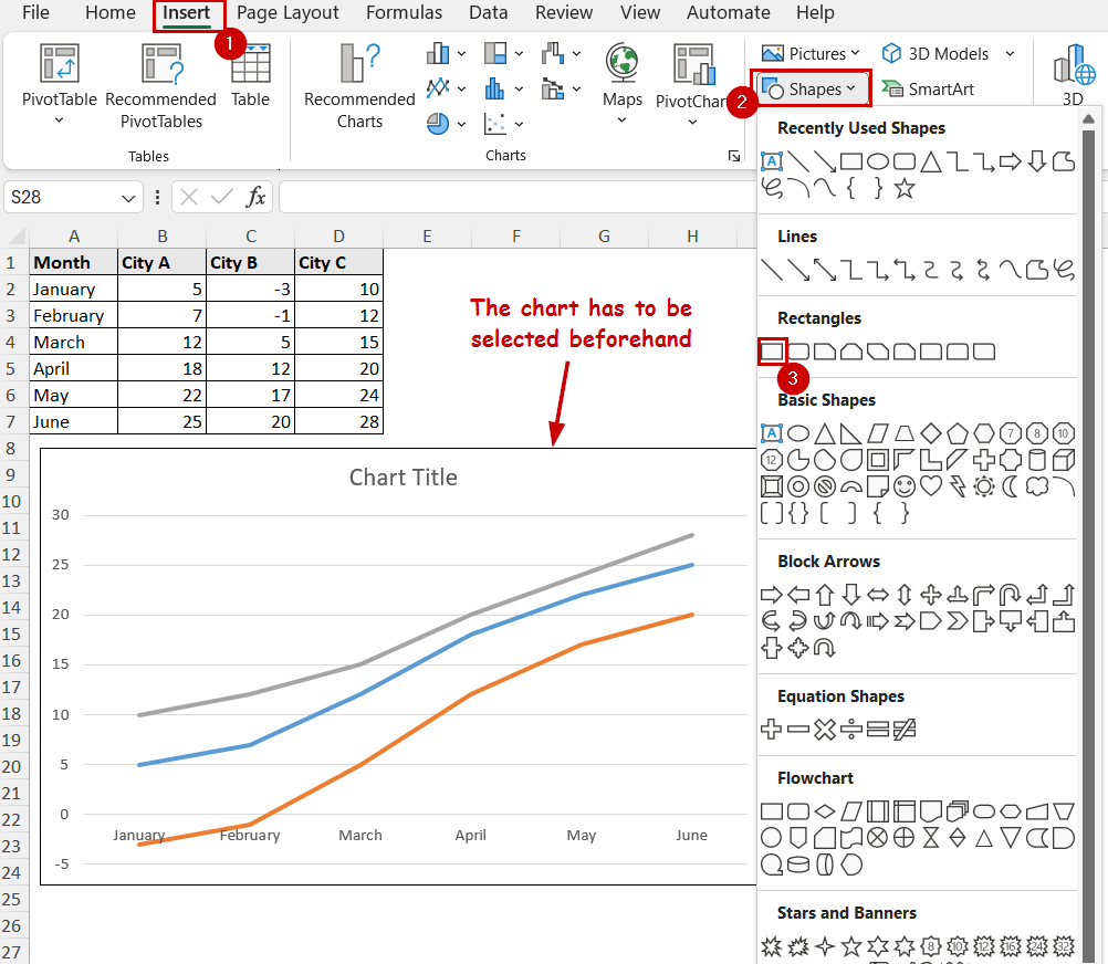
➤ Place the shape over your chart.
➤ Select the shape if it isn’t still selected.
➤ Go to Shape Format >> Shape Styles (group) >> Shape Fill. Then select the color you want to represent from the graph.
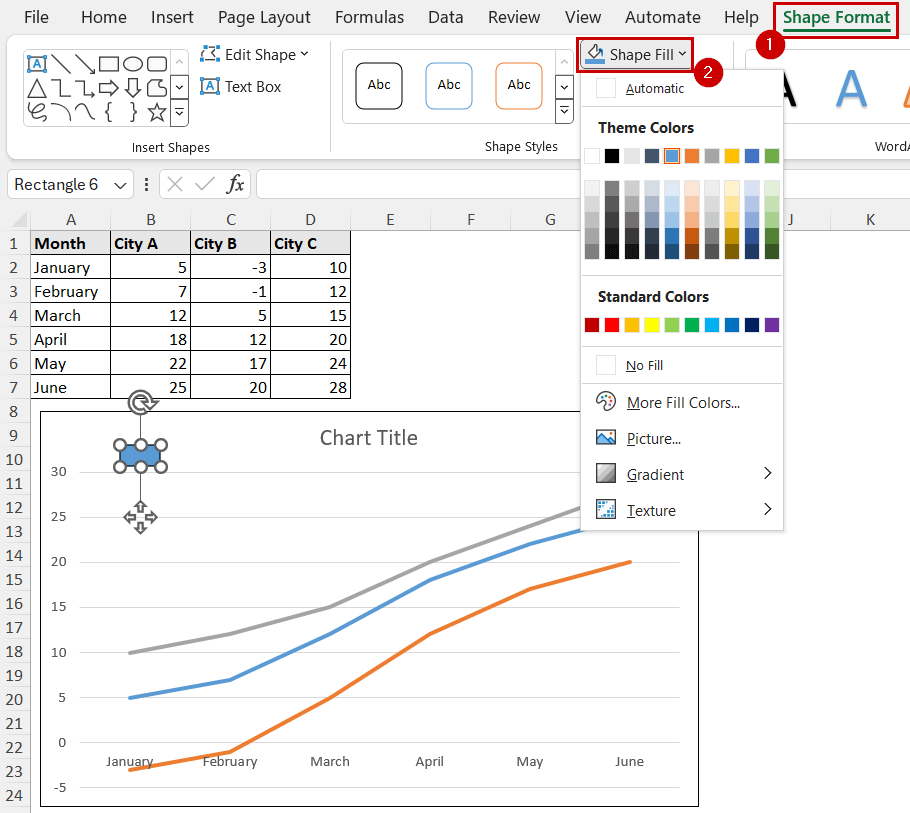
You can also change the color of the graph’s area along with the shape fill to match each other.
➤ Now go to Insert >> Text (group) >> Text Box. (make sure the chart is selected before this)
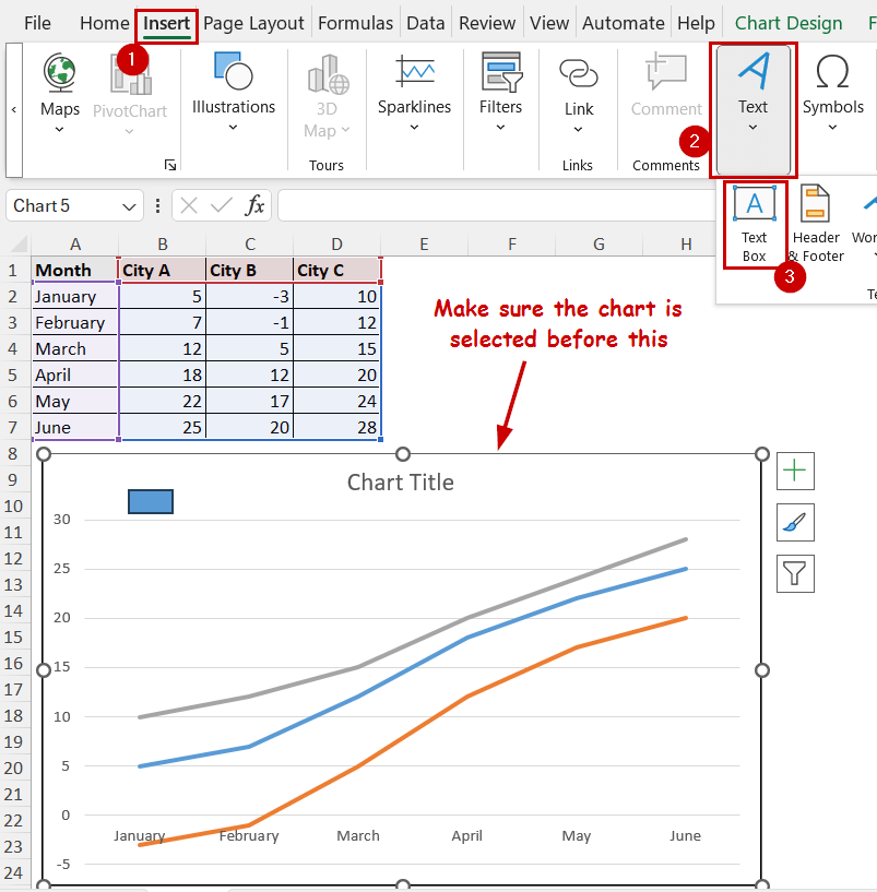
➤ Insert the box beside the shape and add the element’s name as text.
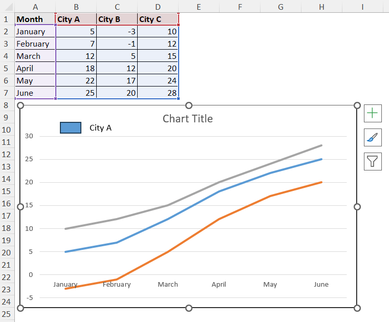
➤ Repeat the process for all the legends.
As you can see, you have to add all the legends individually in this process. So, you might want to avoid this for charts of large and complex datasets.
It also doesn’t update automatically as you are using completely different elements. These elements don’t have any connection with other elements besides being just a part of the same chart.
If you want different designs and positions for the chart element, then this could be a helpful one.
FAQ
How do I put a legend in order in Excel?
To change the legend order, select the chart >> Go to Chart Design >> Data (group) >> Select Data. In the Select Data Source dialog box, you will find the Legend Entries section. You can select the legends and change the order with the up or down key within the box to change the orders.
How do I remove a legend from my chart?
To remove a legend, just click on the legend and press the Delete button on your keyboard. You can uncheck the Legend option from any of the methods to remove them too.
How can I change the location of the legend?
Regardless of the method you choose to add legend (except manually inserting shapes), you have the option to choose where your legends will be in the chart.
This is usually in the form of a right arrow beside Legend selection option. It is available in both the Chart Elements and Design tab.
How do I resize the legend?
Click on the legend section and a rectangular area will appear. Click and drag the corner of it to resize it.
How to edit the text in the legend entries?
Go to Chart Design >> Select Data. You will find the Legend Entries section here. You can edit the legends here by changing the series name (legend text) and series source (chart’s values).
Wrapping Up
In this tutorial, we have covered different ways to add a legend in Excel charts. In the later versions of Excel, you can use the Chart Element button. Or, you can use the Chart Design tab for any version.
We have also demonstrated a method to manually insert each legend. This offers more flexible design options.
Feel free to download the practice file and let us know about your feedback.