How to View Excel Worksheets Side-by-Side Vertically
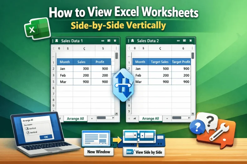
When working with Excel, sometimes we need to look at two worksheets or workbooks at the same time. It allows us to copy and paste data, formulas, or just compare

When working with Excel, sometimes we need to look at two worksheets or workbooks at the same time. It allows us to copy and paste data, formulas, or just compare

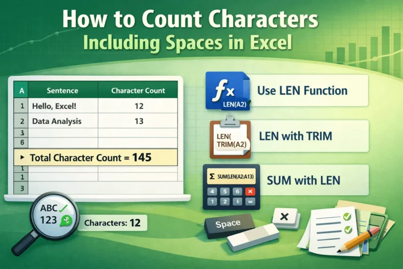
Counting characters, including spaces, in Excel is necessary for tasks such as analyzing text length, validating data entries, or ensuring values fit within predefined limits. By using Excel’s built-in tools

Macros in Excel are effective tools that allow you to automate repetitive tasks, from formatting tables to performing calculations across large datasets. By recording and editing macros, you can save

Pivot Tables in Excel are used for summarizing large numerical datasets. While the default grouping feature works well for dates or equal numeric steps, grouping data into uneven, custom intervals

If you see the “Else without If” error in VBA, it usually happens when an Else statement has no matching If, or when your If…Then…Else block is incomplete. This can

Sometimes in Excel, you need to match a date to a specific range instead of looking for an exact match. For instance, when tracking sales across multiple promotions, you might

Converting text to sentence case is a common formatting task often required in Excel. A sentence case is where just the first letter of the first word in a text

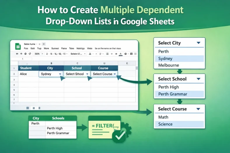
Multiple dependent dropdown lists in Google Sheets is a useful feature you should learn. For example, you are making a sheet where users will first select a city, and then,

Data validation in Google Sheets is a very important skill. For example, you are making a sheet where users will insert business email addresses, but some people are writing without
