A legend is the part of a chart indicating different shapes, colors, fills, etc. of each data series.
But a legend without a chart? The primary goal of a legend is to represent a data series.
Sometimes, a chart may be unnecessary for data representation. A legend alone can help with quick visual cues, sometimes within cells.
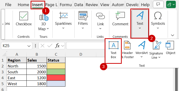
➤ Create a text box from Insert >> Text >> Text Box.
➤ Insert Shapes from Insert >> Illustrations >> Shapes.
➤ Within the text box, place the shapes and text boxes to represent a legend.
➤ Format the shapes and text boxes accordingly to indicate each data series.
The goal here is to mimic the chart legend without a chart. We can incorporate different shapes and text boxes to create the legend. Besides, Excel has other formatting options to mark different values within the cell which can also work as a legend.
In this tutorial, we’ll go through all the methods you can create a legend in Excel without a chart.
Download Practice WorkbookUsing Text Box and Shapes to Create Legend
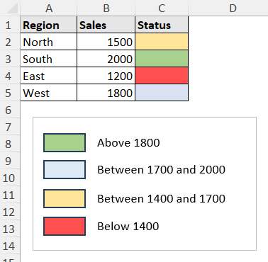
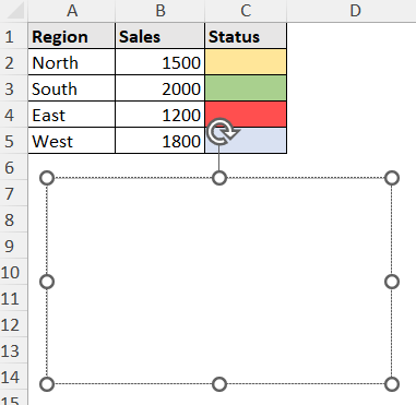
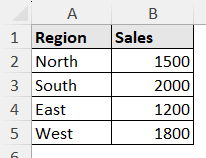
Let’s consider a dataset with color coding, where we may need a legend first.
This is an imaginary region-based sales record, and their sales status is in color code.
We filled the status column manually. (They may be dynamically connected too, more of that in the later sections)
We want to imply the color code with legends. Here is how we can do that:
Steps:
➤ Select Insert >> Text >> Text Box.
➤ Draw the shape where you want your legend to be.
➤ Now go to Insert >> Illustrations (group) >> Shapes. Select the shape you want to display for the legend.
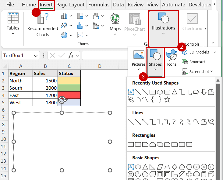
➤ Draw the shape within the text box.

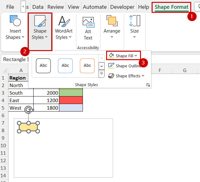
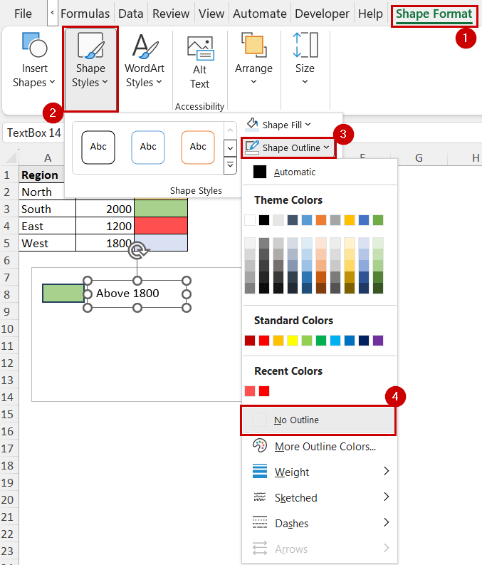
➤ Change the fill color to the code. You can do this from Home >> Font (group) >> Fill. Or, Shape >> Format >> Shape Styles (group) >> Shape Fill.
➤ Now add another text box beside it from Insert >> Text >> Text Box and name it as the label.
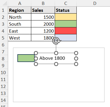
➤ We are removing the border of this text box (optional) from Shape Format >> Shape Styles (group) >> Shape Outline >> No Outline.
➤ Repeat these steps for all the regions.
Now we have created a legend that identifies each data without a chart.
We have demonstrated the process for the legend to identify sales category. You can swap the inner text boxes with regions too to identify them for different sales limits.
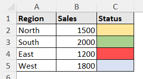
Manually Formatting Cells
In the previous example, we had a separate status column. These fill types alone can identify legends.
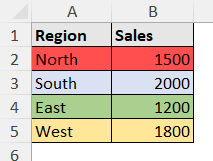
Consider the dataset like this.
Now consider this: we want to pair north with red, south with blue, east with green, and west with yellow.
Coloring the cells containing each value can serve as a legend in this scenario.
We can do that by filling the colors manually, because the region cells are fixed.
Steps:
➤ Select the cells that belong to the same category.
➤ Go to Home >> Font (group) >> Fill Color.
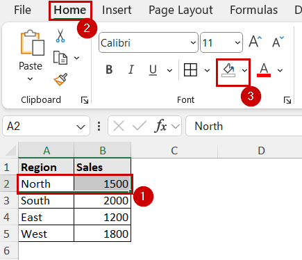
➤ Select the color you want to sync with the data.
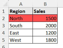
➤ Repeat this for all the cells.
You can add a text box to indicate this legend on top of it. But it would be unnecessary in this case, because the cell values are already indicating what we want to show by these colors.
Using Data Bars, Color Scales, and Icon Sets
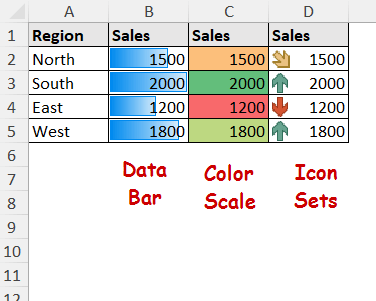
The data bar is a type of conditional formatting. A data bar displays a bar over a value and represents how much it is compared to the other values.
Color scales and icon sets work similarly. Instead of the bars, color scales show different fills, and icon sets show different icons based on numeric values.
They are not legends in a traditional sense. But they are visual tools that show relative size. So, they function similarly to a legend.
You can add data bars from the Conditional Formatting option in Excel.
Steps:
➤ Select the range.
➤ Go to Home >> Styles (group) >> Conditional Formatting.
➤ Select Data Bars/ Color Scales/ Icon Sets depending on what you want to display.
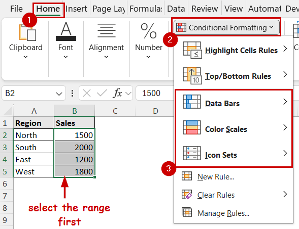
➤ Select your style for each one.
They will display over the cells.
Setting Custom Formatting Rules
Data bars, color scales, and icon sets determine the formatting by dividing the range between top and bottom values. Each of them divides them within an equal range category.
However, you may want to divide the series based on other criteria too.
For that, you need custom rules to set the formatting. You can set the formatting based on the distribution so it can work as a legend.
Steps:
➤ Select the range.
➤ Go to Home >> Styles (group) >> Conditional Formatting >> New Rule.
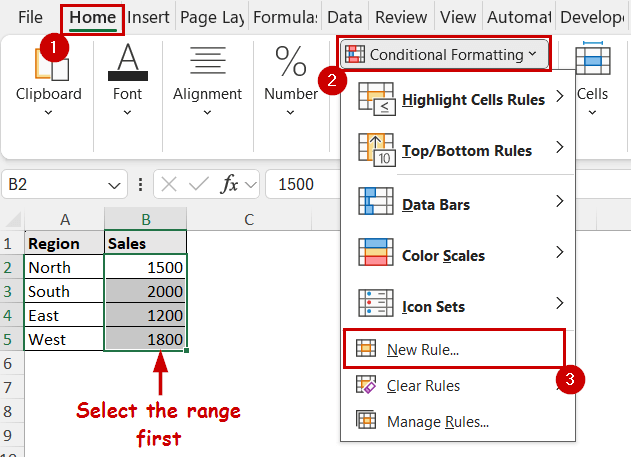
➤ In the New Formatting Rule dialog box, select your rule type and edit the rule.
We are aiming to differentiate the top half and bottom half in the series. So, we selected “Format only top or bottom ranked values” and chose 50% of the range.
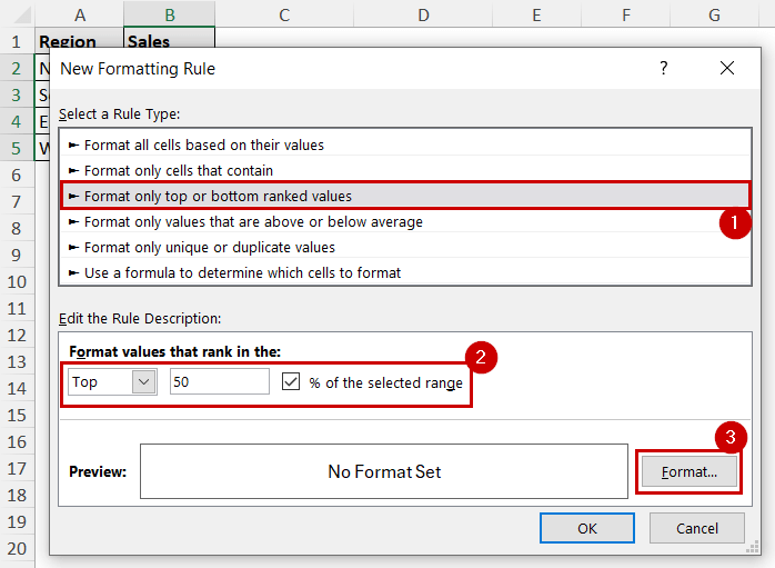
➤ Click on Format after that.
➤ Select the type of formatting you want.
We are choosing a green fill for the top half.
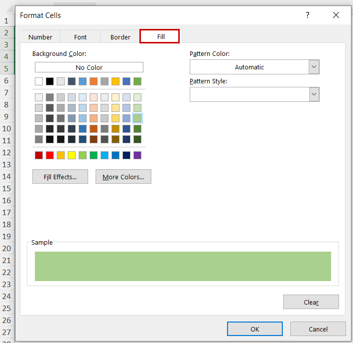
➤ Click on OK in both the Format Cells and New Formatting Rule dialog boxes.
➤ Repeat this process for all the divisions.
We repeated the whole process for the bottom 50%.
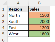
This way, you can create dynamic legends using conditional formatting based on custom rules without a chart in Excel.
FAQ
Is it possible to add a legend to a pivot table?
As of the latest version of Excel, there is no direct way to add a legend to the pivot table. But you can use any of these methods here to create a custom legend for the pivot table.
How do I edit a custom legend entry in Excel?
If you create a legend entry we described in this tutorial, you can select the text box and edit the legend entry. If you create one in a chart that is linked to the source, you need to make changes to the data source or edit it from Chart Design >> Select Data.
Can I create a legend using shapes in Excel?
You can use icon sets as described in the third method to create shapes as a legend.
You can also use Insert >> Illustrations (group) >> Shapes and select other shapes and put it beside the data to make it work as a legend. However, shapes created this way will be static and won’t change with data.
Conclusion
In this tutorial, we have discussed how to create a legend in Excel without a chart.
We have covered blending in different objects such as shapes and text boxes to create a legend. We have also used the manual filling method. These two methods create static legends that don’t change with the data source.
The conditional formatting methods covered in the tutorial create dynamic legends. They change based on the cell values.
Feel free to download the practice file and let us know about your feedback.