
The bell curve represents a normal distribution that is symmetrical about the mean. You can use a function to calculate the normal distribution value and then use charts to create a bell curve in Excel.
➤ The bell curve is a continuous probability distribution symmetrically about the mean.
➤ The empirical rule for normal distribution:
- 68% of the data falls within 1 standard deviation.
- 95% falls within 2 standard deviations.
- 99.7% falls within 3 standard deviations.
➤ Normal distribution function: =NORM.DIST(x,mean,standard_dev,cumulative).
➤ Bell curve: Select the data >> Insert >> Scatter with Smooth Lines and Markers.

In this article, we’ll learn about the bell curve and how to create a bell curve in Excel. We’ll use the NORM.DIST function, for earlier versions of Excel you can use the NORMDIST function.
What is Bell Curve in Statistics?
The bell curve is a continuous probability distribution that is symmetrical about the mean. The curve’s highest point (peak) represents the mean, median, and mode. The standard deviation indicates the spread of the data.
There is an empirical rule for normal distributions.
➤ Around 68% of the observations fall within one standard deviation of the mean. (Mean – SD to Mean + SD)
➤ 95% of the data falls within two standard deviations from the mean. (Mean – 2*SD to Mean + 2*SD)
➤ 99.7% of the data points lie three standard deviations from the mean. (Mean – 3*SD to Mean + 3*SD)
Creating the Bell Curve in Excel
In this dataset, we have participants’ reaction times (in milliseconds) in a cognitive test. Generally, reaction times are normally distributed with most participants having reaction times close to the mean.
Steps:
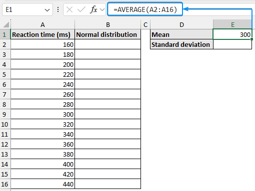
➤ Select the output cell (E1) and use the AVERAGE function to calculate the mean.
=AVERAGE(A2:A16)
➤ Use the STDEV.P or STDEVP function to find the standard deviation.
=STDEV.P(A2:A16)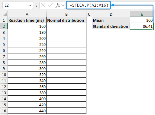
➤ Use the NORM.DIST or NORMDIST function to get the normal distribution values for the calculated mean and standard deviation. Use the Fill Handle to copy the formula.
=NORM.DIST(A2,$E$1,$E$2,FALSE)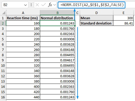
➤ Select the entire data range (A2:B16) >> Insert >> Scatter (X,Y) or Bubble Chart >> Scatter with Smooth Lines and Markers.

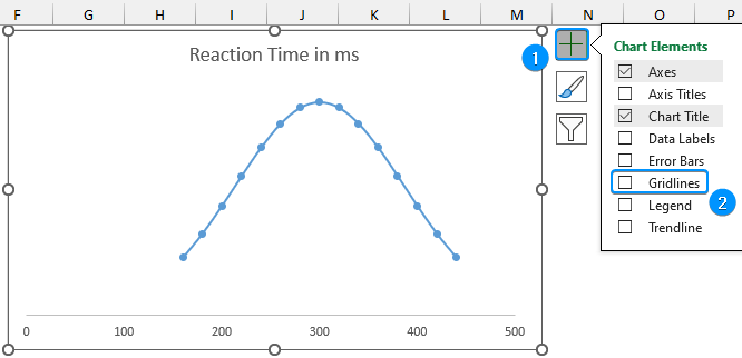
➤ Set a suitable chart title (Reaction Time in ms) >> Click on the vertical axis >> Press the Delete key.
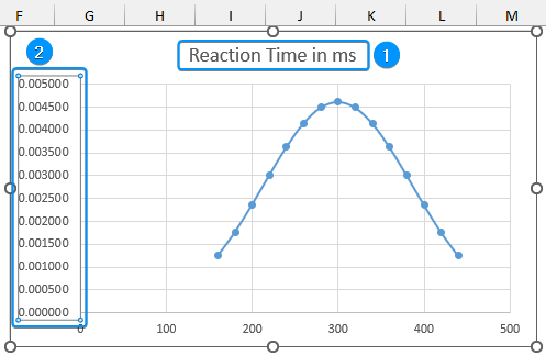
➤ Click on Chart Elements >> Uncheck Gridlines.
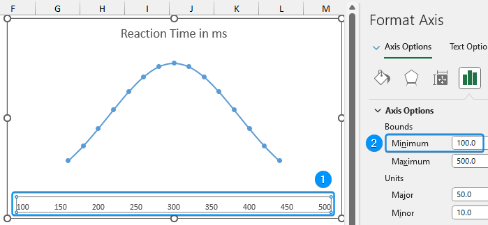
➤ Double-click on the horizontal axis >> Set the Minimum bound to 100.
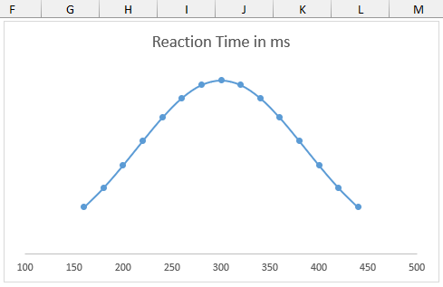
➤ The bell curve is complete.
FAQ
How do you create a frequency curve in Excel?
Enable Data Analysis ToolPak >> Data tab >> Data Analysis >> Histogram >> Input range >> Output range >> Chart Output >> OK.
How to check if data is normally distributed in Excel?
Plot a histogram with the data points and inspect its shape. The shape is unlikely to be smooth but if the peak is in the middle and the plot is fairly symmetrical, then the data can be assumed to be normally distributed. Follow this blog post to learn more about testing for normal distribution.
How do I calculate the Y values for my bell curve?
Use the NORM.DIST or NORMDIST function: =NORM.DIST(x,mean,standard_dev,cumulative)
What if my data does not follow a normal distribution?
A bell curve is specific to a normal distribution. If you’re unsure perform checks for normality and use other statistical methods like lognormal distribution, non-parametric method, etc.
Wrapping Up
In this quick tutorial, we’ve learned about the bell curve and the steps to create a bell curve using Excel. Feel free to download the practice file and share your thoughts and suggestions.