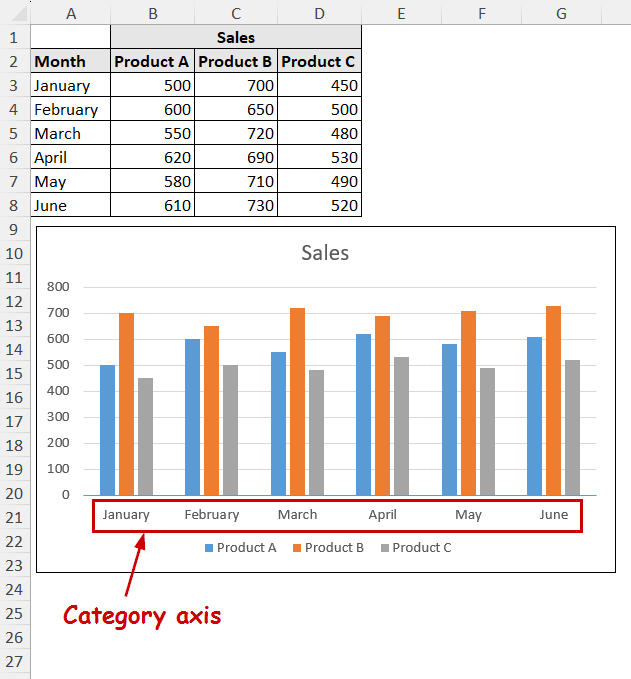
The category axis is the axis that contains the series labels in a chart.
The category axis organizes data more clearly. This improves charts’ readability and makes the data comparison easier.
➤ For most charts, the X-axis is the category axis. The Y-axis is the category axis in bar charts.
➤ Excel creates the category axis automatically if the chart type requires it.
➤ To hide a label in the category axis you need to uncheck it from the Data Source dialog box.
➤ Deleting the category axis entirely won’t bring back the labels unless you manually add them again.
➤ Select the proper data source and avoid congestion to avoid issues with the category axis in Excel.
In this article, we will cover what the category axis is, how it is different from the value axis, and what charts contain the category axis.
We will also cover how to change the labels- add or remove them from the chart- how we can customize the labels for the category axis, and how you can avoid different issues of the category axis.
Download Practice WorkbookWhat is the Category Axis in Excel?
The category axis is the axis of the chart that displays text labels instead of number intervals. Meanwhile, the value axis contains the numeric values.
For most of the chart, it is the X-axis (horizontal axis). In bar charts, this is the Y-axis. Most of the charts can contain a value axis or multiple value axes. But, only a few can contain a category axis.
Some of the charts that contain the category axis are:
- Column charts
- Bar charts
- Line charts
- Area charts
- Bubble charts
Adding the Category Axis in Excel
Excel automatically creates a category axis if the chart requires text labels in the axes.
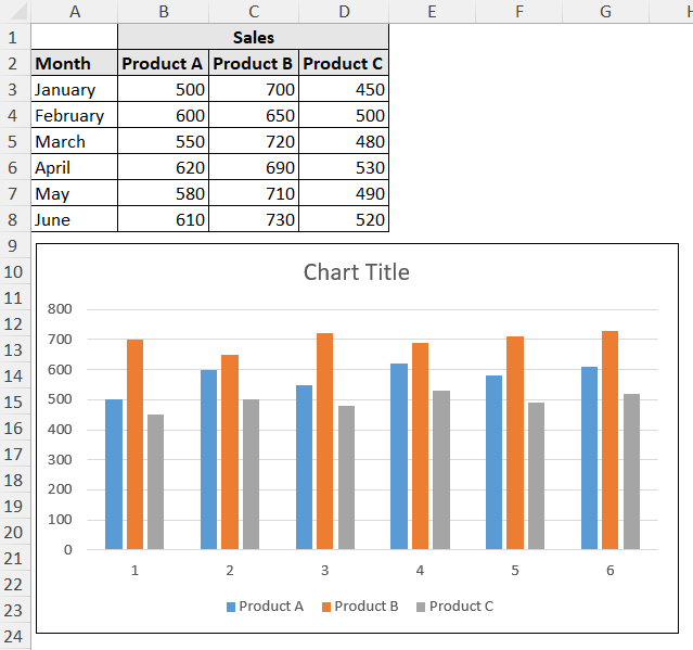
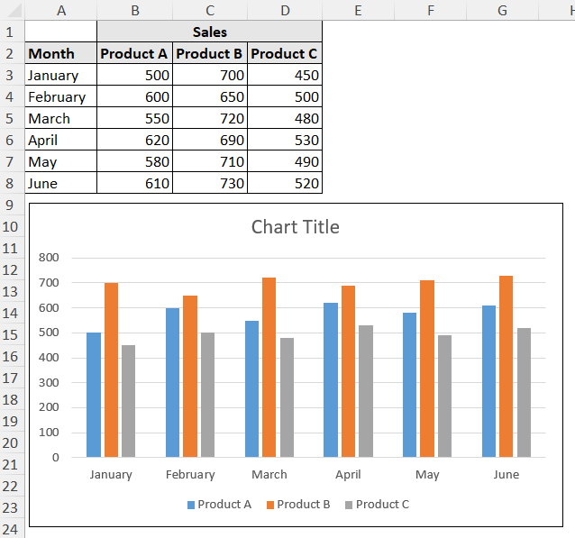
For example, creating a chart from the following dataset will require the month labels in most of the charts.
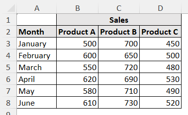
If we create a chart, like a column chart, from this dataset, Excel will automatically put the months’ values on the X-axis.
Steps:
➤ Select the data source.
➤ Go to Insert >> Charts (group).
➤ Select a chart type of your preference.

The chart will contain the category axis.
How to Remove Specific Labels from Category Axis in Excel
You can manually leave out specific parts of the data source to not include them in the category axis. You can do that by holding Ctrl on your keyboard and selecting the cells you want to exclude.
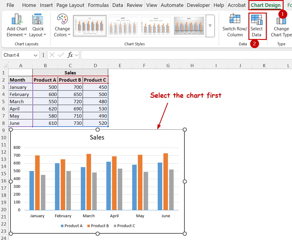
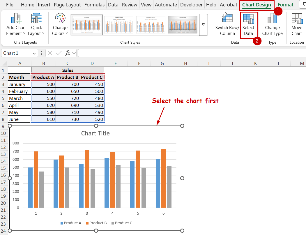
If you want to remove an already existing chart, you need to use the Select Data feature of the chart in Excel.
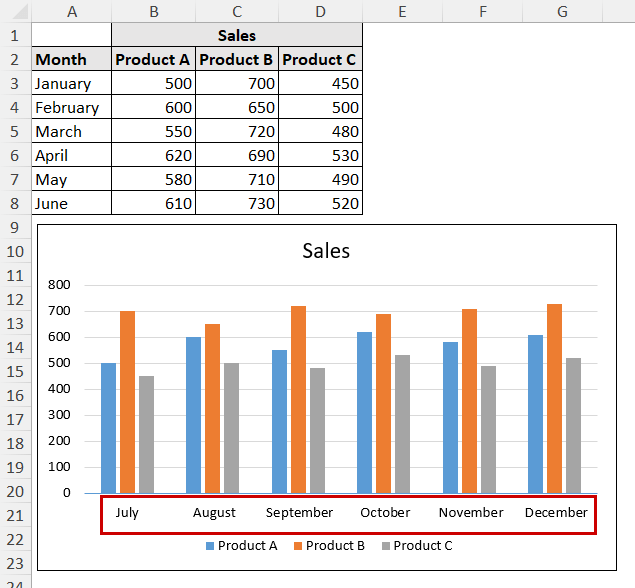
We are going to show that process by removing the sales values from January in the chart we have created in the previous section.
Steps:
➤ Select the chart.
➤ Go to Chart Design >> Data (group) >> Select Data.
➤ Now uncheck the label you want to remove from the axis.
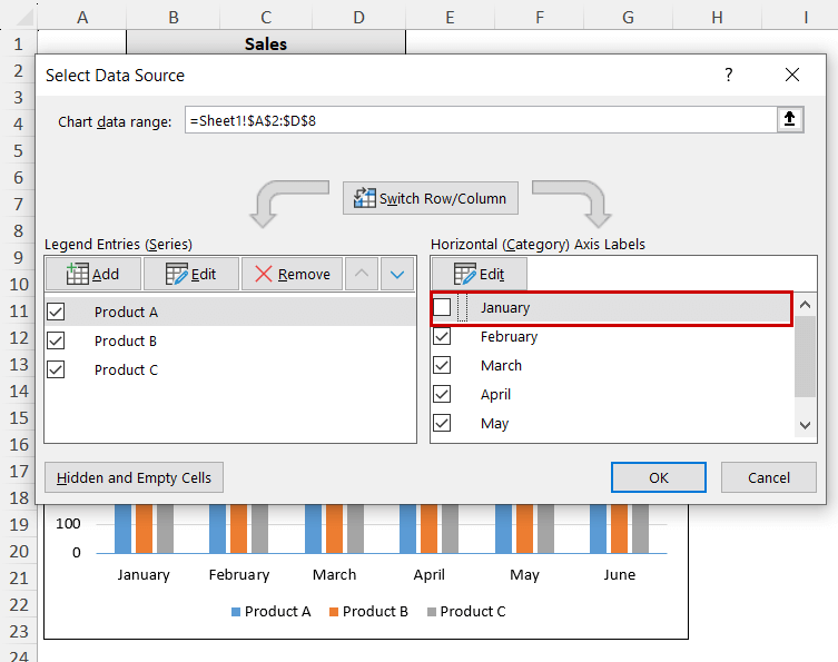
➤ Click on OK.
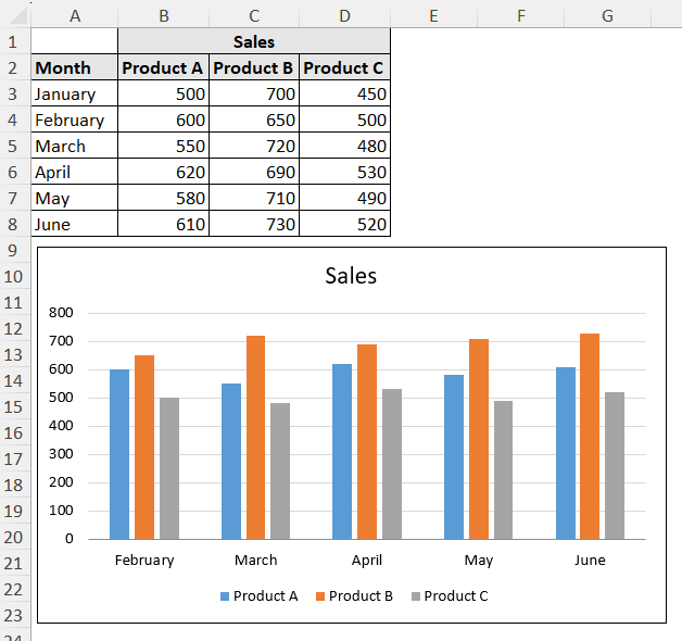
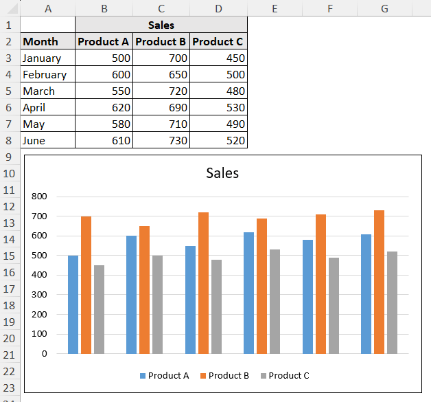
The label will no longer appear in the chart.
You can select the option again, following the same steps to display it again.
How to Change Text Labels in Category Axis
The Select Data feature can change the existing labels, too.
Let’s imagine a scenario where we need to update the months after creating the chart. We can use the Edit feature to change them to use the new source.
Steps:
➤ Select the chart.
➤ Select Chart Design >> Data (group) >> Select Data.
➤ Now select Edit under the Horizontal Axis Labels section.
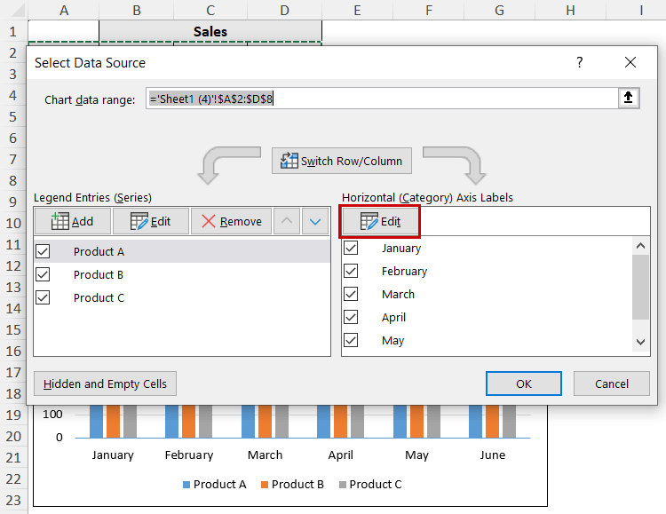
➤ Type out the values or select the range in the field.
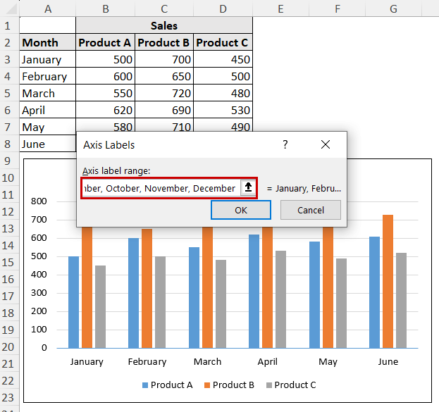
➤ Click on OK and close the dialog boxes.
The labels will now be updated in the category axis.
Note: Changing the cell values from the source also updates the values in the charts dynamically in most cases. If we changed the values from January-June to July-December in the A2:A8 range, we could get the same result.
Removing Category Axis Completely in Excel
To remove all the labels, you can uncheck all the labels in the Select Data Source dialog box. Or, you can simply remove them from the graph if you don’t want to bring them back further.
To delete the labels, select the labels by clicking on one of them. Then press Delete on your keyboard.
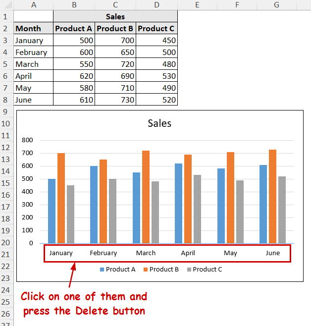
The link will still remain with the source, but the chart won’t show them.
How to Change Text Orientation in the Category Axis
You can select the text rotation options to change the orientation in the category axis.
If there are too many labels in your category axis and it doesn’t fit in the chart, the labels can overlap. One simple way in some cases is to change the orientation of the text labels to fit in the chart.
Steps:
➤ Select the horizontal axis.
➤ Go to Format >> Current Selection (group) >> Format Selection.
This will open the Format Axis pane.
➤ In the Format Axis pane, select Textbox under the Text Options section.
➤ From the Text direction option, select the 90-degree or 270-degree option based on how you want the orientation to be.
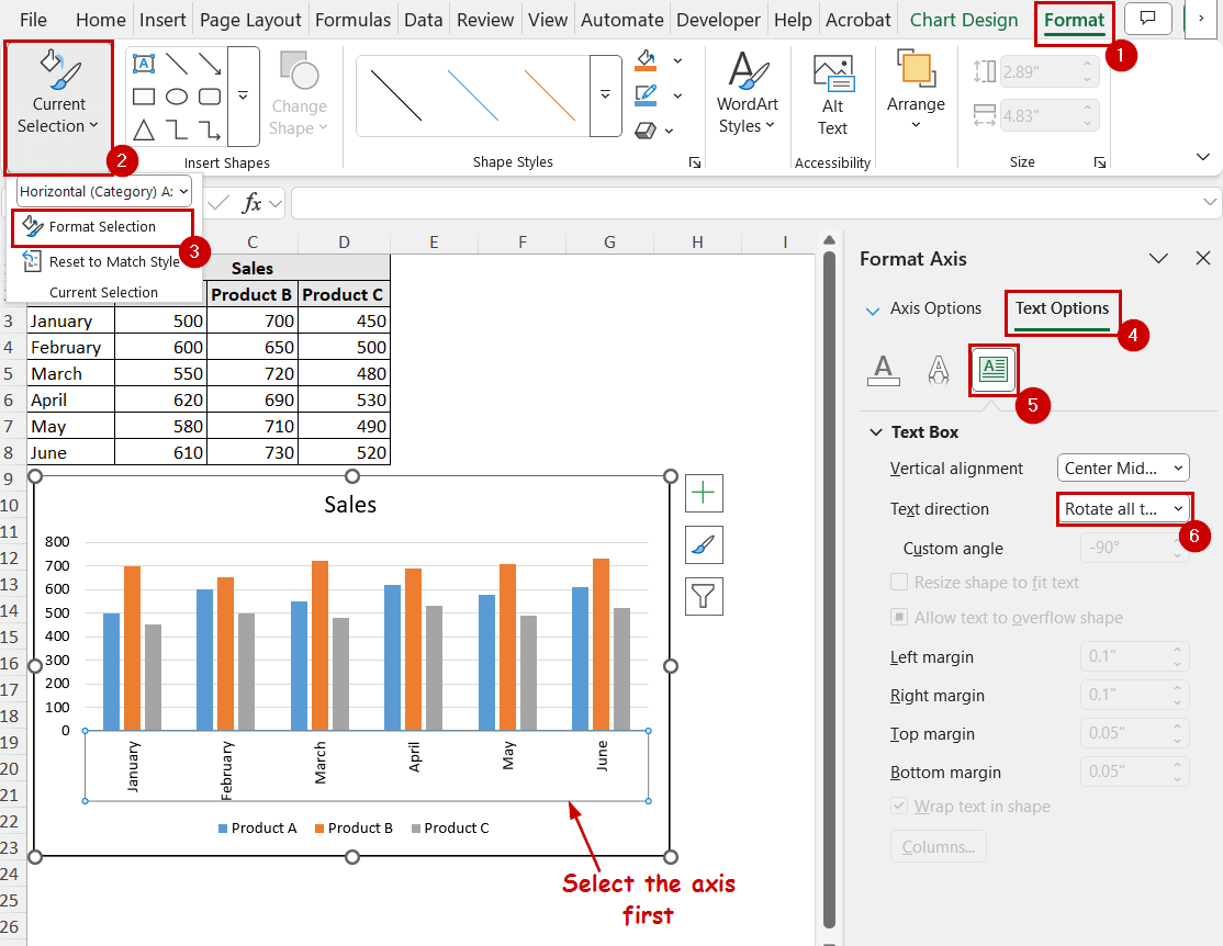
You can choose other custom angles for the orientation, too. However, custom angles won’t solve the overlapping problem.
Note: You can select the axis and press Ctrl+1 to open the Format Axis pane, too.
Common Issues with the Category Axis (and How to Fix Them)
We are focusing on two of the most common issues with the category axis: axis labels not showing properly and text overlapping in the axis.
Labels Showing Numbers Instead of Text Values
Excel sometimes shows the graph we have created before like this.
Instead of the months, there are numeric values as labels.
The problem occurs because of incorrect selection. You have to change the source data cells to solve this problem.
Steps:
➤ Select the chart.
➤ Go to Chart Design >> Data (group) >> Select Data.
➤ Select Edit under the Horizontal Axis Labels.
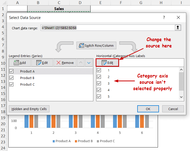
➤ Now, select the proper range in the field.
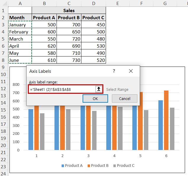
➤ Click on OK and close all the dialog boxes.
The labels should show properly now.
Labels Overlapping
Labels in the category axis overlap because of not enough space in the chart.
The lack of space may come from too many labels for small spaces, texts for the labels being too large, or the charts being small.
You can use different approaches to solve this problem:
- Changing the text orientation (discussed in the previous section).
- Reduce the font size.
- Increasing the chart size.
- Use shorter labels in the data source (e.g. “Jan” instead of “January”).
- Switch to a different type of chart (e.g. changing a column chart to a bar chart will shift the category axis to the Y-axis. Depending on the data, the Y-axis may contain more space).
FAQ
How do I change the category axis font in Excel?
To edit the font style of the text in axes labels, select the label and make changes from the Font group of the Home tab.
You can change the font style, size, color, etc. from the Font group. You can also make them bold, italic, or other custom changes.
How do I hide the category axis in Excel?
To hide the category axis in Excel, you need to uncheck all the labels manually in the Select Data Source box.
To access the Select Data Source box, select the chart and go to Chart Design >> Data (group) >> Select Data. The Select Data Source dialog box will pop up. You can find the labels under the Horizontal Axis Labels section.
Conclusion
In this article, we have covered what the category axis is, its difference with the value axis, and how the adding process of the category axis works.
We have also covered how to remove a specific label, hide all labels, or remove the category axis entirely from the charts in Excel.
We have also covered changing text orientations and different issues with their solutions regarding the category axis in Excel.
Feel free to download the practice file and let us know your feedback.