Data labels in Excel are text boxes that appear next to or on top of data points in the chart.
Data labels show details such as data values, series, percentages, and other relevant information. They make the charts easier to understand.
To add data labels in Excel,
➤ Select the chart.
➤ Select the Chart Element button.
➤ Check the Data Labels option.
There are two main methods to add data labels. Each of the methods accesses the same options in different ways. We are going to cover them in this article.
Besides, there are other ways to add custom data labels in the chart in Excel. We can add custom values, series values, categories, etc. We are also going to cover that in this article.
Download Practice WorkbookUsing Chart Elements Button
The Chart Element button is the plus (+) icon that appears after selecting a chart.
The button was first introduced in Excel 2013. It gives quick access to different common chart elements. We can quickly add, modify, or remove those elements using this button.
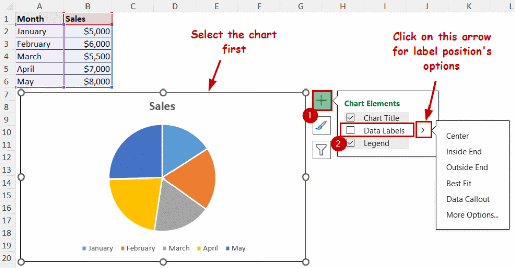
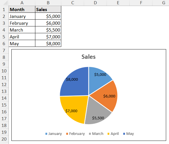
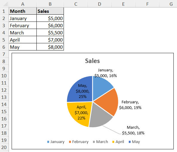
We have created a pie chart from our sales data. The data source contains sales statistics across different months.

We are going to add data labels using the chart elements button in this section.
Steps:
➤ Select the chart.
➤ Select the Chart Element button at the top-right of the chart.
This is the plus icon on top of the buttons that appear after selecting.
➤ Check the Data Labels option.
You can also click on the arrow beside it and select the label positions in the chart.

The labels will appear after checking data labels from here.
This is the quickest way to add data labels in an Excel chart.
Using Chart Design Tab
The Chart Design and Format tabs appear after selecting a chart in Excel. You can access the chart elements from the Chart Design tab too.
Steps:
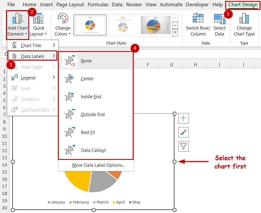
➤ Select the chart.
➤ Go to Chart Design >> Chart Layouts (group) >> Add Chart Element.
➤ Select Data Labels from the dropdown.
➤ Select the position where you want your labels to be.
You can achieve the same result as the previous methods. Because the options are basically the same, you are just accessing them in different ways.
Adding Series, Category, and Percentage as Labels
The direct methods we have shown above always add the numeric values as labels.
We can also show the series, category, percentage, or all of them with the values with more custom options.
Steps:
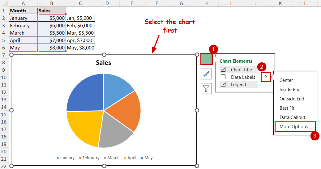
➤ Select the chart.
➤ Click on the Chart Elements button.
➤ Select the right arrow beside the Data Labels option.
➤ Select More Options.

The Format Data Labels pane will appear on the sheet.
➤ Under the Label Options (each one with the same name), you will find the Label Contains section.
Select what you want to display in the labels.
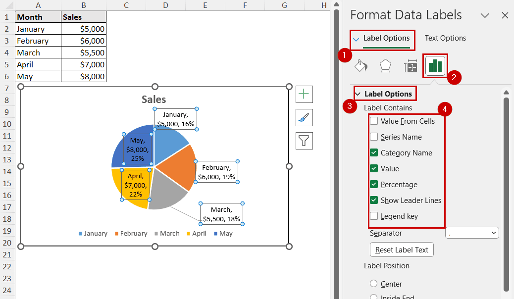
You can choose multiple display options for the labels. For example, we have selected category, value, and percentage here.
Note: Percentage values are available only for charts like pie and doughnut.
Adding Dynamic & Custom Labels from Cells
You can go for completely custom labels in Excel, too.
If you link the custom labels with cells, they are going to be dynamic too. That means when you change those cell values, the labels will also change in the chart.
Let’s say we want to add the short form of the months along with the sales value like in the C2:C6 range.

We are going to link these cells to the labels.
Steps:
➤ Select the chart.
➤ Click on the Chart Elements button.
➤ Select the right arrow beside the Data Labels option.
➤ Select More Options.
➤ Under the Label Options, select Value From Cells as the Label Contains option.
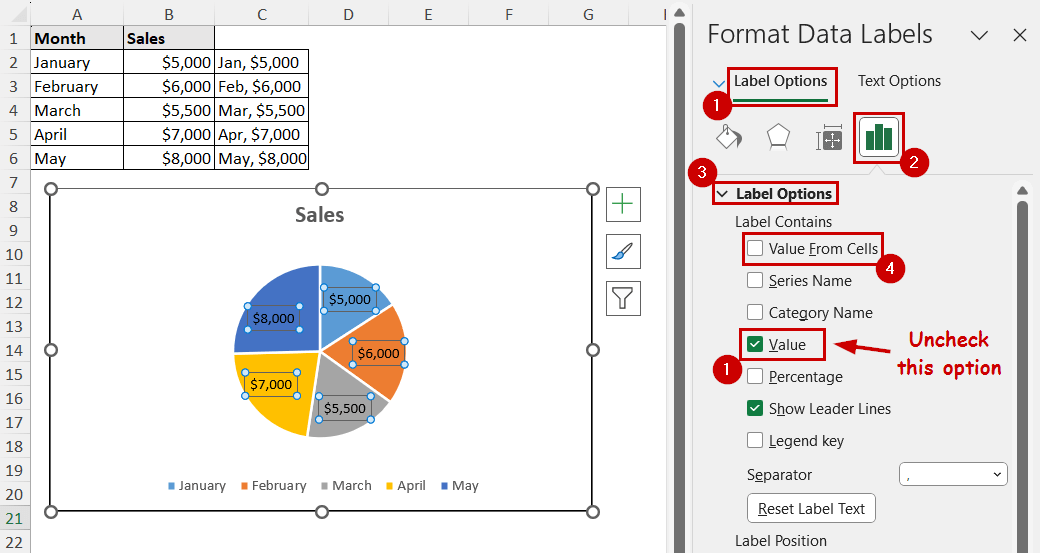
➤ Insert the range in the field.
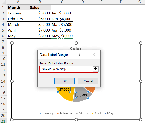
➤ Click on OK.
The cell value will show as data labels in the chart.
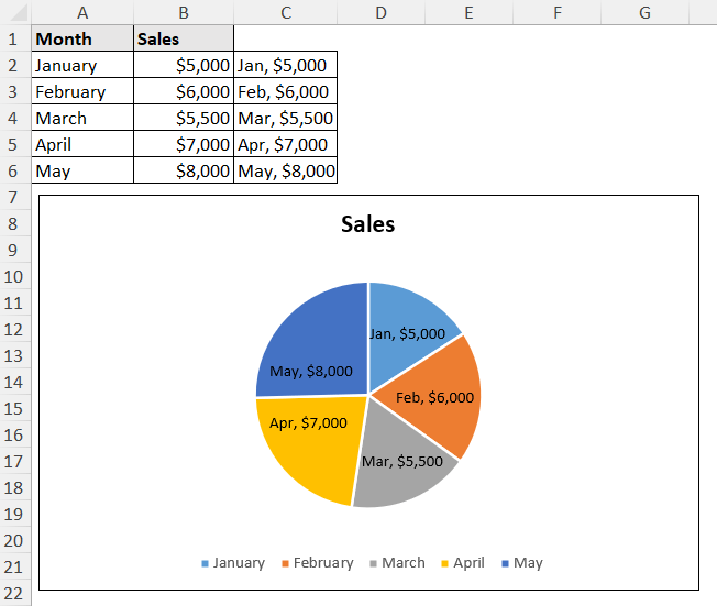
Note: Changing or deleting the cell values in the linked cells will cause changes in the labels too.
FAQ
How do I hide data labels in Excel?
Unchecking the Data Label option from either of the methods will hide the data labels.
For example, click on the Chart Elements button after selecting the chart. Then, uncheck the Data Label option from there.
How do I rotate data labels in Excel?
Open the Format Data Labels pane by double-clicking on any of the data labels. Under the Text options, you will find the Text direction option. Set the option to 90-degrees, 270-degrees, or any custom angles to rotate the text.
How do I add a custom text to data labels in Excel?
If you want to add custom values from different cells, you can use the fourth method in this article. If you want completely different values that don’t exist in any cell, insert the values in the field in the same method. The values should be in an array form.
Conclusion
In this article we have discussed how to add data labels in Excel using the Chart Elements button and the Chart Design tab. Although these are the main methods to add data labels directly, we have also explored how to add customized data labels in Excel charts too.
Feel free to download the practice workbook and give us your feedback.