
Trendlines are often used to understand the pattern of a dataset. If you want to track and analyze your data better, you might have to create a trendline after making a chart. In this article, you will learn how to add a trendline in google sheets and present your data.
Steps to add a trendline in google sheets:
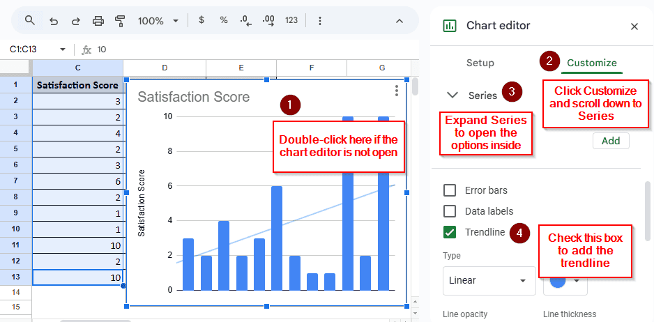
➤ Double-click on your chart.
➤ When the chart editor shows up, click “Customize” to enable that tab.
➤ Scroll down to “Series” and click on it.
➤ Check the “Trendline” box to add a trendline in google sheets.
Before making a trendline, you need to make a chart, if you haven’t already. This article covers creating a basic chart, adding a trendline to the chart, and customizing the trendline for your data analysis. We will create a trendline from some customer feedback data to find a pattern in customer satisfaction.
What is a Trendline?
Simply put, a trendline is a graphic representation of the given data to track patterns. Google Sheets allows you to make different kinds of trendlines, including linear, exponential, polynomial, logarithmic, power series, and moving average.
Adding a Trendline in Google Sheets
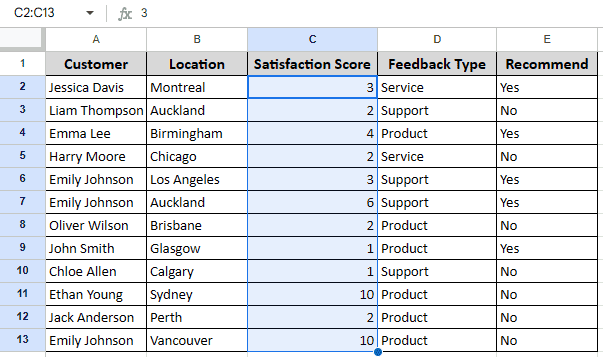
In this example, we have a dataset that shows how satisfied the customers are with the service of a company. We have selected the column with the satisfaction score in the table. It is noticeable that the satisfaction score varies from customer to customer. To analyze this data further, we are going to create a chart, add trendlines, and then customize it.
Step 1: Creating a Chart
First of all, there needs to be a chart in your sheets for adding a trendline. To create a chart, follow the steps below:
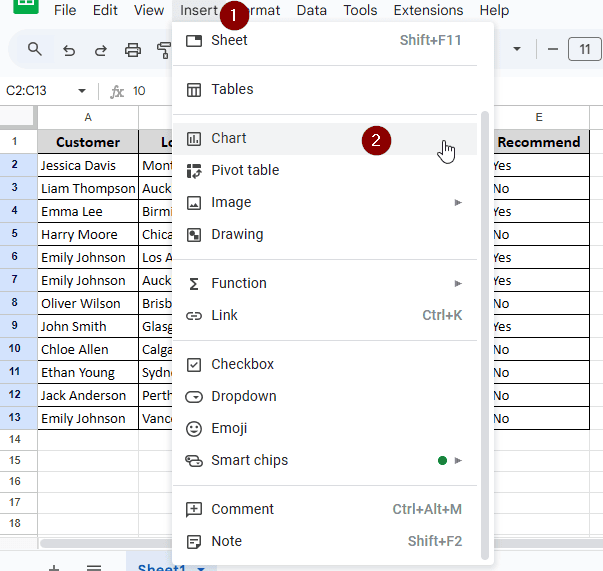
➤ Select the data you want to add to the chart by dragging your mouse while holding the left click.
➤ Click “Insert” to open the submenu. Then click “Chart” to add a chart. It will create a histogram by default.
Step 2: Adding a Trendline
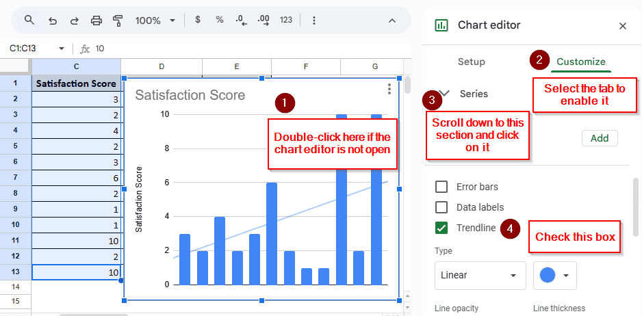
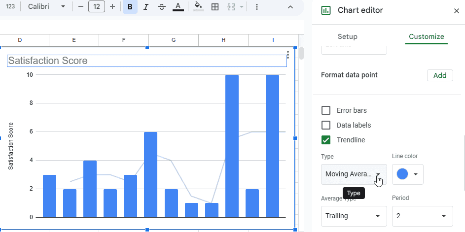
➤ After making the chart, you should see the chart editor on the right. If you don’t, you might want to double-click the chart for the right pane to open.
➤ Click on “Customize”, and scroll down to “Series”.
➤ Click on “Series” to open the submenu. Now, checking the “Trendline” box will create the trendline.
Step 3: Changing the Type of Trendline
➤ In the same section, there is a dropdown menu called “Type”. By default, the linear type will be selected.
➤ You can now select exponential, polynomial, logarithmic, power series, and moving average methods to make your trendline better understood.
Frequently Asked Questions
Is trendline the same as line of best fit?
Not all trendlines are straight, nor are they best fit for all sorts of data. If you want to make a straight best fit line, particularly for a small set of data, you need to use the linear trendline.
What is the formula for the trend line?
The formula is y=mx+b. Here, y and x represent their respective axis, b is where the line intersects y, i.e, the x is 0, and m is the slope.
How to find the slope of a trendline in Google Sheets?
If you go to the series and select “Label”, you will find the option to add a label using the equation. The equation will use the y=mx+b formula, which will show the slope.
Which trendline is best?
There is no best trendline that applies to every situation. However, you might want to use a linear trendline if your data does not fluctuate. The other methods will be better for data that increases or decreases rapidly.
What is the best chart for trend lines?
Using the line chart might be a good option, as the chart shows the variable differences.
Wrapping Up
In this article, we learned how to add trendline in google sheets, and customize the trendline whenever needed. The practice file is for you to use, and feel free to share your thoughts below.