
A vertical or horizontal line is the benchmark or reference to highlight a specific point. To add a vertical line in an Excel graph, we need to either modify a combo chart or a vertical error bar.
Vertical or horizontal lines often work as a benchmark for a reference value. Usually, the reference value is the average or a fixed value. These lines in the chart indicate a threshold for the general data.
To add a vertical line in an Excel graph,
➤ Plot the reference value (e.g. average) in the chart.
➤ Select the chart and select Chart Elements >> Error Bars >> Percentage.
➤ Right-click on the vertical error bar and select Format Error Bar.
➤ In the Format Error Bars pane, set the Direction as Both and value to 100.
➤ Remove the horizontal error bar and make necessary formats to make the vertical line representable.
This tutorial will demonstrate how to add a vertical line in an Excel graph. Excel doesn’t have a direct method of adding vertical lines in a chart. Instead, we can modify the combo chart and error bars to replicate the reference vertical line.
Download Practice WorkbookAdding Vertical Line to Categorical Y-Axis Values (Qualitative Data)
Combo charts containing scatter plots and straight lines are available in Excel. We can modify the straight line to mimic the vertical line in the scatter plot. To make the line vertical, we need to create extra coordinates.
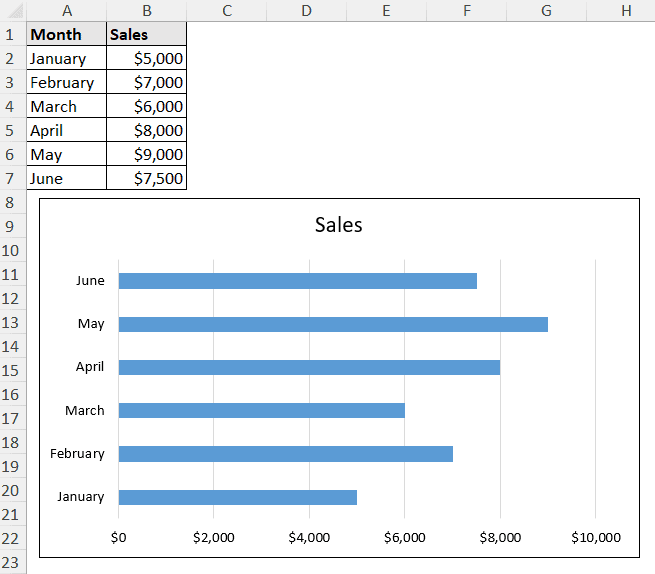
Let’s say we want a vertical line at the average value of this bar chart that displays sales in different months.
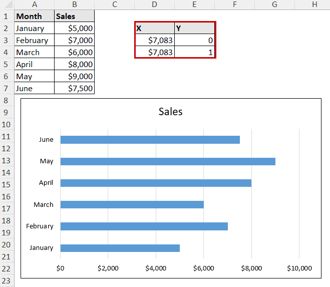
The vertical line should go through (average, 0) and (average, 1) points.
Steps:
➤ In a separate cell (D3), calculate the average value with the AVERAGE formula.
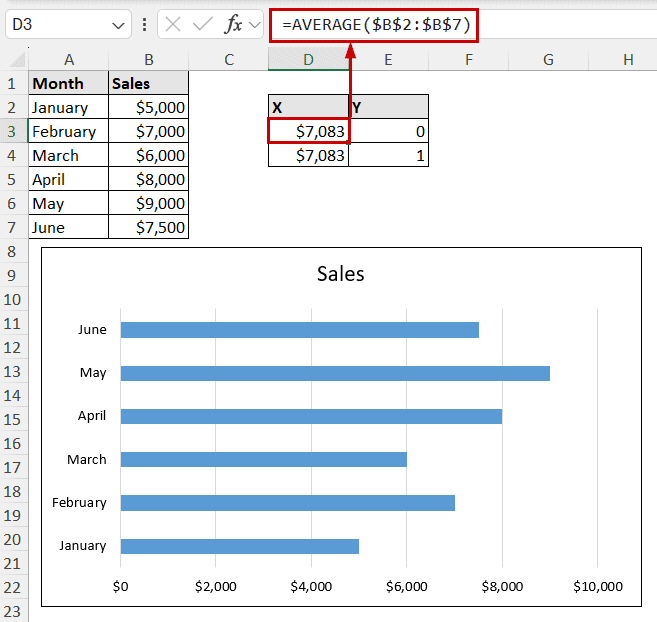
➤ Create a pair of indices for X and Y by repeating the same formula for X and putting 0 and 1 for Y (X contains the same average formula, and Y contains manually inserted 0 and 1).
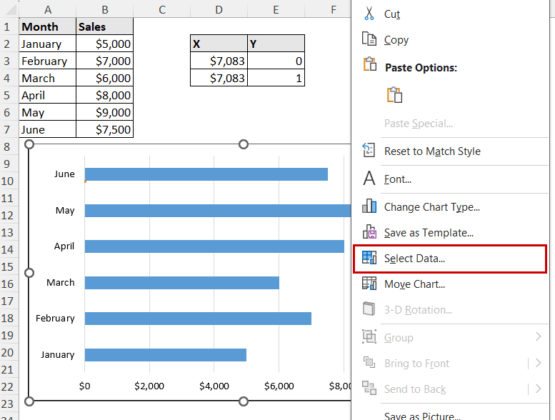
➤ Now, right-click on the chart and select the Select Data option from the context menu.
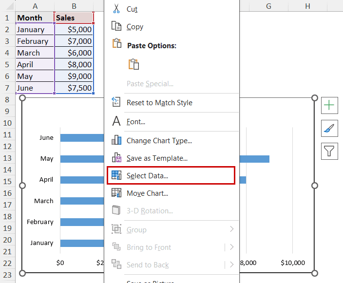
➤ In the Select Data Source dialog box, select Add under Legend Entries.

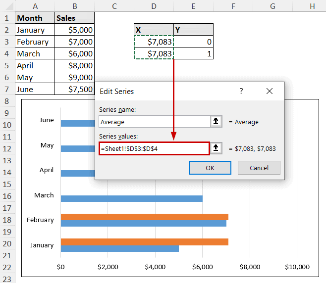
➤ Give the series a name and insert X values as series values.
➤ Close the dialog boxes.
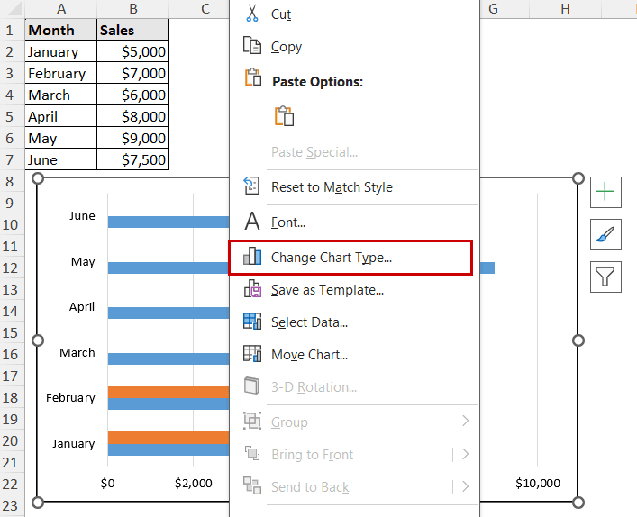
➤ Right-click on the chart and select Change Chart Type from the context menu this time.
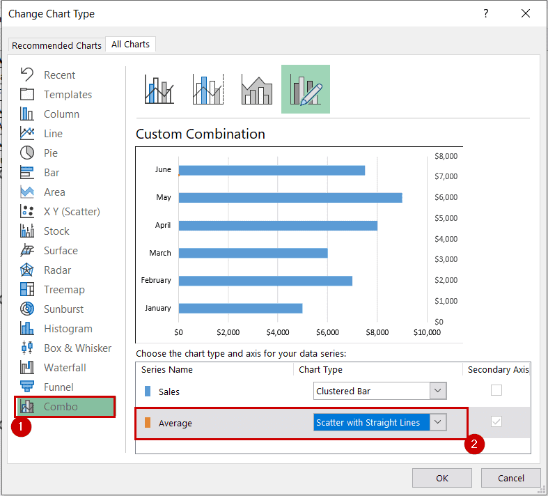
➤ Select a Combo chart and select a scatter plot with lines as the secondary series. Then select OK.
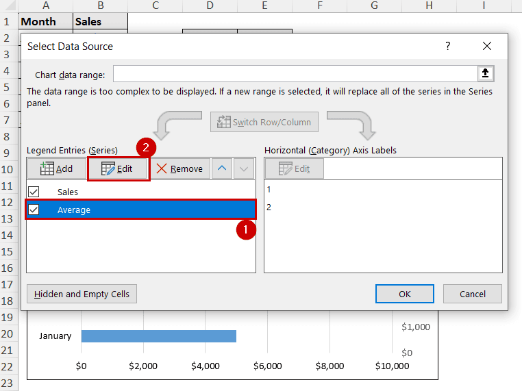
➤ Right-click on the chart and select the Select Data option again.
➤ Select the second series and the Edit option under the Legend Entries.
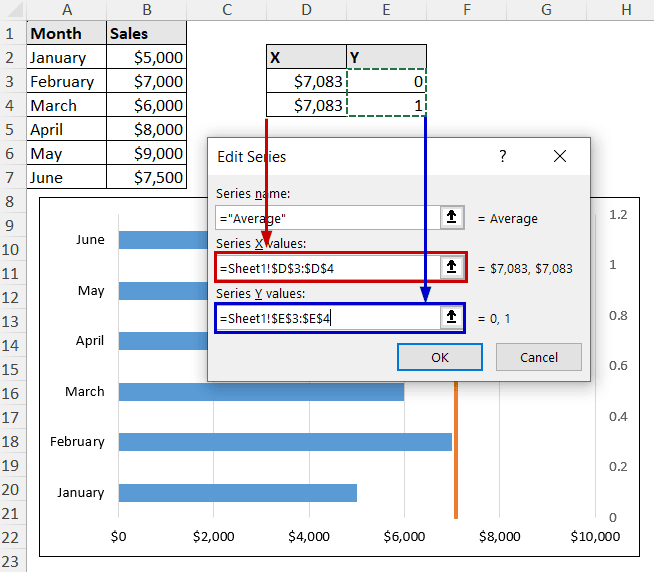
➤ Now select the proper values for the X and Y series in the Edit Series dialog box.
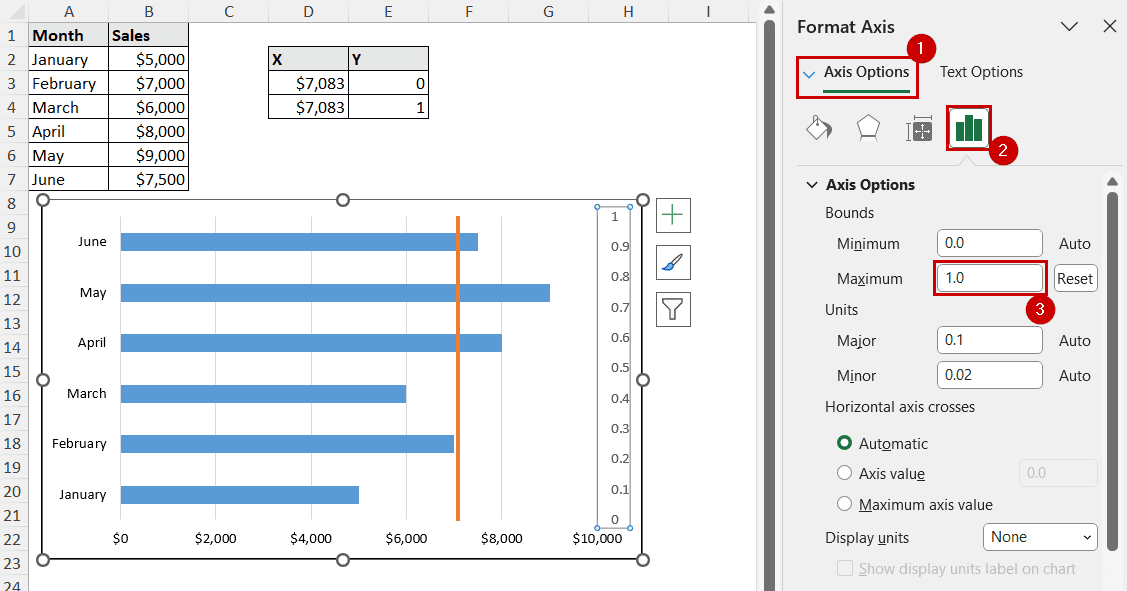
➤ The vertical line should be available at this point, but the line should be a bit off. To adjust it perfectly, right-click on the secondary axis and select Format Axis.
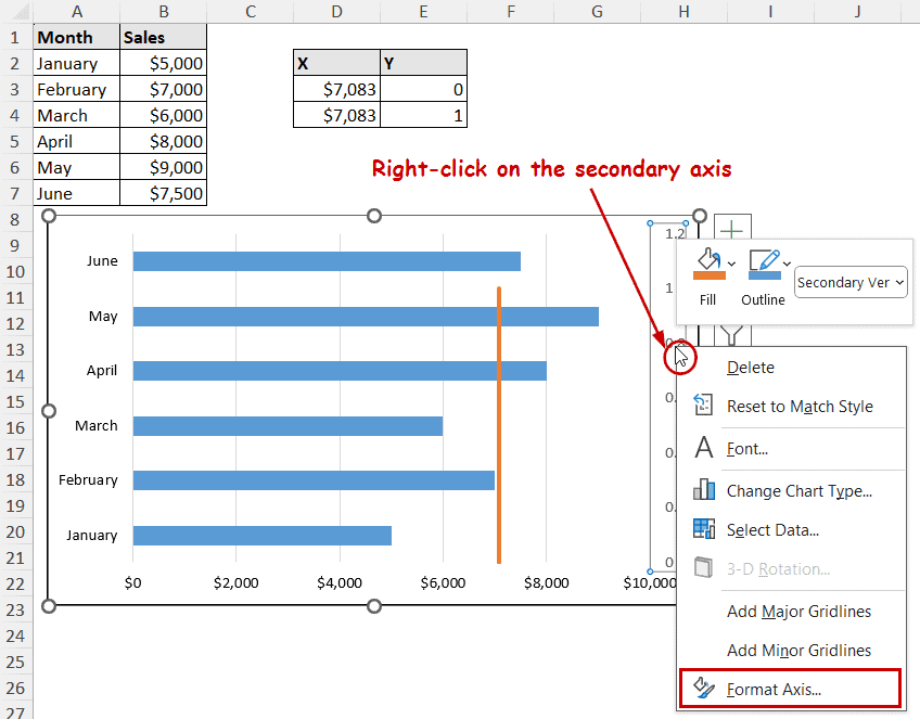
➤ Select the Maximum bound to 1 in the Format Axis pane, and the vertical line will be set in the bar chart.

Adding Vertical Line to Numeric Y-Axis Values (Quantitative Data)
Vertical error bars can be represented as vertical lines in an Excel graph. To do that, we can format the error bar at an average (or any reference point where we want to put a vertical line). Eliminating the horizontal error bar and formatting it can give it the visual appearance, as well as work as an error bar.
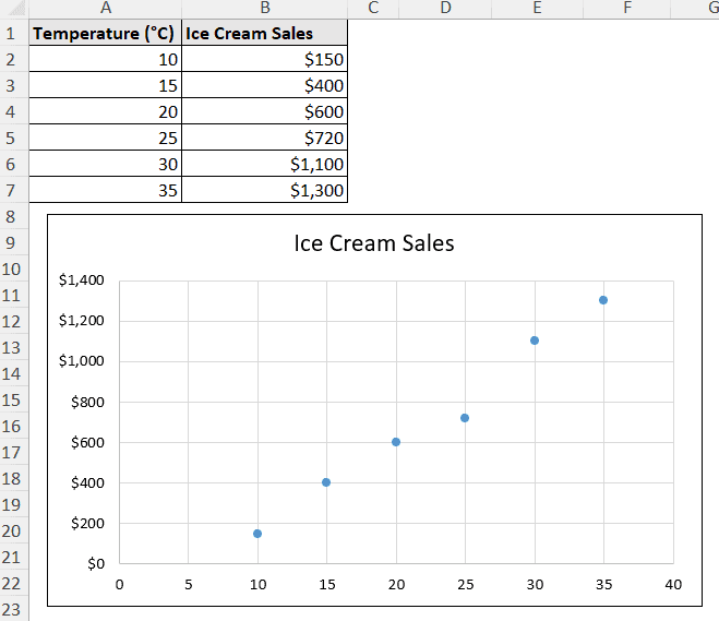
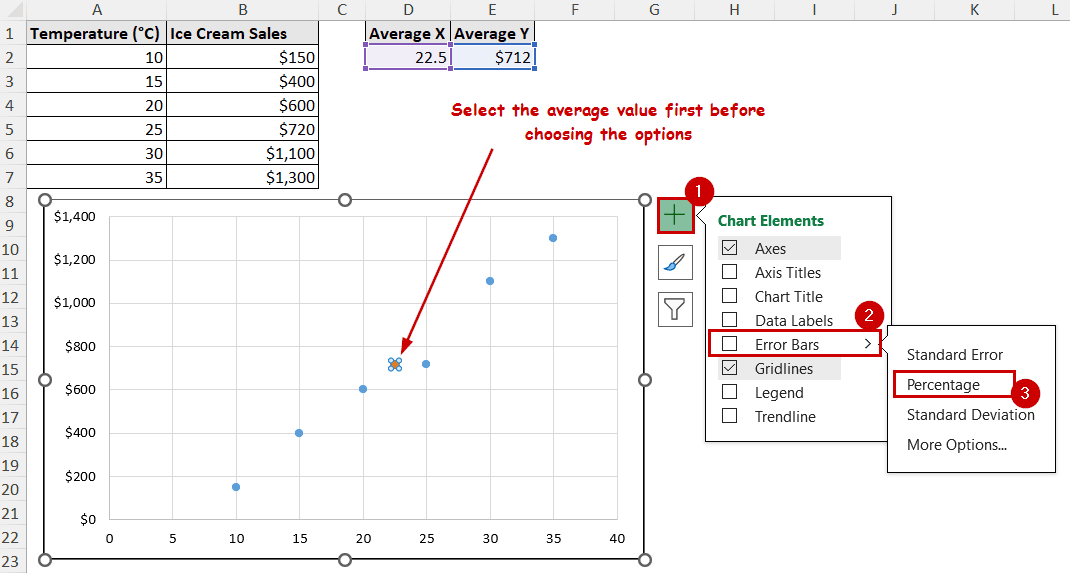
Let’s take a scatter plot of ice cream sales compared to different temperatures. We are choosing a scatter plot because it is also good for demonstrating the idea.
Steps:
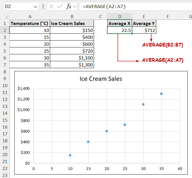
➤ Find the average (or the reference point) of X and Y, where you want to put the vertical line.
➤ Right-click on the chart and select the Select Data option from the context menu.
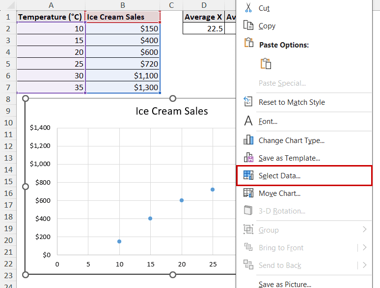
➤ Select Add under Legend Entries.
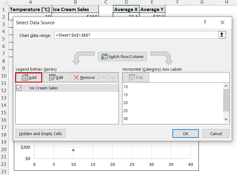
➤ Select the average values for the new X and Y for the series.

➤ Select the average series and go to Chart Elements >> Error Bars >> Percentage.
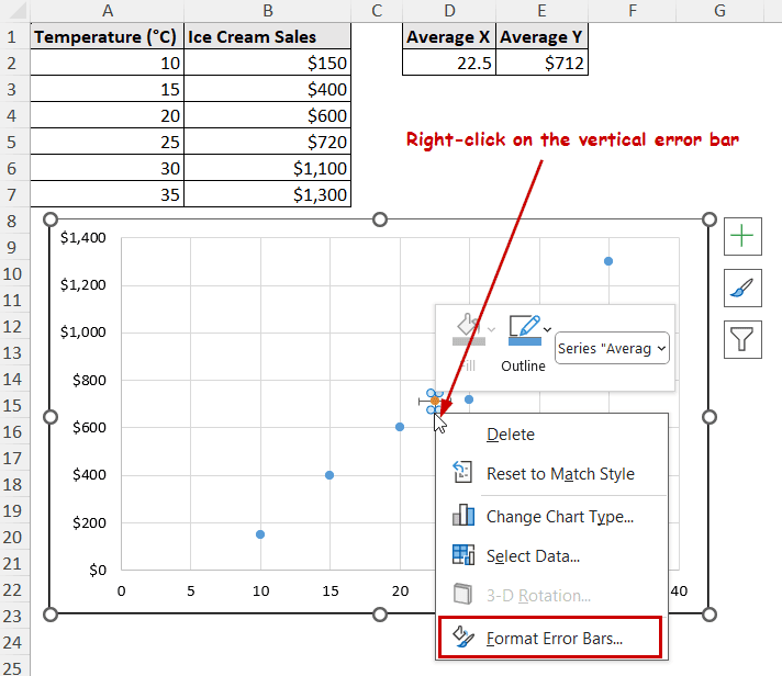
➤ Right-click on the vertical error bar and select Format Error Bars from the context menu.
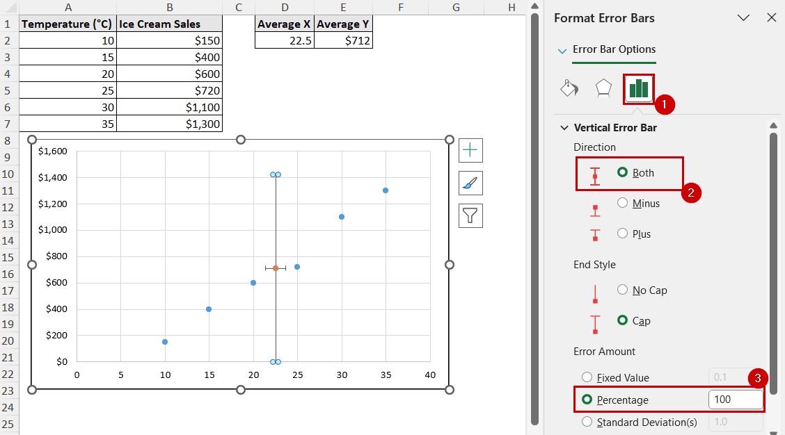
➤ Under the Error Bar Options, select Both in Direction and set the Percentage to 100.
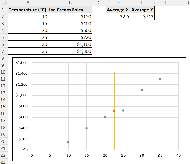
➤ Format the error bar to make the vertical line stand out.
FAQ
How do I add a vertical line to a specific point on the x-axis?
To add a vertical line to a specific point, you can follow the second method of modifying vertical error bars to make it a vertical line.
We have demonstrated the method for an average point. You can select a specific point before adding the error bar and follow the rest of the method to add a vertical line to that point.
How can I add multiple vertical lines to an Excel graph?
You can select a specific point before modifying its error bar to make a vertical line. You can repeat this process for as many points as you want. If you repeat it for multiple reference points, you can get multiple vertical lines.
How do I format the vertical line (e.g., color, style, thickness)?
Whether or not you formatted an error bar or used combo charts for the error, double-click on the line to access the edit options.
Double-clicking on the line opens the Format Data Point/Format Error Bar pane. Go to the Fill & Line tab under it, and you can get all the customizable options available there.
Conclusion
In this tutorial, we have covered how to add vertical lines in an Excel graph. We have created a combo chart and modified error bars to create the vertical lines. The combo chart method is useful for qualitative data on the vertical axis, like the bar chart. Modifying error bars to mimic the vertical lines can be done for any chart.
Feel free to download the practice workbook and give us your feedback.