
A chart’s data is the source from which it’s plotted. To select data for a chart in Excel, we can select it before creating a chart or select the source data after plotting a blank chart.
To select data for a chart in Excel,
➤ Select a blank cell and plot a chart.
➤ Right-click on the chart and select Select Data from the context menu.
➤ Click Add in the Select Data Source dialog box and insert the values or cells working as the data source.
➤ Click Edit in the Select Data Source dialog box and insert the label.
In this tutorial, we will cover how to select data for a chart in Excel. We can select the data both before and after creating a chart. We are going to cover both of them and how to select different types of ranges for this data selection.
Download Practice WorkbookSelecting Data Before vs After Creating a Chart
There are two ways to create a chart based on data in Excel:
- Selecting it before inserting a chart (most common)
- Selecting data for an already existing chart (common for changing data sources)
The second method also applies when you create a blank chart and insert the data later.
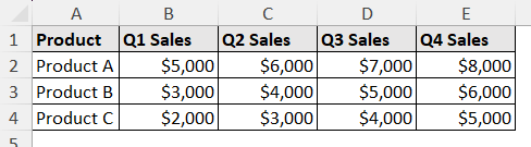
Let’s look at the data with which we are demonstrating both the process. It contains quarterly sales of different products.
Selecting Data Before Creating a Chart
Let’s say we want to include all the cells in the chart (other types of selection are covered later in this article). Before taking the steps to create a chart, you can select these cells to create the chart automatically.
Steps:
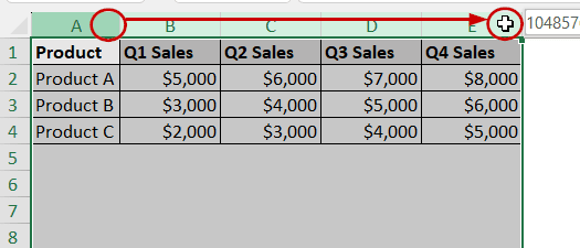
➤ Click on the top left of the data range (A1).
➤ Without releasing the click, drag your cursor to the bottom-right of the selection (E4).
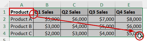
➤ Then release the mouse.
Note: You can also select a cell within the data and press Ctrl + A to select the whole data.
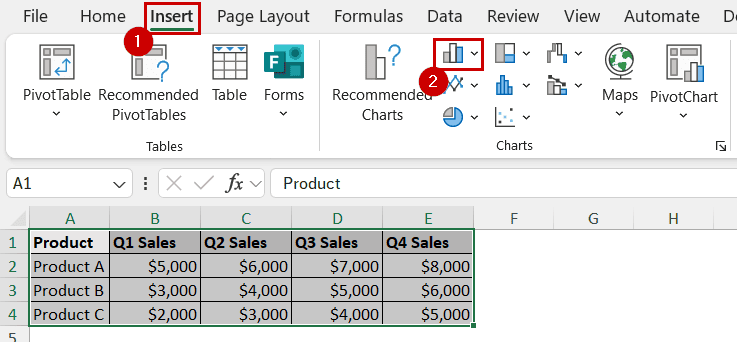
➤ After that, go to Insert >> Charts (group) >> select the chart type.
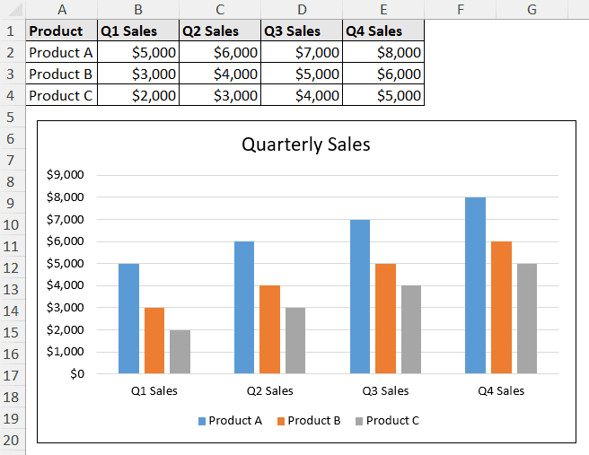
The chart will contain all the selected data.
Selecting Data After Creating a Chart
You can create a blank chart and then select your data. However, this method is more commonly used to modify the data type or source of an existing chart.
Steps:
➤ Select a blank cell.
➤ Go to Insert >> Charts (group) >> select the suitable chart type.

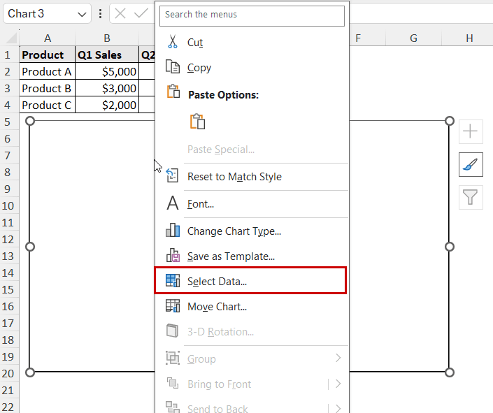
➤ Right-click on the blank chart and select the Select Data option from the context menu.
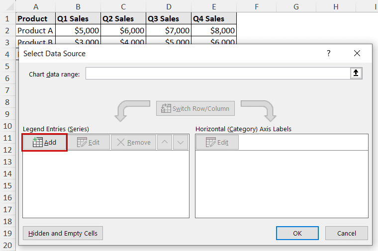
➤ In the Select Data Source dialog box, click on Add under Legend Entries.
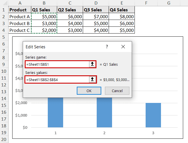
➤ Insert the appropriate Series name and Series values (direct data or cell references) in the Edit Series dialog box.
Note: You can also insert named ranges in these fields. You need to type out the name of the named range instead of inserting any reference.
➤ Repeat the process if you have multiple series and you want to include them in the chart.
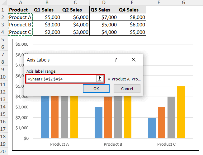
➤ Now, click Edit under the Horizontal Axis Labels.
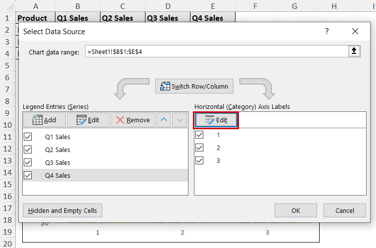
➤ Select the proper range for axis labels.
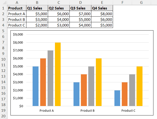
The chart will contain all the data.
Different Types of Data Selection for Charts (Or Other Objectives) in Excel
You might have noticed we included all the data in the charts we created previously. In case you want to select part of the data for a chart (or any other selection type), we will demonstrate that part in this section.
These types of selection are not limited to creating charts; rather, all sorts of actions in Excel that require the selection of cells.
Selecting Adjacent Rows/Columns
To select the adjacent rows/columns fully:
➤ Click on a row/column header (column A).
➤ Without releasing the click, drag your cursor to the end of the header.
➤ Then release the click.
Selecting Adjacent Rows/Columns Partially
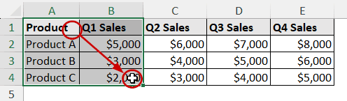
Let’s say we want the first four columns included in our new chart (we want to skip the fifth column). Clicking and dragging is the easiest way to achieve that.
Steps:
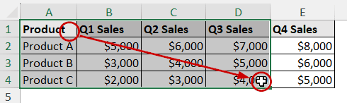
➤ Click on the top left of the first cell (A1).
➤ Without releasing the click, drag your cursor to the bottom-right of the desired selection (D4).
➤ Then release the click.
Select Data from Non-Adjacent Rows/Columns
Now, let’s say we need to select Q1 Sales and Q3 Sales in a chart. We need to use the “Ctrl+click” selection method. This selection process is also called multi-selection.
Steps:
➤ Select the first cells of a range (A1).
➤ Then, without releasing the click, drag the cursor to the end of the first range (B4) to complete the first selection.
➤ Now, hold Ctrl and click and drag from one end to the other of the next range (D1:D4).
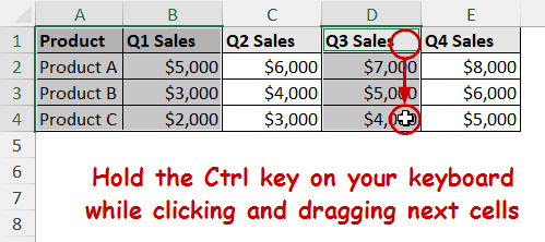
➤ Repeat the process for every non-adjacent cell selection.
Selecting Data from Named Ranges and Tables
A named range is a custom name assigned to a range of cells in Excel. You can name a range by selecting a range and then going to Formulas >> Define Name.
A Table in Excel is a structured range with built-in filtering, formatting, and automatic expansion. Excel converts a range into a table when you press Ctrl + T after selecting the range.
To plot a chart from a named range or table, all you need is to select a cell within the range/table before plotting the chart. When you need to insert a named range/table, insert the name of the range/table in the source options (e.g., the Edit Series dialog box).
FAQ
Why is my Excel chart not selecting all the data?
When you click and drag to select a data range, Excel seemingly picks up all the data. However, Excel ignores the hidden rows. To unhide a column/row, right-click on the next visible column/row header and select Unhide.
Some other reasons might be blank cells or incorrect range selection, too. Make sure that is not the case while you are selecting your data.
How to make an Excel chart update automatically when new data is added?
When the source of a chart is a table, it updates automatically. Convert the source range into a table by selecting it and pressing Ctrl + T . Then, use that as the chart’s source either before creating the chart or after creating it (described earlier in this article).
How do I exclude certain data points from a chart?
Select the data source and click on the cells by pressing Ctrl on your keyboard to exclude them from the selection. You can then proceed to create a chart from this selection, Excel will ignore those values.
You can also exclude data from a chart by hiding rows, filtering data, or adjusting the chart’s data range.
Concluding Words
In this tutorial, we have demonstrated how to select data for a chart in Excel. We have covered how to select a data source before creating a chart. To select data after creating a chart, we have used the Select Data option. The process to select different ranges for charts (or any other process) has also been shown with clicking and dragging and using the Ctrl key method.
Feel free to download the workbook and give us your feedback.