Area charts in Excel are a simple yet powerful way to visualize how different categories contribute to a total over time. It doesn’t matter if you are tracking monthly sales, website traffic, or ...
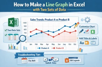
In most workplaces, the ability to display visual data for presentation is a highly required skill. In this case, Excel is one of the best tools that help people to make graphs, charts, and tables to ...
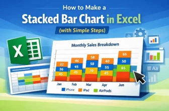
Creating a Stacked Bar Chart in Excel is an excellent way to display data when we want to show both the individual parts and the overall total in one view. Instead of listing numbers in a table, this ...
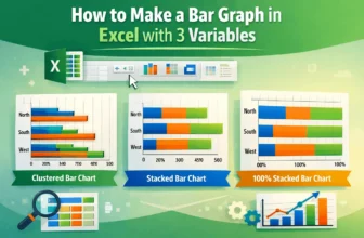
In Excel, a bar graph or chart displays data using horizontal rectangular bars, where each bar's length represents the data point's value. It’s one of the most effective ways to compare categories or ...
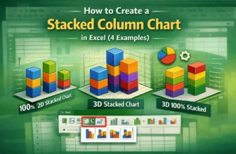
A stacked column chart allows for the comparison of components of a whole across different categories. Instead of showing separate bars, it stacks the values on top of each other, making it easy to ...
When we need to understand and visualize the distribution of a dataset, especially a large one, we use the histogram plot. Plotting a histogram allows us to group a large dataset into small intervals ...
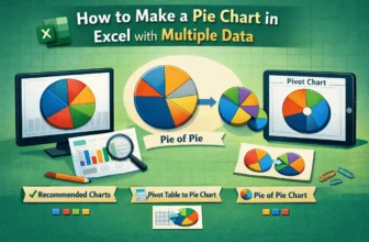
In Excel, our dataset typically contains multiple categories, and we need to compare them to extract relevant information. In such a situation, using a pie chart is very useful as it allows us to ...
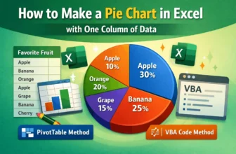
When we work with datasets of various categories, we often need a quick visualization method to see how differently these values or categories are distributed. For this purpose, using a pie chart is ...
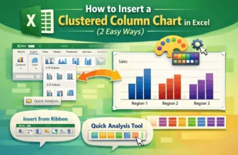
One of the most popular chart styles in Microsoft Excel is the clustered column chart, which is ideal for comparing results across several categories. For ease of comparison, vertical bars are ...