Charts are the visual representation of data. We use charts to quickly identify patterns and trends instead of going through an overwhelming amount of data. You can use the features from the ribbon, the Quick Analysis tool, and keyboard shortcuts to create a chart from a selected range of cells.
To create a chart from a selected range of cells, follow the steps below:
➤ Select the range of cells.
➤ Go to Insert >> Charts >> Select the chart type (Column, Bar, Pie, etc.).
➤ Customize the chart and adjust the range later if necessary.
The goal is to select a particular range before creating the chart. In this tutorial, we’ll go through all the methods of creating charts from selected range of cells.
Using Ribbon Tools
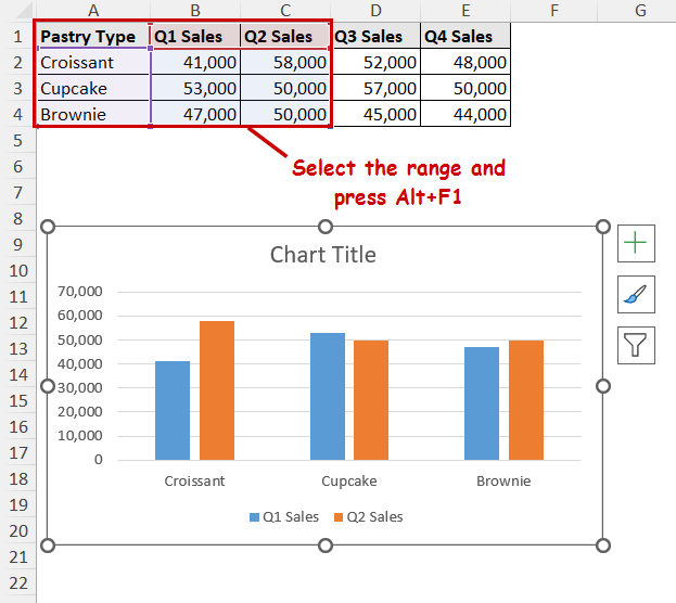
In our dataset, we have different pastry types in column A. And, quarterly sales in columns B to E.
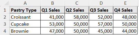
We are going to create a chart from a selected range of the first 2 quarterly sales of each type of pastry.
Usually, the ribbon is the go-to process for chart creation in Excel. You can find different types of charts to insert in the Insert tab.
Steps:
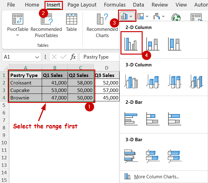
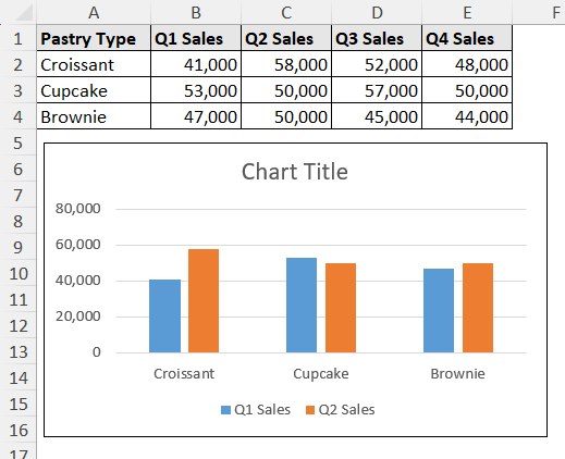
➤ Select the range you want to include in the chart (A1:C4).
➤ Go to Insert >> Charts >> select the type of chart you want to include.
➤ The chart will automatically be created in the sheet.
Using Quick Analysis Tool
The Quick Analysis tool is available from Excel 2013. It can create charts, formattings, summaries, etc. with just a few clicks instead of navigating through all the options.
It automatically appears once you select a range of cells. The shortcut to access this feature is Ctrl+Q.
Steps:
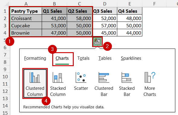
➤ After selecting the range, click on the Quick Analysis tool icon. It appears on the bottom-right of the selection when you hover over the selection.
You can press Ctrl+Q to access the menu after selection directly.
➤ Go to Charts >> select the chart of your preference.
How to Enable the Quick Analysis Tool:
By default, the Quick Analysis tool is enabled in Excel. In case it is disabled on your system, you can do the following:
Select File >> Options >> General >> Check the “Show Quick Analysis options on selection” under User Interface options.
Using Keyboard Shortcuts
Alt+F1 is the shortcut to create a chart in Excel. It is extremely quick to execute. The downside is it automatically selects the chart type based on the data. You have to manually modify it later on if you want a different type of chart.
Steps:
➤ Select the range you want to create the chart from (A1:C4).
➤ Press Alt+F1
Alternative Shortcut: The keyboard button F11 is another shortcut to create charts in Excel. While Alt+F1 creates the chart in the same sheet, pressing F11 creates the same chart in a new sheet.
FAQ
How to change chart style in Excel?
Select the chart you want to change the style of. The chart tools will be displayed beside the top-right of the chart. Click on the Chart Styles from there and select the style you want.
How to change the data range for an existing chart?
To change the data range of an existing chart in Excel, right-click on the chart. Select the “Select Data” option from the context menu and you will get access to the chart data. You can manipulate the data from there.
How to apply data labels in a chart in Excel?
To add data labels, click on the chart to access chart tools >> select Chart Elements >> check the Data labels option.
How to apply an outline to a chart area in Excel?
To add an outline, click on the chart to access the Format tab on the ribbon. You can find the Shape Outline option in the Shape Styles group. You can make changes to the outlines from there.
How to save a chart style as a template?
To save a modified chart as a template for later use, right-click on the chart and select Save as Template from the context menu and save it on your local storage. You can import it later while changing a chart type or inserting a new chart under the templates section of the Insert Chart window.
Wrapping Up
In this tutorial, we’ve learned different ways to create a chart from the selected range of cells. We have covered the use of the ribbon, Quick Analysis tool, and keyboard shortcuts to do so.
It all boils down to the same process of creating charts for a full dataset. Instead, you need to select the range beforehand if you want to create one for a particular range.
Feel free to download the practice file and let us know about your feedback.