The X-axis in Excel charts plays a crucial role in organizing and displaying your data visually whether you’re working with categories, dates, or numerical values. Depending on your dataset, you might need to change how the X-axis looks or behaves such as update the labels, adjust the scale, reverse the order, or convert the axis type entirely. Whether you’re analyzing trends over time, comparing product categories, or presenting custom intervals, Excel gives you multiple ways to modify the X-axis to match your specific needs.
In this article, we’ll walk through the different ways to change, customize, and format the X-axis in Excel using practical examples and step-by-step instructions. Let’s get started.
Steps to change X axis values in Excel Chart:
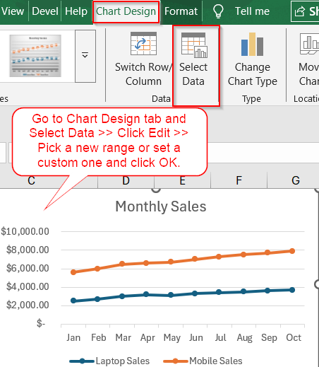
➤ Click once on your Line Chart to select it.
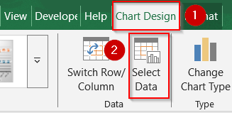
➤ Go to the Chart Design tab that appears in the ribbon once the chart is selected.
➤ Click on Select Data from the Data group.
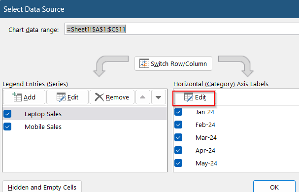
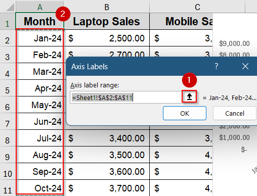
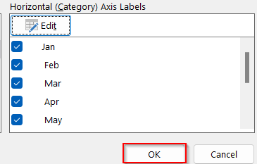
➤ In the Select Data Source window, look under the “Horizontal (Category) Axis Labels” section on the right, and click Edit.
➤ Now the Axis Labels dialog box will appear. Select the range A2:A11 (which contains the month names like Jan-24 to Oct-24)
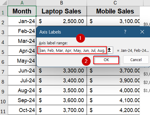
➤ Alternatively, you can also type custom labels separated by commas if you want to manually set them (e.g., Jan, Feb, Mar, Apr, etc).
➤ Click OK to confirm the new X-axis label range and close the dialog boxes.
Update X Axis Labels from Select Data Options
This method is ideal when you want to replace the existing X-axis labels with something more meaningful such as switching from default numbers to custom month names, category names, or even dynamic label ranges. If your chart is pulling data from a different part of the worksheet, or if your time-based data isn’t reflecting properly on the X-axis, this method lets you manually define the labels that appear along the horizontal axis.
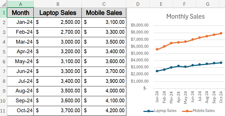
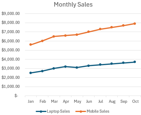
Let’s say you’re using a Line Chart to compare Laptop Sales and Mobile Sales from January to October 2024. The X-axis should display the month names (from the “Month” column), but sometimes Excel doesn’t pick those labels correctly, especially if you inserted the chart too early or modified your dataset later. Here’s how to manually set or change the X-axis labels.
Steps:
➤ Click once on your Line Chart to select it.
➤ Go to the Chart Design tab that appears in the ribbon once the chart is selected.
➤ Click on Select Data from the Data group.
➤ In the Select Data Source window, look under the “Horizontal (Category) Axis Labels” section on the right, and click Edit.
➤ Now the Axis Labels dialog box will appear. Select the range A2:A11 (which contains the month names like Jan-24 to Oct-24)
➤ Alternatively, you can also type custom labels separated by commas if you want to manually set them (e.g., Jan, Feb, Mar, Apr, etc).
➤ Click OK to confirm the new X-axis label range and close the dialog boxes.
You’ll now see the updated labels along the X-axis of your chart.
Adjust X Axis Scale and Formatting Using Format Axis
This method is useful when you want to control how the X-axis looks and behaves like switching from text to date axis, customizing scale limits, or applying specific number formats. In our line chart showing monthly Laptop Sales and Mobile Sales, these tricks help you make the timeline more readable or visually accurate.
Steps:
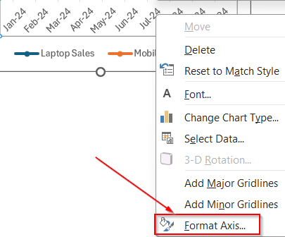
➤ Right-click on the X-axis and choose “Format Axis“.
➤ From the Axis Options panel, you can switch between Text Axis and Date Axis to change how Excel interprets the X-axis values.
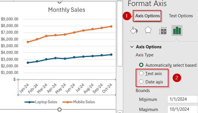
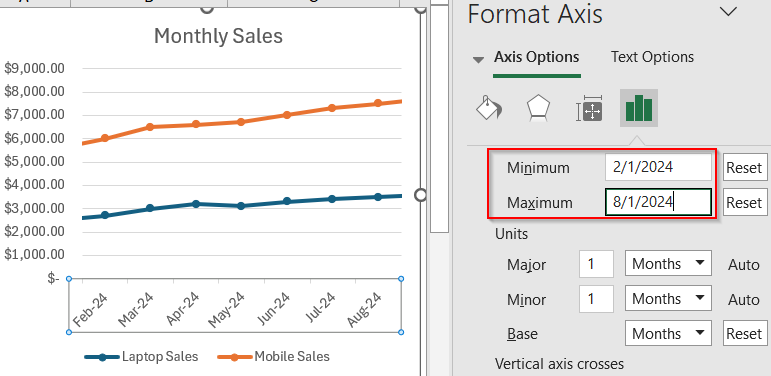
➤ Modify the Minimum and Maximum bounds to zoom in on a specific range (e.g., show only Feb–Aug sales).
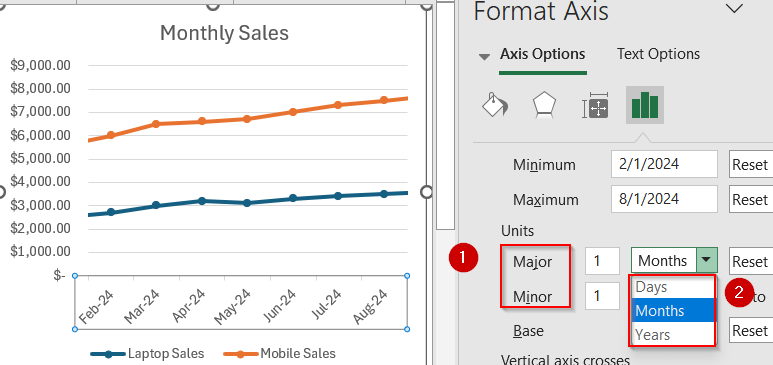
➤ Adjust Major and Minor Units to set how often labels or gridlines appear. You can choose among Days, Months and Years depending on your dataset,
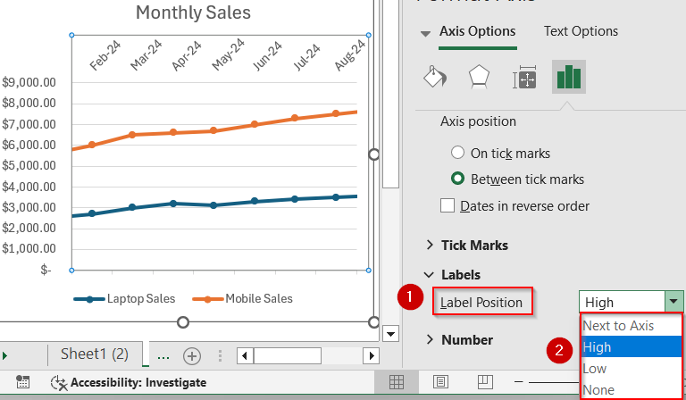
➤ Set Label Position or choose to show labels at High or Low for a cleaner look.
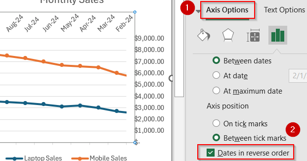
➤ Check the box for Dates in Reverse Order to flip the axis if you want to highlight recent months first.
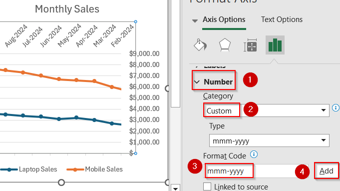
➤ Expand the Number section to format the X-axis as “mmm-yyyy” or apply other custom number/date formats.
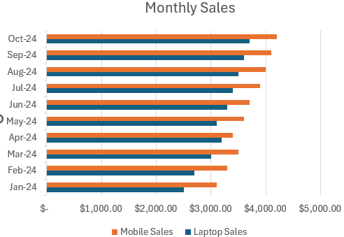
Use a Different Chart Type (e.g., XY Scatter or Bar Chart)
If your X-axis contains actual numbers (not categories or dates), Excel’s default charts may not scale them properly, switching to a different chart type can solve this, especially for data like measurements or irregular time intervals.
Steps:
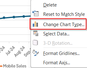
➤ Right-click anywhere on your chart and select Change Chart Type to open the chart type menu.
➤ Choose XY (Scatter) if you want true numeric scaling on the X-axis or select a Bar Chart if you prefer a horizontal layout with categories on the Y-axis and values on the X-axis which is good for rankings or comparisons.
➤ Click OK to confirm.
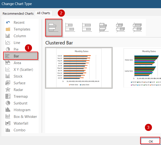
➤ After switching, right-click the X-axis and choose Format Axis to reapply any necessary number formats, bounds, or scaling options to match your original design.
Frequently Asked Questions
Why can’t I edit my X-axis labels directly in the chart?
Excel charts automatically pull X-axis labels from the linked data range. To update them, you must either change the cell values in your source range or manually adjust them using “Select Data” and clicking on “Edit”.
What’s the difference between a Text Axis and a Date Axis in Excel?
A Text Axis treats each label as a separate category with equal spacing. A Date Axis recognizes dates and spaces them proportionally over time which is useful when showing time-based trends like monthly sales or project timelines.
Why did my X-axis scale change or disappear after switching chart types?
Certain chart types, like bar or pie charts, handle axes differently or hide them altogether. If you change to one of these, you may need to reformat the axis manually or pick a better-suited chart type.
Why isn’t my scatter chart showing lines like my line chart did?
By default, Scatter Charts plot data points without connecting lines. To add lines, choose a Scatter subtype with lines (like “Scatter with Straight Lines”) during chart setup or change the chart type afterward.
Wrapping Up
In this tutorial, we learned how to change X-axis values in Excel charts using practical methods like modifying labels, customizing the scale, and switching chart types. Whether you’re analyzing monthly sales trends, tracking time-based data, or working with custom categories, adjusting the X-axis can make your visuals clearer and more meaningful. Feel free to download the practice file and share your feedback.