When working with sales, survey data, or any comparison-based dataset, it’s often helpful to display two related data series side by side. A double bar graph, also known as a clustered column or clustered bar chart in Excel, helps you do exactly that. It lets you compare two values for each category visually, like comparing sales for different products every month without needing to analyze rows and columns of raw numbers.
In this article, we’ll cover practical methods to create a double bar graph using Excel’s built-in clustered chart for adjacent data, and manually adding a second series to an existing chart when your data isn’t next to each other.
Steps to make a double bar graph in Excel:
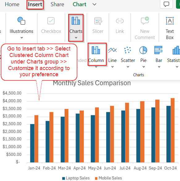
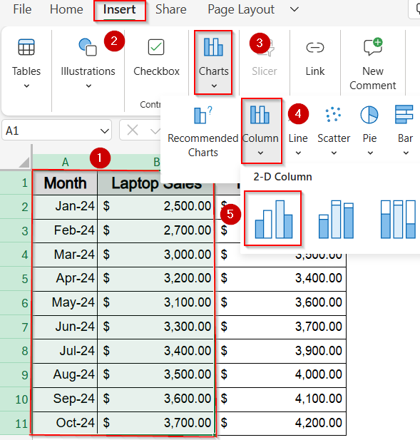
➤ Select the full range A1:C11 including the headers for both series.
➤ Go to the Insert tab on the ribbon.
➤ Click the Insert Column or Bar Chart button in the Charts group.
➤ Choose Clustered Column (for vertical bars) or Clustered Bar (for horizontal bars).
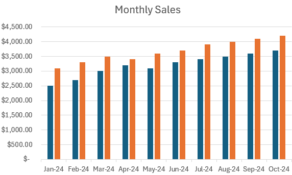
➤ Excel will create a chart showing side-by-side bars for Laptop Sales and Mobile Sales for each month.
Use a Preset Clustered Bar or Column Chart in Excel
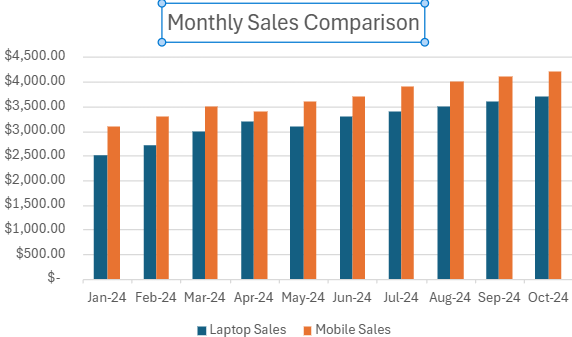
When your dataset is neatly arranged with one category column and two adjacent data columns, Excel makes it easy to generate a double bar graph using its built-in chart presets. This method is ideal for side-by-side comparisons like showing Laptop Sales and Mobile Sales from January to October 2024 where each pair of bars represents data for the same month. The goal is to create a clustered chart that visually separates both series while sharing the same X-axis labels for clarity.
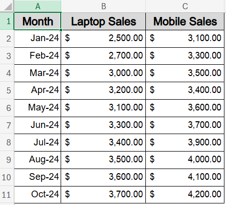
This is the dataset we will be using:
Steps:
➤ Select the full range A1:C11 including the headers for both series.
➤ Go to the Insert tab on the ribbon.
➤ Click the Insert Column or Bar Chart button in the Charts group.
➤ Choose Clustered Column (for vertical bars) or Clustered Bar (for horizontal bars).
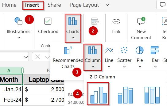
➤ Excel will create a chart showing side-by-side bars for Laptop Sales and Mobile Sales for each month.
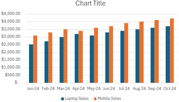
➤ Click on the Chart Title, then type a custom title like Monthly Sales Comparison.
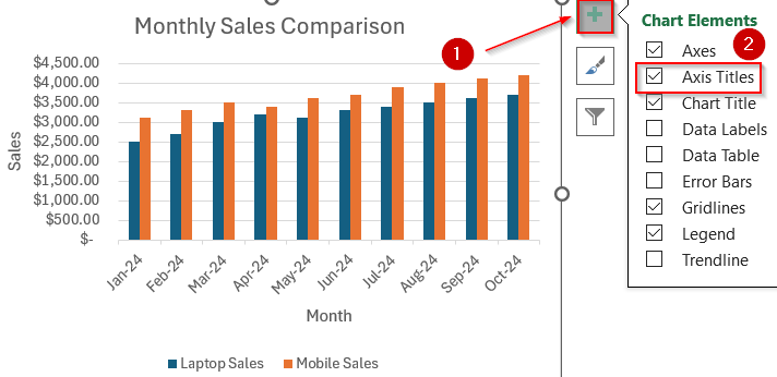
➤ Click the green Chart Elements (+) button and check Axis Titles to add horizontal and vertical labels (like “Month” and “Sales”).
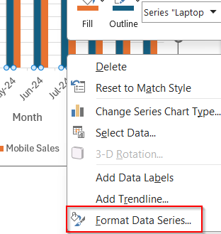
➤ Right-click any bar and select Format Data Series.
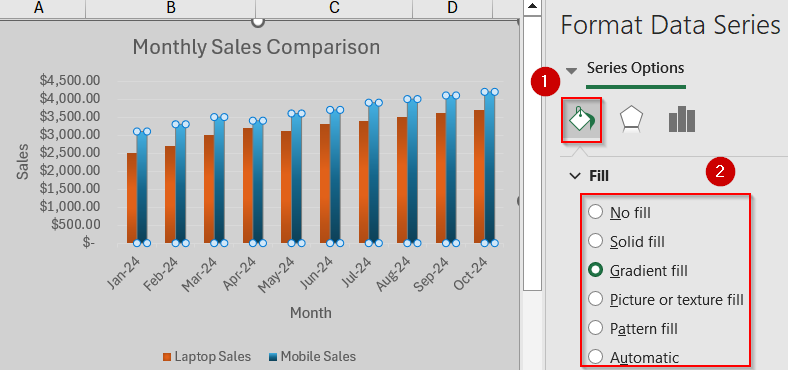
➤ Use Fill & Line options to change colors or effects for each data series.
➤ If bars are too close together or spaced too far apart, adjust the Gap Width inside the Format Data Series pane.
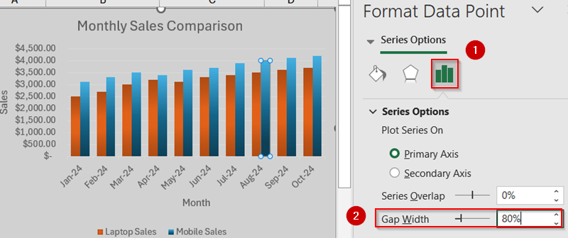
Now you have your fully customised double bar graph in Excel.
Manually Add the Second Series to a Single-Series Chart
If you initially built a chart with just one series like only Laptop Sales and later realized you need to compare it with another series like Mobile Sales, Excel lets you manually add that second set without recreating the chart.
This method is particularly helpful when your second column of data isn’t adjacent, or when Excel simply didn’t pick it up during the first chart insertion. For example, if you already inserted a chart using columns A and B (Month and Laptop Sales), here’s how to integrate the Mobile Sales column as well.
Steps:
➤ Select just the first two columns A1:B11 (Month and Laptop Sales).
➤ Go to the Insert tab and click Clustered Column to insert a single-series bar graph.
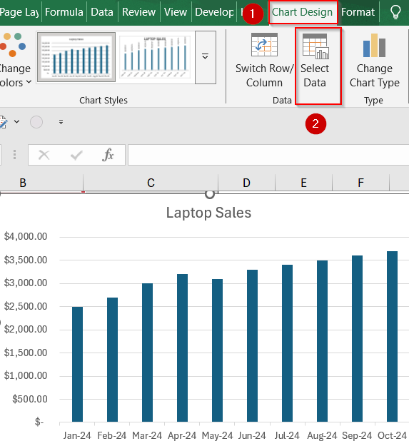
➤ Click the chart once to select it.
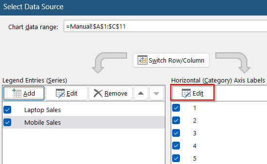
➤ Right-click on the chart or go to the Chart Design tab and choose Select Data.
➤ In the Select Data Source window, click the Add button under the Legend Entries (Series) box.
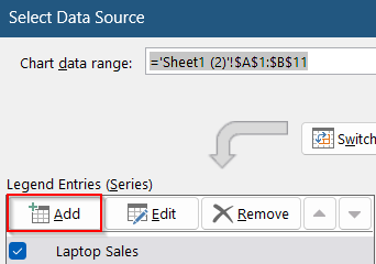
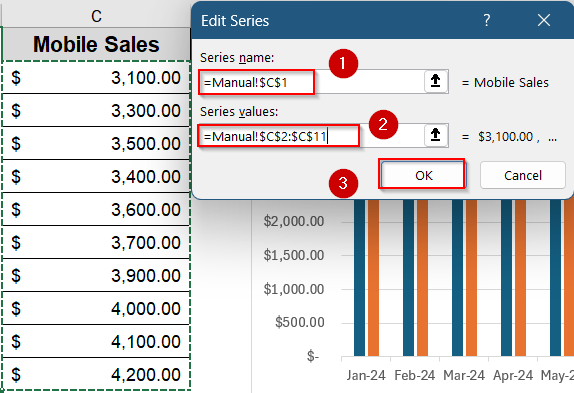
➤ For Series Name, click on cell C1 (“Mobile Sales”).
➤ For Series Values, highlight the range C2:C11.
➤ Click OK to confirm and return to the chart.
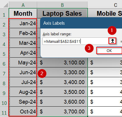
➤ Back in the same dialog, click Edit under the Horizontal Axis Labels section.
and select A2:A11 to display the correct month labels.
➤ Click OK to finalize the updated chart.
➤ Now you’ll see both Laptop Sales and Mobile Sales bars shown side-by-side for each month.
➤ Customize the chart just like before and add titles, colors, and axis labels by using the Chart Elements button or Format options.
Frequently Asked Questions
What is the difference between a Clustered Bar and a Stacked Bar in Excel?
A Clustered Bar Chart places each data series side by side for easy comparison, while a Stacked Bar Chart layers them on top of one another, showing cumulative totals. Use Clustered Bars for double bar graphs.
Why are my bars overlapping instead of being side by side?
This usually happens when you select the wrong chart type or your data isn’t structured properly. Make sure you’re using a Clustered Bar and that each series (e.g., Product A and Product B) has its own column in the dataset.
Can I make a vertical version of the double bar chart?
Yes, you can. Just choose the Clustered Column Chart instead of a Bar Chart during insertion. It displays the grouped bars vertically, which is often better for time-based or sequential data.
How can I add labels to each bar?
After creating your chart, click it once to activate it. Hit the “+” button that appears on the upper right of the chart box called Chart Elements. Then, check Data Labels to show numbers on each bar.
Can I make a triple or multi-bar chart using the same steps?
Yes. Excel automatically handles more than two series. Just include extra columns in your dataset such as “Tablet Sales” or “Accessories” and it will create grouped bars for each category in every time period.
Wrapping Up
In this tutorial, we learned two simple ways to create a double bar graph in Excel either by using a preset clustered chart with your full dataset or by manually adding a second series to an existing single-series chart. Both approaches let you compare two categories side by side, such as Laptop Sales and Mobile Sales across months. Feel free to download the practice file and share your feedback.