Data labels are part of the chart area that provide more context about data points or areas. It can be numeric values, series names, percentages, etc. In Excel, “Format data labels” can refer to text formatting, number formatting, positioning, changing their content, and visual enhancements.
Sometimes, the default data labels aren’t enough for direct insights about data points in a chart. We need to change them often for readability, professional appearance, custom information, or to avoid clutter. Excel has different built-in formatting options for data labels to aid in the process.
➤ You can use the text formatting options from the ribbon after selecting data labels.
➤ Double-click on a label to open the Format Data Labels pane.
➤ Most of the data label formatting options are available in the Format Data Labels pane.
➤ You can click and drag the edge of the data label textbox to move it manually to a custom position.

In this tutorial, we will cover how to format data labels in Excel. We are going to cover basic to advanced formatting. The article includes customizing number formats, changing data label content including custom ones, formatting data label backgrounds, changing data label positions, etc.
Download Practice WorkbookBasic Formatting Options for Data Labels
Some basic text formatting options are available in the Home tab. You can use these options to edit the text inside data labels.
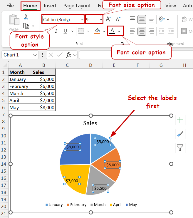
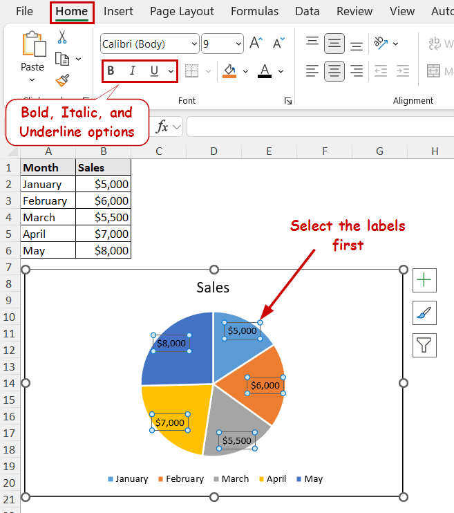
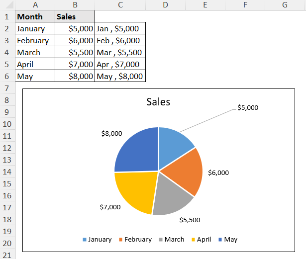
Let’s take a chart that shows the data of sales across different months. The pie chart sales values are also on the labels.

We are going to demonstrate this chart and data labels to explain different formatting options.
Change Font Style, Size, and Color of Data Labels
The font size, style, and fill colors are available in the Font group of the Home tab.
Select the data labels by clicking one of them first. Then, change these options from the tab to change the text formatting of the data labels.
Applying Bold, Italic, or Underline
The bold, italics, and underline options are also available in the Font group. You can use them to add emphasis, contrast, or clarity in the labels.
Aligning Text Within Labels
You can also change the alignment options from the Home tab to change the alignment of data labels.
However, the text boxes should be large enough to notice the change. You can adjust the alignments both vertically and horizontally.
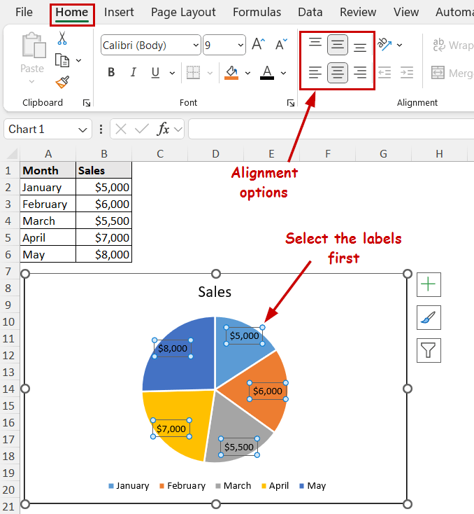
Note: You can change the text box size of the data labels by clicking and dragging their corners.
Customizing Number Format in Data Labels
While creating data labels, Excel usually picks up the cells’ numeric values and formats. We often need to change the number or text format of these data labels in Excel charts.
You can change these values later on from the Format Data Labels pane.
Steps:
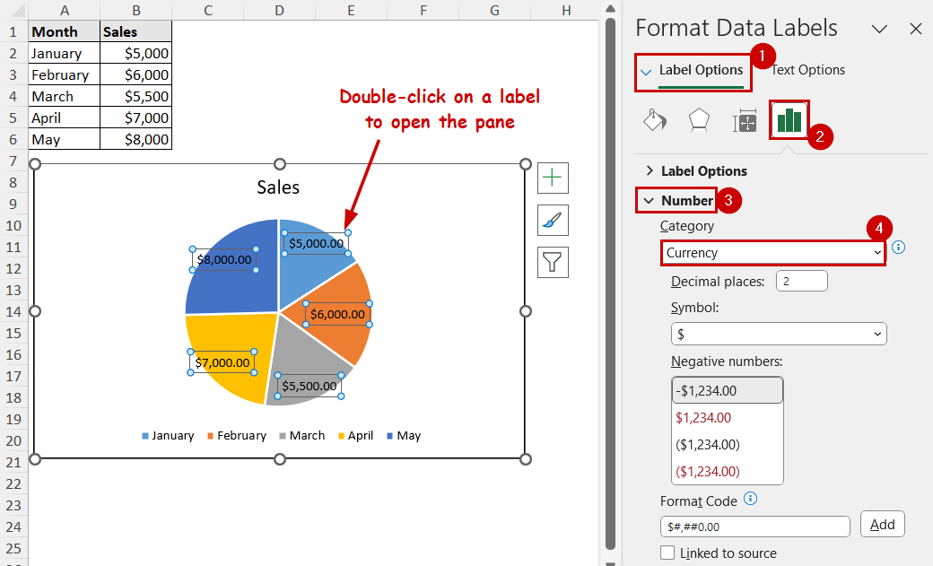
➤ Double-click on a data label to open the Format Data Labels pane.
➤ Under the Label options, select Number.
➤ Change the Category and formats from the options underneath.
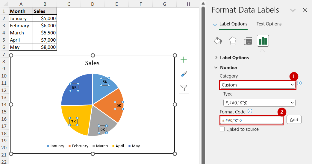
Adding Custom Number Formats in Data Labels
In the number formatting option of the Format Data Labels pane, you can add custom number formats too.
Select Custom as the category and use the same Format Code for cells or TEXT functions.
Note:
➤ We have used #,##0,”K”;0 to display the thousands as K.
➤ You can use #,##0,”M”;0 to show millions as M.
How to Change Data Label Contents in Excel
By default, Excel displays the numeric values in the data labels for a chart. You can change them to display different values such as percentages, categories, series, etc. You can also display custom values from cell references.
Changing Information Type in Data Labels
The option to change what type of information will show in the data labels is available in the Format Data Labels pane.
Steps:
➤ Double-click on a data label to open the Format Data Labels pane.
➤ Under the Label options, you will find the Label Contains section. Select what type of information you want to display from here.
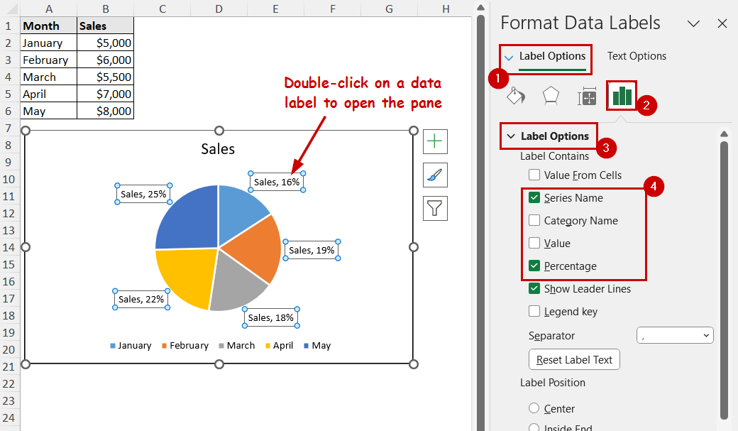
Note: Percentage values are only available in pie and doughnut charts.
Using Cell References as Custom Data Labels
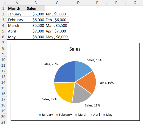
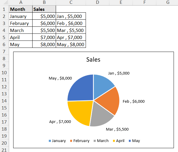
Suppose we want the short form of months along with the sales value to display as data labels. They are in the C2:C6 range.
These are the steps to follow to display a range as data labels:
Steps:
➤ Double-click on a label.
➤ Under the Label Options, uncheck all the options for Label Contaions.
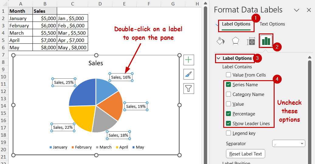
➤ Select the Value From Cells option.
➤ Then select the range in the field of the dialog box.
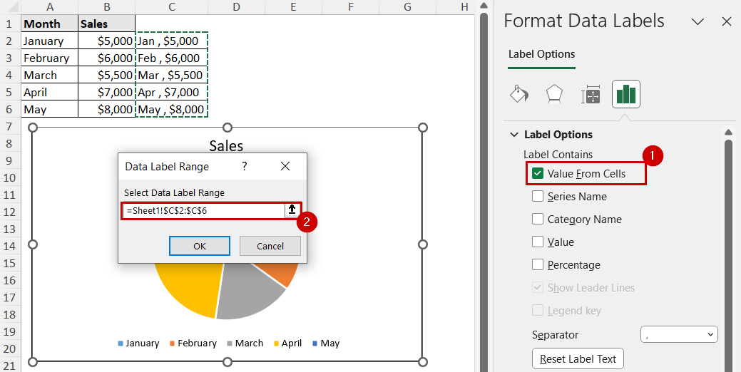
➤ Click on OK, and you will find the cell references as labels.
Formatting Data Label Backgrounds in Excel
From the Format Data Labels pane, you can select the background fill, border, transparency, etc.
Double-click on a label to open the Format Data labels pane.
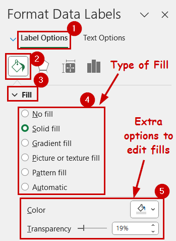
Setting Background Color and Transparency
Under the Label Options, you can find the Fill & Line tab. You can adjust the type of fill, color of the fill, and the transparency of the fill here.
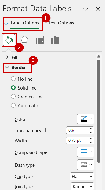
Adjusting Border of Data Labels
Border options are available under the Fill.
You can adjust the type of border, its thickness, style, transparency, etc., from here.
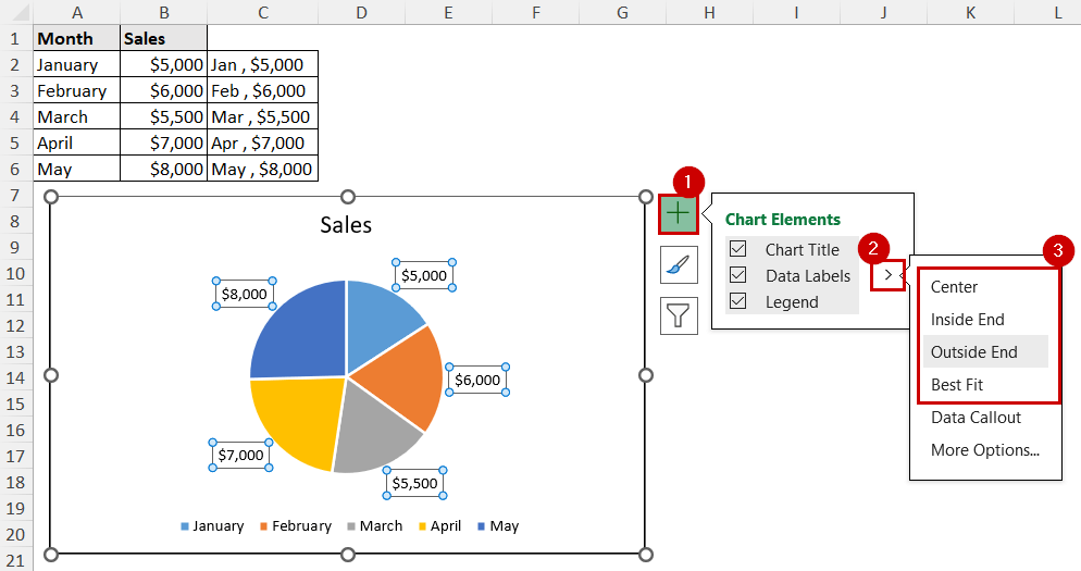
Adjusting Data Label Positions in Excel
Excel automatically sets the position when you create the data labels.
But you can change them from where you create the data labels, such as the Chart Elements button or the Chart Design tab.
Steps:
➤ Select the chart.
➤ Click on the Chart Element button (the plus icon) on the top-right of the chart.
➤ Then click the right arrow beside the Data Labels option.
➤ Change the position of the data labels.
Manually Adjusting the Data Labels
If the automatically adjusted positions don’t suit your style, you can manually drag the data labels and set their positions.
Steps:
➤ Select a data label.
➤ Move your cursor to the edge of a data label until it turns into a four-arrow pointer.
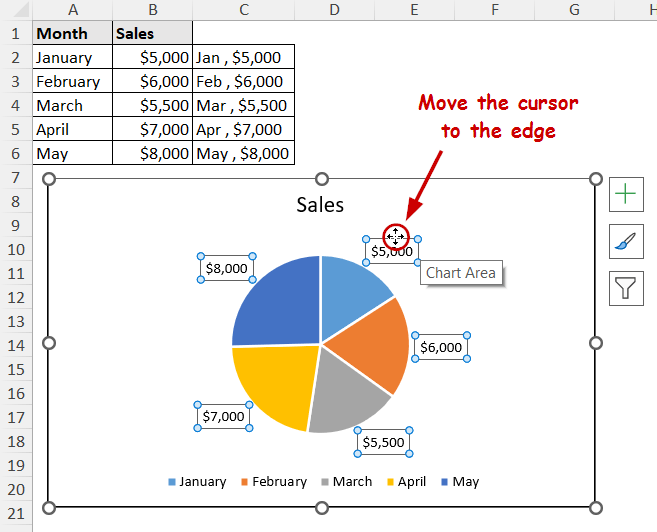
➤ Now, click and move the data label to its desired position.
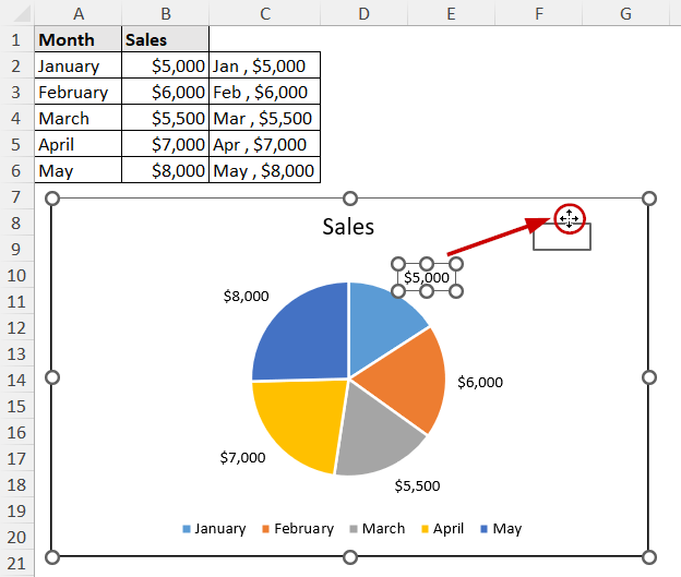
The change in position will happen after releasing the mouse.
Advanced Formatting Options for Data Labels in Excel
Besides all the formatting options we have covered, we can also make some advanced custom adjustments to the labels. Here are some advanced techniques to format data labels in Excel.
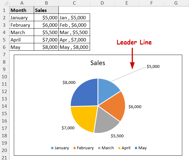
Adding/Removing Leader Lines
Leader lines connect the data labels to their corresponding data point (the line indicating which data label belongs to which point).
Leader lines are helpful in case the data labels are in a different position beside their point or area in the chart. These lines can also be helpful when there are too many data labels in a small area.
Steps:
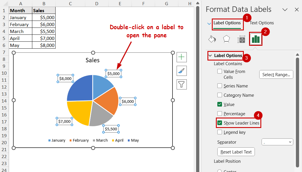
➤ Double-click on a label to open the Format Data Labels pane.
➤ Select all the label options in the Format Data Labels pane.
➤ Check/uncheck the Show Leader Lines option under the Label Contains section to add/remove the leader lines.
Rotating Data Label Texts
The rotating options are available in the Textbox section of the Format Data Labels pane.
Steps:
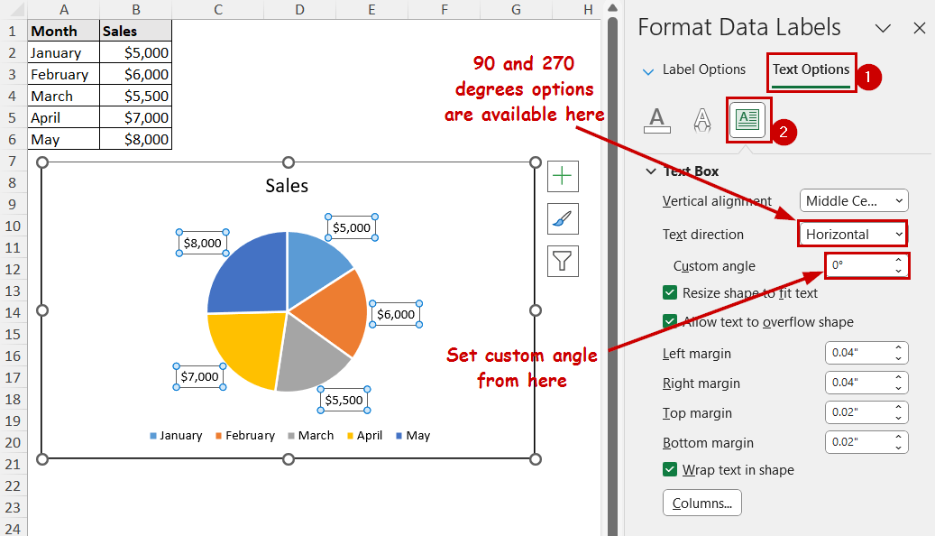
➤ Double-click on a label to open the Format Data Labels pane.
➤ Go to Text Options >> Textbox.
➤ Set the 900 or 2700 options from the Text direction, or set the custom angle from the option under it.
FAQ
Why are my data labels overlapping in Excel?
Data labels can overlap when you have too many labels in a small area. Increase the chart area or remove some of the data labels to avoid overlapping.
You can remove specific data labels by selecting them individually and pressing Delete on the keyboard.
How do I add a line break in data labels in Excel?
Use the Shift+Enter combination on your keyboard to add line breaks in data labels.
You can also use different techniques like using the CHAR(10) characters to add a line break in a cell. Then use those cells as data label references.
Conclusion
In this tutorial, we have discussed how to format data labels in Excel. We have covered basic formatting options like changing the text strength to advanced ones. We covered how to change the number of formattings on the labels, change label backgrounds, change the label contents entirely, and adjust the labels manually.
In addition, we have covered the leader lines and rotation of texts in the data labels.
Feel free to download the practice workbook and give us your feedback.