Funnel charts are an effective way to visualize data that flows through stages, such as sales pipelines, lead conversions, or recruitment processes. Each stage is represented as a horizontal bar, and the chart narrows from top to bottom which illustrates drop-offs clearly. Funnel charts are especially useful in business dashboards and marketing analytics, helping decision-makers spot bottlenecks or inefficiencies quickly.
In this article, you’ll learn how to create a Funnel Chart in Excel, step by step. We’ll walk through the built-in Funnel Chart feature introduced in Excel 2016 and later, explain how to prepare your data for best results, and offer formatting tips to enhance readability and impact.
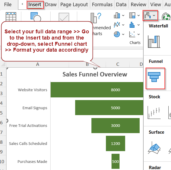
Steps to create a funnel Chart in Excel:
➤ Organize your data with stages and corresponding values in two columns.
➤ Go to the Insert tab and select Funnel from the Insert Waterfall, Funnel, Stock, Surface, or Radar Chart in the Charts group.
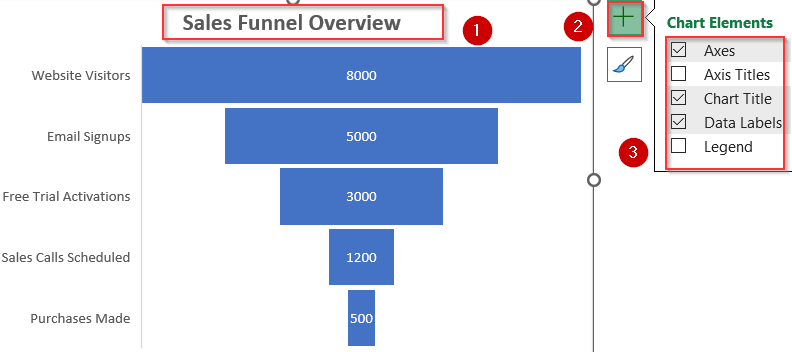
➤ Use the Chart Elements (+) icon to add titles, data labels, and legends for clarity.
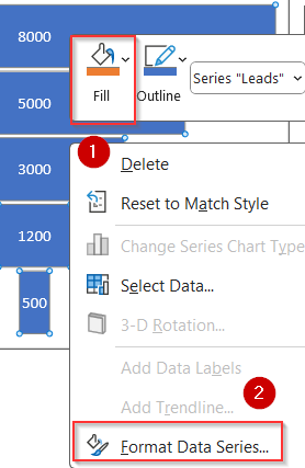
➤ Customize bar colors and spacing by right-clicking the bars and selecting Format Data Series.
Steps to Create a Funnel Chart in Excel
Creating a funnel chart in Excel is quick and straightforward. To demonstrate the process, we’ll use a simplified sales funnel dataset with five stages. Each stage represents a level in the customer acquisition process, and the number indicates how many prospects remain at each step.
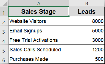
Step 1: Select the Dataset in Excel
To begin, make sure your data is structured with two columns, one for the stages and another for the values (e.g., number of leads). This ensures Excel can read and plot the funnel chart correctly.
Steps:
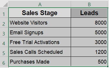
➤ Highlight the entire table, including headers (e.g., “Sales Stage” and “Leads“).
➤ Make sure your values decrease top to bottom for a smooth funnel shape, or adjust later.
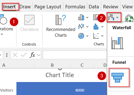
Step 2: Insert the Funnel Chart
Once your dataset is selected, Excel makes it simple to insert a funnel chart through the built-in Insert menu.
Steps:
➤ Go to the Insert tab on the ribbon.
➤ Click the small arrow under Insert Waterfall, Funnel, Stock, Surface, or Radar Chart in the Charts group.
➤ Select Funnel from the list of chart types.
Step 3: Customize and Format the Chart
After inserting the chart, you can enhance its readability with a few formatting adjustments. Excel automatically sorts the bars in descending order, but you can reverse this to preserve your original stage order.
Steps:
➤ Click the Chart Title and rename it to something relevant like “Sales Funnel Overview”.
➤ Use the Chart Elements (+) icon to add or remove elements like Data Labels, Legend, or Gridlines.
➤ To adjust bar spacing or color, right-click any bar >>> Change Fill color.
➤ For advanced control, click on Format Data Series.
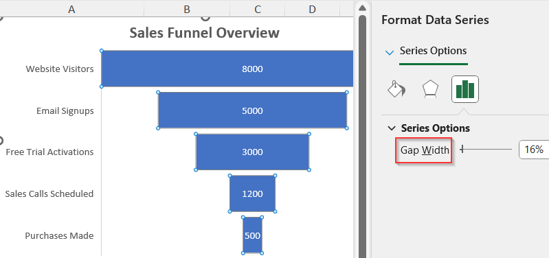
➤ Adjust Gap Width according to your liking.
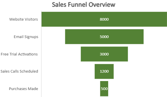
Now you have a clean and effective Funnel chart ready to communicate insights visually.
Frequently Asked Questions
What is a funnel chart used for in Excel?
A funnel chart is ideal for visualizing data that passes through a series of stages, such as a sales or recruitment process. It helps highlight points of significant drop-off, inefficiencies, or bottlenecks in the workflow..
Can I customize the colors of each stage in a funnel chart?
Yes, Excel allows full customization of funnel chart stages. You can select individual bars, right-click, and use the “Format Data Point” option to apply unique colors, gradients, or patterns to better match your brand or presentation theme.
What kind of data works best for funnel charts?
Funnel charts are best suited for categorical, stage-based data that decreases at each step. Examples include lead generation funnels, order processing, onboarding funnels, or customer retention stages where values typically decline with each transition.
How do I add data labels to a funnel chart?
To display data labels, click on the chart, then click the green Chart Elements (+) icon and enable “Data Labels”. You can customize their position, number format, and font style to improve clarity and visual emphasis.
Wrapping Up
In this tutorial, we learned how to create a funnel chart in Excel using the built-in feature available in Excel 2016 and newer versions. Funnel charts offer a clean, visual way to analyze drop-offs in multi-stage processes like sales, marketing, or hiring. With Excel’s built-in tools and simple formatting, you can turn raw data into a clear visual that supports smarter data-driven decisions. Feel free to download the practice file and share your feedback.

