A stacked funnel chart is an excellent visual for tracking data through stages like marketing pipelines, sales funnels, or user journeys. Unlike the default funnel chart in Excel, which only allows a single data series, a stacked funnel chart lets you compare multiple subcategories (like Product A and Product B) at each funnel stage. However, Excel doesn’t offer a built-in “stacked funnel chart” option, but you can create it manually using creative chart formatting techniques.
In this article, we’ll learn multiple practical ways to build a stacked funnel chart in Excel using stacked bar charts and 3D pyramid visuals. Let’s get started.
Steps to create a stacked funnel chart in Excel:
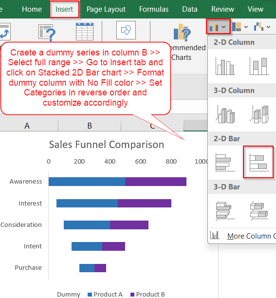
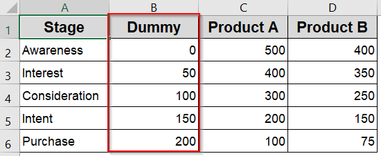
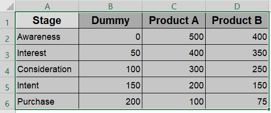
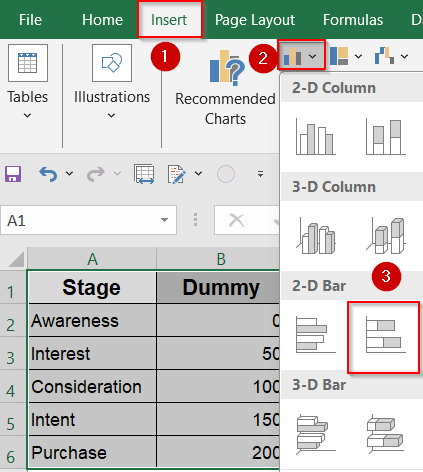
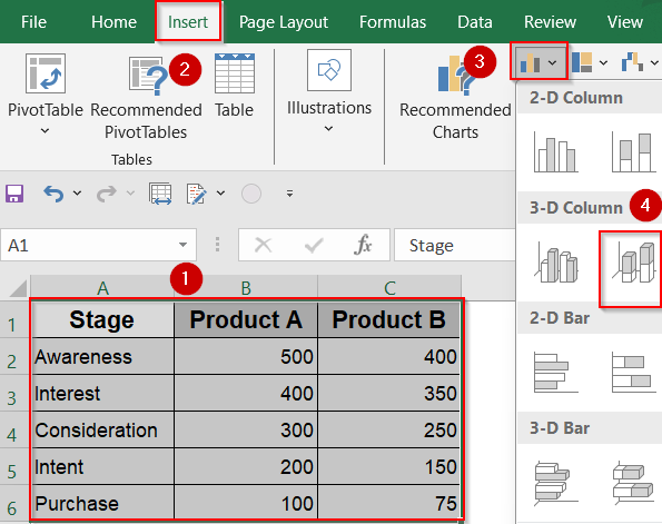
➤ To give the bars a funnel-like appearance, insert a “Dummy” column with increasing values from top to bottom in column B.
➤ Select your full dataset including headers and go to the Insert tab >> Click Insert Column or Bar Chart >> Select 2-D Stacked Bar.
➤ Right-click and format the Dummy series with No Fill so it becomes invisible and offsets the bars.
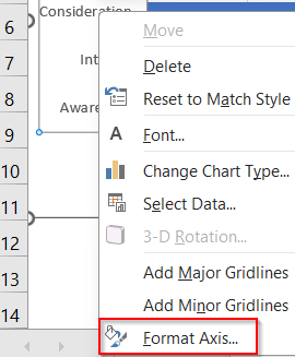
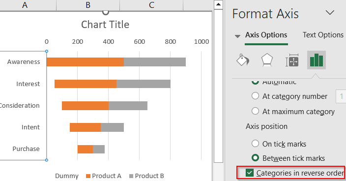
➤ Click the Vertical Axis (Stage names), right-click and choose Format Axis and check the box “Categories in reverse order” to flip the funnel direction from top to bottom.
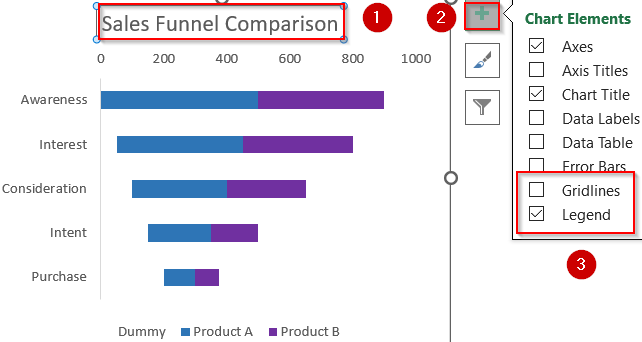
➤ Format the colors of Product A and Product B to differentiate them clearly and remove gridlines and adjust the title/legend for clarity using the Chart Elements (+) icon.
Create a Horizontal Stacked Funnel Chart in Excel
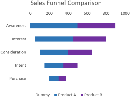
This method uses a 2-D stacked bar chart, combined with a dummy column to create the funnel effect. It’s ideal when you want to compare subcategories (like Product A vs Product B) across funnel stages, gradually narrowing the chart from top to bottom
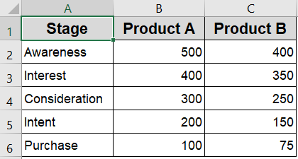
We’ll use a sample dataset that represents five funnel stages from Awareness to Purchase for Product A and Product B. Each stage shows how many users or leads remain at that point which allows comparison of conversion drop-offs between the two product lines.
Steps:
➤ To give the bars a funnel-like appearance, insert a “Dummy” column with increasing values from top to bottom in column B.
➤ Select your full dataset including headers.
➤ Go to the Insert tab >> Click Insert Column or Bar Chart >> Select 2-D Stacked Bar.
➤ Right-click and format the Dummy series with No Fill so it becomes invisible and offsets the bars.

➤ Click the Vertical Axis (Stage names), right-click and choose Format Axis.
➤ Check the box “Categories in reverse order” to flip the funnel direction from top to bottom.
➤ Format the colors of Product A and Product B to differentiate them clearly.
➤ Remove gridlines and adjust the title/legend for clarity using the Chart Elements (+) icon.
Now you have your fully customized stacked funnel chart ready in Excel.
Create a 3D Pyramid-Style Stacked Funnel Chart Visually
This method uses a 3-D stacked column chart with pyramid shapes to create a funnel-like visual. It works well for presentations and storytelling but is less precise and takes more space than the horizontal stacked bar method.
Steps:
➤ Select the entire dataset.
➤ Go to the Insert tab >> Choose Insert Column or Bar Chart >> Select 3-D Stacked Column.
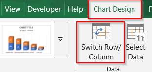
➤ Then select the chart and go to the Chart Design tab >> Switch Row/column.
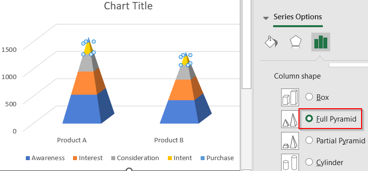
➤ Click any of the bars, then right-click >> Choose Format Data Series.
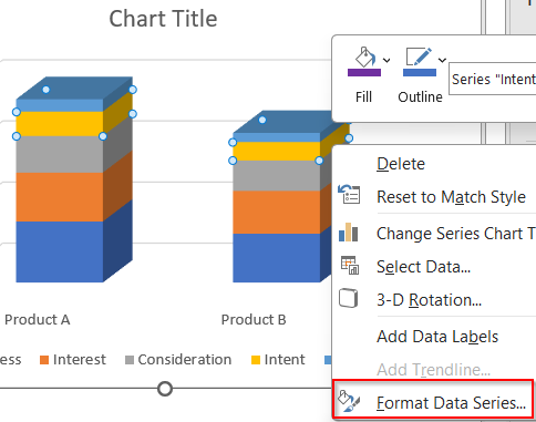
➤ Under the Column shape options, select Full Pyramid.
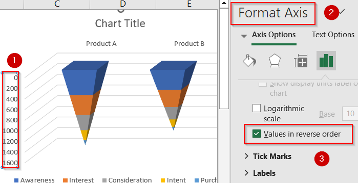
➤ Select the Vertical Axis and right-click to open the Format Axis pane.
➤ Check the box “Values in reverse order” to flip the funnel direction from top to bottom.
➤ Format the chart colors, title, and labels as needed.
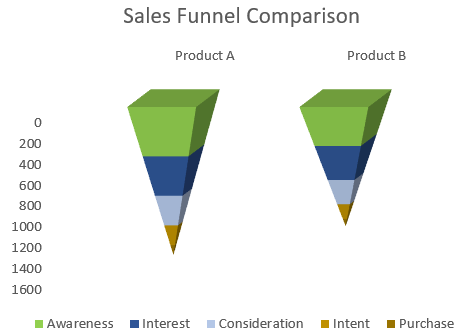
This produces a vertical, cone-shaped chart that gives a funnel-like visual. However, the layout isn’t as precise or space-efficient as the horizontal stacked bar method.
Frequently Asked Questions
Can I create a stacked funnel chart in Excel directly?
Excel doesn’t have a built-in stacked funnel chart type. However, you can easily simulate one using a stacked bar chart with dummy spacing or a 3D cone chart, depending on your visual needs.
What’s the difference between stacked funnel and default funnel chart?
A default funnel chart in Excel is limited to one data series and shows simple drop-off across stages. A stacked funnel chart lets you compare multiple categories at each stage for richer insights.
Do I need a dummy column for all funnel charts?
No, dummy columns are only necessary when using stacked bar charts to visually simulate a funnel shape. They aren’t required in 3D cone charts or basic stacked charts that don’t need shaping.
Can I use percentages instead of raw numbers in the funnel?
Yes, you can build your chart using percentages rather than raw values. This is especially helpful when visualizing conversion rates, retention, or drop-off percentages across different funnel stages.
Which method is best for presentations or dashboards?
If visual impact matters most, the 3D cone chart works well in presentations. But if you need clean comparisons, accurate labels, and flexibility, the horizontal stacked bar chart is more reliable.
Wrapping Up
In this tutorial, we learned how to create a stacked funnel chart in Excel using two practical methods using a horizontal stacked bar chart and 3D pyramid columns. While Excel doesn’t offer a native stacked funnel option, combining series data with visual formatting gives you a clear and personalized chart. Feel free to download the practice file and share your feedback.

