Histogram charts in Excel offer a great way to visualize how data is distributed across defined ranges or “Bins”. But sometimes, your bin range might not work as expected. Excel could ignore your bins, use wrong intervals, or show one large bar instead of many. Whether you’re using the built-in histogram chart or the Data Analysis Toolpak, issues with bin ranges are common and often confusing.
In this article, we’ll walk through the exact reasons why the Excel histogram bin range is not working, and show you clear, step-by-step solutions to fix it without needing any guesswork. Let’s get started.
Steps to make histogram bin range work properly in Excel:
➤ Go to the column containing your bin values and check for any text, labels (like “Bins”), or blank cells.
➤ Delete anything that’s not a number including merged cells, hidden characters, or headers copied from the web.
➤ Use a completely separate column to store just the bin limits (e.g., 49, 59, 69…), with no other values.
➤ Re-run your histogram or formula after confirming the bin range is clean and properly sorted.
Common Issues Behind Bin Range Not Working in Excel
Before jumping into fixes, it’s helpful to understand what might be going wrong. Here are the most common causes:
➤ You’re using non-numeric bin values or mismatched data types.
➤ Your bin range is not selected correctly in the histogram dialog.
➤ You’re using blank cells or text values inside the bin range or input range.
➤ You’re using the Histogram Chart (2016+) and expecting it to behave like the Data Analysis Toolpak feature.
➤ Excel is auto-binning and ignoring your manual bin definitions.
Use Correct Bin Range Format for Data Analysis Toolpak
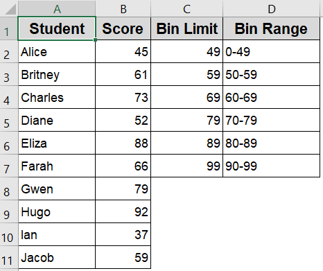
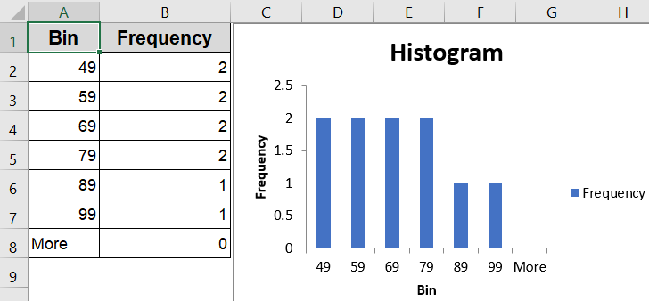
If you want Excel to generate a histogram with precise intervals like 0–49, 50–59, and so on, the Data Analysis Toolpak is a solid choice. This method helps create a frequency distribution and chart based on your manually defined bin range. The output includes both a table and a histogram chart, provided your bin formatting is correct.
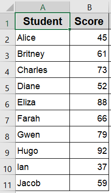
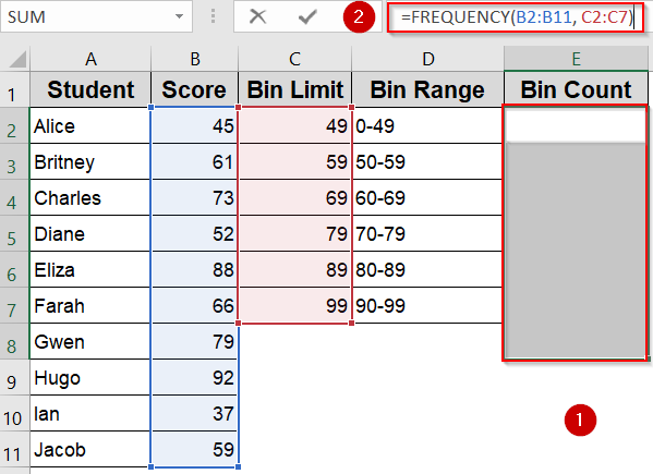
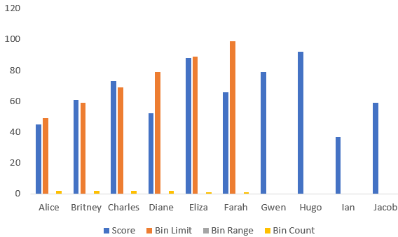
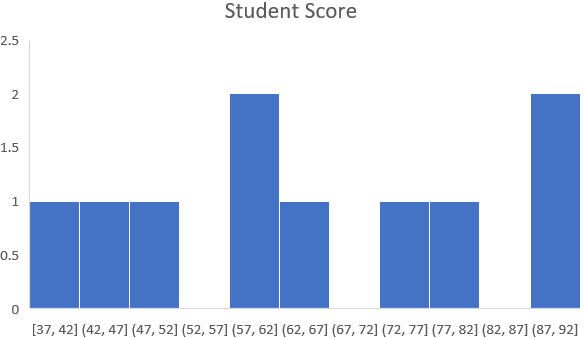
Our sample dataset displays the test scores of ten students in column A with numeric scores between 0 and 99 in column B. We’ll use this score data to demonstrate various methods for creating histogram bins, applying frequency formulas, and grouping values in Excel.
Steps:
➤ Type your bin upper limits in column C. Ensure your bin values are sorted in ascending order and contain only numbers, no blanks or text allowed.
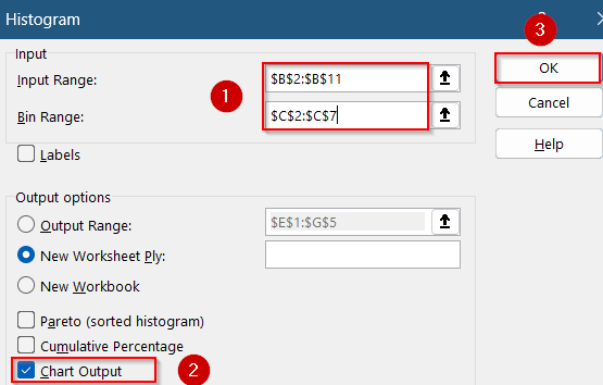
➤ Go to the Data tab >> Click Data Analysis >> Choose Histogram.
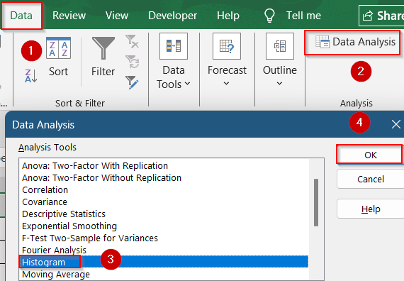
➤ In the dialog box, select the Input Range (your raw scores) and the Bin Range (your bin upper limits).
➤ Check the box labeled Chart Output to automatically create a histogram.
➤ Click OK to view the frequency table and chart.
If your chart looks off (e.g., only one bin appears), the most common causes are text or blank values in the bin column, bin values not sorted from lowest to highest and not enough bin limits to cover your data range. Fixing them will solve your issue.
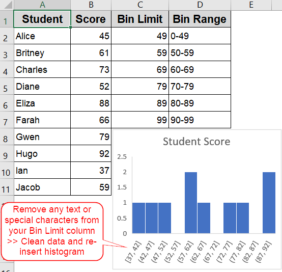
Clear All Non-Numeric or Empty Bin Cells
Even one mislabeled or blank bin can break the histogram process in Excel. Before running your histogram (whether using the Toolpak or FREQUENCY), it’s essential to verify the integrity of your bin range. This method focuses on cleaning up your bin data to ensure accurate histogram output.
Steps:
➤ Go to the column containing your bin values and check for any text, labels (like “Bins”), or blank cells.
➤ Delete anything that’s not a number including merged cells, hidden characters, or headers copied from the web.
➤ Use a completely separate column to store just the bin limits (e.g., 49, 59, 69…), with no other values.
➤ Re-run your histogram or formula after confirming the bin range is clean and properly sorted.

Clean numeric bin values are the foundation of accurate histogram creation. A tidy bin column prevents errors and ensures your output looks exactly as expected.
Apply Manual Binning with FREQUENCY Function Instead
When Excel’s histogram charting doesn’t behave as expected or you want total control using the FREQUENCY formula is a reliable alternative. This method allows you to manually define bins and generate counts per bin using a formula. It’s perfect for custom grouping and works across all Excel versions.
Steps:
➤ List your bin upper limits in a separate column C (e.g., 49, 59, 69, 79, 89, 99).

➤ In an adjacent column E, select a range of 6 cells (for 6 bins), including one extra to catch values over 99.
➤ Enter the formula in the Formula Bar:
=FREQUENCY(B2:B11, C2:C7)
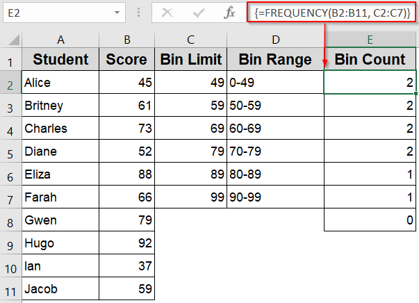
➤ Press Ctrl + Shift + Enter to confirm as an array formula (just Enter in Excel 365).
➤ Excel will return the count of values that fall within each bin.
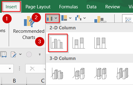
➤ Use this output to create a standard Column Chart manually via the Insert tab.
This approach gives you full control over bin grouping and works even when Excel’s built-in histograms fail to deliver.
Adjust Format Axis Settings to Control Bins for Built-in Histogram Chart
If you insert a histogram directly via the Insert tab, Excel auto-generates bins based on your data spread. However, you can customize these bins using the Format Axis pane. This method is useful when you prefer visual output quickly and still want control over bin settings.
Steps:
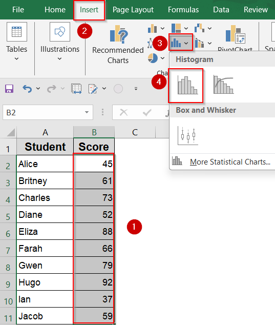
➤ Select your Score column >> Go to the Insert tab >> Click Insert Statistic Chart >> Choose Histogram.
➤ Click the horizontal axis on the chart >> Right-click and choose Format Axis.
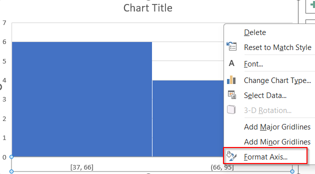
➤ Under Axis Options, set Bin Width to set the size of each group, or use Number of Bins to define how many groups you want.
➤ Use Overflow Bin and Underflow Bin to specify the max value to group above or specify the min value to group below your limits.
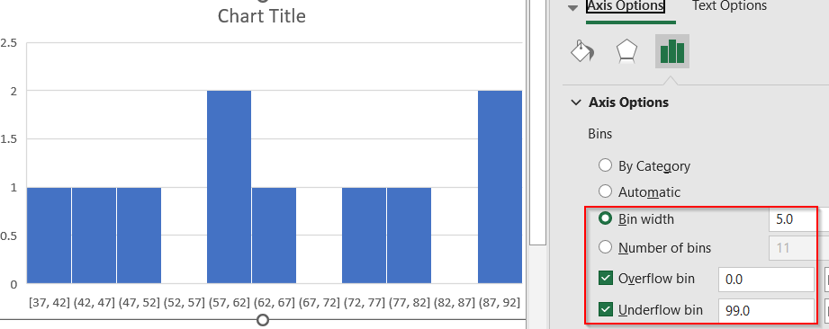
This method is best for quick data exploration and lets you visually adjust how Excel groups the scores into bins.
Frequently Asked Questions
Why is Excel ignoring my bin range in the histogram?
If you’re using the Insert tab’s built-in histogram chart, Excel won’t accept a custom bin range. To use your own intervals, you must apply the Data Analysis ToolPak histogram option instead.
Why is my histogram only showing one bar?
A single-bar histogram often indicates issues with the bin range such as overly large intervals, unsorted or mismatched values, or even text entries. Ensure your bins are numeric, sorted, and suitable for your data range.
Can I use category labels in my bin range?
No, Excel histogram bins must contain numeric values. If you want descriptive labels like “20–29,” you’ll need to add them separately, either with helper columns or by customizing axis labels manually in the chart.
Does sorting the bin range matter?
Yes, it does. If your bin values aren’t sorted in ascending order, Excel won’t classify data correctly. This can cause missing or misaligned bars in your histogram, especially when using the ToolPak method.
Wrapping Up
In this tutorial, we showed how to fix the common issue of histogram bin ranges not working in Excel. Whether you’re using the Data Analysis Toolpak, the built-in chart, or the FREQUENCY function, the key is using clean, sorted, numeric bin values. Avoid text or blanks, choose the right method for your Excel version, and double-check your settings. With these quick fixes, your histogram should display correctly every time. Feel free to download the practice file and share your feedback.
![[Fixed] Histogram Bin Range Not Working in Excel](https://excelinsider.com/wp-content/uploads/thumbs_dir/featured-image-how-to-create-a-bin-range-in-excel-raizeqmtr9bd5w85v1he5a50w0a5fq58sb2ita0w1o.webp)
![[Fixed] Histogram Bin Range Not Working in Excel](https://excelinsider.com/wp-content/uploads/thumbs_dir/featured-image-how-to-make-pareto-chart-in-excel-raizpv22mojijs2iwukgnh3dy5giisawbczd95j6f0.webp)