Mapping data in Excel lets you turn raw geographic information into excellent visuals that are easy to interpret. Whether you’re tracking regional sales, population by state, or user distribution across countries, mapping adds clarity and impact to your data. Excel makes this process simple with built-in map charts and basic manual tools without requiring any advanced skills.
In this article, you’ll learn multiple effective ways to map data in Excel using the built-in Filled Map chart feature and manual techniques for smaller or custom datasets. Let’s get started.
Steps to map data in Excel:
➤ Make sure your data includes recognizable geographic names (e.g., country, state, city).
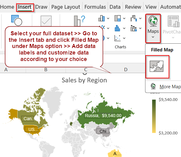
➤ Select your entire dataset including headers.
➤ Go to the Insert tab >> Click Maps >> Choose Filled Map.
➤ A geographic chart will appear on your worksheet.
➤ Double-click on Chart Title to change it and add Data Labels from Chart Elements (+) icon.
➤ Then click on More Data Label Options.
➤ Check the boxes for Value and Category Name if you want to display them on your map.
➤ Go to the Chart Design tab and select a preset color or chart style from Change Colors or Quick Styles.
➤ Format your data as you like from the Format Data Series pane.
Use Excel’s Built-in Map Chart Feature
If you’re working with regional data like sales per state or population by country, Excel’s Filled Map chart can instantly turn it into a visual map. This method is ideal for quickly spotting geographical trends, comparing regions, or enhancing reports with easy-to-read visuals. You simply provide recognizable location names and corresponding values, and Excel does the rest.
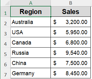
In this example, we’re using sales figures from different states. This small, location-based dataset is perfect for creating a geographic map to show which regions perform better in terms of sales.
Steps:
➤ Make sure your data includes recognizable geographic names (e.g., country, state, city).
➤ Select your entire dataset including headers.
➤ Go to the Insert tab >> Click Maps >> Choose Filled Map.
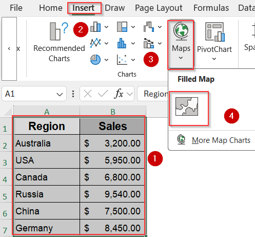
➤ A geographic chart will appear on your worksheet.
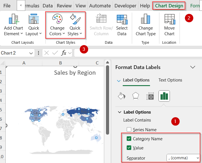
➤ Double-click on Chart Title to change it and add Data Labels from Chart Elements (+) icon.
➤ Then click on More Data Label Options.

➤ Check the boxes for Value and Category Name if you want to display them on your map.
➤ Go to the Chart Design tab and select a preset color or chart style from Change Colors or Quick Styles.
➤ Click on the colored maps to open the Format Data Series pane and adjust Map projection, Map area and Map labels according to your choice.
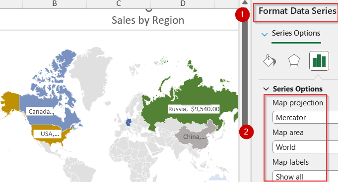
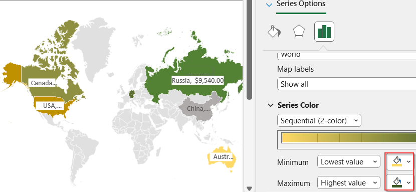
➤ Scroll down to Series Color and set a color for Minimum and Maximum value.
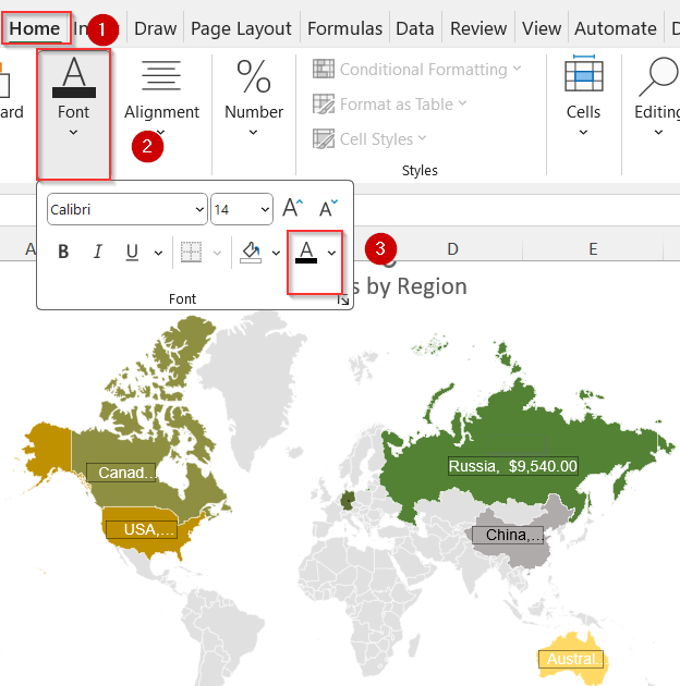
➤ Select your data labels and go to the Home tab >> Adjust font color, styles and fill options for under the Font group as you like.
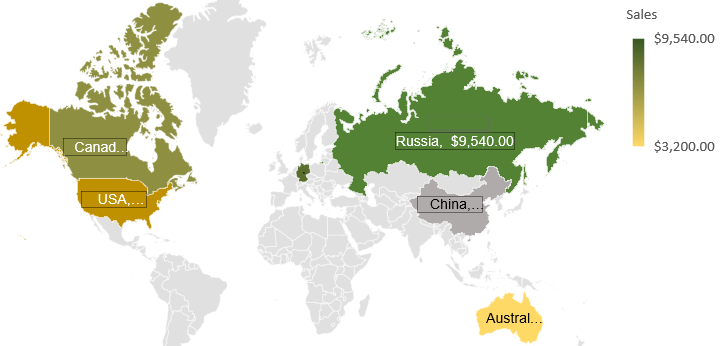
Now you have your fully customized mapped data in Excel.
Note:
This feature is available only in Excel 2019, Excel 2021, and Microsoft Office 365.
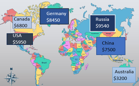
Create a Custom Visual Map Manually in Excel
If you’re using an older version of Excel or want full creative control, manual mapping is a great alternative. This method helps you build a stylized, presentation-friendly visual using shapes, text, and color. The end result isn’t geographically accurate but can effectively display regional comparisons, especially in smaller datasets.
Steps:
➤ Insert your location-based data into a basic Excel sheet.
➤ Go to Insert tab >> Click Illustrations >> Choose Shapes.
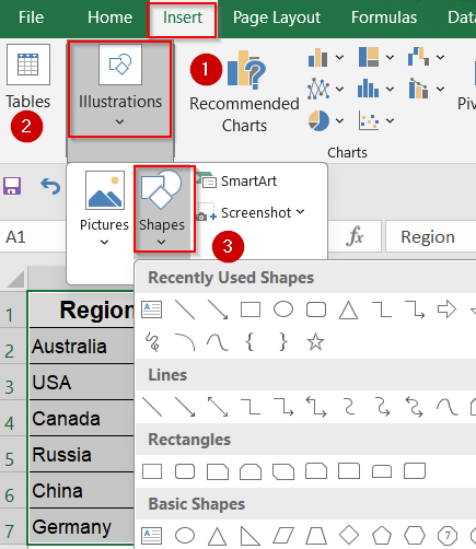
➤ Use rectangles, circles, or arrows to visually represent your data on the sheet.
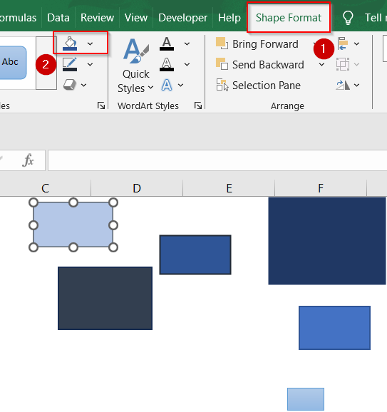
➤ Color the shapes differently to reflect data magnitude (e.g., darker shades for higher numbers) using the Fill color option from the Shape Format tab.
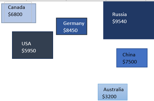
➤ Use Text Boxes to add location names and numeric values beside each shape. Format font and fill color according to your liking.
➤ Adjust layout manually to resemble a geographic layout (if needed).
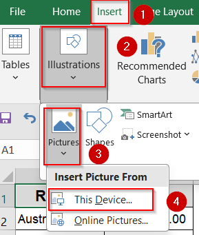
➤ You can also insert a static image of a map and layer your shapes/texts over it for more realism using Insert tab >> Pictures under Illustrations group >> This Device/Online Pictures.
Now we have our manually created mapped data in Excel.
Frequently Asked Questions
What versions of Excel support the built-in map chart?
The Filled Map chart feature is available only in Excel 2019, Excel 2021, and Microsoft Office 365. If you’re using an older version, the Maps option won’t appear under the Insert tab.
Why doesn’t my map chart show anything?
If your map isn’t displaying correctly, double-check for spelling errors in your location names. Excel also performs better when the app language is set to English or another officially supported language region.
Can I use city or postal code data in map charts?
Yes, Excel supports mapping cities, states, countries, and even postal codes. However, postal codes may require additional context like a country or state to ensure correct placement on the map.
Can I use conditional formatting on maps?
You can’t apply conditional formatting directly to the map chart. However, you can highlight cells in your data table using conditional formatting to add visual cues that complement your geographic chart.
Wrapping Up
In this tutorial, we learned how to map data in Excel to visualize geographic trends and make your data easier to understand. From built-in map charts to manual drawing techniques, Excel provides flexible tools to represent regions and values clearly. Feel free to download the practice file and share your feedback.

