Pie charts are designed to show how parts of a dataset contribute to the whole. But sometimes, the default positioning of slices might make it hard to emphasize the most important category. By rotating your pie chart, you can reposition any slice by placing it at the top or center of focus, so your key data points stand out more clearly.
In this article, you’ll learn how to rotate a pie chart in Excel step by step. We’ll guide you through selecting the chart, accessing the correct formatting pane, and using the Angle of First Slice setting to control the rotation. With just a few adjustments, you’ll be able to enhance the readability and impact of your pie chart.
Steps to rotate a pie chart in Excel:
➤ Highlight your data and insert a 2-D Pie chart from the Insert tab.
➤ Right-click the pie chart and choose Format Data Series to open the pane.
➤ Adjust the Angle of First Slice to rotate the pie as needed.
➤ Use the slider to preview and position key slices for better visibility.
Steps to Rotate a Pie Chart in Excel
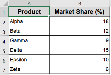
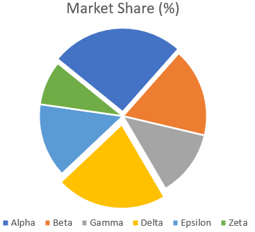
You can rotate a pie chart in Excel by changing the angle of the first slice. This feature helps you highlight specific categories by repositioning their location within the chart. We’ll use the following simple dataset to demonstrate how to rotate a pie chart. It contains 6 products and their corresponding market share percentages.
Step 1: Select and Insert a Pie Chart
Before rotating a pie chart, you first need to create one using the data available in your worksheet. Excel makes it very simple to build a pie chart from a range of values that represent parts of a whole such as market share figures by product, expenses by category, or survey responses. This chart type helps visualize proportions, and once it’s inserted, you can fully customize its look and feel.
Steps:
➤ Highlight the range A1:B7 that includes your categories and values.
➤ Go to the Insert tab from the Ribbon.
➤ Click the Pie Chart icon under the Charts group.
➤ Choose 2-D Pie from the drop-down options.
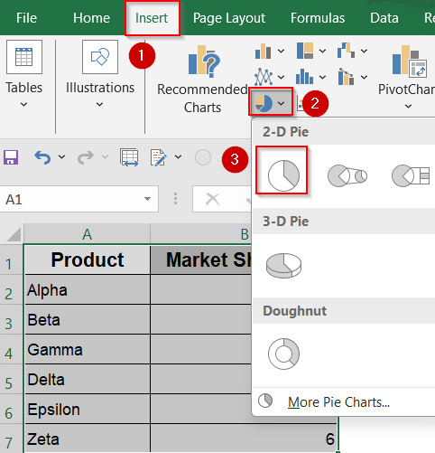
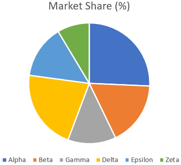
Excel will now insert a pie chart based on your selected data.
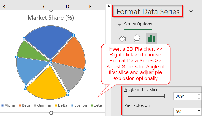
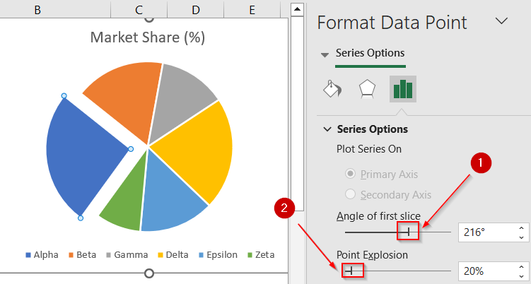
Step 2: Open the Format Data Series Pane
With your pie chart now visible, the next step is accessing the formatting tools that allow you to rotate the chart. Excel’s formatting options are packed into the “Format Data Series” pane, which lets you fine-tune slice positions, angles, and more. This pane is where you’ll find the setting to adjust the pie chart’s starting angle, a key part of rotating the chart.
Steps:
➤ Click once on any slice of the pie to select the entire chart.
➤ Right-click on the selected chart >> Choose Format Data Series.
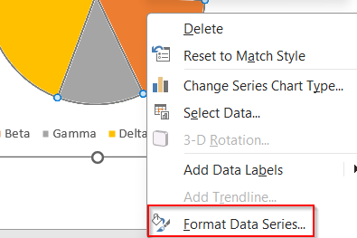
➤ The Format Data Series pane will open on the right side of your screen.
If the pane doesn’t appear, make sure you’ve selected the chart and try again.
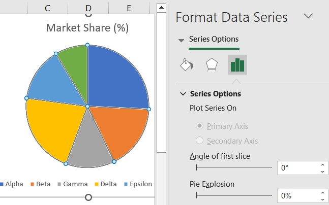
Step 3: Adjust the Angle of First Slice
Now comes the core part where we rotate the pie chart. Instead of dragging slices manually, Excel provides a precise control labeled “Angle of First Slice” that lets you define where the first data slice should begin. This tool is especially useful if you want certain categories like the largest or most important one to appear at the top or center of the pie chart.
Steps:
➤ In the Format Data Series pane, look for the Angle of First Slice setting.
➤ Increase or decrease the angle using the input box or arrow controls.
➤ For example, setting it to 90° rotates the first slice to start at the top.
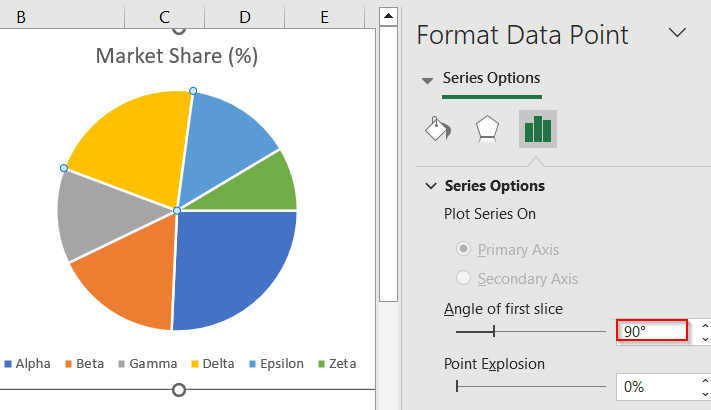
➤ Observe how each increment shifts the chart clockwise, changing slice positions.
This feature helps you bring important data slices to more visible areas like the top or center.
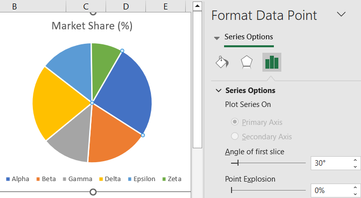
Step 4: Preview and Fine-Tune the Rotation
After setting an initial angle, it’s a good idea to preview how your pie chart looks with different starting positions. Sometimes a small adjustment can dramatically improve the visual impact of your chart. Excel lets you test these changes in real time, so you can stop adjusting as soon as the layout looks perfect for your needs.
Steps:
➤ Drag the Angle of First Slice slider slowly and watch the pie update live.
➤ Stop when the category you want to emphasize appears in your preferred location.
➤ You can continue formatting with additional customizations like slice color or explosion.
Rotating the chart this way doesn’t alter your data but enhances the visual flow.
Frequently Asked Questions
What does "Angle of First Slice" mean in Excel pie charts?
The “Angle of First Slice” setting controls where the first slice begins on the chart. Adjusting it rotates the pie clockwise, helping you visually re-prioritize which data categories appear more prominently.
Will rotating the pie chart change my data?
No, rotating a pie chart only changes the visual arrangement of the slices on the chart. Your actual data remains completely unchanged, and all values and percentages will continue to accurately represent your original dataset without any modification.
Why should I rotate a pie chart in Excel?
Rotating a pie chart helps bring key data categories into focus, especially when presenting to an audience. For example, you might want the largest category to start at the top or align with a label.
Can I rotate individual slices within the pie?
Excel doesn’t allow rotating individual slices independently. Instead, you can rotate the entire chart by adjusting the Angle of First Slice. To emphasize specific slices, you can use the “Explode” feature, which pulls slices out from the pie for focus.
How do I reset the pie chart to its original rotation?
If you want to undo any rotation changes, open the Format Data Series pane and set the Angle of First Slice back to 0°. This resets the chart to Excel’s default orientation when it was first created.
Wrapping Up
In this tutorial, we walked through how to rotate a pie chart in Excel using the Angle of First Slice setting. With just a few clicks, you can reposition key slices to improve emphasis and visual balance. Whether you’re presenting sales figures, survey results, or budget breakdowns, rotating your chart helps direct your audience’s attention where it matters most. Feel free to download the practice file and share your feedback.