Sparklines are tiny, cell-sized charts that give you a quick visual representation of data trends right inside a single cell. Whether you’re tracking monthly sales, temperature changes, or stock prices, sparklines make it easy to spot patterns without cluttering your worksheet with full-sized charts.
In this article, we’ll learn step-by-step how to create three types of sparklines in Excel which are Line, Column, and Win/Loss. Each method includes sample data and visual cues to help you follow along easily. Let’s get started.
Steps to create sparklines in excel:
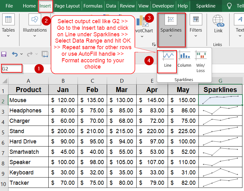
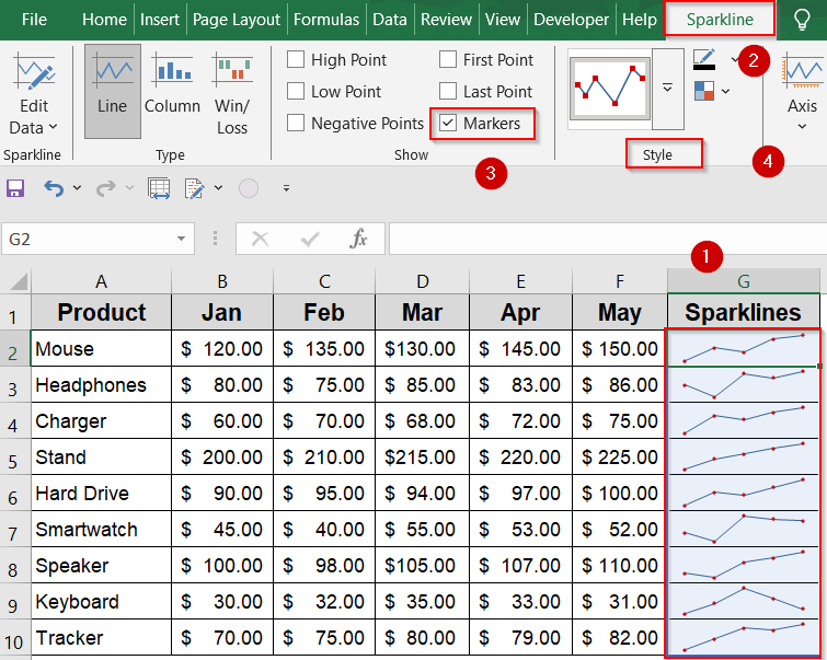
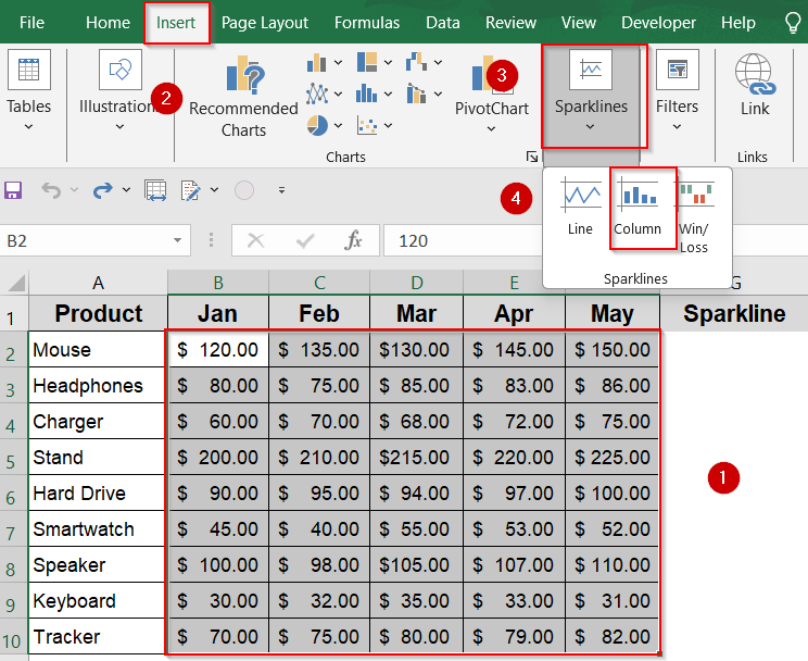
➤ Select the cell beside your data row where you want the sparkline (e.g., G2).
➤ Go to the Insert tab on the Ribbon.
➤ Click Line in the Sparklines group.
➤ Set the Data Range to the row’s data (e.g., B2:F2).
➤ Confirm the Location Range is the selected cell (e.g., G2).
➤ Click OK to insert the sparkline.
➤ Repeat for other rows (e.g., H3 with B3:G3, H4 with B4:G4 and so on) to visualize multiple trends side by side or drag down using the AutoFill handle.
➤ Use the Sparkline tab to add Markers or customize colors as you wish.
Create Line Sparklines to Visualize Data Trends
Line sparklines are compact, in-cell charts that show trends and patterns over a series of data points, making it easy to spot rises, falls, and fluctuations at a glance. They turn raw numbers into visual insights without taking up extra space on your worksheet.
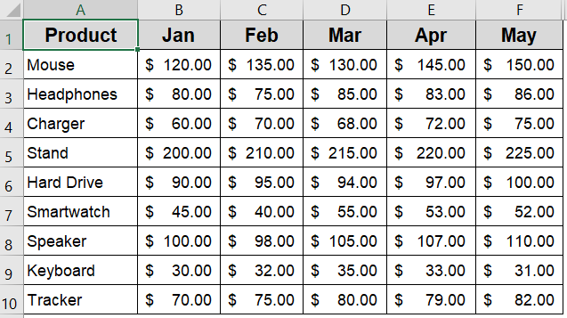
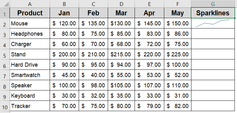
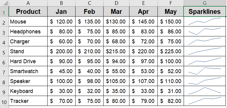
We’ll use a sample dataset showing monthly sales (Jan to May) for different products. Each row represents one product, and sparklines will be inserted beside each row to visualize its sales trend over time. This horizontal layout is ideal for creating clear, row-based sparklines.
Steps:
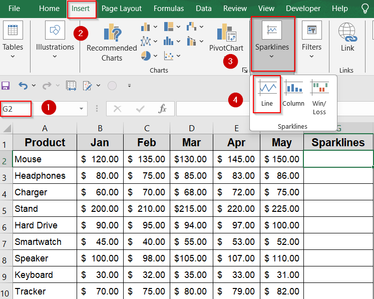
➤ Select the cell beside your data row where you want the sparkline (e.g., G2).
➤ Go to the Insert tab on the Ribbon.
➤ Click Line in the Sparklines group.
➤ Set the Data Range to the row’s data (e.g., B2:F2).
➤ Confirm the Location Range is the selected cell (e.g., G2).
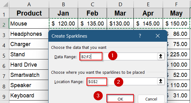
➤ Click OK to insert the sparklines.
➤ Repeat for other rows (e.g., H3 with B3:G3, H4 with B4:G4, etc) to visualize multiple trends side by side. Or, drag down using the AutoFill handle.
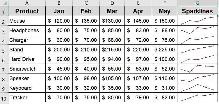
➤ Use the Sparkline tab to add Markers or customize colors as you wish.
Now each selected cell contains a mini line chart that updates dynamically, helping you quickly compare trends across your dataset without cluttering the sheet.
Insert Column Sparklines to Highlight Highs and Lows
Column sparklines use vertical bars within a cell to visually represent data values. They’re perfect for quickly identifying highs, lows, and variations in your data, giving you a clear picture of how values compare across a sequence. Unlike line sparklines, which emphasize trends, column sparklines focus on the magnitude of each data point, making it easy to spot peaks and dips at a glance.
Steps:
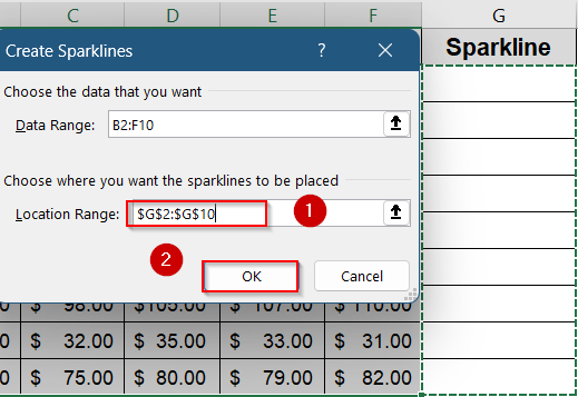
➤ Select your data range B2:F10 on which your sparklines will be based on.
➤ Go to the Insert tab on the Ribbon, then click Column in the Sparklines group.
➤ In the dialog box, set the Location Range to the selected cells (e.g., G2:G10).
➤ Click OK to insert the column sparklines.
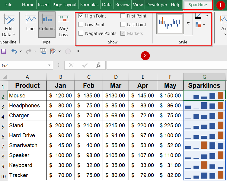
➤ Each cell in column G will then display a mini column chart corresponding to its row’s data. Use the Sparkline tab to customize colors, mark high/low/negative points or pick default styles.
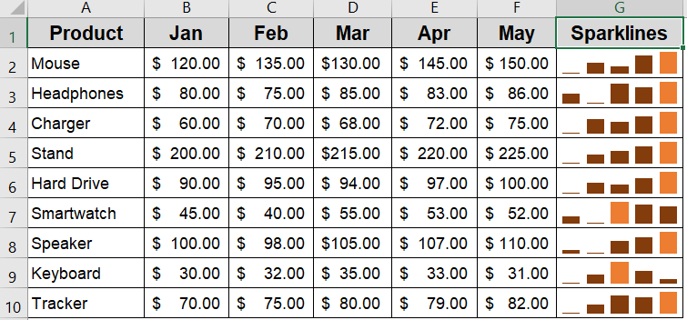
Now your column sparklines are customized according to your choice.
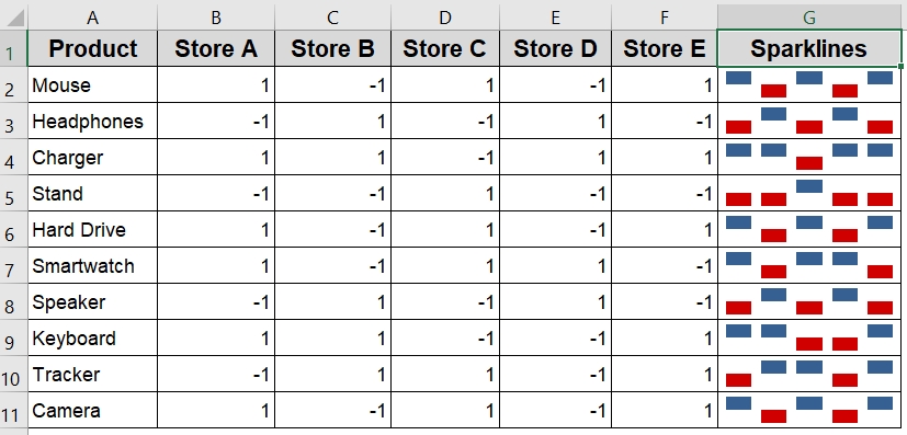
Use Win/Loss Sparklines to Highlight Positive and Negative Values
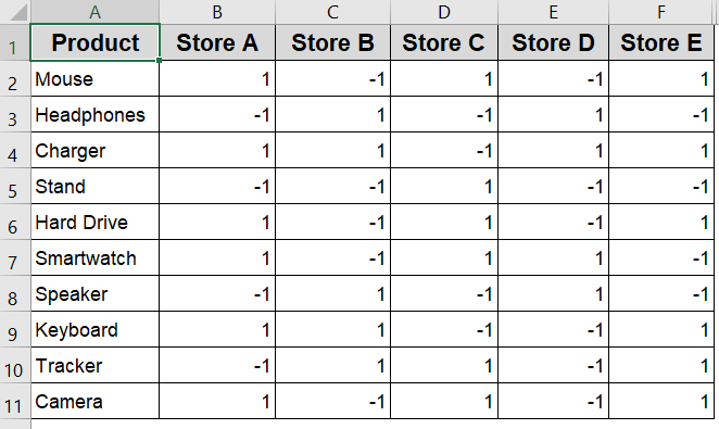
Win/Loss sparklines are perfect for visualizing binary data, such as profit/loss, success/failure, or positive/negative changes. They display upward bars for positive values and downward bars for negative values, making it easy to quickly spot gains and losses in your data. This method works best when your dataset contains a mix of positive and negative numbers.
We’ll use a sample dataset that shows the sales performance of various tech products across five retail stores, where a value of 1 indicates the product met its sales target (Win) in that store, and –1 means it missed the target (Loss).
Steps:
➤ Select your data range B2:F10 containing both positive and negative values.
➤ Go to the Insert tab on the Ribbon and click Win/Loss in the Sparklines group.
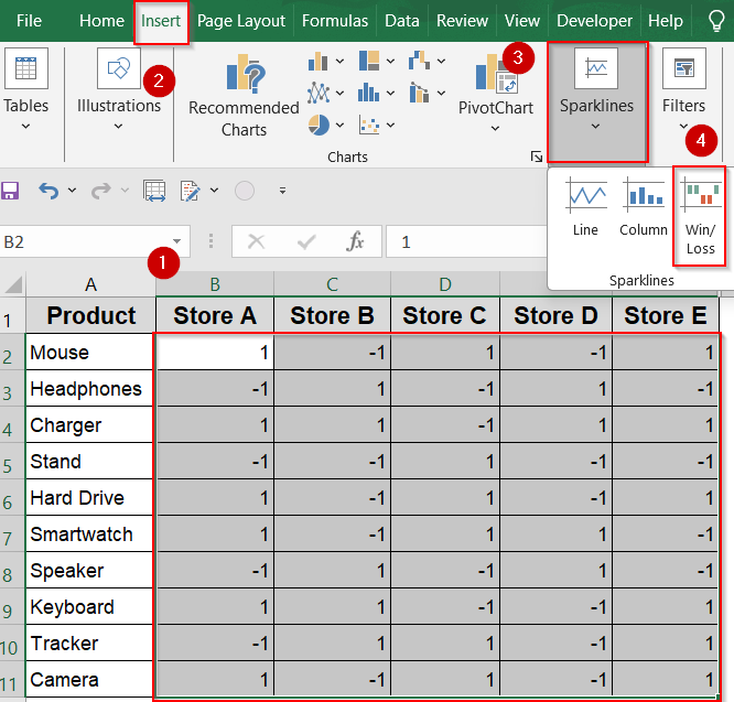
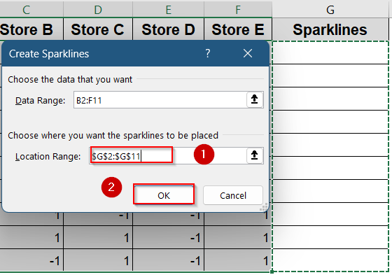
➤ In the dialog box, set the Location Range to where you want the sparklines such as G2:G10.
➤ Click OK to insert the Win/Loss sparklines.
Now you can customize it according to your preference.
Frequently Asked Questions
Can I create sparklines for vertical data instead of horizontal rows?
Yes, you can create sparklines for vertical data, but you’ll need to adjust the layout manually. Excel is optimized for row-based sparklines, so it’s easier to transpose vertical data into rows for cleaner results.
What should I do if my dataset includes blank cells or error values?
Blank or error-filled cells can disrupt the appearance of sparklines by causing breaks or incorrect shapes. To avoid this, clean your data beforehand or use formulas like IFERROR or IF to substitute meaningful values.
Is there a way to copy sparklines across multiple rows efficiently?
Yes. After inserting a sparkline in one row, you can drag the fill handle down or use Format Painter to apply the same formatting and sparkline type to other rows. Excel will auto-adjust the data range.
Are sparklines supported in all versions of Excel?
Sparklines are supported in Excel 2010 and newer (Windows), Excel 2011 and newer (Mac), and Excel for Microsoft Office 365. They also work in Excel Online, though customization options may be slightly limited there.
How can I remove or update a sparkline once it’s created?
To remove a sparkline, select the cell, go to the Sparkline tab, and click Clear. To update its range or type, use the options in the same tab to modify data, format, or style as needed.
Wrapping Up
In this tutorial, we learned how to create sparklines in Excel and explored the three available types which are Line, Column, and Win/Loss. These miniature charts allow you to display trends, shifts, and patterns within a single cell, making your data easier to interpret at a glance. Whether you’re tracking performance metrics, monthly progress, or any sequential data, sparklines offer a clean, compact solution for visual analysis. Feel free to download the practice file and share your feedback.

