An equation in an Excel graph provides information about the scattered data in the graph. To show the equation in an Excel graph, you need a suitable chart for a trendline and enable the option to display it on the chart.
This equation represents the mathematical equation of the trendline. The trendline is the general direction of the data with the plotted variables. As the equation provides the relationship between variables, they are helpful for trend analysis, predicting future data, and understanding the relationship.
To show the equation of a trendline in an Excel graph,
➤ Plot a chart that supports a trendline.
➤ Add a trendline from Chart Elements >> Trendline.
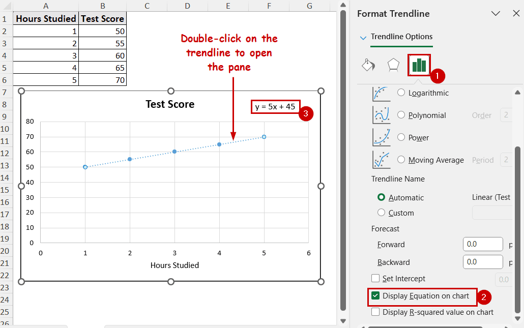
➤ Double-click on the trendline to open the Format Trendline pane.
➤ Select Display Equation on chart.
In Excel, the equation that is displayed on the chart is the trendline’s equation. There is an option available directly for such customization in the Format Trendline pane.
In this tutorial, we’re going to share how to show the equation in an Excel graph in a detailed step-by-step process.
Download Practice WorkbookThe option to show the equation on a chart is available in the Format Trendline pane. However, you need a trendline available on the chart to access the pane.
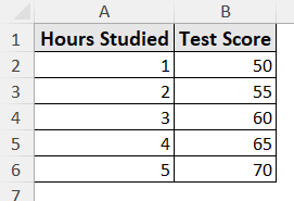
We are using the following dataset for the demonstration. It contains a sample correlation between hours studied and test scores for a sample.
Here is a detailed, step-by-step process on how to display the equation on an Excel graph:
Step 1: Insert a Scatter Chart
Trendlines are the most effective in scatter plots. So, we are plotting a scatter plot for this demonstration.
To insert a scatter chart, select the data and go to Insert >> Charts (group) >> Insert Scatter.
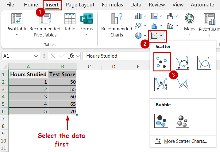
The scatter chart will appear on the sheet.

Step 2: Add a Trendline
You can avoid this step if you create a scatter plot with lines. If you don’t have a trendline showing, select the chart and Chart Elements >> Trendline.
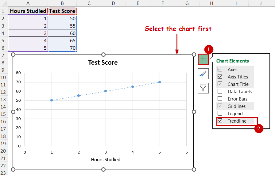
The trendline will appear on the scattered points.
You can also click on the right arrow beside the Trendline option in Chart Elements and access different types of trendlines, such as polynomial, exponential, etc. For the sake of simplicity in the demonstration, we have kept it linear.
Step 3: Display the Equation on Chart
➤ Now double-click on the trendline to open the Format Trendline pane.
➤ Under the Trendline Options, select the Display Equation on chart.
Note: The equation displayed here can change depending on the type of trendline you selected.
Optional: You can select the R-squared value option under it to show goodness of fit in the chart.
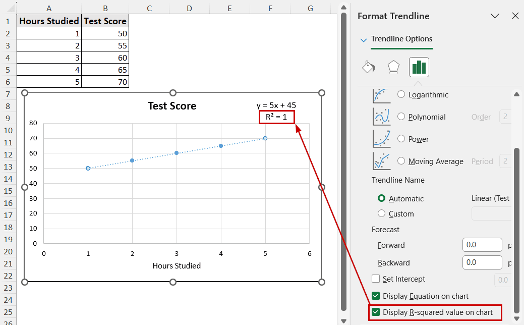
The value 1 indicates the trendline equation is a perfect fit for the data. The closer to a 1 this is, the closer the fit.
Step 4: Customize the Equation
In most cases, the equation may appear in an undesirable space on the chart. You can select the equation by clicking on it. After the selection, click on the edge of the selection and move it around to place the equation in the desired place.
You can also format the text after selecting it and using the same options to format text in a cell.
How to Interpret the Equation
The equation we got from the demonstration is y=5x+45. The slope of the value is 5, and the intercept is 45.
In a hypothetical case, the person would get 5 times the hour spent as a result of this special case. And, it will stack on top of 45.
Even without studying (x=0), the person would get 45.
Let’s say the person decided to study 10 hours for this special case. The output would then be 5X10+45=95 test score.
Things to Keep in Mind
➤ Always select the correct data for the trendline.
➤ Select the proper chart type. Some charts, like pie, don’t support trendlines.
➤ There are different trendline types. Not all type fits all the data. Select the proper fit to find the optimum value for predicting.
FAQs
Can I show equations on bar or pie charts?
No, the equation is supported on XY Scatter, Line, and similar charts. The chart either has to contain a line or be able to plot a trendline from the data. Only then can you show equations on these charts in Excel.
Why doesn’t the equation displayed on my chart match my data points exactly?
The equation in an Excel graph represents the graph’s trendline. The trendline represents the best fit for your data. It doesn’t always go through all the data points, especially if there’s a variability in the data.
How do I update the equation if my data changes in Excel?
The equation inserted in this method should update automatically if the source data changes. In case if it doesn’t update, refresh the sheet from the Data tab. If that doesn’t work either, remove the equation by pressing Delete on your keyboard after selecting it, and then add it again.
Concluding Words
The equation helps to identify the relations between data points for forecasts and trend analysis. You can find the option to display the equation in an Excel graph from the Format Trendline pane. Simply checking the options will show the equation on the chart. Just make sure that your chart has a line or supports a trendline to show the equation. Experiment with different trendline types and equations to find the best fit for a forecast.
Feel free to download the practice workbook and give us your feedback.