A correlation graph, also known as a scatter plot, is a great way to visualize the relationship between two variables. A correlation graph can be made quickly with Excel’s charting feature, and this article will discuss in detail how to make a correlation graph in Excel. Whether you’re comparing screen time to productivity, revenue to advertising spend, or study hours to test scores, you can easily observe the direction and strength of relationships by making a correlation graph.
➤ A correlation graph helps visualize the relationship between two variables. This article explores what is a correlation graph and how to make a correlation graph in Excel. In addition, it also discusses the coefficient of determination (R2) and plotting a regression line.
➤ Correlation graph: Select data >> Insert >> Scatter or Bubble Chart >> Scatter.
➤ Coefficient of determination shows how well data points fit the regression line.
➤ Coefficient of determination: =RSQ(known_ys,known_xs)
➤ Regression line: Select chart >> Chart Elements >> Trendline.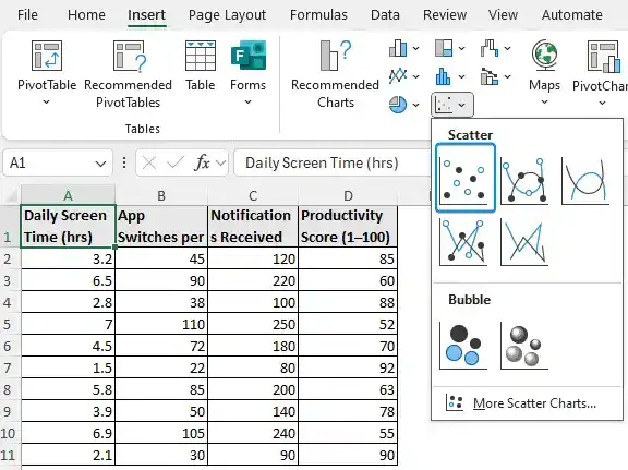
What is a Correlation Graph?
A correlation graph is a visual representation of the relationships between two variables. In the graph, each point refers to a data pair and the pattern or trend of the points indicates whether the variables are positively, negatively, or not at all correlated.
Making a Correlation Graph in Excel
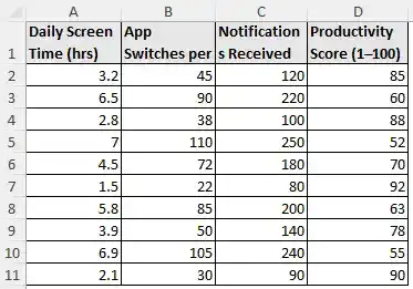
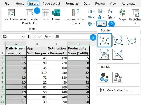
The mobile usage and productivity dataset contains daily screen time in hours, app switches per day, notifications received, and productivity score (1-100) from columns A through D.
To understand the impact of mobile usage on productivity, let’s examine the daily screen time vs. productivity score variables in a correlation graph and plot a regression line. Afterwards, let’s use the notifications received vs. productivity score to calculate the coefficient of determination.
Comparisons like these help us understand whether using the phone more often leads to less productivity. Are productivity and the ability to focus impacted by frequent notifications? Analyzing these variable pairs provides insights into how mobile usage affects productivity.
We’ll use the Excel charts in the Insert tab to create a correlation graph. The scatter plot can be found in the Insert Scatter or Bubble Chart group. This approach works best with numerical data like mobile usage and productivity, and helps spot trends.
Steps:
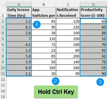
➤ To plot the correlation graph of daily screen time vs. productivity score, highlight the data from the two non-contiguous/non-adjacent cell ranges.
➤ Select the first cell range (A2:A11), hold down the Ctrl key and choose second range (D2:D11).
➤ Go to the Insert tab >> Scatter or Bubble Chart >> Scatter.
➤ Click Chart Elements (plus icon) >> Check Axis Titles >> Uncheck Gridlines.
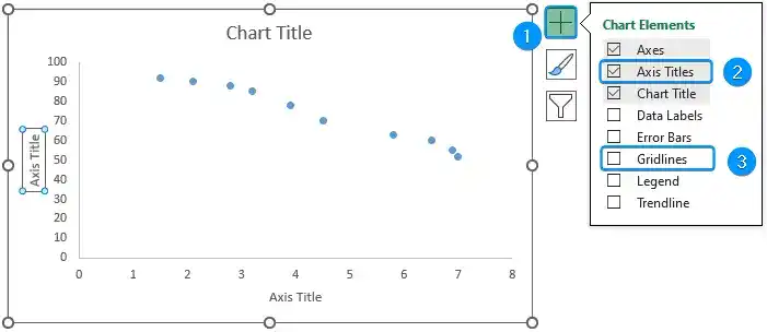
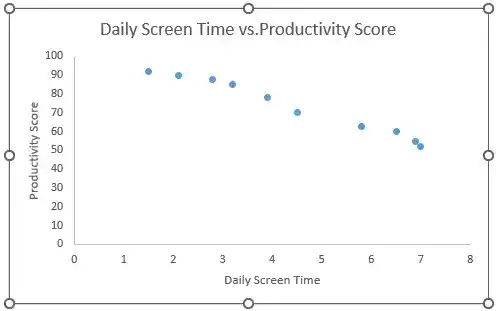
➤ Select the Chart >> Click on the Axis Title text >> set daily screen time as the horizontal axis title >> Enter productivity score for the vertical axis title >> Rename the chart title to daily screen time vs. productivity score.
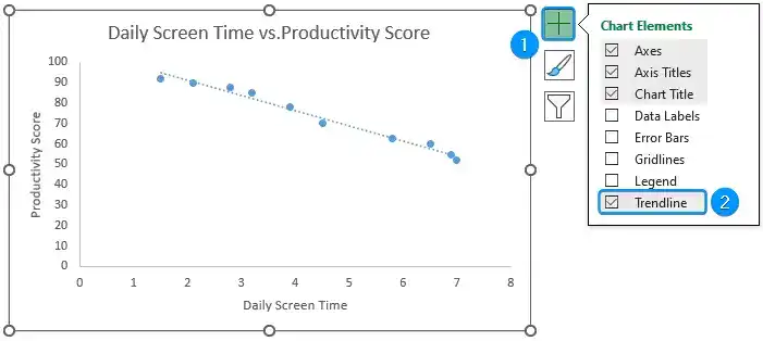
Adding a Regression Line to Correlation Graph in Excel
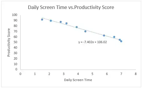
The addition of a regression line, also known as a trendline, to the correlation graph helps visualize the strength and direction of the relationship. The regression equation and R-squared value can also be shown on the chart.
Steps:
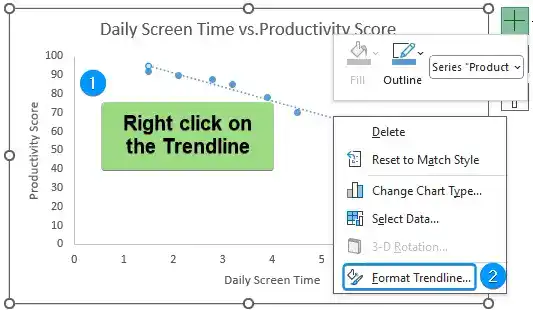
➤ Select the chart >> Click on Chart Elements (plus icon) >> Enable Trendline.
➤ Right-click on the Trendline >> Format Trendline.
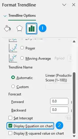
➤ In the Format Trendline window, Trendline Options >> Enable Display Equation on Chart.
➤ The final result is shown in the image below.
Calculating Coefficient of Determination (R2)
The coefficient of determination (R2) shows how well the data points fit the regression line. The value of R2 ranges from 0 to 1. An R2 of 0 indicates the regression line does not explain the variation in the dependent variable. Meanwhile, an R2 of 1 means that the regression line explains all the variations in the dependent variable. Previously, we’ve shown how to display the R2 value in the correlation graph. But Excel has a built in function to calculate the R2 value. The RSQ function in Excel returns the R2 value.
Steps:
➤ Considering notifications received as the independent variable and productivity score as the dependent variable. Select the output cell C13 and enter the formula.
=RSQ(D2:D11,C2:C11)

FAQ
Can you make a correlation table in Excel?
Use Data Analysis ToolPak add-in: Data tab >> Data Analysis >> Correlation >> Input range >> Grouped by columns >> Labels in first row >> Output range >> OK.
How to plot correlation in Excel?
Plot correlation graph: Select data >> Insert >> Scatter or Bubble Chart >> Scatter.
How to get a regression line in Excel?
Add a regression line: Select chart >> Chart Elements >> Trendline >> More Options >> Display equation on chart.
How to get the R square value in an Excel graph?
Calculate R square value: Double-click on the Trendline >> Format Trendline >> Display R square on chart.
Correlation vs Regression
➤ Correlation measures the strength and direction of relationship between two variables.
➤ Regression establishes a relationship between a dependent and one or more independent variables to make predictions.
Wrapping Up
In this tutorial, we’ve learned about correlation graphs and how to make a correlation graph in Excel with scatter plots. In addition, we learned to add a regression line to the correlation graph and calculate the coefficient of determination. Feel free to download the practice file and share your thoughts and suggestions.