
A correlation matrix is the ideal tool for examining data containing multiple variables and determining their relationships. This tutorial explores how to make correlation matrix in Excel with built in tools and functions. Whether you’re conducting research, performing business analytics, or working with weather dataset, this blog will help you see trends in your data and illustrate the relationships between variables.
➤ A correlation matrix displays the correlation coefficients between multiple variables. In this article, we’ll learn about correlation matrix and how to make correlation matrix in Excel using the Data Analysis ToolPak and combining functions. In addition, we’ll interpret and understand the significance of the values in the correlation matrix.
➤ These coefficients signify the strength and direction of the relationship between multiple variables.
➤ Enable Data Analysis: File >> Options >> Excel Add-ins >> Data Analysis.
➤ Get correlation matrix: Data tab >> Data Analysis >> Correlation >> Input range >> Grouped by columns >> Labels in first row >> Output range.
➤ Functions: =CORREL(OFFSET(first_variable_cell_reference,0,ROWS($1:1)-1),OFFSET(first_variable_cell_reference,0,COLUMNS($A:A)-1))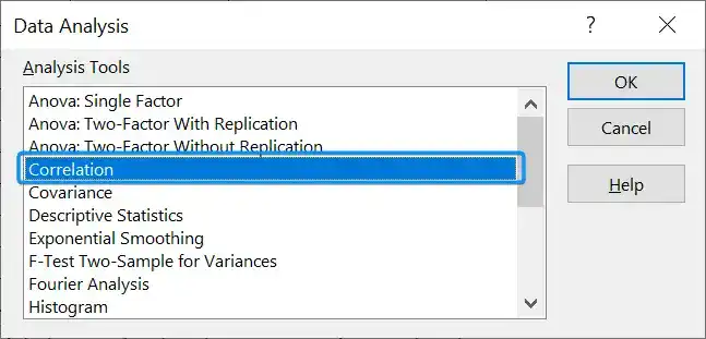
What Is Correlation Matrix in Statistics?
A correlation matrix displays the correlation coefficients between multiple variables. The diagonal elements are always 1 since they represent the correlation of each variable with itself. The off diagonal elements represent the correlation between different variable pairs.
The coefficients range from -1 to +1, and 0 indicates no correlation.
➤ 0.90 to 1.00 (−0.90 to −1.00): Very strong positive (negative) correlation
➤ 0.70 to 0.90 (−0.70 to −0.90): Strong positive (negative) correlation
➤ 0.50 to 0.70 (−0.50 to −0.70): Moderate positive (negative) correlation
➤ 0.30 to 0.50 (−0.30 to −0.50): Weak positive (negative) correlation
➤ 0.00 to 0.30 (0.00 to −0.30): Negligible correlation
Making Correlation Matrix with Data Analysis ToolPak
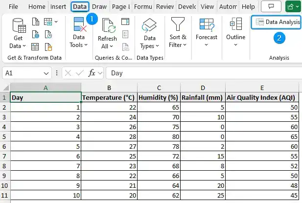
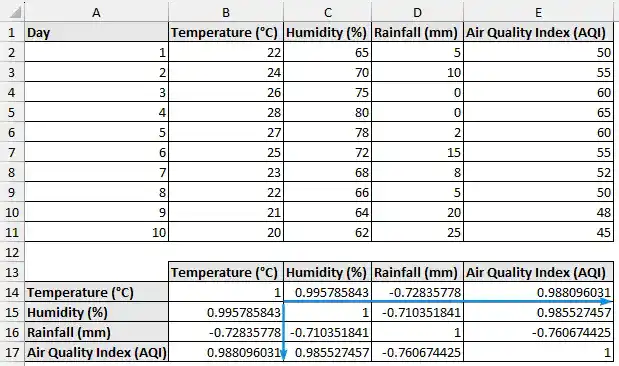
The weather dataset contains the temperature, humidity, rainfall, and air quality index. from columns A through E.
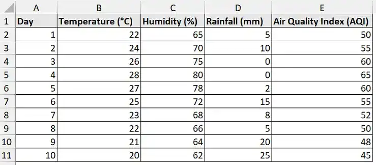
We want to understand the degree to which rainfall, humidity, temperature, and AQI are correlated. The rainfall, humidity, and temperature are the independent variables, while AQI is the dependent variable. This helps us understand which factors lead to good and poor air quality.
The correlation matrix can be made with Excel’s built in Data Analysis Toolpak. This approach works best when examining continuous numerical data, such as weather data. It is ideal for beginners because it’s fast, intuitive, and free of complex formulas. The Data Analysis Toolpak is located at the top right corner of the Data tab. If you don’t see the option, then follow these steps to enable the Data Analysis add-in.
Steps:
➤ Click on the File tab at the top left corner of the Home tab.
➤ Select Options. You can also use the shortcut Alt+F+T to open Excel Options.

➤ Select Add-ins >> Choose Excel Add-ins from the dropdown >> Go.
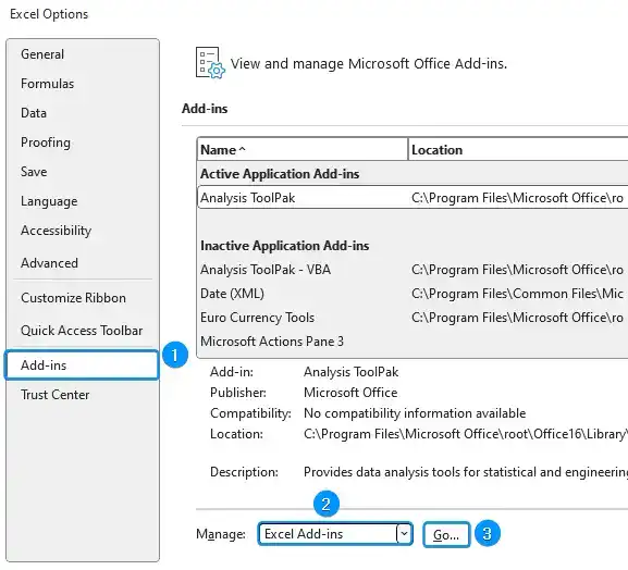
➤ Check the Analysis ToolPak option >> OK.
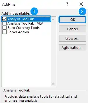
The Data Analysis option will be available in the Data tab whenever you open a new workbook.
➤ Go to the Data tab >> Click Data Analysis.
➤ Select Correlation >> OK.
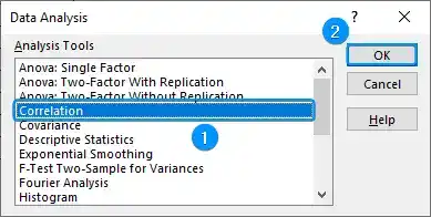
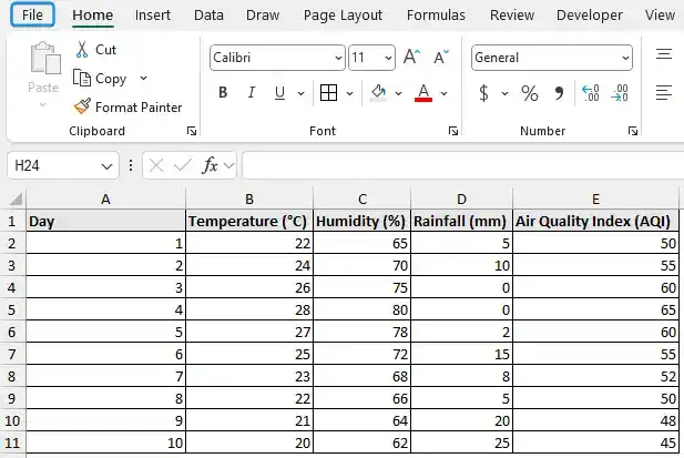
➤ Select the input range (B1:E11) >> Enable grouped by columns >> Tick the option Labels in first row.
➤ Choose the output cell (A13) >> OK.

➤ Excel generates a correlation matrix with the sample data.
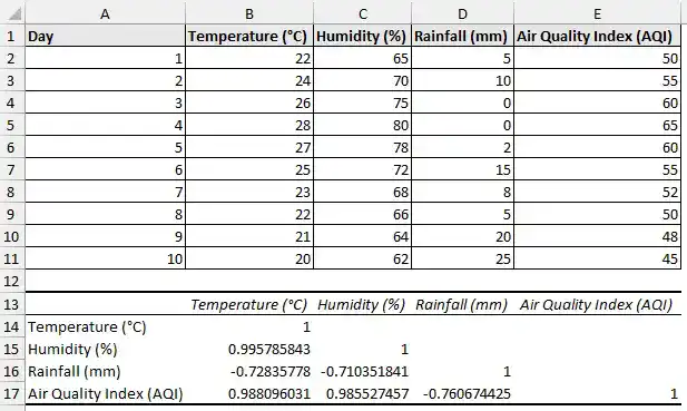
➤ AQI and humidity (0.986) have a very strong positive correlation, indicating that higher humidity leads to poor AQI.
➤ AQI and rainfall have a strong negative correlation (-0.761). Rainfall enhances the quality of the air.
➤ The relationship between temperature and humidity (0.996) is almost perfect, indicating that hotter days have higher humidity.
➤ Temperature and rainfall have a strong negative correlation of -0.728, which suggests that rainfall tends to decrease with an increase in temperature.
➤ Humidity and rainfall also have a strong negative correlation of -0.710, rainfall decreases as humidity increases.
➤ The correlation matrix reveals a strong relationship between temperature, humidity, and rainfall. This indicates that the variables do not act on their own, rather they influence each other greatly.
Using Excel Functions to Make Correlation Matrix
If you prefer formulas over the Data Analysis Toolpak, Excel provides a versatile method for creating a correlation matrix by combining the CORREL and OFFSET functions. This approach is perfect when you want a formula based dynamic matrix that changes automatically based on your data or when add ins are unavailable. You can calculate the pairwise correlations across multiple variables using CORREL and OFFSET functions, without manually entering each pair.
Steps:
➤ Select the output cell (B14) and enter the formula.
=CORREL(OFFSET($B$2:$B$11,0,ROWS($1:1)-1),OFFSET($B$2:$B$11,0,COLUMNS($A:A)-1))
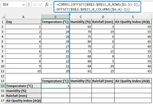
➤ Drag the Fill Handle tool along the rows and across the columns to autofill the formula.
➤ You’ll get the same correlation matrix as before. The key findings have been discussed previously.
FAQ
How to find the correlation coefficient between two variables in Excel?
=CORREL(array1, array2)
How to do multiple correlation analysis?
=CORREL(OFFSET(first_variable_cell_reference,0,ROWS($1:1)-1),OFFSET(first_variable_cell_reference,0,COLUMNS($A:A)-1))
How do I interpret the value of the correlation coefficient?
➤ 0.90 to 1.00 (−0.90 to −1.00): Very strong positive (negative) correlation
➤ 0.70 to 0.90 (−0.70 to −0.90): Strong positive (negative) correlation
➤ 0.50 to 0.70 (−0.50 to −0.70): Moderate positive (negative) correlation
➤ 0.30 to 0.50 (−0.30 to −0.50): Weak positive (negative) correlation
➤ 0.00 to 0.30 (0.00 to −0.30): Negligible correlation
How to create a correlation matrix in Excel?
Use Data Analysis ToolPak add-in: Data tab >> Data Analysis >> Correlation >> Input range >> Grouped by columns >> Labels in first row >> Output range >> OK.
How to calculate the correlation coefficient for non-numeric data?
Excel’s CORREL and PEARSON functions work with numeric data only. You need to convert non-numeric data like text, categorical values, etc. into numerical form.
Does correlation imply causation?
No. Correlation only indicates the strength and direction of the relationships, not cause and effect. Establishing causality requires additional analysis.
Wrapping Up
In this tutorial, we’ve learned about the correlation matrix and how to make a correlation matrix in Excel using Data Analysis ToolPak and by combining functions. Feel free to download the practice file and share your thoughts and suggestions.