Gantt charts are essential tools for visualizing timelines, tracking project progress, and managing tasks over time. While Google Sheets doesn’t have a dedicated Gantt chart feature, you can still create one using a few smart workarounds.
In this article, we’ll walk through multiple ways to build a Gantt chart in Google Sheets from simple formatting tricks to more dynamic, data-driven charts using formulas and built-in tools.
Steps to create a Gantt chart in Google Sheets using conditional formatting:
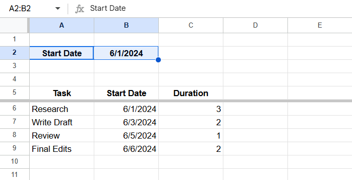
➤ Set up your table with Task, Start Date, and Duration columns (e.g., A6:C9)
➤ In a row above your table (e.g., row 3), link the first timeline cell (D3) to the global Start Date (e.g., =B2), and extend with =D3+1 for daily increments
➤ Select the range where the Gantt chart should appear (e.g., D6:J9)
➤ Go to Format >> Conditional formatting
➤ Choose “Custom formula is” and enter: =AND(D$3 >= $B6, D$3 < $B6 + $C6)
➤ Pick a fill color and click Done. Your timeline will now highlight active task durations automatically

Create a Gantt Chart Using Conditional Formatting
This is the simplest way to build a Gantt-style chart directly in Google Sheets without needing any chart tools or scripts. The idea is to create a timeline using dates as column headers, and use conditional formatting to highlight the cells that represent each task’s active duration. It’s ideal for quick project visuals where you want to map tasks against dates and visually track when each task begins and ends.
We’ll use a sample dataset with task names, start dates, and end dates to illustrate the process. Here’s the structure of the dataset:

In the next steps, we’ll show you how to lay out the timeline, apply formatting rules, and create a clean Gantt-style view.
Steps:
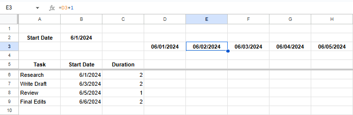
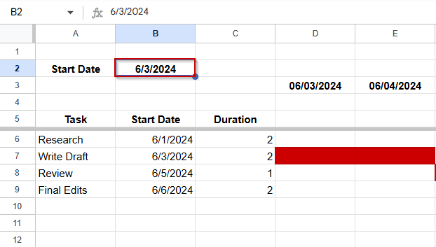
➤ Add a few rows above your table and write the Start Date of your tasks in one of the rows (e.g, B2), like this:
➤ Click on D3, write the formula: =B2.
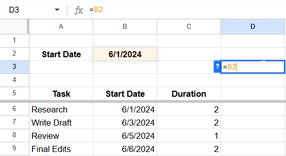
D3 should be linked to cell B2 now.
➤ Click on E3 and write =D3+1, then drag it through the sheet until you get your desired end date.
➤ Select the cells from where you want the Gantt Chart to appear. In this case, we will be selecting cells D6:J9.
➤ Go to Format >> Conditional formatting.
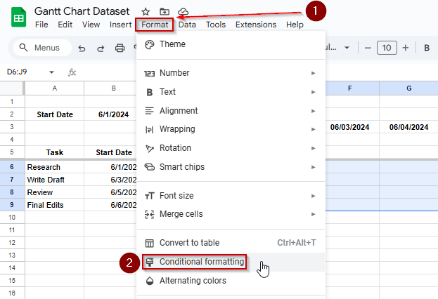
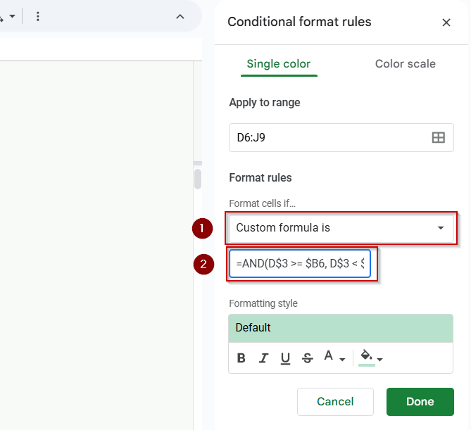
➤ Under “Format rules,” select Custom formula is.
➤ Enter this formula:
=AND(D$3 >= $B6, D$3 < $B6 + $C6)
You will also see the Gantt chart becoming visible on the sheet.
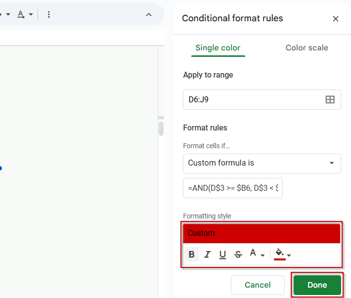
➤ Choose a fill color to represent the task bar.
➤ Click Done.
➤ Adjust column width and freeze columns A–C if needed.
This visually highlights tasks across the calendar based on their start date and duration.
The Gantt chart is dynamic and will update accordingly when you change the start date in B2.
Build a Gantt Chart with a Stacked Bar Chart in Google Sheets
To enhance your Gantt chart in Google Sheets, use a stacked bar chart. This method separates each task’s offset and duration into two stacked series. By hiding the offset and coloring only the duration, you create a horizontal timeline that illustrates each task’s schedule. This approach offers greater control over the chart’s visual appearance compared to the conditional formatting method.

In this method, we’ll use a new dataset that includes project tasks with start dates and durations, and calculate their offset from the project’s earliest start date to build the stacked chart.
Steps:
➤ Create a new table next to your existing one with three columns: Task, Offset, and Duration. This new table will be used to build the stacked bar chart.
➤ In the Offset column, enter this formula in the first row and drag it down:
=B2 – MIN($B$2:$B$7)
➤ In the Duration column, just copy the values from your original Duration column.
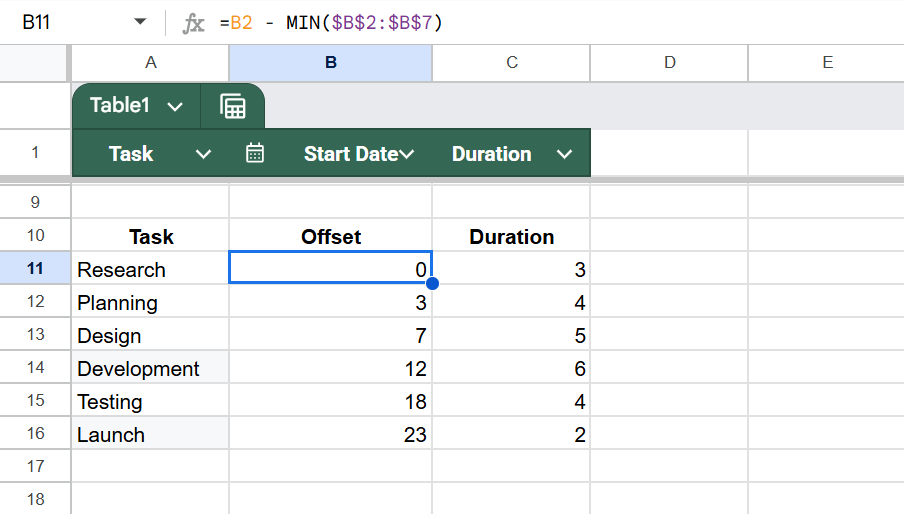
This calculates how many days each task starts after the earliest task in your list. The “Offset” controls how far from the left (start of the timeline) each task bar begins in the chart.
When you use both these values in a stacked bar chart, the offset becomes an invisible spacer, and the duration becomes the visible Gantt bar.
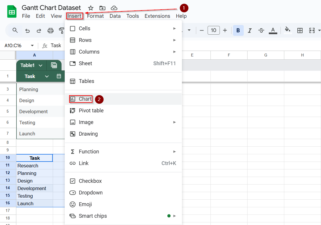
➤ Select this table
➤ Go to Insert >> Chart
➤ In the Chart Editor, set the chart type to Stacked Bar Chart
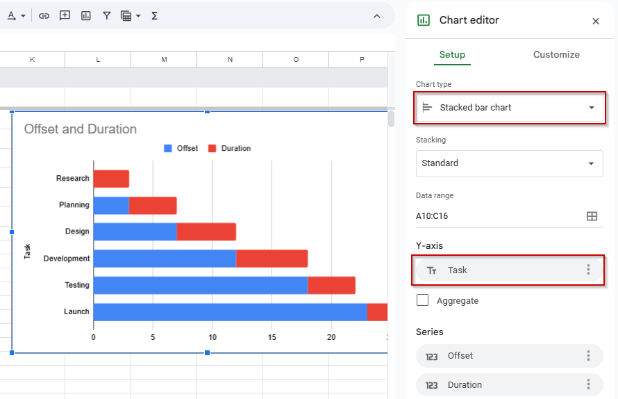
➤ Go to the Customize tab
➤ In the Series section, set the Offset bar color to “None” or transparent
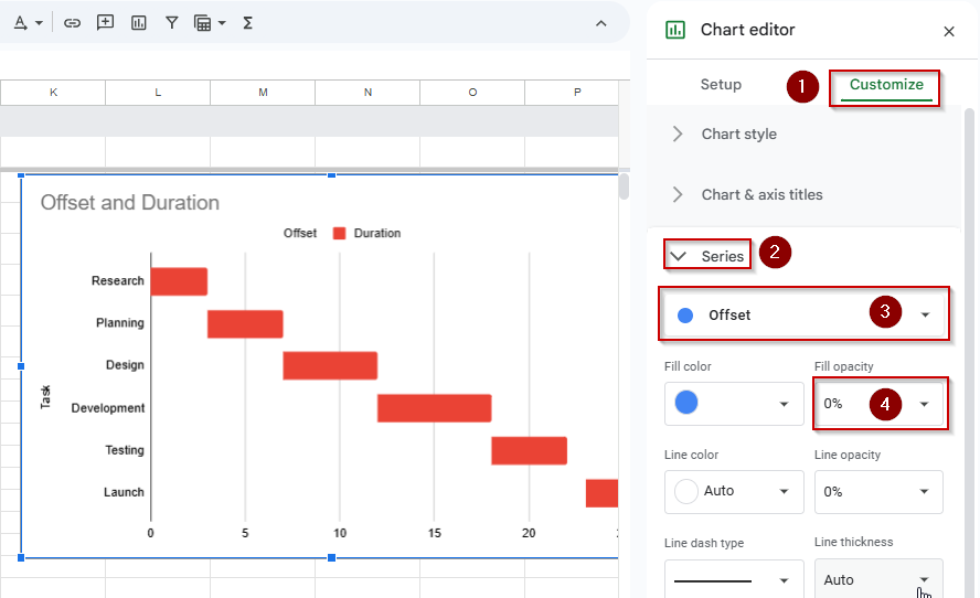
➤ Customize axis labels and task bar colors if needed
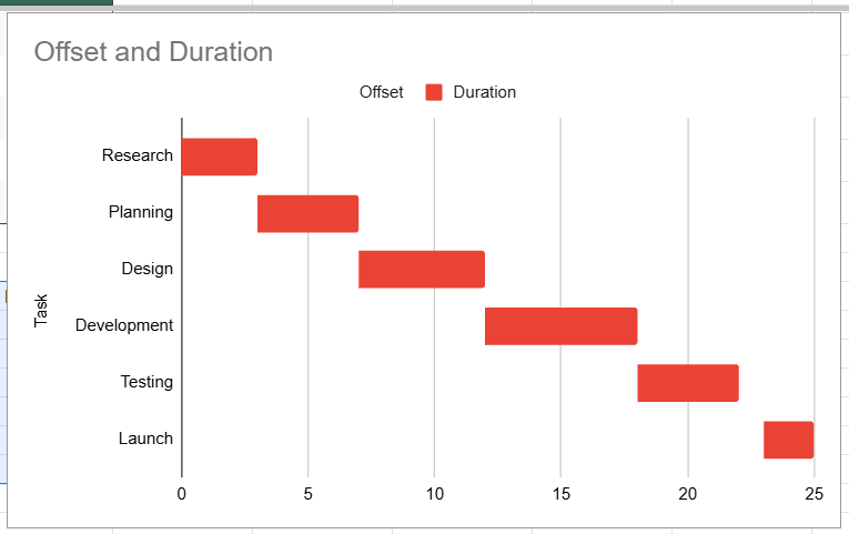
You now have a basic Gantt chart with horizontal bars representing each task duration.
Generate a Gantt Chart Using Google Charts (Apps Script)
This method uses Google Apps Script along with Google’s Gantt Chart library to create a dynamic, interactive Gantt chart inside your spreadsheet. Unlike the previous methods that rely on visual tricks or built-in chart types, this one gives you full control over task dependencies, start/end dates, durations, and progress tracking.
We’ll use the following dataset, which includes all the necessary project details such as start dates, end dates, durations, completion percentages, and dependencies:

Steps:
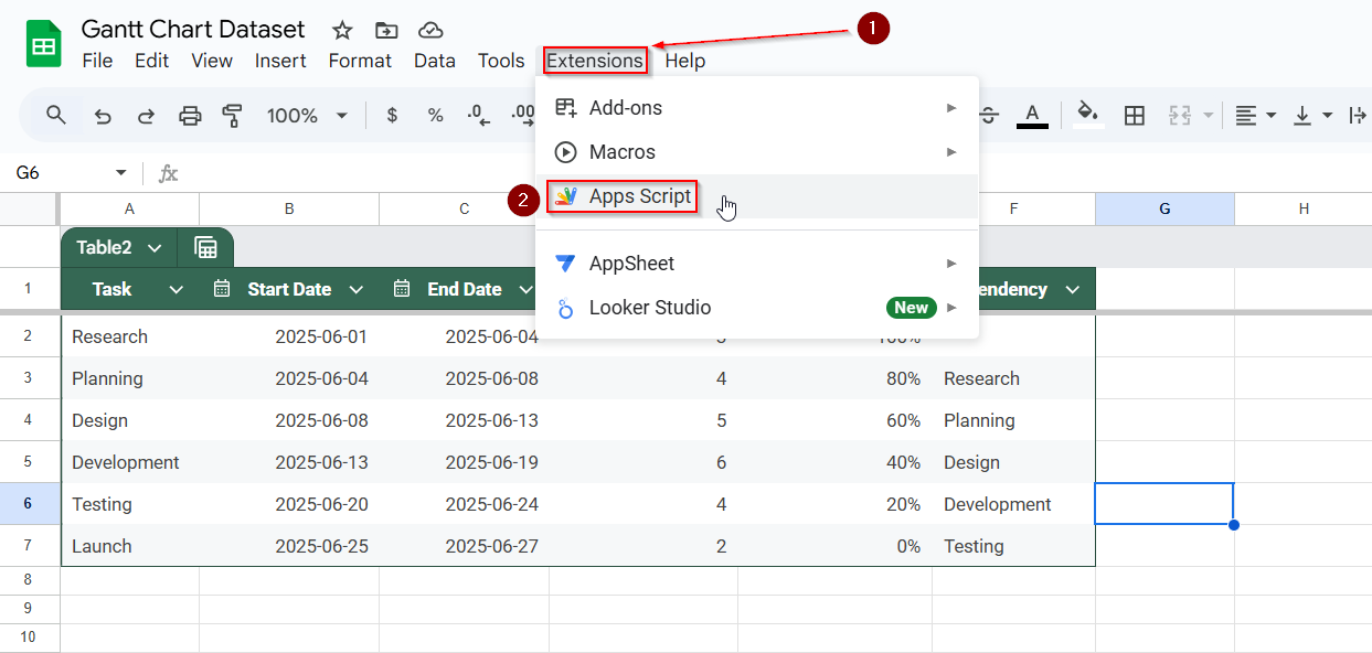
➤ Go to Extensions >> Apps Script.
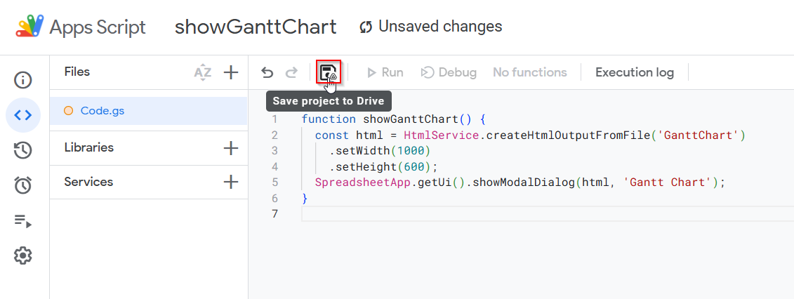
➤ Replace any existing code with:
function showGanttChart() {
  const html = HtmlService.createHtmlOutputFromFile('GanttChart')
    .setWidth(1000)
    .setHeight(600);
  SpreadsheetApp.getUi().showModalDialog(html, 'Gantt Chart');
}
➤ Save the script by clicking on the floppy disk icon.
➤ Create a new HTML file in App Script (File (+) >> New >> HTML file) named GanttChart
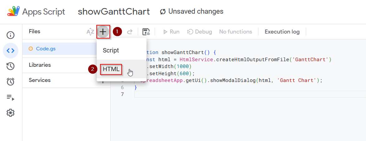
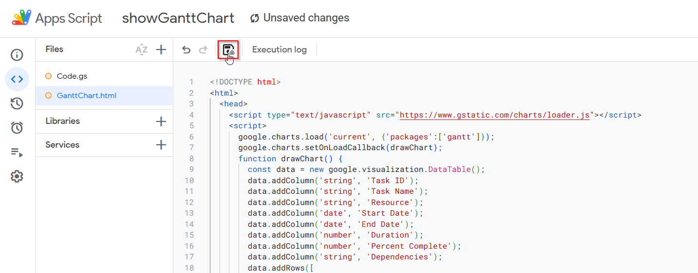
➤ Paste this code inside the HTML file:
<!DOCTYPE html>
<html>
  <head>
    <script type="text/javascript" src="https://www.gstatic.com/charts/loader.js"></script>
    <script>
      google.charts.load('current', {'packages':['gantt']});
      google.charts.setOnLoadCallback(drawChart);
      function drawChart() {
        const data = new google.visualization.DataTable();
        data.addColumn('string', 'Task ID');
        data.addColumn('string', 'Task Name');
        data.addColumn('string', 'Resource');
        data.addColumn('date', 'Start Date');
        data.addColumn('date', 'End Date');
        data.addColumn('number', 'Duration');
        data.addColumn('number', 'Percent Complete');
        data.addColumn('string', 'Dependencies');
        data.addRows([
          ['1', 'Research', null, new Date(2025,5,1), new Date(2025,5,4), null, 100, null],
          ['2', 'Planning', null, new Date(2025,5,4), new Date(2025,5,8), null, 80, '1'],
          ['3', 'Design', null, new Date(2025,5,8), new Date(2025,5,13), null, 60, '2'],
          ['4', 'Development', null, new Date(2025,5,13), new Date(2025,5,19), null, 40, '3'],
          ['5', 'Testing', null, new Date(2025,5,20), new Date(2025,5,24), null, 20, '4'],
          ['6', 'Launch', null, new Date(2025,5,25), new Date(2025,5,27), null, 0, '5']
        ]);
        const chart = new google.visualization.Gantt(document.getElementById('chart_div'));
        chart.draw(data);
      }
    </script>
  </head>
  <body>
    <div id="chart_div"></div>
  </body>
</html>
➤ Save all files
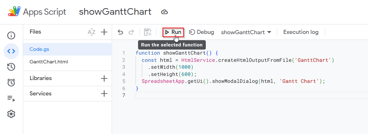
➤ Back in the Script Editor, run showGanttChart()
➤ Grant necessary permissions.
➤ The interactive chart will open as a pop-up inside your Google Sheet.
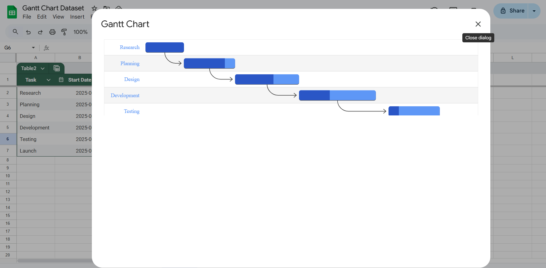
This method gives you full control over timeline visuals, task dependencies, and progress tracking.
Frequently Asked Questions
Can I create a Gantt chart in Google Sheets without coding?
Yes, you can create basic Gantt charts using conditional formatting or stacked bar charts. These methods require no coding and are ideal for quick, static timelines.
What’s the best method for presenting a Gantt chart in meetings?
The stacked bar chart method is best for presentations. It looks polished and professional while remaining easy to create using Google Sheets’ built-in chart tools.
Can I track task progress in a Google Sheets Gantt chart?
Yes, the Apps Script method allows you to show task completion percentages. This makes it useful for project tracking where task status needs to be updated frequently.
Is there a way to include task dependencies in my Gantt chart?
Only the interactive Gantt chart created with Google Apps Script supports task dependencies. This allows you to show how one task’s start depends on the completion of another.
Do I need any special add-ons to build a Gantt chart in Google Sheets?
No add-ons are needed to create Gantt Charts in Google Sheets. All three methods, including conditional formatting, stacked bar chart, and Apps Script, can be created using built-in Google Sheets features and tools.
Wrapping Up
Google Sheets may not offer a native Gantt chart option, but it still allows you to build flexible, functional timeline charts using built-in tools and a bit of creativity. Whether you need a quick overview with conditional formatting or an advanced, interactive chart using Apps Script, these methods let you track tasks visually, share updates, and stay on top of your projects.