We use combo charts in Google Sheets to easily compare different types of data on one single chart. This makes spotting patterns and understanding complex information, such as sales and profit margins, easier. In this article, we will learn how to make combo charts using the Chart Editor and then customize them in Google Sheets.
➤ First, select the whole dataset including headers, i.e., A1:C13.
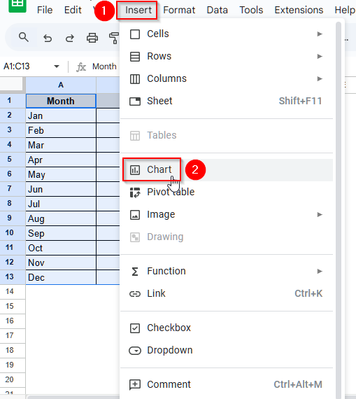
➤ Now, from the top menu bar, click on Insert, and you will see a list of options.
➤ Select Chart from those options, and a default chart will appear. Also, on the right panel, you will see the Chart Editor.
➤ Under the Chart Editor, find the Setup tab. Then, click on the drop-down icon on the box under the Chart type. You will see a list of different chart types appear.
➤ Scroll to the Line option, and you will find a Combo chart.
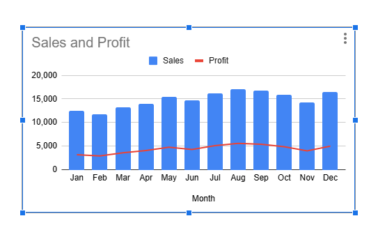
➤ Finally, select that Combo chart, and you will see your previous chart updated to a similar combination of bar chart and line chart, where the sales figures are shown by the bars and the profit figures are shown by a line.
What is A Combo Chart in Google Sheets?
A combo chart is a combination of two or more different chart types into a single chart. It is particularly useful when we have data from different categories and need to compare them over time.
Steps to Make a Combo Chart in Google Sheets
The Chart Editor is a built-in tool in Google Sheets that lets us create different charts and offers a wide range of editing options.
Step 1: Making a Default Chart in Google Sheets
We will use the following dataset to make a combo chart using the Chart Editor in Google Sheets.
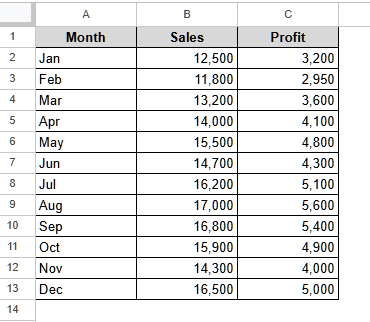
This is a monthly sales dataset of a company with the monthly profit in USD.
Steps:
➤ First, select the whole dataset including headers, i.e., A1:C13.
➤ Now, from the top menu bar, click on Insert, and you will see a list of options.
➤ Select Chart from those options.
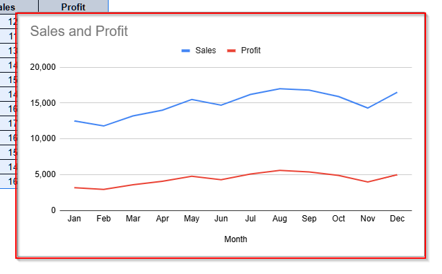
➤ Now, a default chart will appear in Google Sheets. Also, on the right panel, you will see the Chart Editor.
Step 2: Creating a Combo Chart Using the Chart Editor Option
Now, we will update the default chart to a combo chart using the Chart Editor.
Steps:
➤ Under the Chart Editor, you will find the Setup tab. The first option under this tab is the Chart type.
➤ Then, click on the drop-down icon on the box under the Chart type. You will see a list of different chart types appear.
➤ Scroll to the Line option, and you will find a Combo chart. It is a combination of a bar chart and a line chart.
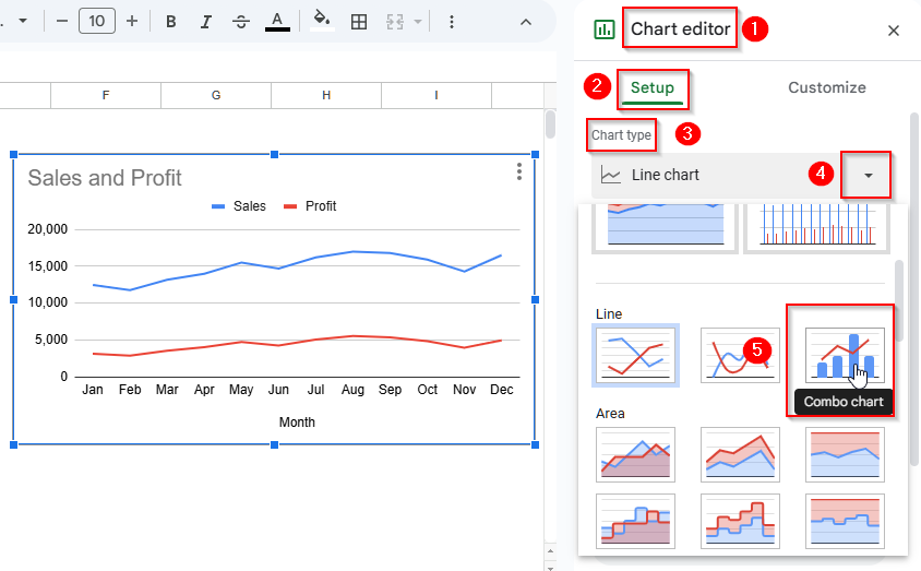
➤ Finally, select that Combo chart, and you will see your previous chart updated to a similar combination of bar chart and line chart, where the sales figures are shown by the bars and the profit figures are shown by a line.

Step 3: Customize the Combo Chart
To make the combo chart more visually appealing, we can customize the color, font, style, etc. Let’s customize some of the combo chart’s components.
Changing the Background Color
To make our combo chart stand out and clear, we can customize the background color. Let’s follow the steps below to do it.
Steps:
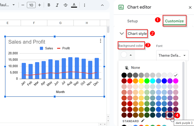
➤ Select the Customize tab under the Chart Editor.
➤ Click on Chart Style and under the Background color, choose any of the colors you like. Here, I will use the Dark Purple 3.
Changing the Font Color of Chart and Axis Titles
To make the titles of our combo chart visually clear, we will change the font color of both the chart and axis titles font color.
Steps:
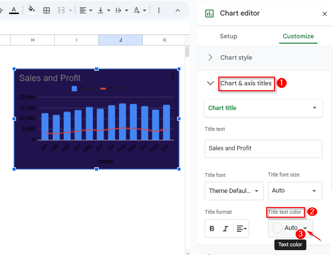
➤ First, click on the Chart and axis titles under the Chart Editor option.
➤ Then, click on the drop-down icon under the Title text color.
➤ Now, a color palette will open up, and you can choose your preferred font color from the options. To make the visualization better, we will choose the white color here.
Customizing the Font Colors of Legend Labels
Now, let’s change the font colors of our legend label.
Steps:
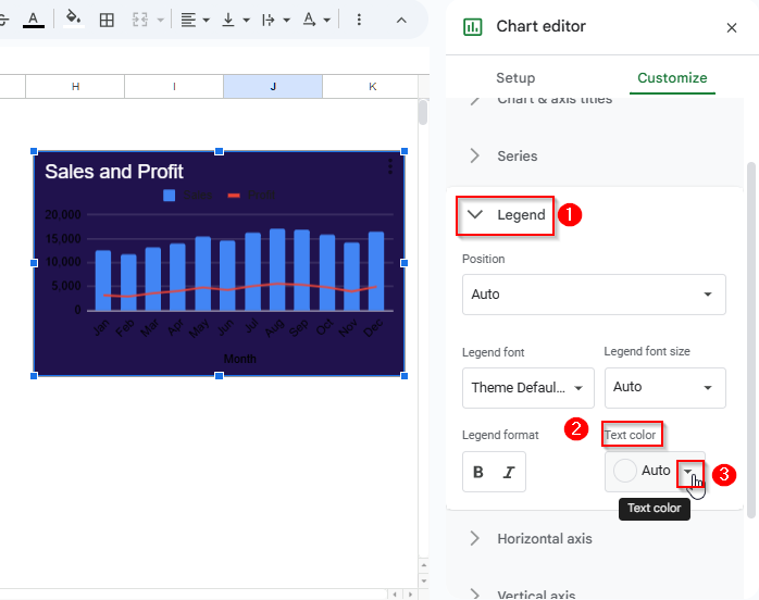
➤ To change the legend label color, first select Legend under Customize.
➤ Now, under the Text color option, you can choose any color to customize your legend label font color. We will use the white color here.
Changing the Font colors of the Horizontal and Vertical axes
Let’s change the font colors of the horizontal and vertical axes to match the other fonts.
Steps:
➤ First, select Horizontal axis under the Customize option.
➤ Now, click on the drop-down icon under Text color and choose the color you want to use.
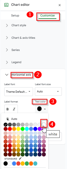
➤ Similarly, from the Vertical axis, we can change the font colors of the vertical labels.
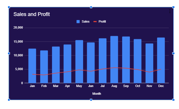
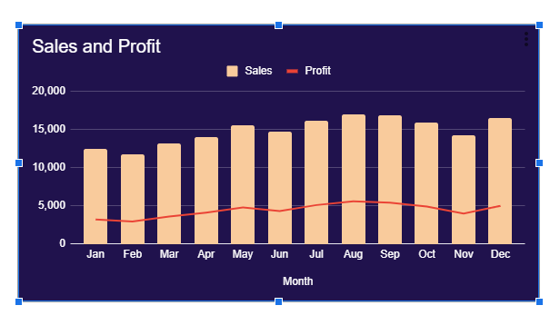
➤ Finally, after changing all the labels’ font colors, our chart is like below.
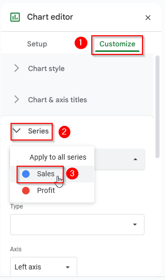
Customizing the Series Colors
Now, we will change the color of the Column chart.
Steps:
➤ First, select Series under the Customize tab in Chart Editor.
➤ Now, select Sales from the box under the Series options.
➤ Then, click on the drop-down menu under the Fill color option, and you will see a color palette.
➤ Choose any color for the column chart.
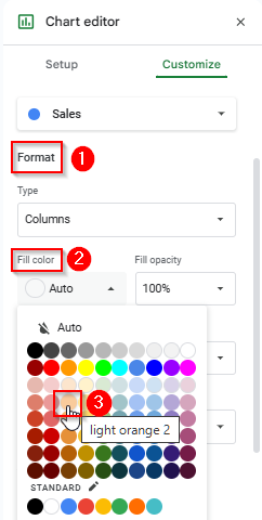
➤ Finally, select the color and the fill of the column chart will be changed.
Frequently Asked Questions
Are Combo Charts Dual Axis Charts?
A Dual Axis chart has two vertical or y-axis, while a Combo Chart might have two vertical axes or only one vertical axis, as it is a combination of two or more charts. Thus, a combo chart need not to show different scales always.
How Can I Create a Combo Chart in the Google Sheets Mobile App?
Unfortunately, you cannot. The mobile app version of Google Sheets does not support creating or customizing any chart. So, to create a Combo Chart, you have to use Google Sheets on your PC.
Can I Add Gridlines in Combo Charts in Google Sheets?
Yes, you can. First, click on the chart and open the Chart Editor. Then, go to the Customize tab and select Gridlines and ticks. You’ll see options for the Vertical axis and the Horizontal axis there. Now, choose the axis you want, then adjust Major gridlines and Minor gridlines by turning them on or off.
Wrapping Up
In this article, we have learned how to create a Combo Chart in Google Sheets and customize it using the Chart Editor and Customize option. Give it a try and share your thoughts with us.