
Sparklines in Google Sheets are miniature charts that fit into a single cell, providing a quick visual representation of your data. They’re perfect for dashboards, trend tracking, and giving context without taking up space.
In this article, you’ll learn how to use the SPARKLINE function in different formats with practical examples, including line charts, bar charts, column charts, and win/loss indicators.
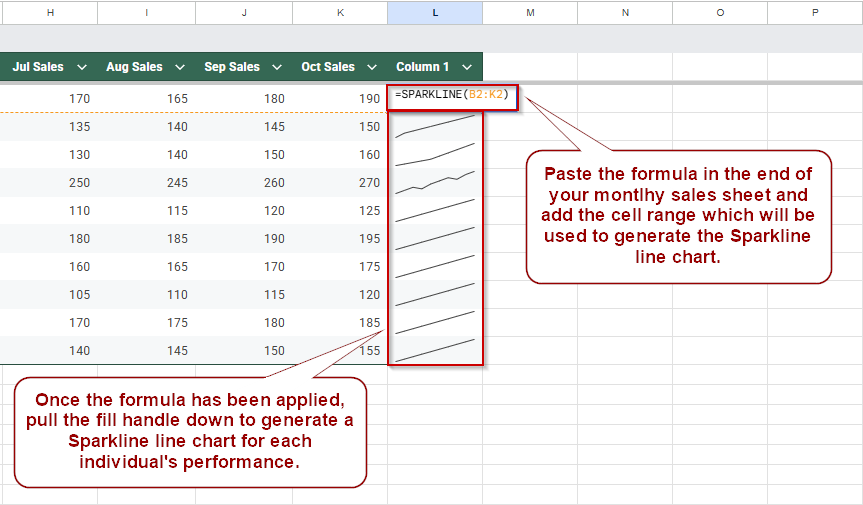
Steps to create a basic line sparkline in Google Sheets to visualize monthly sales trends:
➤ Click on cell L2, where you want to insert the sparkline for the first employee.
➤ Type the formula: =SPARKLINE(B2:K2) to reference the sales data from January to October.
➤ Press Enter to generate a compact line chart representing that employee’s sales trend.
➤ Click on cell L2, then drag the fill handle down to L11 to apply the sparkline to all employees.
What is a Sparkline Function in Google Sheets?
A sparkline is a lightweight chart displayed in a single cell, created with the SPARKLINE function. Unlike standard charts, sparklines update instantly with changes in your data and are embedded right in the spreadsheet grid.
Syntax: =SPARKLINE(data, [options])
Create a Basic Line Sparkline to Show Sales Trends in Google Sheets
This method helps you visualize monthly sales performance for each employee using a compact line sparkline. Instead of creating full-sized charts, you can insert these small graphics directly into cells to spot patterns at a glance. It’s mainly useful when working with team-level data over time.
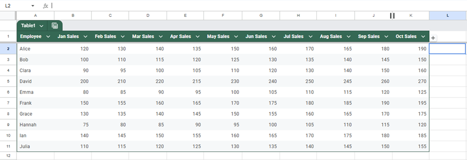
For this example, we’ll use a dataset with 10 employees and their monthly sales from January to October. Each row contains the sales figures for one employee across those months.
Steps:
➤ Click on cell L2, where you want the sparkline for the first employee to appear.
➤ Type the formula:
=SPARKLINE(B2:K2)
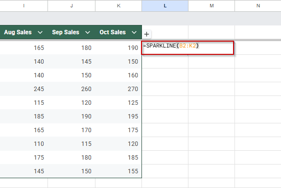
This tells Google Sheets to create a line sparkline based on sales data from January (B2) to October (K2).
➤ Press Enter.
You’ll see a small line chart showing Alice’s sales trend across those months.
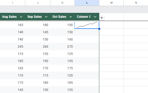
➤ To add sparklines for all employees, click on cell L2 again, then drag the fill handle at the bottom-right corner of the cell down to L11.
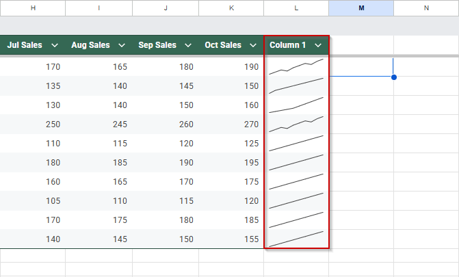
Each row now displays a mini line chart reflecting that employee’s monthly sales trend, making it easy to compare performance visually.
Generate a Column Sparkline to Compare Monthly Sales Values in Google Sheets
Column sparklines are ideal when you want to focus on the relative size of values across a period, like which months had the highest or lowest sales for each employee. Instead of summarizing data trends like line sparklines, column sparklines help you compare each value more distinctly.
We’ll continue using the same dataset with 10 employees and their monthly sales from January to October.
Steps:
➤ Click on cell L2, or whichever column you want to display the sparkline in for the first employee.
➤ Enter the following formula to generate the column-style sparkline:
=SPARKLINE(B2:K2, {“charttype”, “column”})
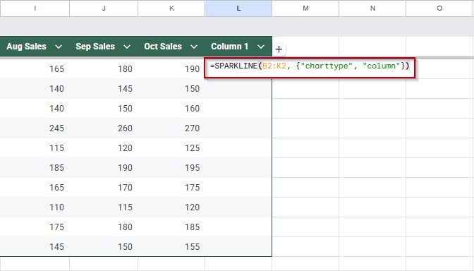
➤ Press Enter.
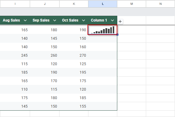
The sparkline will appear as a series of vertical bars, each representing monthly sales.
➤ Drag the fill handle down from L2 to L11 to apply the formula to the other rows.
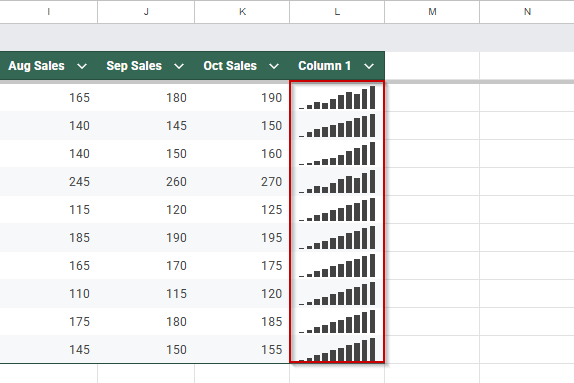
Now, each employee row has a column sparkline showing how their sales compared month-to-month. This is great for spotting individual monthly spikes or dips in performance across your team.
Customize Line Sparklines with Colors and Styles in Google Sheets
After adding basic sparklines to your sheet, you can make them more useful and visually appealing by customizing their appearance. Google Sheets lets you change the line color and thickness and add an axis line. These small changes can make a big difference, especially when looking at trends across multiple rows of data. Let’s apply these style options using the same 10-row employee sales dataset.
Steps:
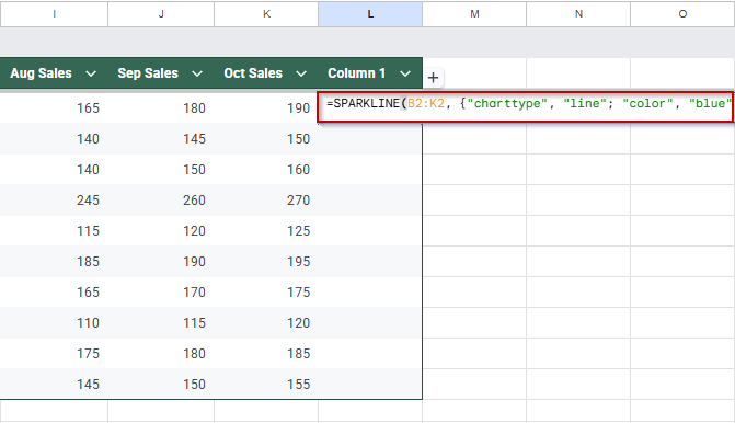
➤ Click on cell L2, where you want your customized sparkline to appear.
➤ Enter the following formula to add a blue line with a gray axis:
=SPARKLINE(B2:K2, {“charttype”, “line”; “color”, “blue”; “linewidth”, 2; “axis”, true; “axiscolor”, “gray”})
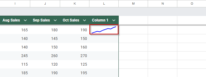
➤ Press Enter to generate the sparkline. You’ll see a bolder blue line with a visible horizontal axis for better reference.
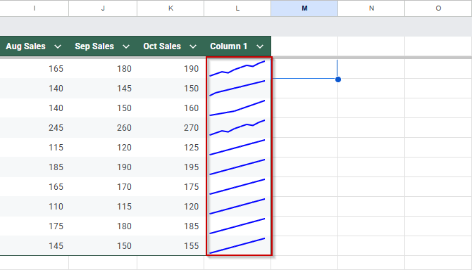
➤ Drag the fill handle from L2 down to L11 to apply the same styled sparkline to the rest of the rows.
➤ Adjust colors or line width as needed to match your sheet’s theme or improve visibility.
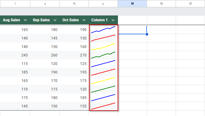
This approach makes your sparklines easier to read and gives your dashboard a more polished, professional look.
Add Win-Loss Sparklines to Track Performance Outcomes in Google Sheets
If you’re evaluating whether employees met their monthly sales targets, win-loss sparklines are a clean and effective way to visualize this. Instead of showing actual sales numbers, these sparklines display binary results, indicating only whether each goal was achieved (a “win”) or not (a “loss”). This is useful when you want to focus on consistency or performance patterns without being distracted by sales figures.
Using a simple helper table and a built-in formula, you can quickly generate a visual overview of each employee’s performance throughout the year.
Steps:
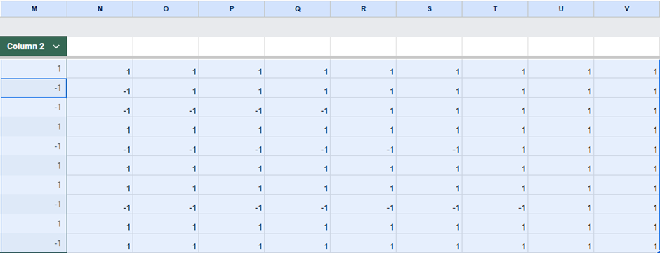
Create a new helper table in your dataset to convert sales into binary values (1 for hit target, -1 for miss).
➤ Select cells M2:V11.
➤ Enter the following formula to generate a helber table:
=ARRAYFORMULA(IF(B2:K11>=115, 1, -1))
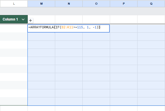
➤ Press Enter.
➤ In cell W2, enter the sparkline formula:
=SPARKLINE(M2:V2, {“charttype”,”winloss”})
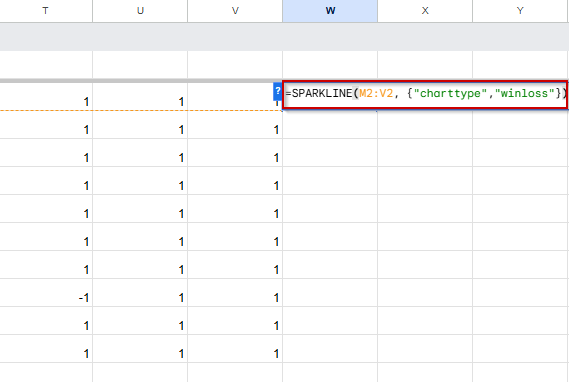
➤ Press Enter, then drag down from W2 to apply it to all employees.
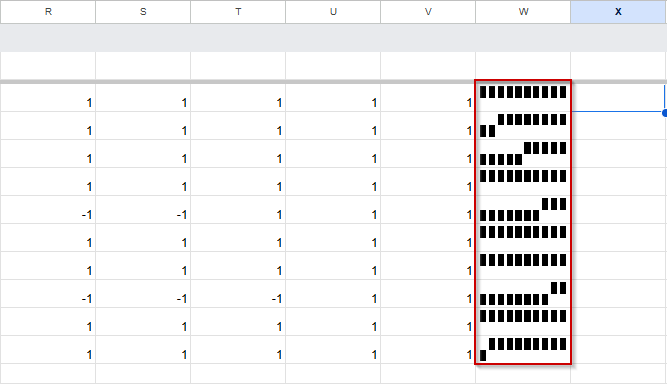
This method is perfect when the question is simply, “Did they meet the goal or not?” It makes it easy to scan performance across months without overthinking the numbers.
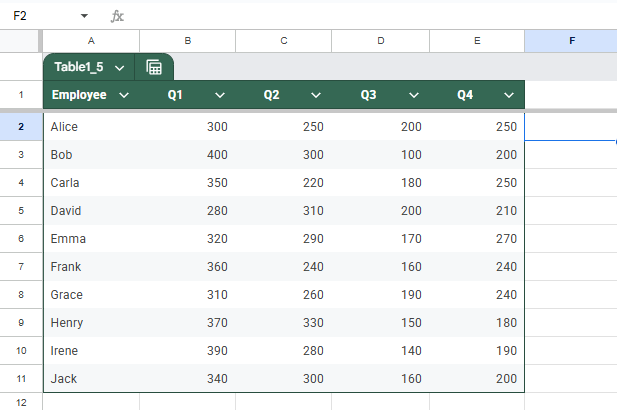
Add a Basic Bar Sparkline to Show Standalone Values in Google Sheets
Bar sparklines are perfect for visualizing static or periodic performance metrics, like quarterly sales, in a compact and readable format. Unlike line sparklines, which show trends, bar sparklines emphasize the size of individual values. This makes them ideal for comparing employee performance across four quarters without creating complete charts.
This is the dataset that we will be using for this method:
Steps:
➤ Click on F2, the cell where you want the first sparkline to appear.
➤ Enter the following formula:
=SPARKLINE(B2:E2, {“charttype”,”bar”})
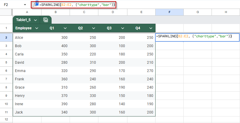
➤ Press Enter to insert the bar sparkline for the first employee.
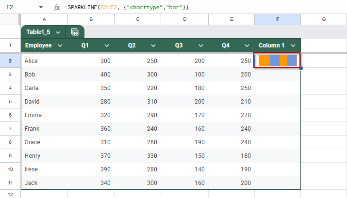
➤ Drag the fill handle from F2 to F11 to apply it to the rest.
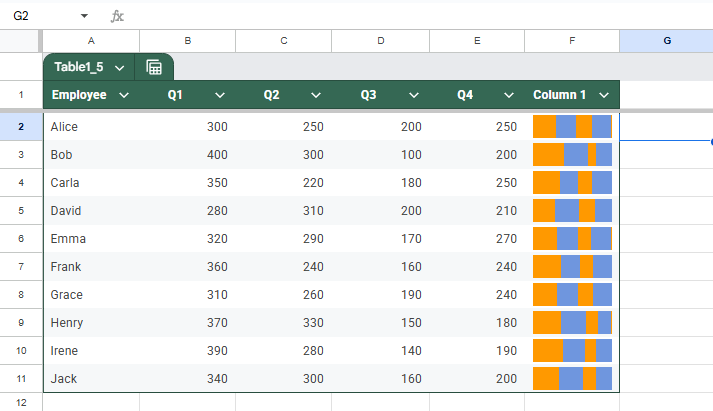
Each employee row will now show a mini bar chart, quickly comparing their quarterly performance.
Compare Actual vs Target Performance Using Dual-Series Sparklines in Google Sheets
Dual-series sparklines in Google Sheets allow you to display two related metrics, such as target vs. actual sales, in a single, compact line chart. This makes it easy to monitor whether employees are hitting their goals month after month, without cluttering your sheet with full-sized graphs.
In this method, we’ll use a dataset that records both target and actual sales for each employee across five months. Each row contains alternating columns for monthly targets and their corresponding actual results:
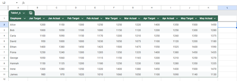
Steps:
➤ Insert a new column header in L1 to hold the sparkline.
➤ Click on the cell L2
➤ Enter this formula:
=SPARKLINE({B2,D2,F2,H2,J2;C2,E2,G2,I2,K2}, {“charttype”,”line”;”series”,2})
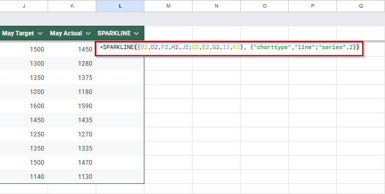
This stacks the target and actual data vertically to compare trends in one mini-chart.
➤ Press Enter, then drag the formula down to fill other rows.

You now have dual-line sparklines showing actual vs. target sales side-by-side.
Frequently Asked Questions
What are sparklines used for in Google Sheets?
Sparklines create mini charts inside cells to show trends, patterns, or comparisons without full-size charts. They’re ideal for visualizing sales, progress, or binary outcomes quickly and clearly.
Can I customize the color of sparklines in Google Sheets?
Yes, you can customize sparkline colors by using options like “chartcolor“, “linewidth“, or “axis” in the SPARKLINE formula. This helps improve readability and highlights key differences in data trends.
What’s the difference between line, bar, and win-loss sparklines?
Line sparklines show trends, bar sparklines display comparative values, and win-loss sparklines show binary results (like yes/no or pass/fail). Each serves a different purpose for visual analysis in Sheets.
How do I update sparklines when new data is added?
To update sparklines, adjust the formula range to include the new data. If your data grows regularly, consider using dynamic named ranges or the ARRAYFORMULA function for automatic updates.
Wrapping Up
Sparklines in Google Sheets offer a powerful way to visualize data trends, comparisons, and outcomes directly within cells, without cluttering your sheet with large charts. Whether you’re tracking sales over months, highlighting differences in performance, or marking wins and losses, sparklines help convey insights at a glance.
With just a few formulas and styling options, you can turn rows of numbers into clear, meaningful visuals that make your spreadsheet easier to analyze and share.

