Excel Charts
How to Make a Radar Chart in Excel (with Easy Steps)
Learn how to make a radar chart in Excel by selecting your dataset, inserting the chart, and formatting it for clear data visualization.
Read article

Tasmia Rahim holds a B.Sc in Electrical Engineering with a focus on automation and embedded systems, supporting logic-driven spreadsheet workflows. With 2 years of Excel and Google Sheets experience, she works with conditional formatting and basic automation. She is interested in using macros and ActiveX controls to simplify Excel tasks and improve usability.
Articles by Tasmia Rahim are developed under the guidance of ExcelInsider’s core training program and are technically reviewed by Nehad Ulfat, lead spreadsheet consultant, to ensure accuracy and user-centric value.
Learn how to make a radar chart in Excel by selecting your dataset, inserting the chart, and formatting it for clear data visualization.
Learn how to create a scatter plot with 3 variables in Excel by preparing data, inserting a bubble chart, adding labels & customizing axes.
Learn how to show both percentage and value in an Excel pie chart by adding and formatting data labels for clear & informative visualization.
Learn how to rotate a pie chart in Excel by adjusting the angle of the first slice in the Format Data Series pane for data presentation.
Learn how to change pie chart colors in Excel by manually filling slices, applying themes, using chart styles, or automating with VBA.
Learn how to create a Bar of Pie chart in Excel by selecting data, inserting the chart, adjusting the split & customizing labels and format.

Learn how to make a pie chart in Excel with words by selecting data, inserting the chart, adding category names & customizing its appearance.
Learn how to sort a bar chart in Excel in descending order using built-in sort, SORT function, helper columns, axis options, or pivot tables.
Learn how to add a line to a bar chart in Excel using combo charts, trendlines, extra data series, or vertical average lines for clarity.

Learn how to make a double bar graph in Excel using a preset clustered chart or by manually adding a second series to an existing chart.
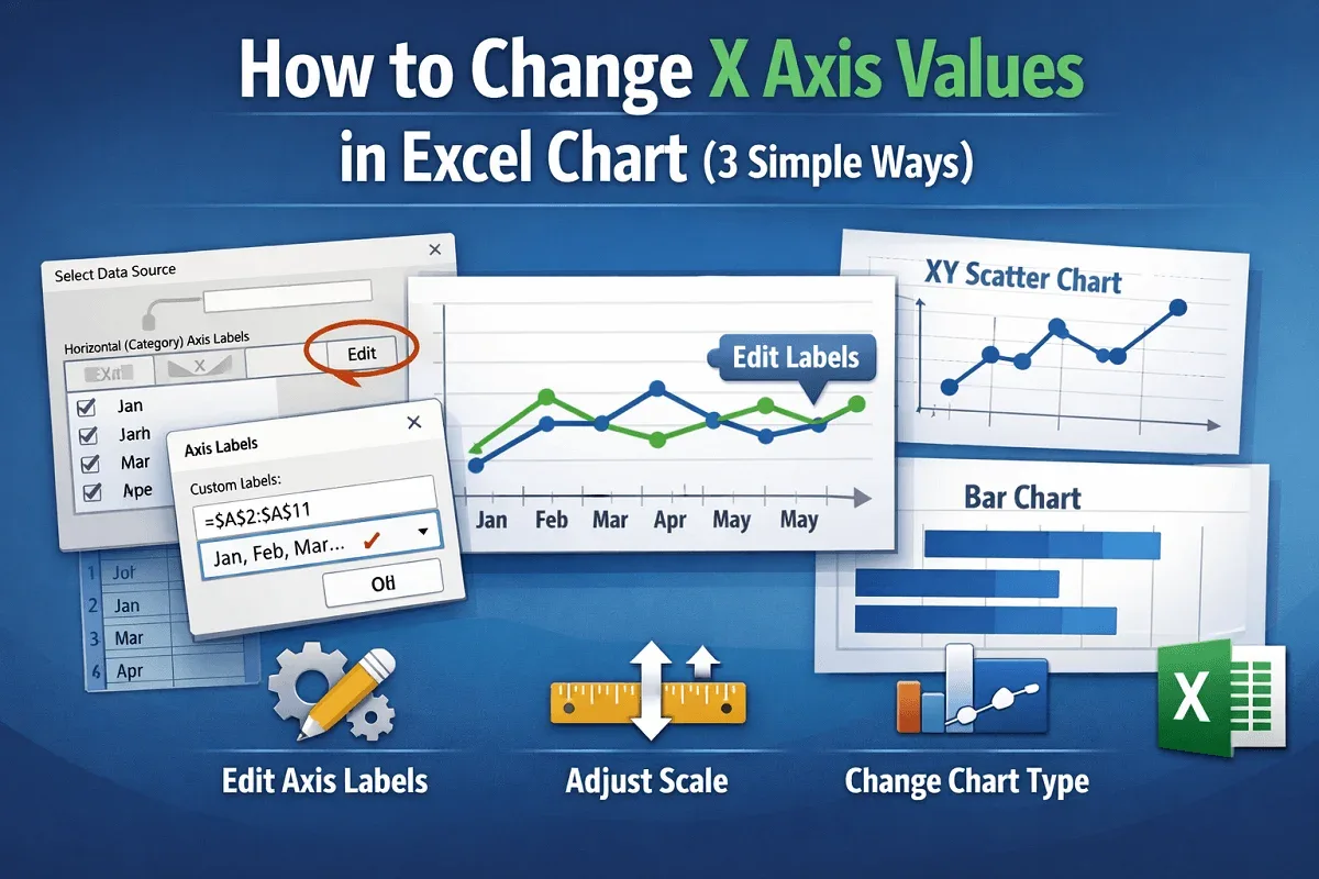
Learn how to change X-axis values in Excel charts by updating labels, adjusting scale and formatting, or switching to a different chart type.
Learn how to use AVERAGEIF in Excel with greater than 0 criteria to calculate averages for numbers, ranges, text matches & date conditions.