Excel Charts
How to Add Data Labels in Excel Chart (4 Simple Methods)
Learn how to add data labels in Excel charts using different methods. Includes custom labels, percentages & cell links for clear charts.
Read article


Abrar-ur-Rahman Niloy holds a Bachelor of Science in Engineering and has over 4 years of experience with Excel and Google Sheets. He specializes in data analysis using charts, pivot tables, and advanced filtering, as well as workflow automation with Google Apps Script and Excel VBA. Notable projects include developing automated trackers and reporting tools for personal and professional use. Niloy is passionate about improving productivity through smarter spreadsheet design and automation.
Articles by Abrar Niloy are developed under the guidance of ExcelInsider’s core training program and are technically reviewed by Nehad Ulfat, lead spreadsheet consultant, to ensure accuracy and user-centric value.
Learn how to add data labels in Excel charts using different methods. Includes custom labels, percentages & cell links for clear charts.
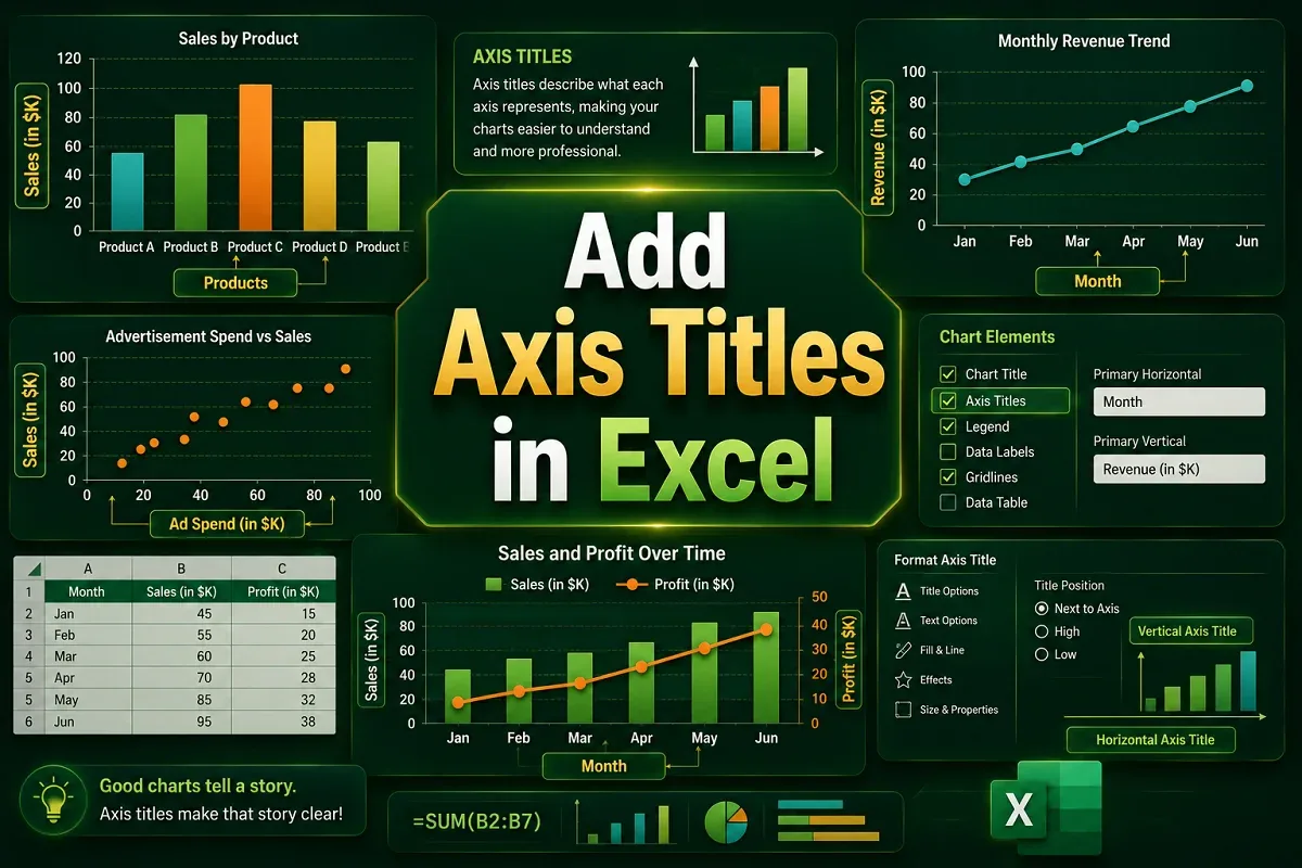
Learn to add Excel axis titles using Chart Elements or Design tab. Simple steps to label charts clearly for better data presentation.
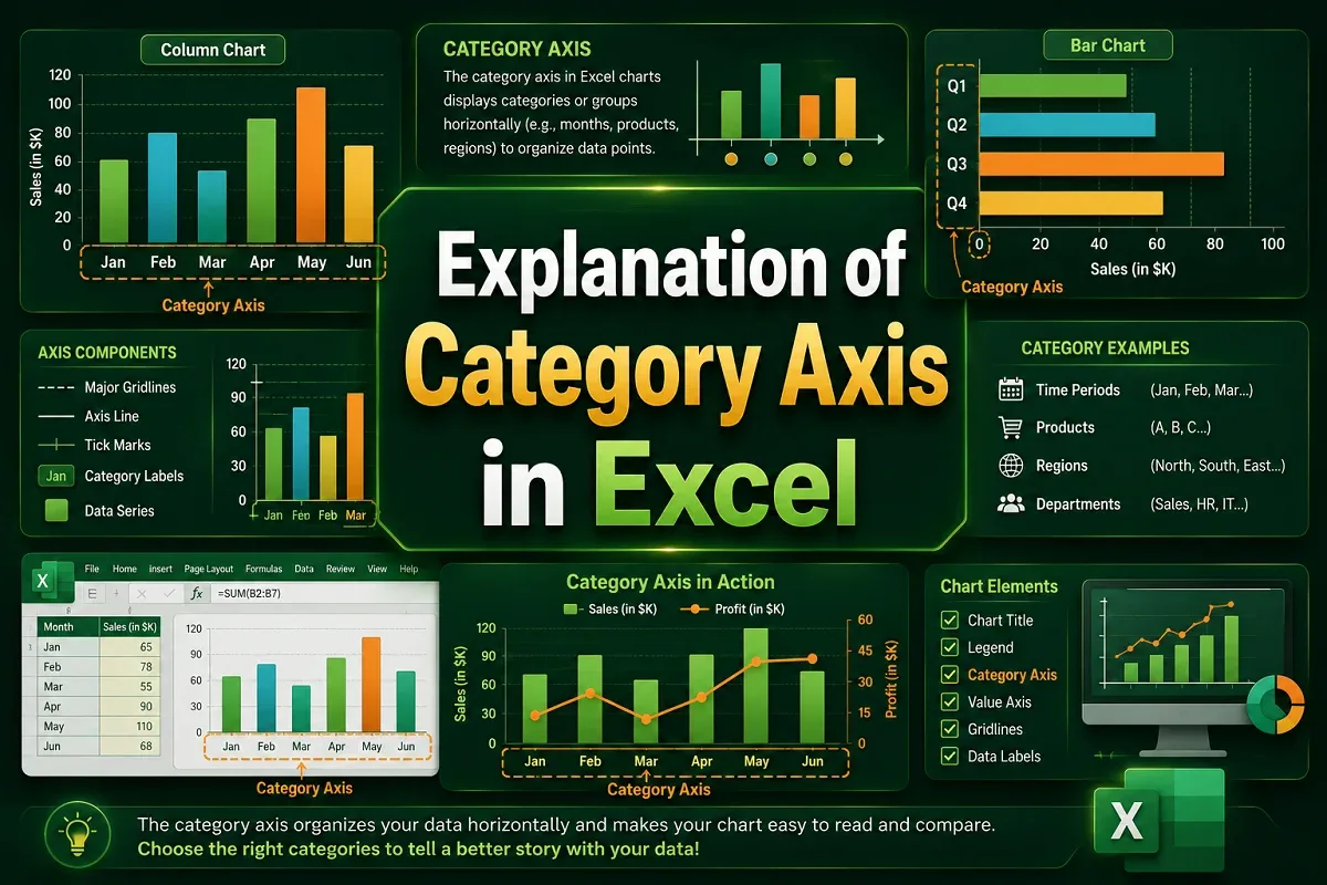
Learn how to use the category axis in Excel charts to organize labels, customize text orientation, and fix common issues.
Learn how to rename Excel chart legends by editing data series names. Step-by-step guide for both dynamic and static legend renaming methods.
Change Excel legend colors by editing data series colors. Simple steps to customize chart appearance for clearer data visualization.
Reorder Excel legend without changing chart data. Simple steps to customize legend sequence while preserving your chart.
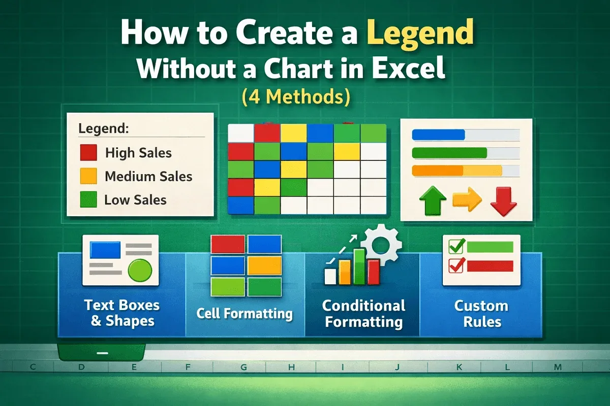
Create Excel legends without charts using text boxes, shapes & formatting. Step-by-step guide for visual data representation in cells.
Learn how to add a legend in Excel charts using the Chart Elements button, Chart Design tab, or manual methods.
Learn how to edit a legend in Excel charts, including changing text, moving positions, customizing order, and formatting appearance.
Learn how to create a chart from selected range of cells using ribbon features, quick analysis tool, and keyboard shortcut
Learn how to show percentage in excel chart (pie & clustered columns) by formatting data labels with 2 different & easy ways.