Displaying percentages in graphs can help viewers to understand the relative distribution of different categories. You can add these percentages directly using the data label formatting, or by calculating them on sheets and using them as labels.
➤ Create a graph from the dataset.
➤ Right-click on the chart area and select Add Data Labels from the context menu.
➤ Right-click on a label and select Format Data Labels.
➤ Check Percentages from the Format Data Labels >> Label Options >> Label Contains.
(or check the Value From Cells under the same options and select the range if you calculate percentage manually to include them in the graph)
While the first method only works for certain charts, the second method works for all types of charts. In this tutorial, we’ll go through both of the methods to display percentage in an Excel chart.
Download Practice WorkbookFormatting Data Labels to Show Percentage
You can display the percentages directly with this method. However, it only works for specific charts like pie, doughnut, etc.
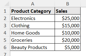
Let’s take a dataset containing different products and their sales values.
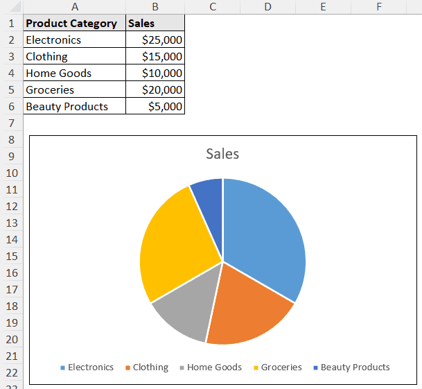
To demonstrate this process, we are going to create a pie chart and add the data labels as percentages.
Creating the Pie Chart:
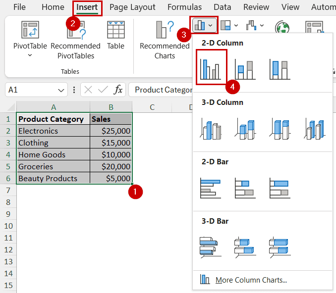
➤ Select the data range (A1:B6).
Or, a cell in it if you want to include the whole dataset.
➤ Go to Insert >> Charts >> Insert Pie or Doughnut Chart >> Pie.
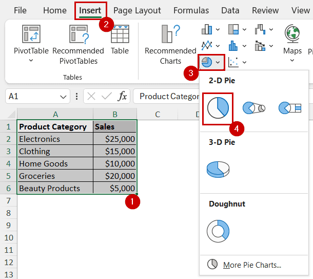
A pie chart will appear on the sheet.
Adding Percentage Labels to the Chart:
➤ Right-click on the chart area and select Add Data Labels from the context menu.
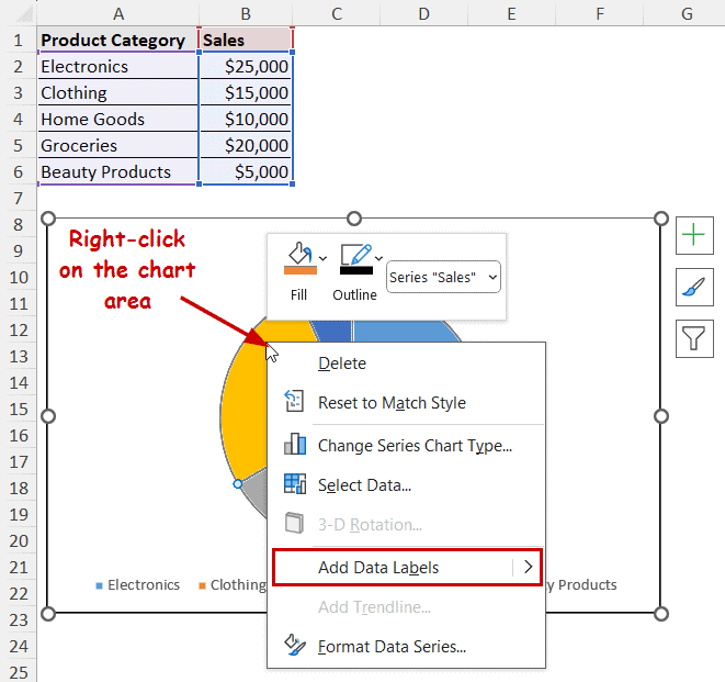
You can also add it from the Chart Elements (the plus icon that appears on the top-right after selecting the chart) or the Chart Design tab from the ribbon.
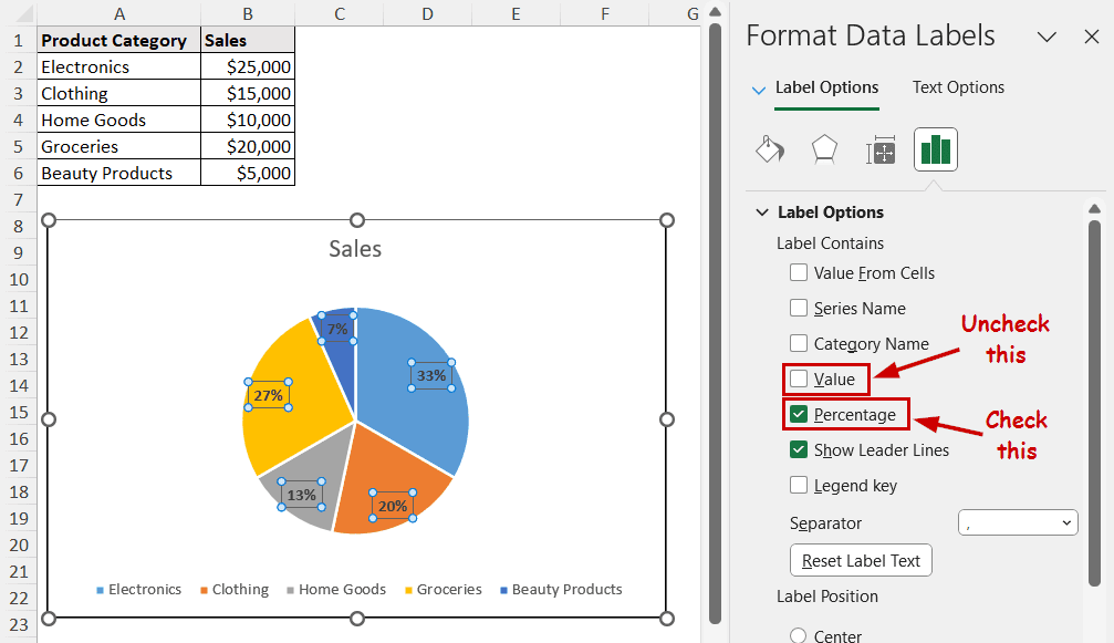
➤ After the label appears, it will be the raw values from the cells. Right-click on it and select Format Data Labels.
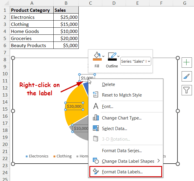
➤ The Format Data Labels window will appear now on the right of the sheet. Check Percentage and uncheck Values under the Label Contains section.
This is how you can show percentages in an Excel graph directly.
Manually Calculating and Adding Percentages as Labels
While the previous method is straightforward, it only works for certain types of charts.
What if you want to display the same type of percentage in the column chart, or any other types of charts?
You need to calculate the percentage separately on the sheet and add it to those charts for this. So, in this method, we are going to demonstrate how to add percentages as a label in charts like column chart.
Steps to Add Column Chart:
➤ Select the dataset (or a cell in it if you want to include the whole dataset).
➤ Go to Insert >> Charts >> Insert Column or Bar Chart >> Clustered Column.
Steps to Calculate Percentages:
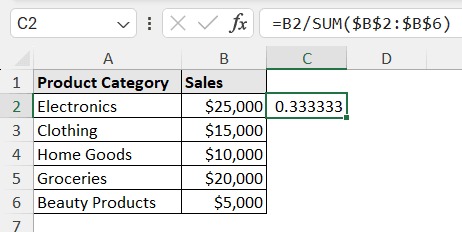
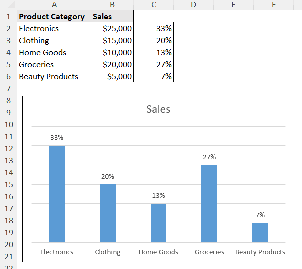
Now we need the percentage values on the cells. We need to calculate them manually.
➤ Use the formula in the output cel (C2).
➤ Use the Fill Handle tool to autofill the rest of the cells.
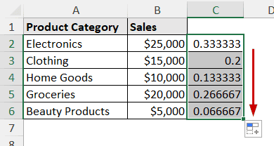
➤ Now format the cells as percentages from Home >> Number >> Percent Style.
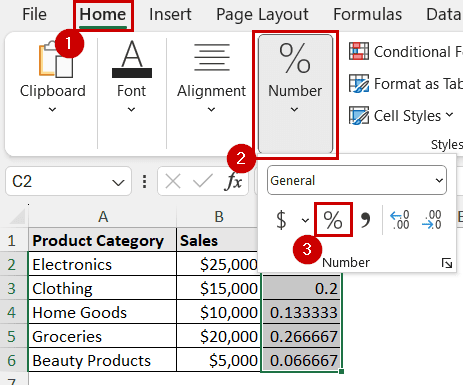
The SUM function here calculates the total value. It’s argument range (B2:B6) is in absolute reference because we don’t want them to change while autofilling.
Steps to Add Percentage Labels:
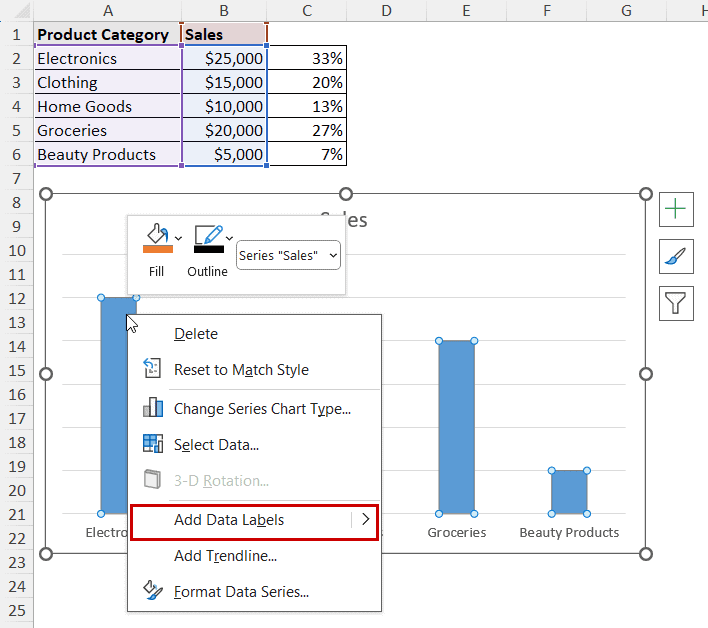
➤ Right-click on a column and select Add Data Labels from the context menu.
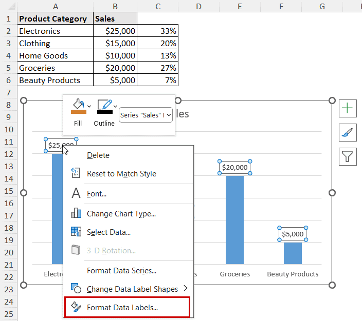
➤ Right-click on a label and select Format Data Labels from the context menu.
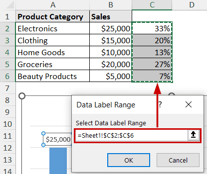
➤ Now select the “Value from Cells” option from the Format Data Labels.
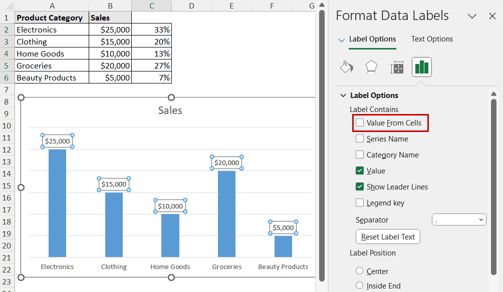
➤ Select the cells containing the percentages and click OK.
➤ Uncheck the Value option if you don’t want them to display with the percentages.
The column chart will now show percentage values.
FAQ
What is the best Excel chart for percentages?
The best Excel chart to show the percentage distribution would be the pie chart. It is the circular chart divided into slices that represent the distribution.
You can insert them from Insert >> Charts >> Insert Pie or Doughnut Chart >> Pie.
What is the formula for percentage in Excel?
The formula for percentage is (value/total)*100. You can calculate the total with the sum function or addition formula in Excel. Also, you can skip the multiplication of 100 and format the fraction values as percentages.
How do I compare percentages in Excel?
You can compare percentage differences using the formula: ((value-previous value)/previous value)*100.
Let’s say you have two values in A1 and B1. The percentage difference would be ((B1-A1)/A1)*100.
Can I show percentages in a stacked column chart?
There are percentage values in the Y axis of a stacked column chart. However, you can’t show it on the labels. Because each column reaches 100% value and the segments represent the proportion of each category instead of the total.
Can I display percentages in a line chart?
You can’t directly display percentages in a line chart. However, you can use the second method to calculate the percentage and then either label it or create a line chart with those values.
Wrapping Up
In this tutorial, we have covered two different ways to display percentage in an Excel graph. To show the percentage in a graph, create bar charts and add data labels directly. Otherwise, you have to manually calculate the percentage values and use those values to represent them in a graph.
Feel free to download the practice file and let us know about your feedback.