Excel Charts
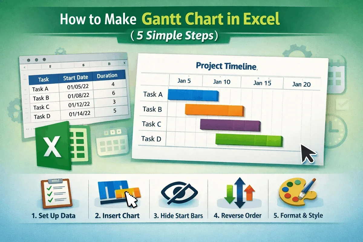
How to Make a Gantt Chart in Excel (with 5 Simple Steps)
Learn how to make a Gantt chart in Excel by setting up tasks, inserting a stacked bar chart, hiding start dates, and formatting for clarity.
Read article

74 articles
Learn how to make a Gantt chart in Excel by setting up tasks, inserting a stacked bar chart, hiding start dates, and formatting for clarity.
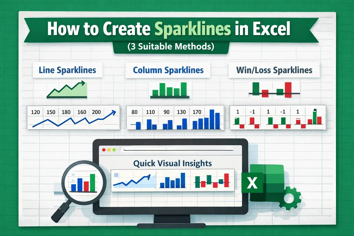
Learn how to create sparklines in Excel with line, column, and win/loss styles to visualize trends, highs and lows, and value comparisons.
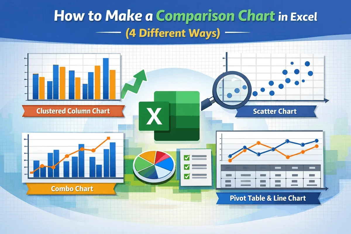
Learn how to make a comparison chart in Excel using clustered columns, scatter plots, combo charts, or Pivot Tables with line charts.
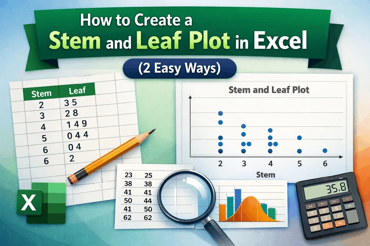
Learn how to create a stem and leaf plot in Excel using a scatter chart for visualization or by manually building a traditional plot.
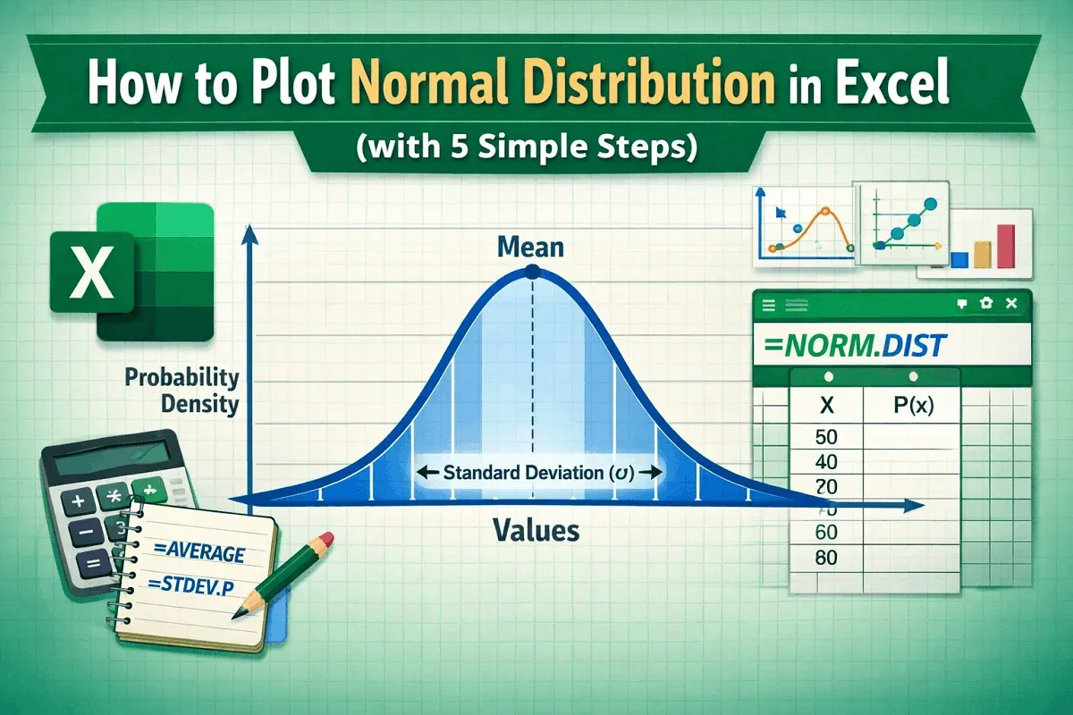
Learn how to plot a normal distribution in Excel by calculating mean, standard deviation, using NORM.DIST, and inserting a customized chart.
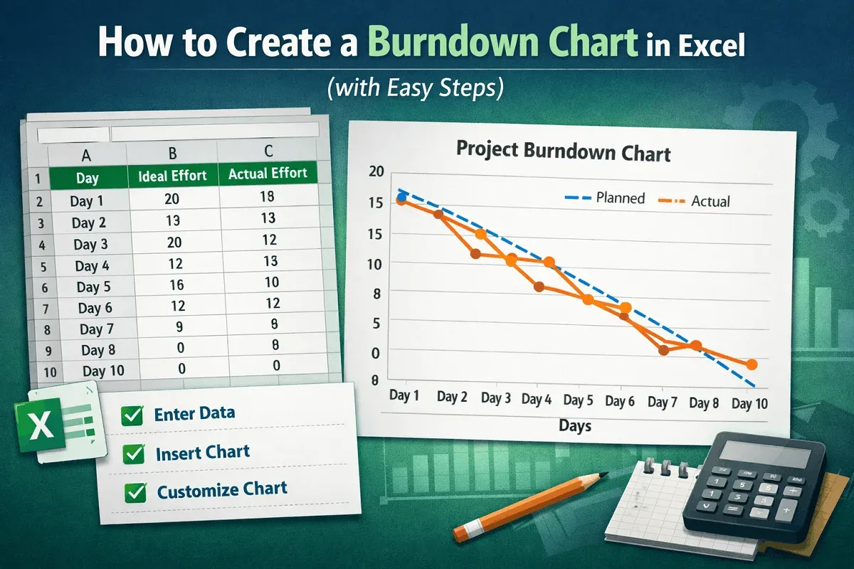
Learn how to create a burndown chart in Excel by entering your dataset, inserting a line chart, and customizing it for project tracking.
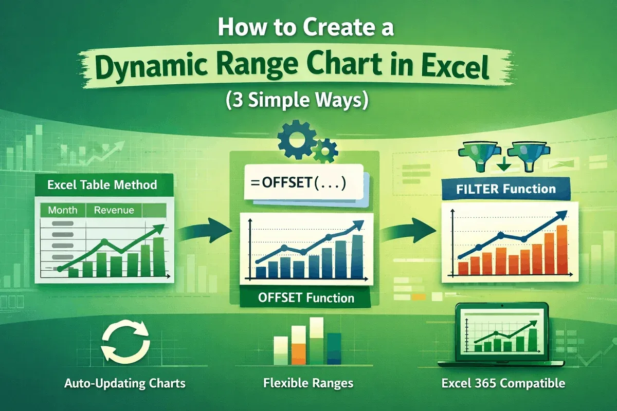
Learn how to create a dynamic range chart in Excel using tables, OFFSET with named ranges, or FILTER with dynamic arrays in Excel 365.
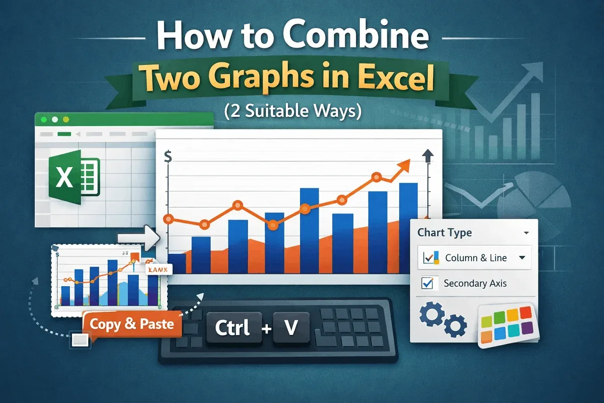
Learn how to combine two graphs in Excel using the Combo Chart tool to overlay data or by manually merging charts with a simple copy-paste.
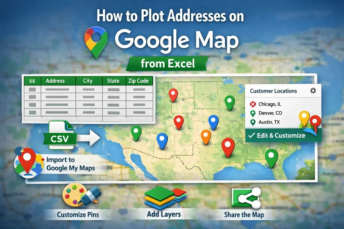
Learn how to plot addresses on Google Maps from Excel by preparing data, importing it into Google My Maps, and customizing labels & styles.
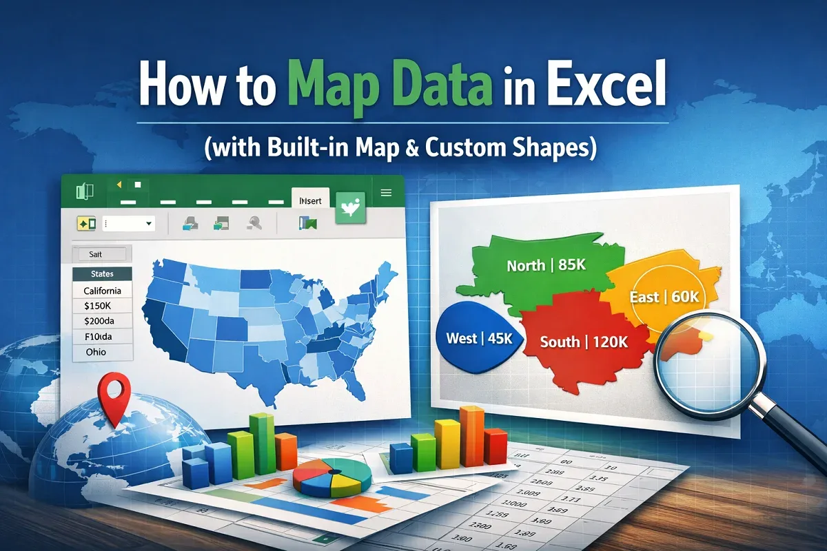
Learn how to map data in Excel using the built-in map chart feature or by creating a custom visual map manually for geographic insights.
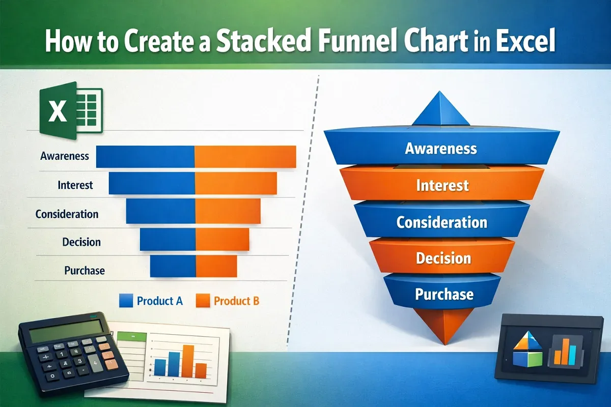
Learn how to create a stacked funnel chart in Excel, including horizontal stacked funnels and 3D pyramid-style charts.
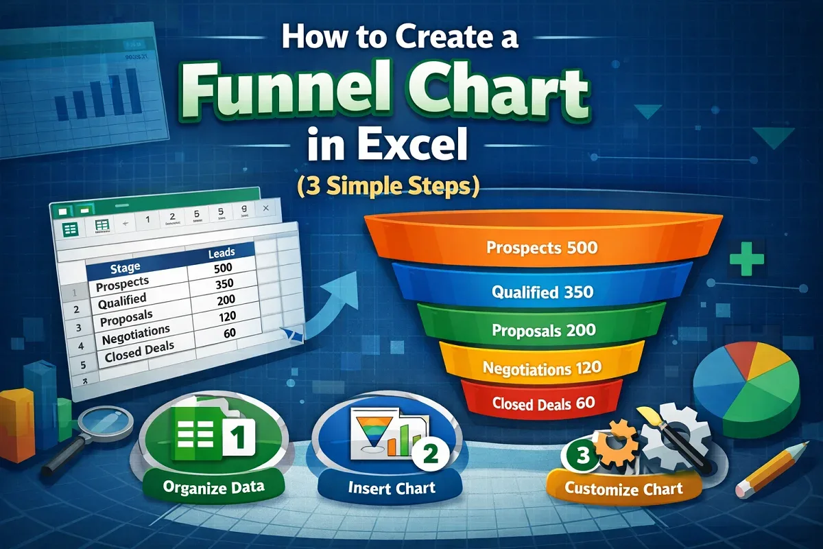
Learn how to create a funnel chart in Excel by selecting your dataset, inserting the chart, and customizing it for clear data visualization.