Excel Charts
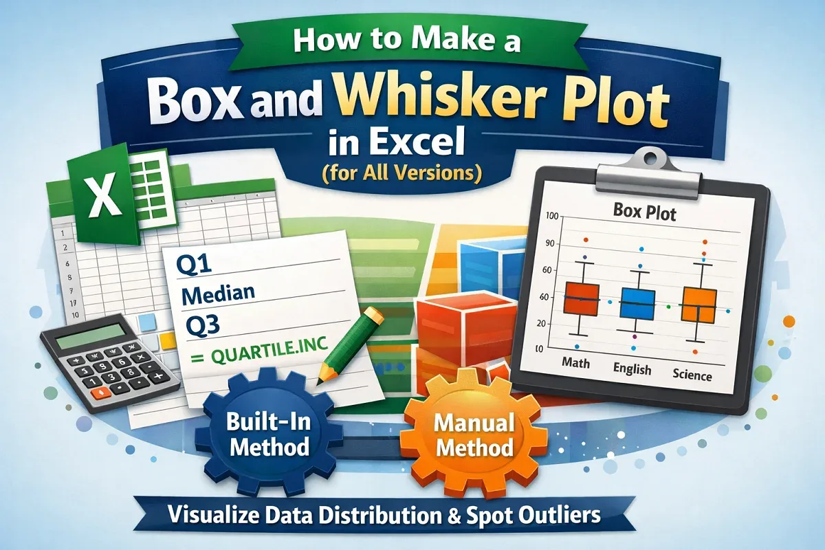
How to Make a Box and Whisker Plot in Excel (for All Versions)
Learn how to make a box and whisker plot in Excel using the built-in chart feature in newer versions or by creating one manually.
Read article

74 articles
Learn how to make a box and whisker plot in Excel using the built-in chart feature in newer versions or by creating one manually.
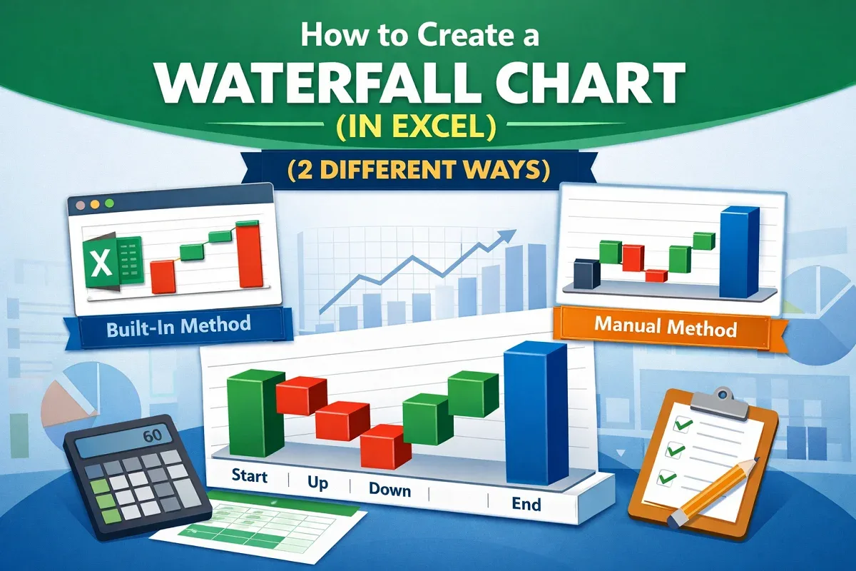
Learn how to create a waterfall chart in Excel using the built-in feature in newer versions or by manually building
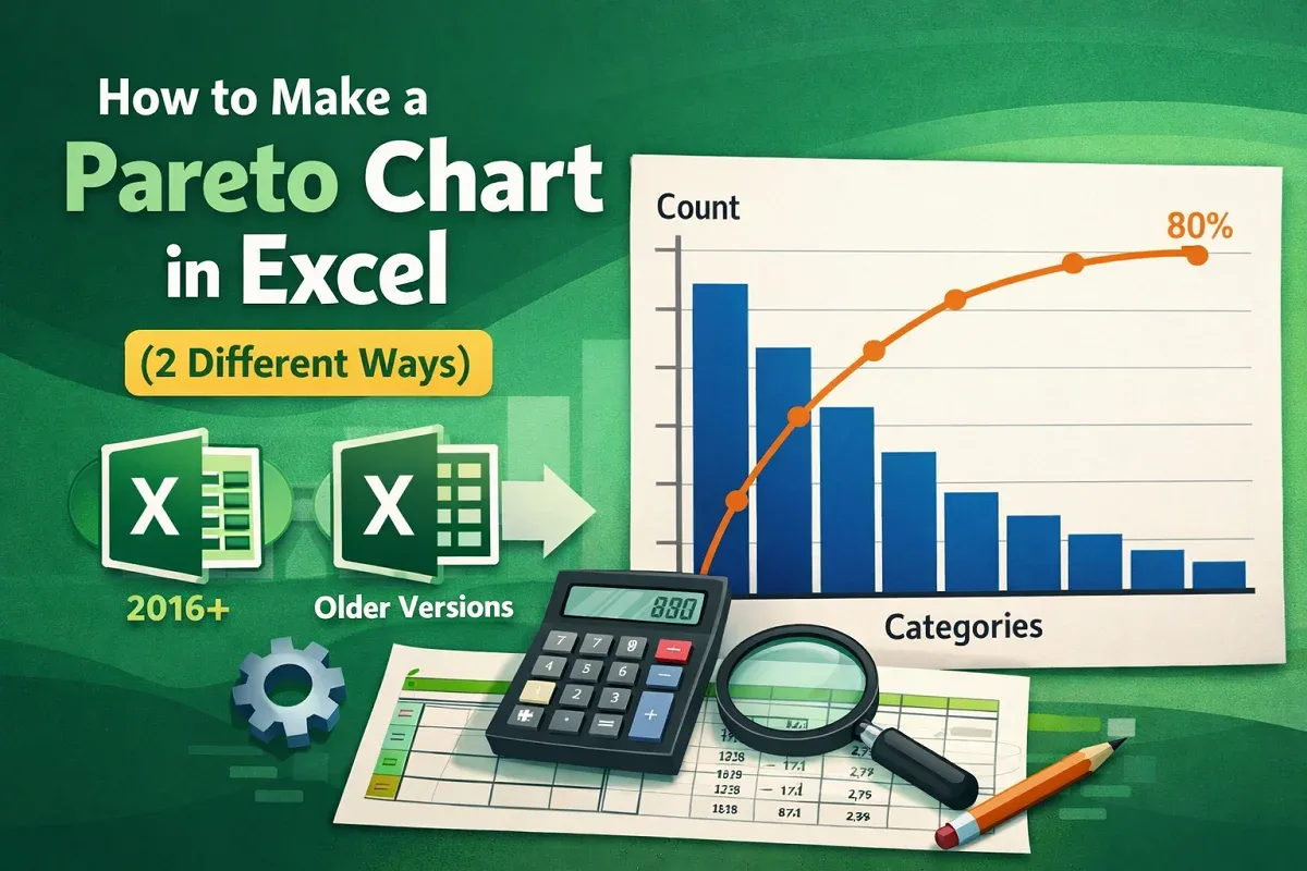
Learn how to make a Pareto chart in Excel using the built-in tool in newer versions or by manually creating one in older Excel versions.
![[Fixed] Histogram Bin Range Not Working in Excel](https://pub-b39c974f4c124a36a2fb517be38076ec.r2.dev/images/2026/08/featured-image-excel-histogram-bin-range-not-working-2-61a2aa04.webp)
Fix the “Histogram bin range not working” issue in Excel by using correct formats, clearing errors or, adjusting axis settings.

Learn how to create a bin range in Excel using the Histogram tool, built-in histogram charts, or the FREQUENCY function for data grouping.
Learn how to make a radar chart in Excel by selecting your dataset, inserting the chart, and formatting it for clear data visualization.

Learn how to create a scatter plot with 3 variables in Excel by preparing data, inserting a bubble chart, adding labels & customizing axes.
Learn how to show both percentage and value in an Excel pie chart by adding and formatting data labels for clear & informative visualization.
Learn how to rotate a pie chart in Excel by adjusting the angle of the first slice in the Format Data Series pane for data presentation.

Learn how to change pie chart colors in Excel by manually filling slices, applying themes, using chart styles, or automating with VBA.

Learn how to create a Bar of Pie chart in Excel by selecting data, inserting the chart, adjusting the split & customizing labels and format.

Learn how to make a pie chart in Excel with words by selecting data, inserting the chart, adding category names & customizing its appearance.