Coloring a chart by value assigns a unique color to each data point according to its value. To change the chart color based on value in Excel, we need to split the source data into different series that will have different colors.
When different series have different colors, it improves the readability and clarity of the chart, highlights key information, and is better for overall representation.
To change the chart color based on its values in Excel,
➤ Split the original data source into different series by using the formula:
=IF(AND(value>=min_value,value<=max_value),value,””)
➤ Select these series to plot a chart.
➤ Plot a bar or column chart.
While Excel doesn’t directly have a process to assign different colors in a chart based on values, we can mimic the process by creating different series and plotting them. In this tutorial, we’ll cover how to change the chart color based on value in Excel.
Download Practice WorkbookSteps to Change Chart Color Based on Value in Excel
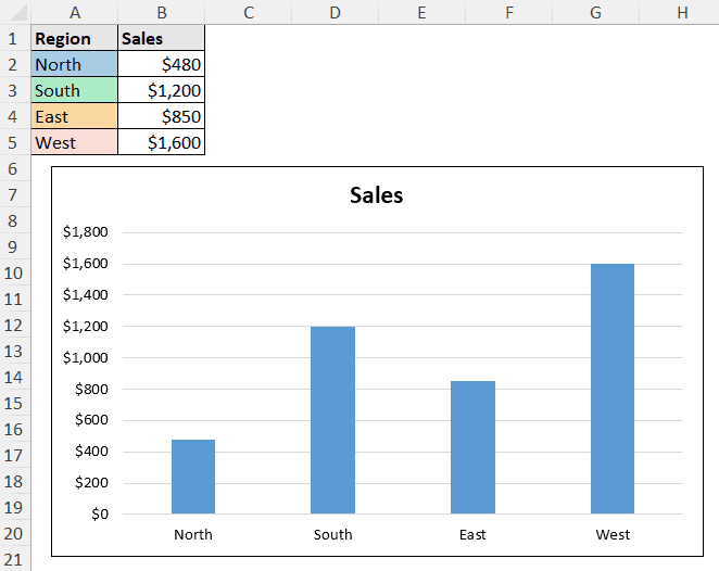
A single series can have only one color in Excel charts. We can split the data of the series into multiple series based on different ranges. If we plot a chart based on those split ranges, Excel will treat them as different series and have different colors for them.
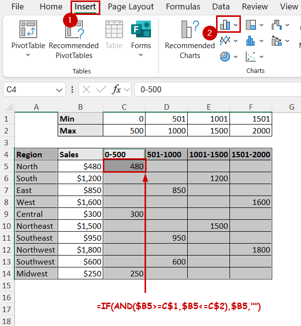
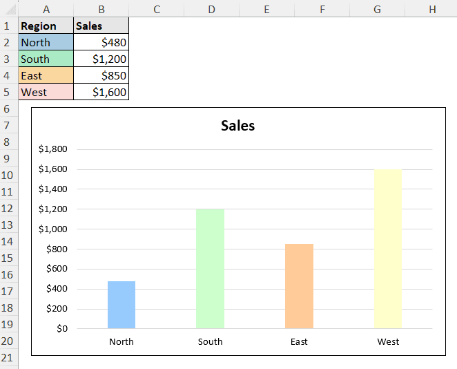
Let’s take the following data as an example. It shows the sales value across different regions.
We will first split the regional sales into different categories based on their values.
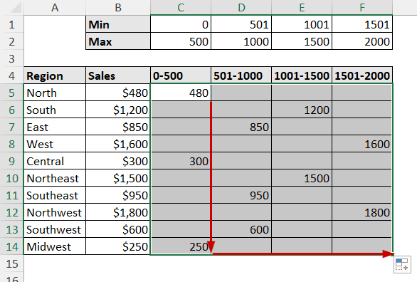
Step 1: Separate the Values Using Formulas
We can use the AND function to filter values matching the minimum and maximum criteria. Combine that with IF, and we can change the TRUE and FALSE values to their actual form.
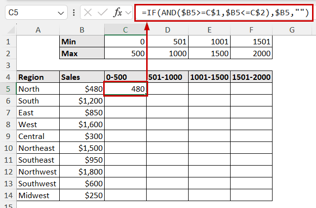
➤ Select the output cell and insert the following formula:
=IF(AND($B5>=C$1,$B5<=C$2),$B5,””)
➤ Replicate the formula for the rest of the cells.
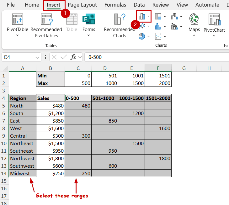
Step 2: Plot the Chart
Now that we have different values in different ranges, they can work as different series in a chart. Use the output cells as the data source for the chart, and that will do the job.
➤ Now select the categories and value buckets individually by holding Ctrl and dragging.
➤ Then go to Insert >> Charts (groups) >> Insert Column or Bar Chart.
➤ The chart will be visible on the sheet, where different values will have different colors based on the range.
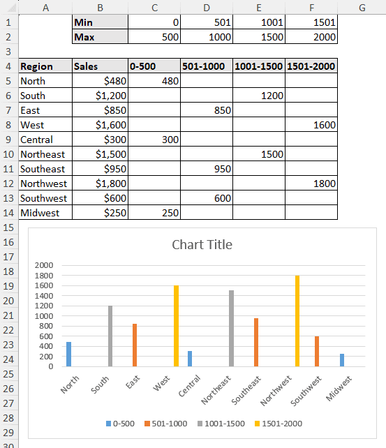
➤ Make some formatting to the chart to make it presentable.
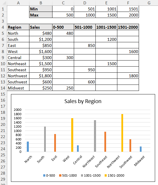
Column or Bar charts are the most suitable for these types of color sorting. This is because we can plot different lines for different series.
Change Chart Color Based on Cell Color
Here is an interesting one: you can change the color of a series in a chart based on the source’s cell color.
Extracting the color code from each cell and assigning it to charts requires some VBA.
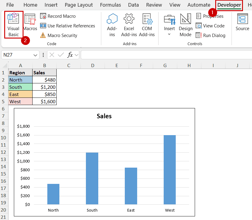
You need the Developer tab enabled on your ribbon. If you don’t have that, right-click on the ribbon >> select Customize the Ribbon >> check Developer in the tab’s list.
Steps:
➤ Plot a Bar or Column chart.
➤ Go to Developer >> Code (group) >> Visual Basic.
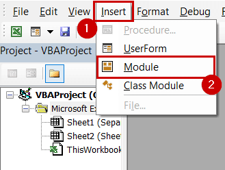
➤ Select Insert >> Module.
➤ Insert the following code in the module:
Sub MatchChartColorsToCellColors()
    With Sheets("Sheet1").ChartObjects("Chart 1").Chart.SeriesCollection(1)
        Set cellRange = ActiveSheet.Range(Split(Split(.Formula, ",")(1), "!")(1))
        For counter = 1 To cellRange.Cells.Count
            .Points(counter).Format.Fill.ForeColor.RGB = ThisWorkbook.Colors(cellRange.Cells(counter).Interior.ColorIndex)
        Next counter
    End With
End Sub
➤ Press F5 on your keyboard to run the code.
The chart’s series color will match the cell colors.
Notes:
In With Sheets(“Sheet1”).ChartObjects(“Chart 1”).Chart.SeriesCollection(1):
➤ We have assumed the sheet’s name is “Sheet1”. If it isn’t, either use your sheet’s name in the string or change the sheet name to Sheet1.
➤ The same goes for “Chart 1”. If you have created multiple charts in the same sheet, Excel will keep naming them Chart 2, Chart 3, and so on. Either change the chart name back to Chart 1 or change the object name in the code to match your chart’s name.
FAQ
Can I apply conditional formatting to charts?
As of the latest version of Excel, you can’t directly apply conditional formatting to charts.
However, you can simulate the effect by splitting the data into multiple series, as we have mentioned in the article. Or, you can use VBA codes to match your criteria.
How do I create a gradient color scale in a chart?
You can manually select a gradient fill on each series in bar or column charts. Double-click on a bar to open the Format Data Point pane and change the fill options there. Make sure you have only one bar selected before making the edits.
Keep in mind that the process is completely manual, and the color doesn’t change with values in this process.
How do I color a line chart based on thresholds?
You can split the different values into different segments, in the same way, for certain thresholds.
After the separation, plot the chart and assign different colors for each segment.
How do I color positive and negative values differently?
Using the same method, split the data into two series (positive and negative). You can use a simple IF formula for that, for example, IF(value>0, value, “”) and IF(value<0, value, “”) for these two columns.
Then, plot the output ranges in a chart and set different colors for them.
Concluding Words
In this tutorial, we have covered how to change the chart color based on value in Excel. To do that, we have separated the values into different ranges. This creates some custom series from a bunch of values using formulas. We have used these series for plotting so that the chart has different colors based on value.
Feel free to download the practice workbook and give us your feedback.