
Error bars are the horizontal or vertical lines in each data point that show the uncertainty of the data. Adding error bars in Excel indicates adding those margins of error in the charts.
Error bars show the confidence of each point. They can also be used to compare variability between different groups and indicate data reliability.
To add Error Bars in an Excel chart, what you have to do is:
➤ Select the chart.
➤ Select Chart Element >> Error Bars.
➤ Then select the type of error bar.
Error bars can be of four types: standard deviation, standard error, confidence intervals, and percentage or fixed value.
In this tutorial, we are going to demonstrate how to add error bars in Excel. We are going to use the Chart Elements button and the Chart Design tab to add the error bars.
Also, we are going to show how to open and work with the Format Error Bars pane to modify and add custom error bars and custom bars for each series.
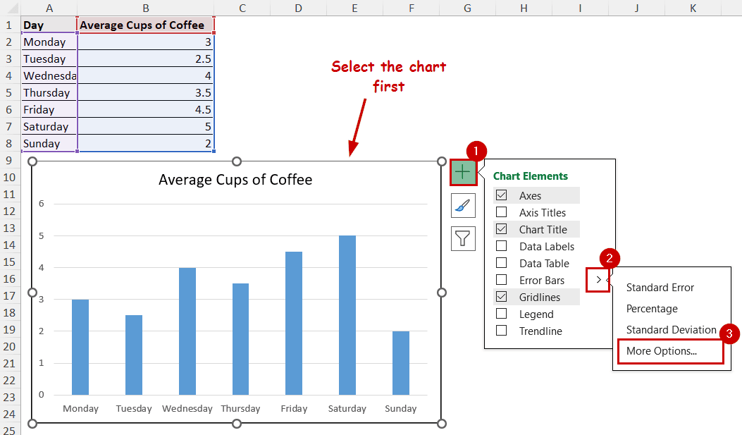
Download Practice WorkbookUsing the Chart Elements Button to Add Error Bars
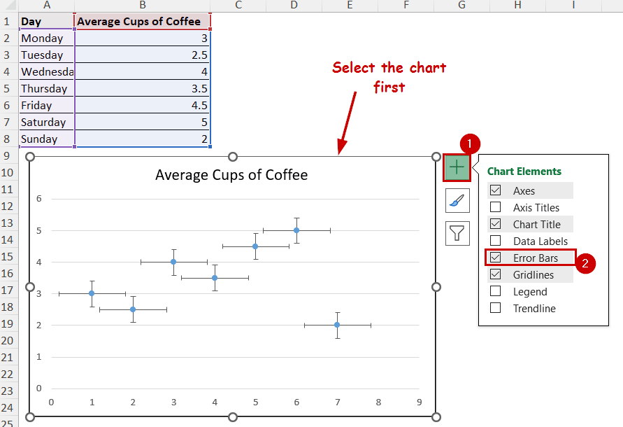
The Chart Element button is the plus icon that pops up after selecting a chart.
It appears in the top-right position of the chart, usually at the top of other buttons. The button provides easy access to add, modify, or remove different elements of the chart.
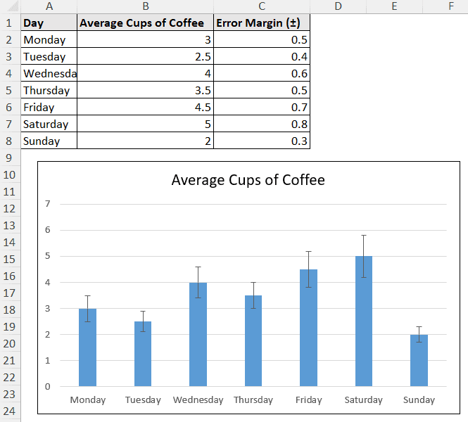
This is the column chart we are using for demonstration. The chart contains data on the average cups of coffee consumed by a guy across a week.
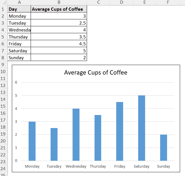
We are going to add error bars using the Chart Element button in this chart.
Steps:
➤ Select the chart.
➤ Click on the Chart Elements button (the “+” icon at the top-right).
➤ Check Error Bars.
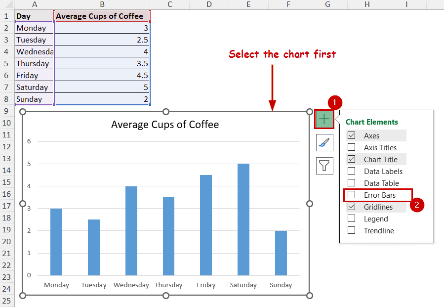
The error bars will be added to the chart.
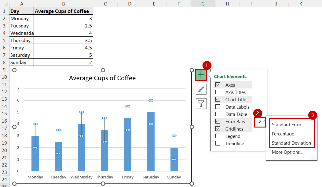
Note: You can click on the right arrow beside the Error Bars option to select the type of error bar you want to add.
Customize Error Bars with the Chart Design Tab
After selecting a chart, two additional tabs appear on the ribbon- Chart Design and Format.
The Chart Design tab has the same element options available in the Chart Elements button. We can use this tab to add error bars in Excel.
Steps:
➤ Select the chart.
➤ Go to Chart Design >> Chart Layouts (group) >> Add Chart Element.
➤ Select Error Bars in the dropdown.
➤ Then select the type of error bars.
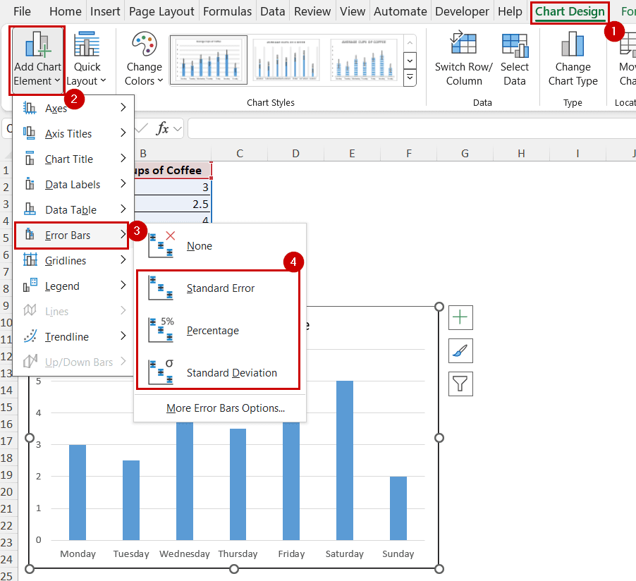
This will give the same results as the previous methods, as they are the same options accessed in different ways.
How to Add Custom Error Bars in Excel
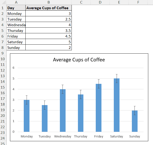
Checking the Error Bars option from the Chart Elements usually adds standard error bars.
Although you can change them to percentage or standard deviation directly, Excel has more options to add standard and customized error bars.
Steps:
➤ Select the Chart.
➤ Go to Chart Elements >> Error Bars >> More Options.
The Format Error Bars pane will open up.
➤ Under the Error Bar Options, select Fixed Value, Percentage, or Standard Deviations and their amount.
You can find these options in the Error Amount section.
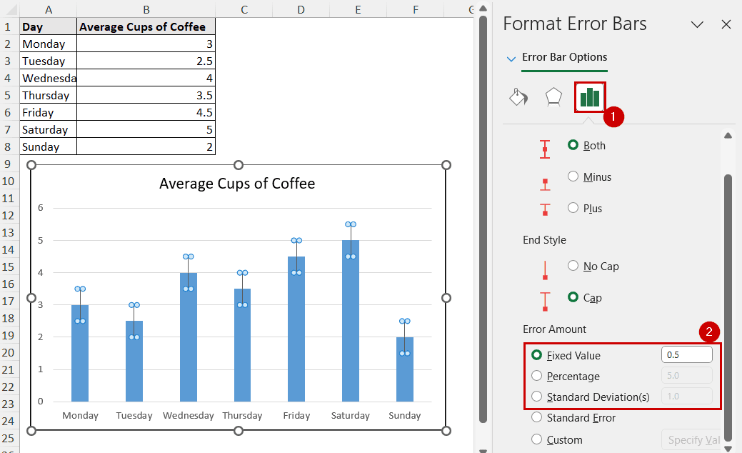
With these options, you can have more control over the error bars you are adding.
Add Individual Error Bars for Each Data Series
Generally, Excel adds error bars of the same length to all columns or data points.
In practical cases, some measurements have more consistent results than others. So, some charts need error bars of different lengths for different data points.
Let’s assume we have different error margins for each day in our data source.
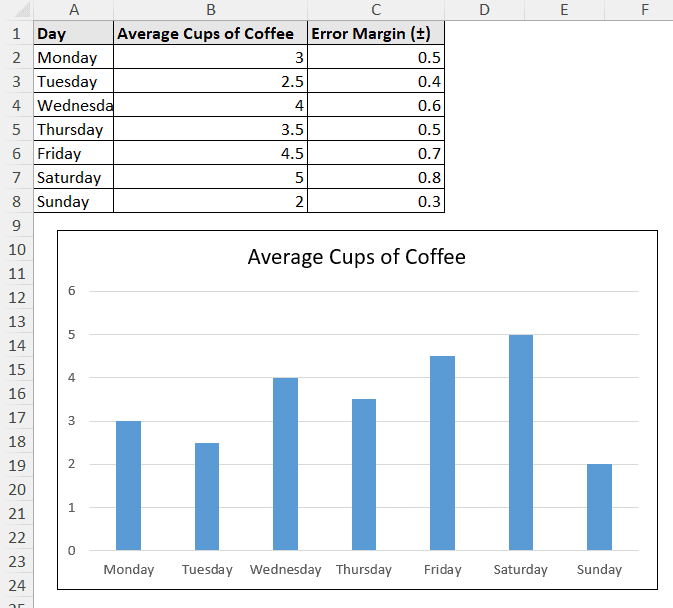
This should result in different lengths of error bars for each day.
You can add them using the Custom measurement from the Format Error Bar planes.
Steps:
➤ Select the chart.
➤ Select Chart Element >> Error Bars >> More Options.
➤ In the Format Error Bars pane, select Custom and then Specify Value under the Error Amount.
➤ Select positive and negative error values to match with each series.
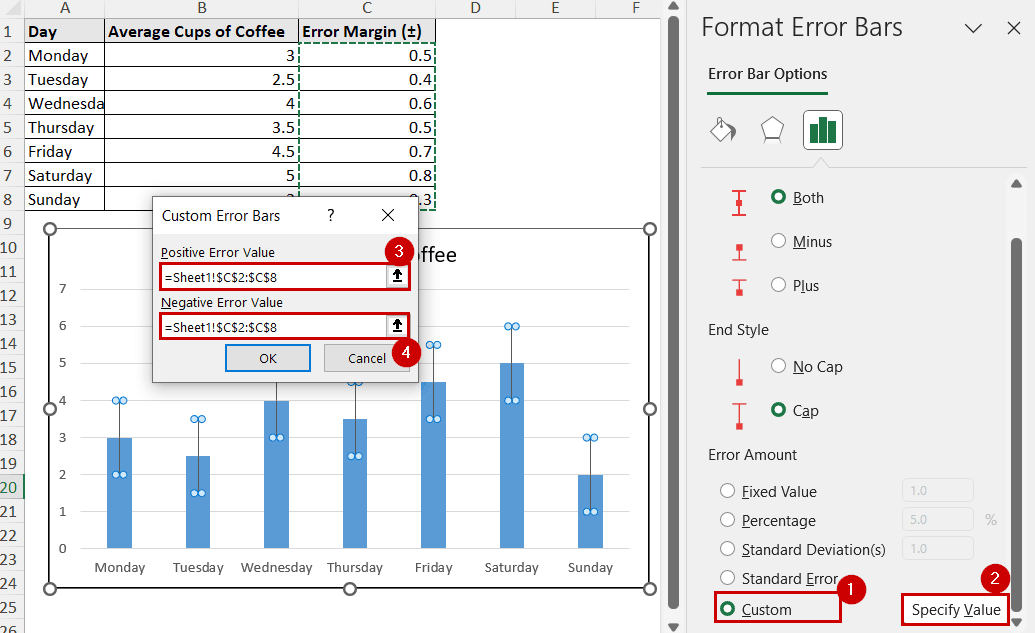
➤ Click on OK.
The error bars will have different lengths for each series now.
Note: We have used the same values for positive and negative values here. You can use different series for each one to have different lengths of error bars on the positive and negative sides.
Adding Horizontal Error Bars for Improved Visuals
Most of the charts have default vertical error bars. Bar charts have default horizontal error bars.
Scatter and bubble charts have both horizontal and vertical error bars.
In these types of charts, you need to add error bars and remove the ones you don’t need (like vertical ones).
This is a scatter plot from our original data source.
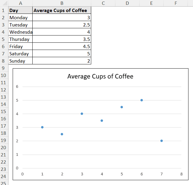
We are going to demonstrate how to add horizontal error bars in Excel in this chart.
Steps:
➤ Add error bars from any of the methods as usual.
For example, Chart Elements >> Error Bars. It will add both horizontal and vertical error bars.
➤ Now select a vertical bar and press Delete on your keyboard.
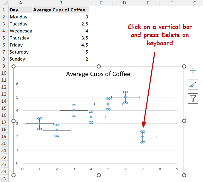
The chart will now only have horizontal error bars.
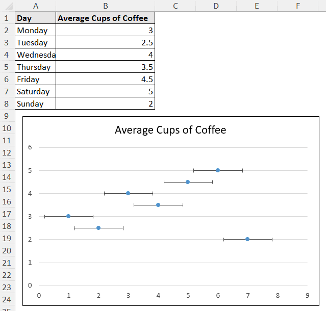
You can modify these bars to different error values or other custom values, as demonstrated in other methods too.
Note: You can use the context menu to delete the vertical bars, too. Right-click a vertical bar and select Delete from the context menu.
FAQ
How do I delete error bars in Excel?
You can select the error bars and press Delete on your keyboard to delete the error bars directly.
Or, you can use the context menu. Right-click on an error bar and select Delete.
How do I add percentage or standard deviation error bars in Excel?
Instead of just checking Error Bars from the Chart Element button, click on the arrow beside it and select Percentage or Standard Deviation. This will add the type of error bars you want in the chart.
You can select More Options to have more control over the percentage and standard deviation amount.
What is the difference between standard deviation error bars and standard error bars?
The standard deviation error bars show how each data point is spread around an average or mean.
Meanwhile, the standard error bars indicate how much it is reliable the data points are in the sample. The shorter the bar, the higher the confidence of the sample.
Conclusion
In this article, we have covered how to add error bars in Excel. We have demonstrated how to use the Chart Elements button and the Chart Design tab to add error bars. Adding custom error bars and error bars of different lengths for each data point are also covered. We have also demonstrated how to add and keep the horizontal error bars.
Feel free to download the workbook and give us your feedback.