Scatter plots are commonly used to visualize the relationship between two numeric variables. When a third variable needs to be included, Excel offers a practical solution through the Bubble Chart. This chart functions like a scatter plot but incorporates the third variable by adjusting the size of each data point, effectively adding a third dimension.
This guide explains how to create a scatter plot with three variables in Excel using a Bubble Chart. It covers step-by-step instructions with a sample dataset, shows how to format and customize the chart, and provides tips for improving readability and presentation.
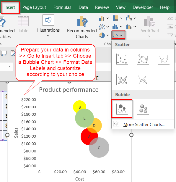
Steps to create a scatter plot with 3 variables in Excel:
➤ Use a dataset with three numeric columns such as one for X-axis, one for Y-axis, and one for bubble size.
➤ Insert a Bubble Chart to represent the third variable visually.
➤ Customize chart labels, colors, and axes for better interpretation and design clarity.
Steps to Create a Scatter Plot with 3 Variables in Excel
Follow the steps below to create a scatter plot that visually represents three numerical variables using Excel’s Bubble Chart. This method helps you compare data points not just by position, but also by scale. We’ll demonstrate the process using a sample dataset involving product performance where we compare cost, sales volume, and profit margin.
Step 1: Prepare Your Data
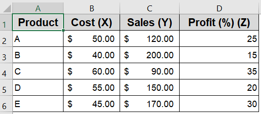
Before creating a scatter plot with three variables in Excel, it’s essential to organize your data correctly. Bubble charts require exactly three numerical inputs: one each for the X and Y axes, and one for the bubble size. Proper structure ensures Excel can map your data accurately without misplacing categories or distorting the chart layout. Keep your dataset clean, numerical, and aligned in adjacent columns to avoid errors during chart creation.
Steps:
➤ Make sure your numeric data is arranged in three adjacent columns, such as Cost, Sales, and Profit Margin.
➤ Do not include the product name column (e.g., Column A) during chart insertion. Only select columns B to D that contain the numerical values.

Step 2: Insert a Bubble Chart
Excel doesn’t offer a direct “3D scatter plot” option, but the Bubble Chart is its built-in alternative. It visually resembles a scatter plot while letting you encode a third variable using the size of each bubble. This makes it ideal for representing multivariate relationships which allows you to visualize not just position but also scale and influence. Once your data is ready, inserting a bubble chart is straightforward using Excel’s chart tools.
Steps:
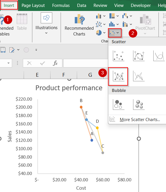
➤ Select the data range B2:D6, excluding any column headers.
➤ Go to the Insert tab at the top of the Excel ribbon.
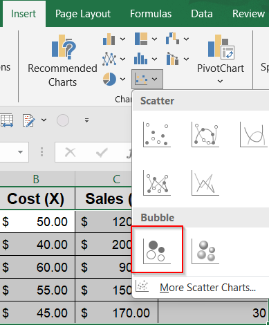
➤ Click the Insert Scatter (X, Y) or Bubble Chart dropdown in the Charts group.
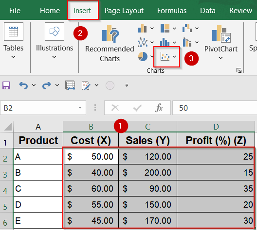
➤ Choose Bubble Chart from the available options.
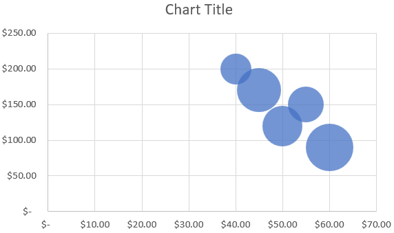
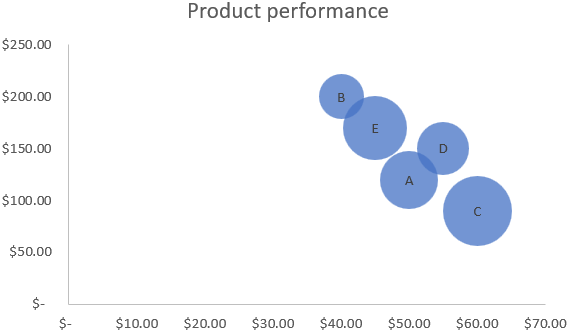
Excel will now insert a bubble chart where X-axis shows the Cost, Y-axis shows the Sales and Bubble size represents the Profit Margin.
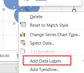
Step 3: Add Data Labels and Format the Chart
Adding data labels is a crucial step in making your bubble chart informative and easy to interpret. By default, Excel does not label each bubble, which can make it difficult to tell which data point corresponds to which category. By linking labels to the product names in your dataset, you give viewers instant clarity. You can also modify the label content and placement to reduce clutter and highlight key points.
Steps:
➤ Click on any bubble to select the entire data series >> Right-click >> Choose Add Data Labels.
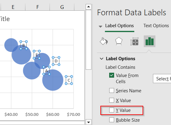
➤ Right-click again on any label >> Select Format Data Labels to open the formatting pane.
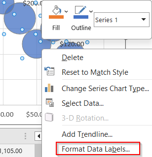
➤ Check Value From Cells >> Select the range A2:A6 to display the corresponding product names and click OK.
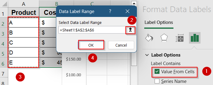
➤ Optionally, uncheck Y Value if you want to hide the numeric Y-axis label and keep only the product names.
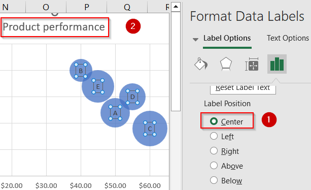
➤ Scroll down and adjust Label Position to Center and change Chart Title to Product Performance for better clarity.
With labels added, each bubble now clearly shows which product it represents, enhancing the chart’s usability.
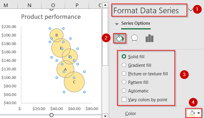
Step 4: Customize the Axes and Bubbles
To create a polished and professional chart, it’s important to refine the appearance of both the axes and the bubbles. This includes adjusting the scale for better spacing, changing bubble colors to align with branding or themes, and adding clear chart titles. These final touches help make your chart more visually appealing and easier to read, especially when presenting to others or printing your report.
Steps:
➤ Right-click on either axis (horizontal or vertical) >> Choose Format Axis.
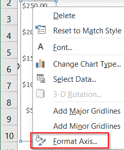
➤ Adjust parameters like minimum and maximum values, tick marks, and intervals.

➤ Click on any bubble >> Select Format Data Series >> Change the Fill color to customize each bubble’s appearance.
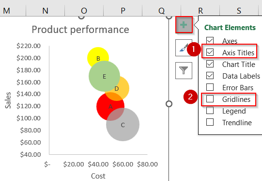
➤ Go to the Chart Elements (+) button >> Add clear Axis Titles by selecting the chart >> Check the box and edit the titles for clarity.
➤ Uncheck Gridlines for better visual appearance.
➤ If you wish, you can also change the chart type to a standard scatter plot from the Insert tab and adjust the label position accordingly.
With these enhancements, your bubble chart will clearly communicate three dimensions of data in a compact, insightful visual.
Frequently Asked Questions
Can Excel create a 3D scatter plot?
Excel does not support true 3D scatter plots where all three variables are spatially distributed. However, using a Bubble Chart is the closest workaround which allows you to display three numeric dimensions effectively.
How do I choose which column represents which variable?
To assign variables in a 3-variable scatter plot, use the X-axis for the independent variable, the Y-axis for the dependent variable, and the bubble size to represent a third metric such as profit or quantity.
Can I add a fourth variable to the scatter plot?
Excel charts are limited to 3 numeric dimensions in a bubble chart. To represent a fourth variable, you might use bubble color or data labels creatively, but that requires manual formatting and legend creation.
How do I avoid overlapping bubbles in my chart?
Try increasing the chart size or adjusting the bubble scale in the Format Data Series pane. Alternatively, tweak the axis limits to reduce congestion.
Why are my bubble sizes not accurate?
Excel interprets the bubble size column as area, not radius. This can skew perception if values vary widely. Normalize the third variable (e.g., scale to 1–100 range) for better balance.
Wrapping Up
In this tutorial, we covered how to create a scatter plot in Excel with 3 variables by using a Bubble chart. This method allows you to visualize two variables using X and Y axes, while representing a third dimension through bubble size. While it isn’t a true 3D scatter plot, it provides a clear and insightful view of how three numeric variables relate to one another. Feel free to download the practice file and share your feedback.

