A matrix in Excel is a structured arrangement of values in rows and columns which is similar to a table and often used for comparing data points, analyzing relationships, or summarizing large datasets. Whether you’re visualizing sales by month, mapping concepts, or summarizing data, Excel provides multiple ways to create a matrix that suits your purpose.
In this article, we’ll cover multiple effective methods to build a matrix in Excel using a basic data grid, SmartArt graphics, PivotTables, Bubble Matrix Chart, and Quadrant Matrix Chart for analyzing performance zones. We’ll also provide a sample dataset to help you follow along. Let’s get started.
Steps to create a matrix in Excel:
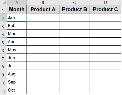
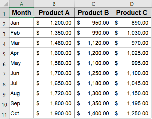
➤ Open a new Excel worksheet and start entering your data directly.
➤ In column A (from A2 to A11), list the months sequentially to represent your timeline.
➤ Add product names as headers in row 1 across columns B to D to categorize sales data by product.
➤ Apply bold formatting to the header row and add borders around your data range to improve clarity and readability.
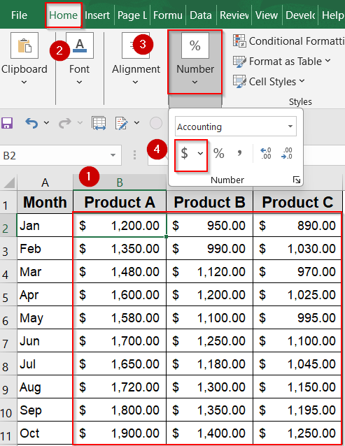
➤ Fill in the sales figures for each month and product in the corresponding cells (B2:D11).
➤ You can also format them as currency figures by going to the Home tab and clicking the $ sign under the Number group.
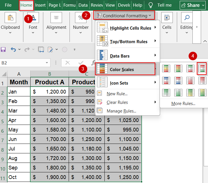
➤ Use Conditional Formatting from the Home tab to highlight performance differences using Color Scales or Data Bars for instant visual insights.
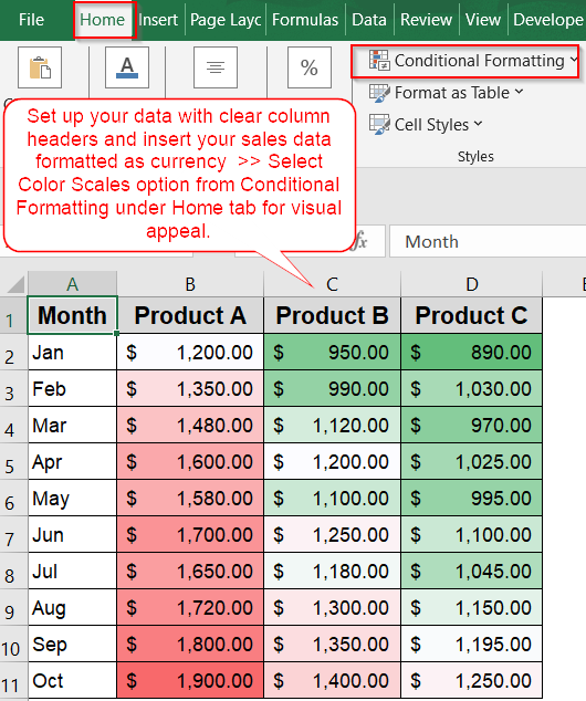
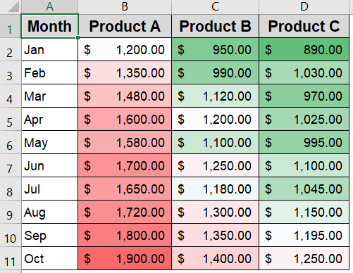
Build a Clear Monthly Sales Grid Matrix in Excel for Easy Comparison
This method guides you to create a well-structured grid matrix displaying monthly sales data for three products such as Product A, Product B, and Product C over ten months. The output is a clean and organized table from scratch that helps you instantly compare sales performance across products and spot trends over time with ease.
Steps:
➤ Open a new Excel worksheet and start entering your data directly.
➤ In column A (from A2 to A11), list the months sequentially to represent your timeline.
➤ Add product names as headers in row 1 across columns B to D to categorize sales data by product.
➤ Apply bold formatting to the header row and add borders around your data range to improve clarity and readability.
➤ Fill in the sales figures for each month and product in the corresponding cells (B2:D11).
➤ You can also format them as currency figures by going to the Home tab and clicking the $ sign under the Number group.
➤ Use Conditional Formatting from the Home tab to highlight performance differences using Color Scales or Data Bars for instant visual insights.
You now have a traditional 10×3 matrix where each row shows monthly sales data across three product types.
Create Conceptual Matrices Using SmartArt in Excel for Visual Clarity
This method leverages Excel’s SmartArt feature to build visually appealing matrix diagrams ideal for illustrating relationships, priorities, or categories rather than numerical data. The output is a clear, customizable visual matrix which is perfect for presentations, planning, or brainstorming such as a risk assessment grid that communicates impact and likelihood levels at a glance.
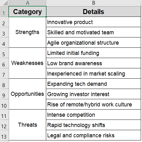
This is the sample dataset we will be using:
Steps:
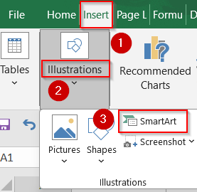
➤ Go to the Insert tab on the Ribbon and click on SmartArt.
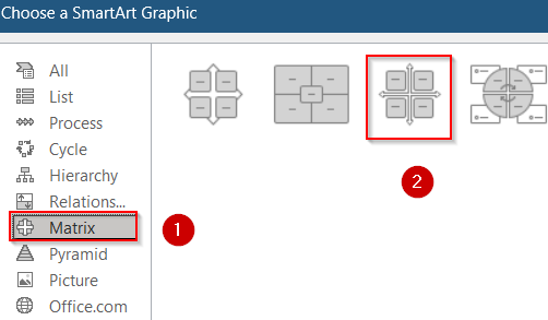
➤ From the SmartArt gallery, select Matrix from the left-hand menu, then choose a layout like “Grid Matrix” or “Basic Matrix” and click OK to insert it into your worksheet.
➤ Click inside each SmartArt box to add descriptive text relevant to your context such as labels like Strengths, Weaknesses, Opportunities and Threats to display. Assign different fill colors to each box for easier visualization.

This approach creates a visually structured matrix diagram that helps clearly communicate relationships or classifications without relying on numeric data.
Build a Dynamic Sales Matrix with PivotTables in Excel for Interactive Analysis
This method uses PivotTables to create a flexible, dynamic matrix that summarizes your sales data by month and product. The output is an interactive table that automatically totals and arranges sales figures, allowing you to easily explore, filter, and analyze trends across multiple dimensions without manual updates.
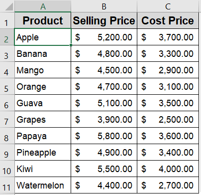
We’ll use this product sales dataset, where rows represent months and columns represent different product categories. This layout helps us build matrices that show comparisons across both dimensions.
Steps:
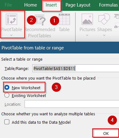
➤ Select your entire dataset (A1:D11), then go to the Insert tab and click PivotTable.
➤ Choose to place the PivotTable in a new worksheet and click OK.
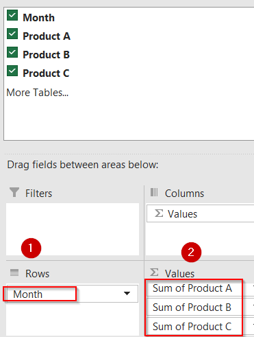
➤ In the PivotTable Fields pane, drag the Month field into the Rows area.
➤ Drag Product A, Product B, and Product C fields into the Values area; ensure each value field is set to “Sum” to calculate total sales.
➤ Optionally, drag the Product fields into Columns and the sales data into Values if your dataset is structured differently (e.g., vertical list).
➤ Apply PivotTable Design options such as Banded Rows or Tabular Layout from the Design tab to enhance readability and visual appeal.
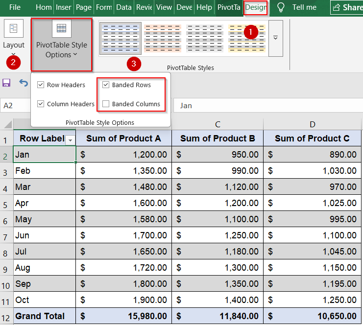
This matrix automatically updates as your source data changes, and you can add filters or slicers to interactively drill down into specific months or products.
Create a Matrix-Style Bubble Chart for Multi-Metric Comparison
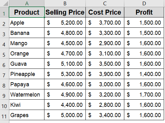
This method is ideal if you want to compare multiple metrics like Selling Price, Cost Price, and Profit per product using a single, dynamic visual. A matrix-style bubble chart places each product on an X-Y grid (e.g., Cost vs. Selling Price), while the bubble size reflects an additional value such as Profit. The output allows you to evaluate product positioning and profitability at a glance.
This is the sample dataset we will be using:
Steps:
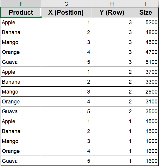
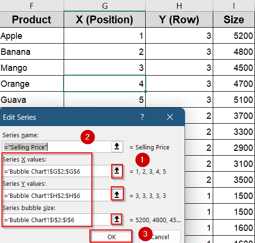
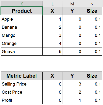
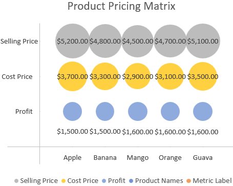
➤ First, assign each product a unique serial number from 1 to 5 (or up to how many products you have). This number determines the product’s horizontal position along the X-axis, arranging the bubbles from left to right in order.
➤ Next, use fixed helper values of 3, 2, and 1 for the Y-axis to separate the three rows such as 3 for Selling Price (top row), 2 for Cost Price (middle row), and 1 for Profit (bottom row). This way, the bubbles for each metric line up neatly in their respective rows.
➤ Finally, prepare the data for each metric separately by selecting the X positions (serial numbers), the corresponding Y value (3, 2, or 1), and the actual values for that metric as the bubble sizes. For example, for Selling Price, use Y=3 and the Selling Price values as sizes. Then do the same for Cost Price (Y=2) and Profit (Y=1) to create three distinct data series for your chart.
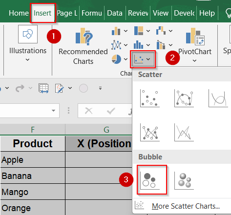
➤ Now select your helper range from column F to I.
➤ Go to the Insert tab >> Choose the Bubble Chart from the Insert Scatter menu.
➤ Excel will insert a basic bubble chart. Click on Select Data from the Chart Design tab.
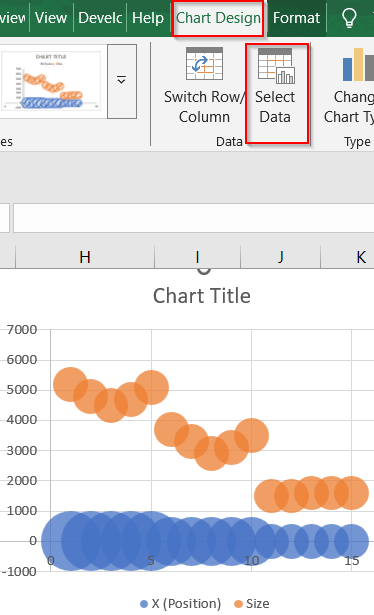
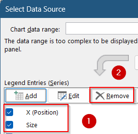
➤ Select the existing series and hit Remove under Legend Entries.
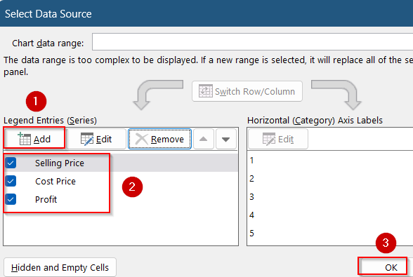
➤ Click on Add series for each metric with the correct X, Y, and size values from the helper table. Then, click OK.
➤ Repeat for all three metrics, placing them on different Y positions so they appear in separate matrix rows.
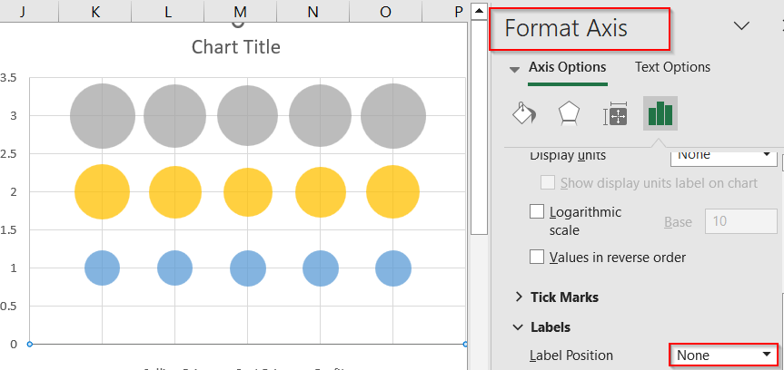
➤ Right-click axes >> Click Format Axis >> Set Label Position to None to hide labels for a cleaner layout.
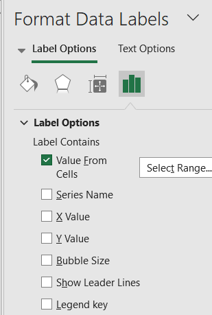
➤ Finally, right-click bubbles >> Open Format Data Labels >> Enable Bubble Size and hide Y-values for clarity. Optionally, uncheck Show Leader Lines as well.
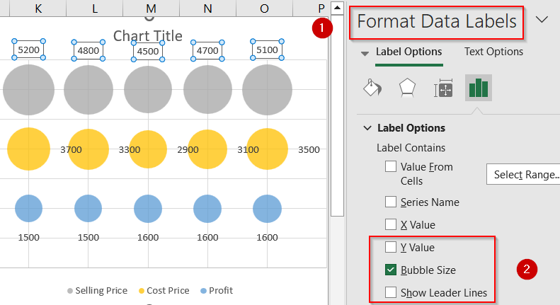
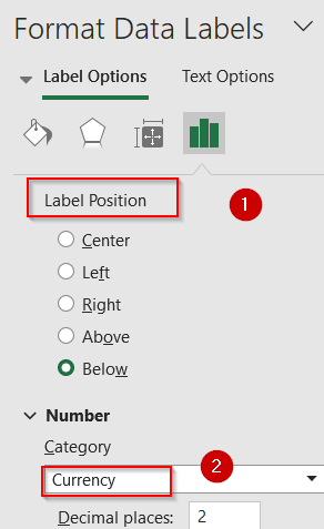
➤ Scroll down to Label Position and select your preferred one. Under the Number section, choose a field like Currency.
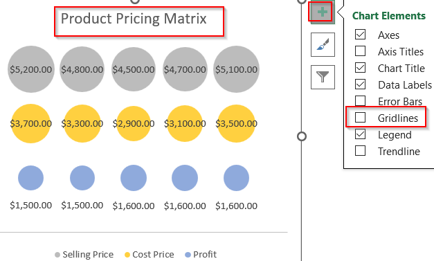
➤ Edit Chart Title and click on Chart Elements (+) icon to turn off Gridlines for better visibility.
➤ Add product names (X-axis) and metric labels (Y-axis) using bubble labels or extra helper series with small invisible values.
➤ Then, go to Select Data and add two series using the helper tables. Click OK to save changes.
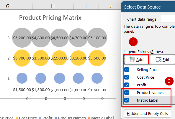
➤ Go to Format Data Labels and check Value for cells to select respective labels for both axes. Uncheck any other boxes checked and set Label Position as you like.
This creates a clean matrix with three horizontal rows with each row showing how the 5 products compare on Selling Price, Cost Price, and Profit.
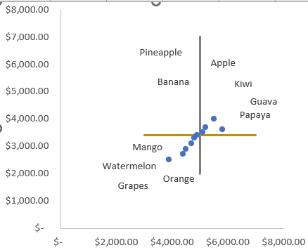
Build a 4-Quadrant Matrix Chart to Segment Product Performance
Use this method when your goal is to categorize products into four distinct performance zones based on two critical metrics such as high vs. low cost and high vs. low selling price. A 4-quadrant matrix chart breaks the visual space into four logical zones (e.g., low-cost/high-price, high-cost/low-price, etc.), helping you quickly identify which products are overperforming or underperforming. The output gives you strategic insights at a category level.
This is the dataset we will be using:
Steps:
➤ Select the Selling Price and Cost Price columns from your dataset.
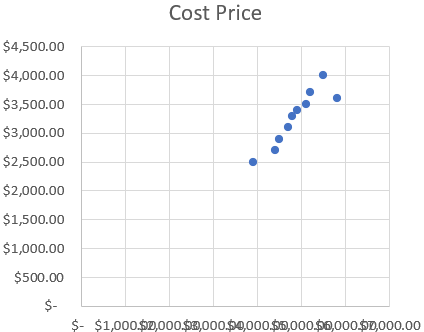
➤ Go to the Insert tab >> Click on Scatter Chart >> Choose Scatter with only markers.
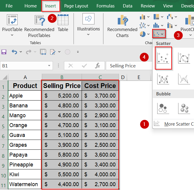
➤ Excel will plot each product as a data point. Now you’ll divide the chart into four performance zones.
➤ Estimate median or threshold values (e.g., SP = 5000, CP = 3400) to use as quadrant boundaries.
➤ Enter the Vertical Line Table anywhere in your sheet by setting both X values to 5000 (your Selling Price threshold), and choosing Y values that cover your chart’s full height (e.g., from 2000 to 7000). This ensures the vertical line spans the entire Y-axis range.
➤ Enter the Horizontal Line Table with both Y values set to 3400 (your Cost Price threshold), and X values spanning across your chart (e.g., from 3000 to 7000). This will draw a full-width horizontal line across the chart.
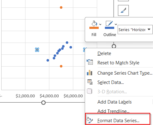
➤ Then, select the chart >> Go to the Chart design tab and click Select Data.
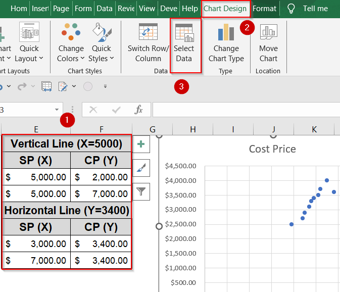
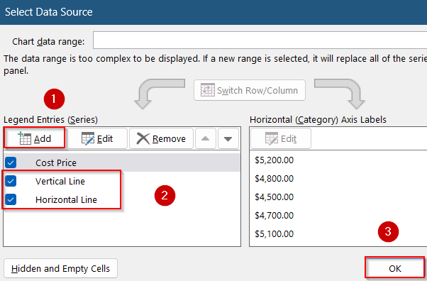
➤ Add each boundary line as its own series using two points (start to end). Click Add under Legend Entries to display the two new series.
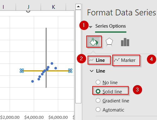
➤ Then, right-click the series markers and open Format Data Series.
➤ Format the boundary lines with solid colors and no markers for a clean quadrant split.
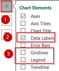
➤ Select the chart and click on the Chart Elements (+) icon. Uncheck Gridlines and Legend to reduce clutter and enable Data Labels.
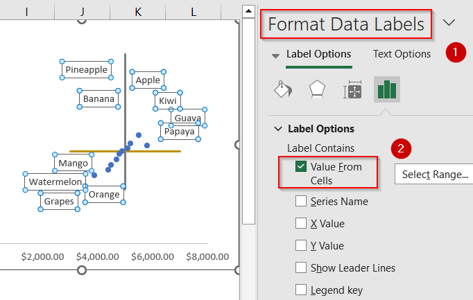
➤ Click on the plotted product points and go to Format Data Labels. Check Value From Cells to display product names and uncheck default Y values to avoid clutter.
➤ If your product names look clustered, move the labels around for a better fit. Temporarily enable Show Leader Lines for guidance.
Now each product is visually positioned within a quadrant, helping you identify which ones have high margins, low costs, or potential pricing issues.
Frequently Asked Questions
What is a matrix in Excel?
A matrix in Excel is a structured grid of numbers arranged in rows and columns, used for organizing data or performing mathematical calculations like multiplication, inversion, and transposition.
How do I transpose a matrix in Excel?
To transpose (flip rows and columns), use the TRANSPOSE function. Select an empty output range and type =TRANSPOSE(range). Then press Ctrl + Shift + Enter if needed, depending on your Excel version.
Can I perform matrix multiplication in Excel?
Yes, Excel allows matrix multiplication using the MMULT function. Just ensure the first array’s columns match the second array’s rows. Use Ctrl + Shift + Enter in older versions for accurate results.
What’s the difference between a table and a matrix in Excel?
An Excel table is a structured list with column headers and dynamic features, while a matrix is a fixed grid used for mathematical operations or comparisons between two variables across rows and columns.
Can I format a matrix like a heatmap?
Yes. Use Conditional Formatting, specifically Color Scales to apply gradient shading. This visually emphasizes value ranges, making trends, patterns, or outliers across your matrix much easier to identify and interpret at a glance.
Wrapping Up
In this tutorial, we learned three effective methods to create a matrix in Excel starting from building manual data grids to using visual SmartArt and dynamic PivotTables. We also showed how to create a Bubble Matrix Chart for a grid-style data comparison, and a Quadrant Matrix Chart for analyzing performance zones. Whether you’re comparing sales figures, visualizing concepts, or summarizing data, Excel offers flexible options to suit your matrix-building needs. Feel free to download the practice file and share your feedback.

