Excel is a great tool to use in a company or an organization to maintain staff information, reporting lines and defining roles. However, simply putting these data in a list does not suffice when it comes to complex relationships, duties and company hierarchy. Creating an organizational chart would be a great option to visually represent the structure of a company or a team. In this article, we will show you how you can transform basic data to an eye-catching, clear and organized chart.
➤ Go to Insert > Illustrations > SmartArt.
➤ In the Choose a SmartArt Graphic box, select Hierarchy and then pick a preferred Organizational Chart box.
➤ Copy and paste the list in the chart.
➤ Use Tab button or SmartArt Design Demote option to format and position the roles properly.
Excel has two great tools such as, the SmartArt graphics and the Microsoft Visio Add-in that can build professional charts from a normal list. We have discussed both of these methods on how to create an organization chart in Excel from a list with detailed instructions in this article.
Utilize SmartArt Feature to Create an Organizational Chart from a List
SmartArt Graphics is a built-in feature in Excel that can create professional looking charts for visualizing hierarchies, processes or relationships with a few clicks. It even offers pre-designed layouts that make it easy to build the chart without needing to manually draw the shapes or connections.
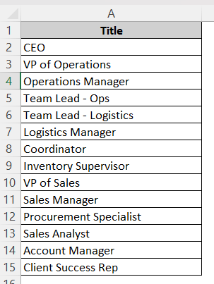
The dataset below contains the positions of the staff in a company maintaining their hierarchy order in the form of a list:
To create an organizational chart from this list using SmartArt, follow the steps below:
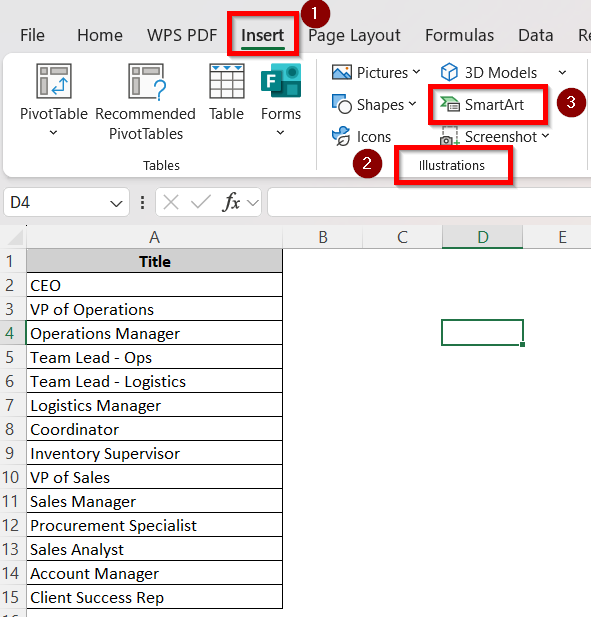
➤ Go to the Insert tab. In the Illustrations ribbon, select SmartArt.
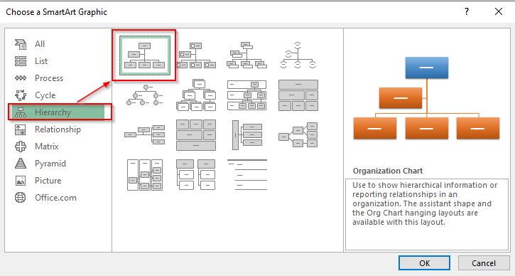
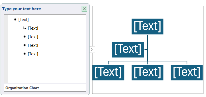
➤ A dialogue box titled Choose a SmartArt Graphic will pop up. Select Hierarchy from the options on the left and then the Organizational Chart block which is the very first figure. Click OK.
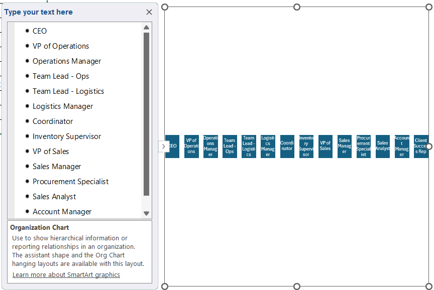
➤ The organizational chart will show up like this:
➤ Select the first text box on the left and press CTRL A to select all the texts.
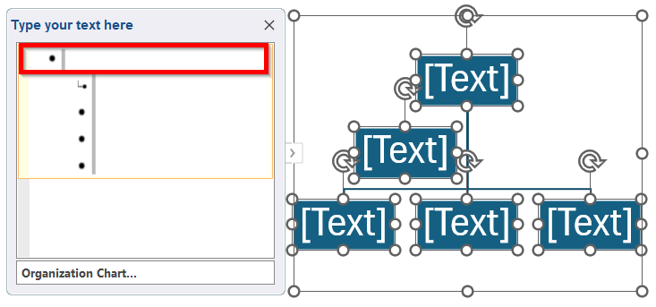
➤ Once they’re all selected, press Delete . The organizational chart will now become empty devoid of all shapes and texts.
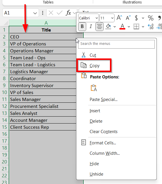
➤ Now, select column A where the list is and right click on it. Select Copy.
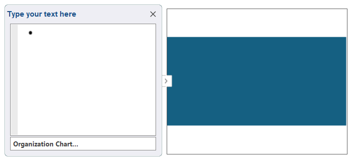
➤ Now, select the Textbox in the chart again and right click on it. Then select the Paste option.
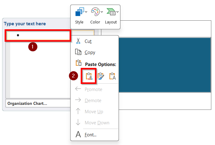
➤ The entire list will now be added to the organizational chart.
Once you have made it to this part, now you need to organize the chart according to the hierarchy. You can do this part in more than one way. We have discussed both below for you to choose whichever method you prefer.
Use TAB Button to Organize the Chart
It is the easiest way to organize a chart as pressing the Tab button once will add a position under the previous position. Let’s take a look at how you can do this-
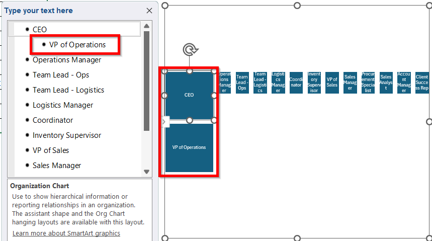
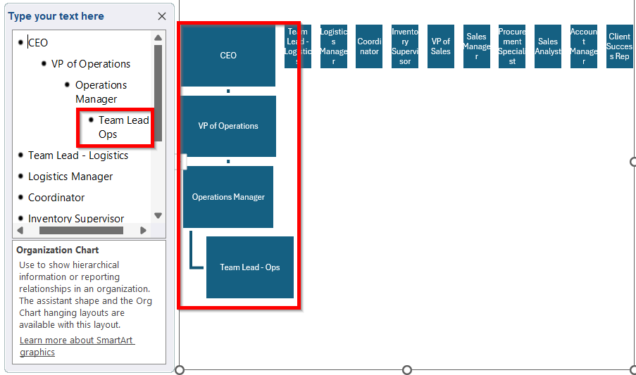
➤ Select the VP of Operations and press the TAB button once. It will be added one step under the CEO position.
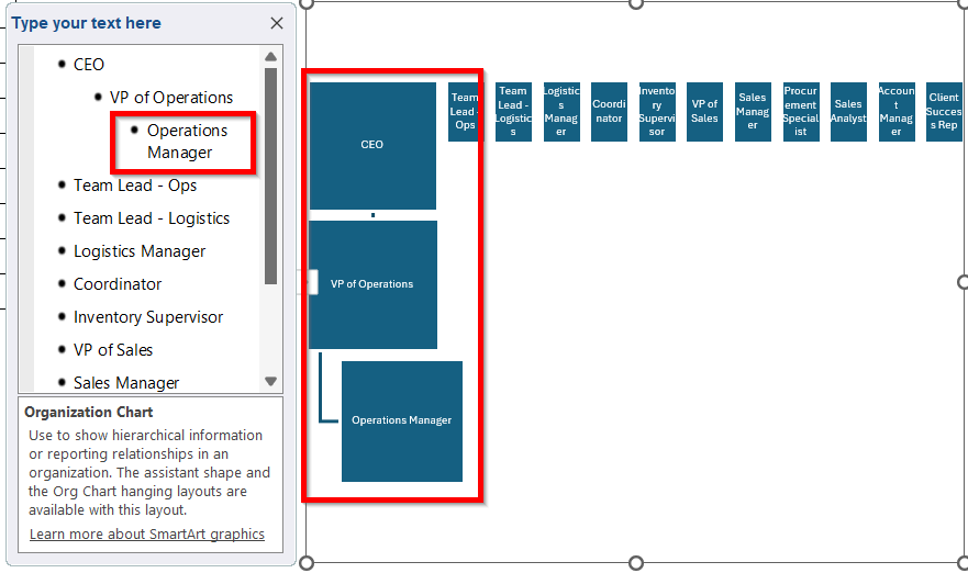
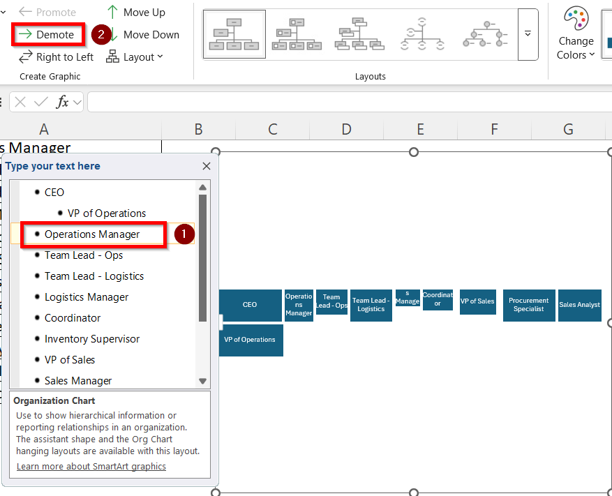
➤ Similarly, select the Operation Manager and press the TAB button 2 times again. It will be added as a new position under the VP of Operations.
➤ Next, Select Team Lead-Ops and press the TAB button 3 times. It will be added as a new position under Operations Manager.
➤ Select Team Lead-Logistics and press the TAB button 3 times. It will be added as another position under Operations Manager.
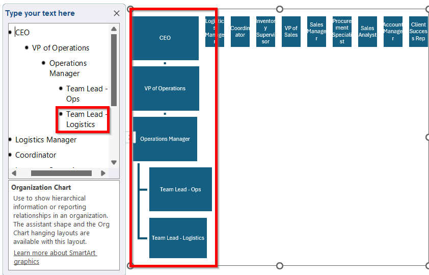
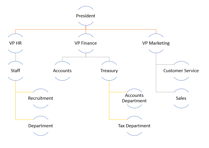
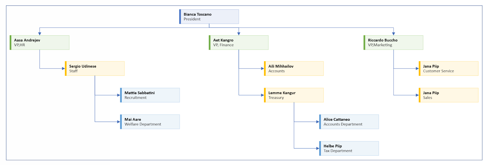
➤ Continue this process for the rest of the positions and place them according to their hierarchy. The finished result will be like this:
Use SmartArt Design Feature to Organize the Chart
This is another method of organizing the chart using the Demote option in the SmartArt Design section. Follow the steps below to use this feature:
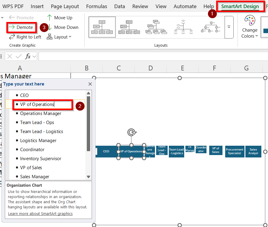
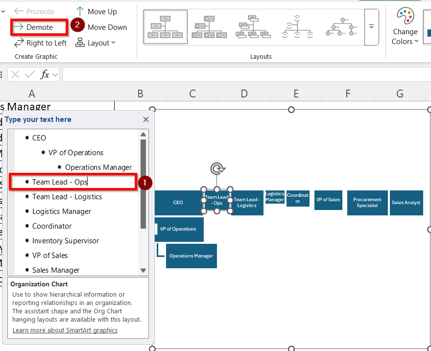
➤ Click on the SmartArt Design tab from the ribbons. Select VP of Operations and click on Demote 1 time. It will be added one step under the CEO position.
➤ Select the Operation Manager and press Demote 2 times again. It will be added as a new position under the VP of Operations.
➤ Select Team Lead-Ops and press Demote 3 times. It will be added as a new position under Operations Manager. Repeat the same thing for Team Lead-Logistics.
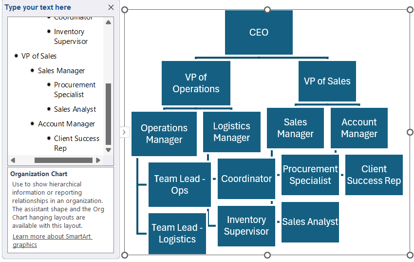
➤ Repeat these steps for each of the positions according to their hierarchy. The finished output will be this:

Create a Data Driven Organizational Chart with Excel Visio Data Visualizer Add-In
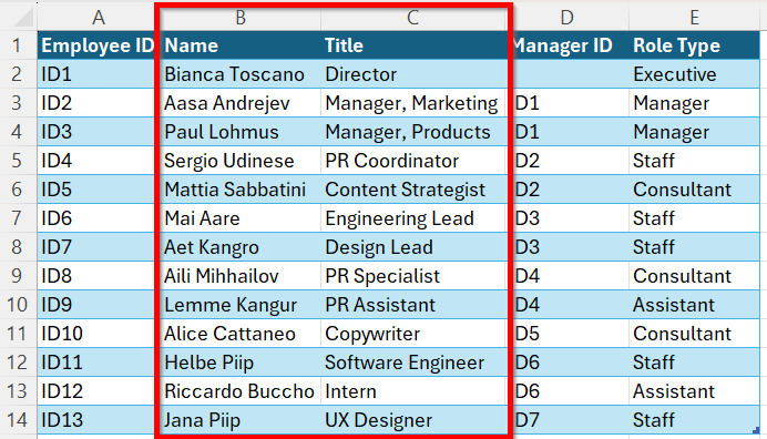
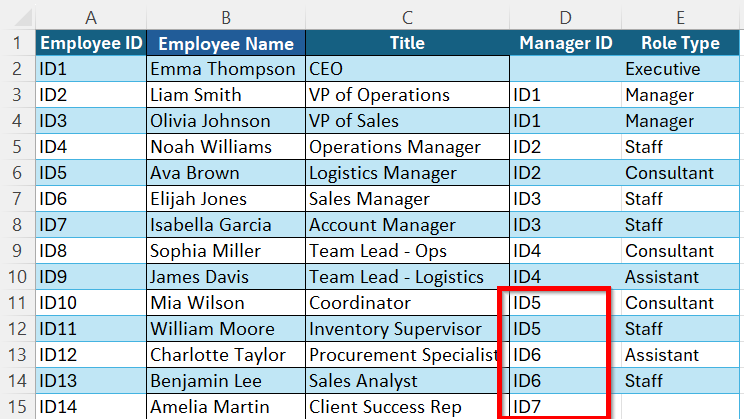
Organizations with larger structures and lots of data can utilize the Excel Visio Data Visualizer Add-In option to create an organizational chart from a list. Suppose, this is our dataset:
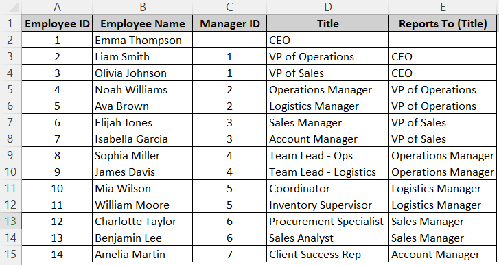
Here, the Manager ID indicates the chain of command respective to the Employee ID. The Manager ID of VP of Operations and VP of sales is 1 which means they report to Employee ID 1, the CEO.
Now, to organize these in a chart using the Visio add-in, follow the steps below:
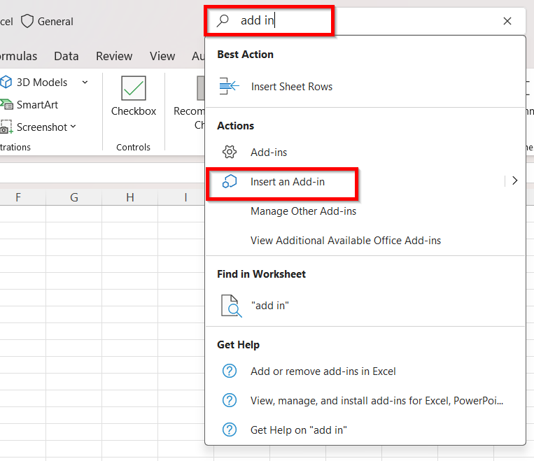
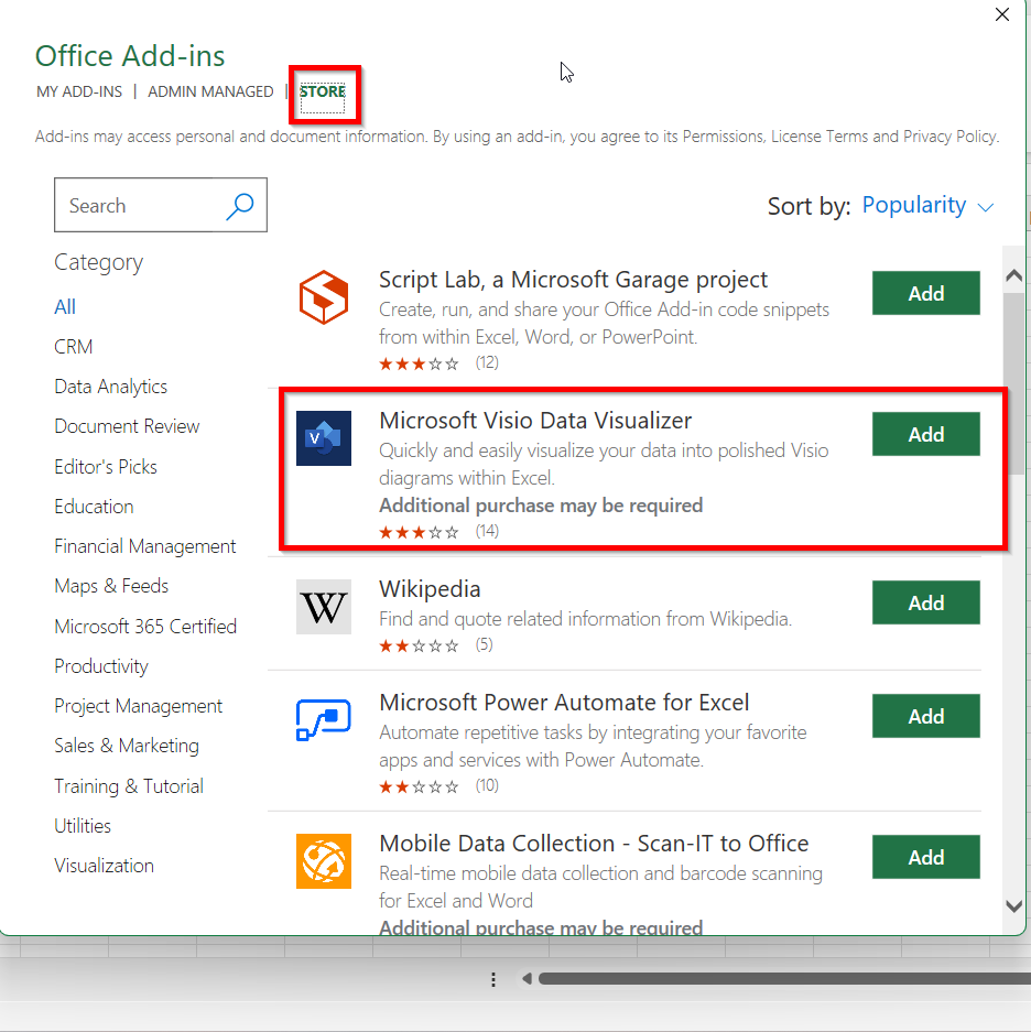
➤ In the search bar, type Add-in and select Insert an Add-in option.
➤ Go to the Store in the Office Add-ins window. Look for Microsoft Visio Data Visualizer and click Add.
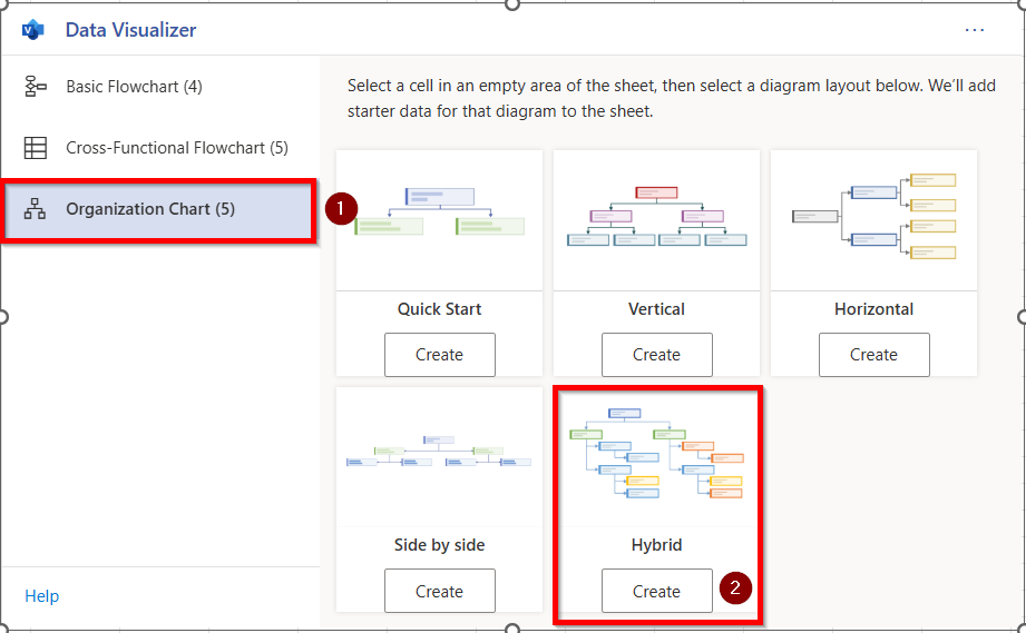
➤ A Data Visualizer window will pop up where you need to select the Organizational Chart option and then Hybrid. Click on Create.
➤ This sample dataset will show up where we will select the Name and Title columns to replace them with our own dataset.
➤ Copy the Name and Title columns from our dataset and paste them into this table.
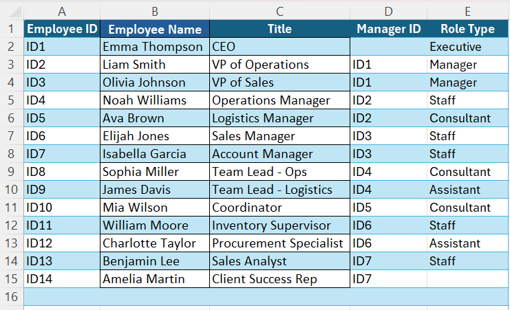
➤ Now, edit the Manager ID column according to our dataset. For example, the 12th row should report to ID5 instead of ID6 and the 14th row should report to ID6 instead of ID7.
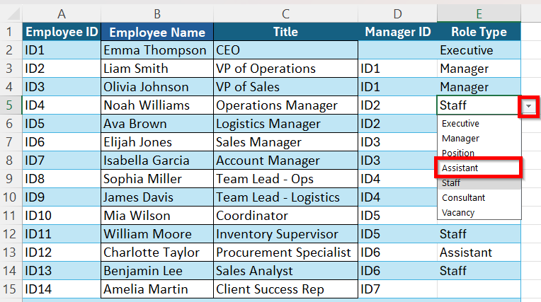
➤ In the Role Type column, assign the roles for each suitably. The chain of command goes like this: Executive> Manager> Assistant> Staff. So, click on the Staff cell for Employee ID4 and select the arrow beside the cell. Choose Assistant as it is one position under the Manager roles of VP. The same thing will apply for Employee ID5 to ID7.
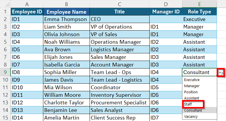
➤ Now, click on the Consultant cell for Employee ID8 and select the arrow beside the cell. Choose Staff as it is one position under the Assistant role of Operations Manager. The same thing will apply for Employee ID9 to ID14.
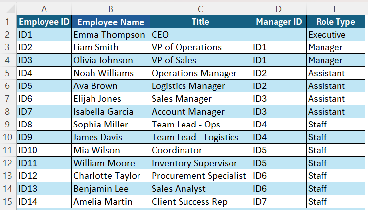
➤ The finished will table will be like this:
➤ Back to the diagram, click on Refresh to update the chart with all the edits. Your organization chart will be prepared.
Frequently Asked Questions
What Is The Easiest Way to Create an Organizational Chart in Excel?
The easiest way to create an organizational chart in Excel is to use the built-in SmartArt feature. Go to Insert → SmartArt → Hierarchy and then choose a preferred layout for your chart.
Does SmartArt Update Automatically if The Data Changes?
No, SmartArt can’t automatically update the data as it is not linked to the dataset directly. Any changes made in the chain of command or the names will have to be manually formatted and edited on the chart later.
Can I Customize a Chart Using SmartArt?
Yes, SmartArt allows you to customize an organizational chart completely. You can change everything- shapes, colours, layout styles, fonts, sizes, text styles etc easily in the SmartArt feature.
Wrapping Up
Whether you need a quick visual chart of your data or a dynamic, elaborate chart connected to your employee database, Excel can do both easily. You have flexible options such as the SmartArt feature where you can customize and format a chart according to your preference. On the other hand, you can save time by using the automated VIsio feature where the dataset will be connected to produce the chart automatically. The key is choosing the best method that better suits your needs.