A timeline in Excel is a visual way to organize events, tasks, or milestones over a period of time. Whether you’re managing a project, planning a schedule, or tracking progress, timelines make your data easier to understand. Excel lets you create timelines using built-in templates, charts, SmartArt, PivotTables, and Gantt-style formatting.
In this article, you’ll learn step-by-step how to create a timeline in Excel with dates using different methods suited for both simple visuals and dynamic project tracking.
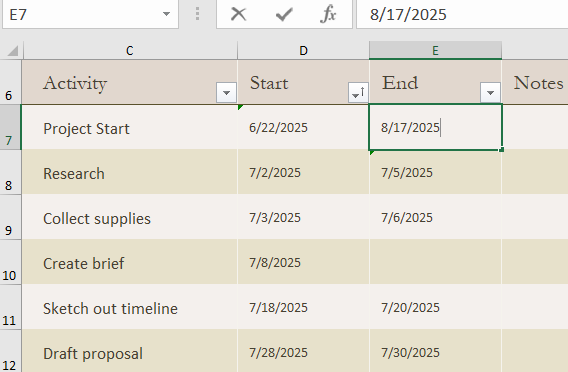
Steps to create a Timeline in Excel with Dates:
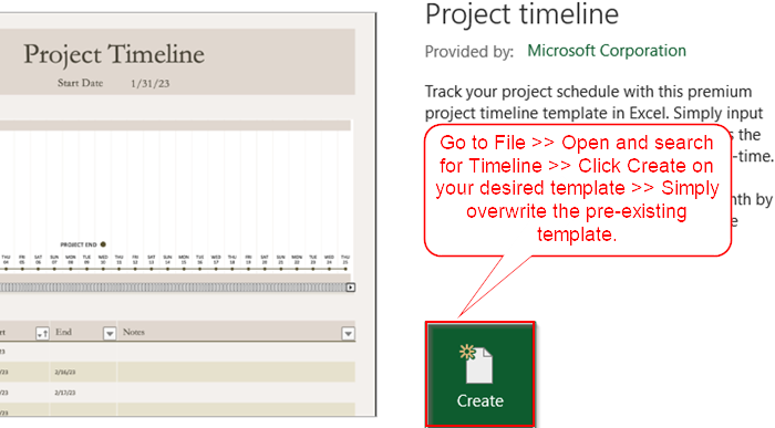
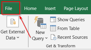
➤ Go to the File tab.
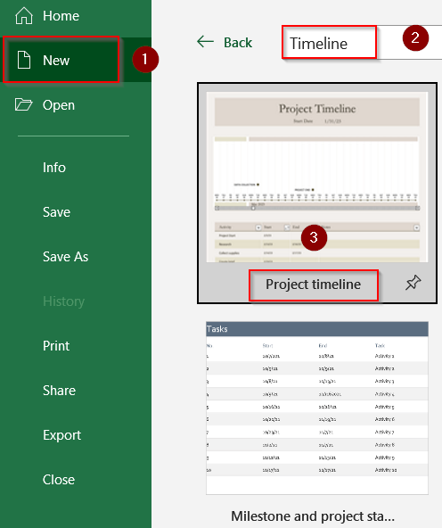
➤ Click on New and then search for “Timeline” in the search box.
➤ Choose from options like “Project Timeline,” “Milestone Tracker,” or “Gantt Project Planner”.
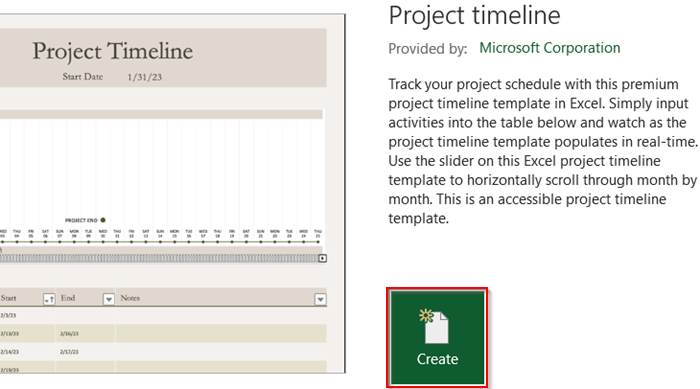
➤ Click the template you like, then hit Create or Use Template (depending on your version of Excel).
➤ Once it opens, simply overwrite the default entries in the table or chart that comes with the template by double-clicking any cell.
Use Excel’s Built-In Timeline Templates
If you prefer to skip setup, Excel has ready-made timeline templates you can download and customize.
Steps:
➤ Go to the File tab.
➤ Click on New and then search for “Timeline” in the search box.
➤ Choose from options like “Project Timeline,” “Milestone Tracker,” or “Gantt Project Planner”.
➤ Click the template you like, then hit Create or Use Template (depending on your version of Excel).
➤ Once it opens, simply overwrite the default entries in the table or chart that comes with the template by double-clicking any cell.
Templates are ideal if you need a fast, polished solution without starting from scratch.
Insert Timeline Using SmartArt Graphics
SmartArt is a fast way to create visual timelines without worrying about formulas or charts. It’s great for presentations and status reports.
Steps:
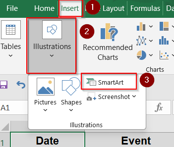
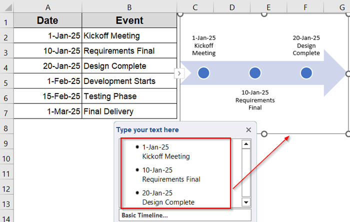
➤ Go to the Insert tab >> SmartArt tool under the Illustrations group.
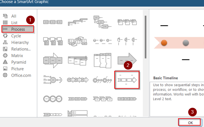
➤ Select Process >> Basic Timeline and click OK.
➤ A graphic will appear with placeholder text. Replace each shape with your own event and date.
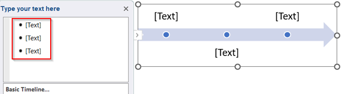
➤ Use the Text Pane to easily edit and expand items.
➤ Use SmartArt Design tools to customize layout, colors, and effects by clicking on ribbon.
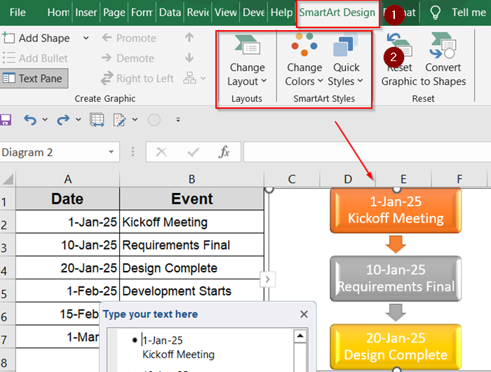
This method is more visual and presentation-friendly, though less suitable for dynamic or long timelines.
Create a Manual Timeline with Shapes and Text Boxes
This method gives you full creative control over how your timeline looks. You can use it for presentations or reports where visual customization is key.
Steps:
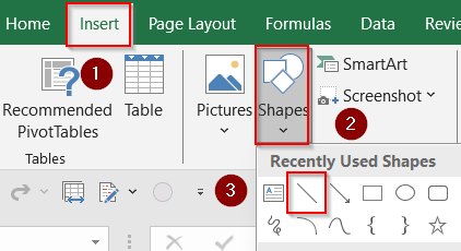
➤ Open your Excel sheet and go to the Insert tab.
➤ Under Illustrations, click Shapes and choose the Line tool.
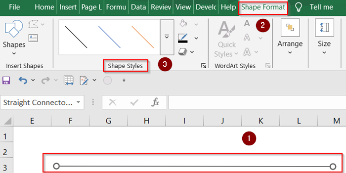
➤ Draw a horizontal line across the sheet to represent the timeline base. You can customize how your line looks using Shape Styles under the Shape Format tab.
➤ Add Milestones by inserting circles or rectangles using the Shapes tool. Place the shapes however you like.
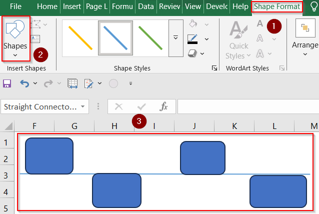
➤ Click Insert >> Text Box to label each milestone with dates or events.
➤ Align each shape and text box to keep everything visually balanced.
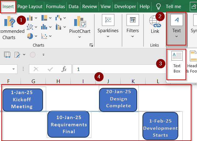
➤ Use color fill, bold fonts, and arrows to make it more readable using Shape Styles & WordArt Styles.
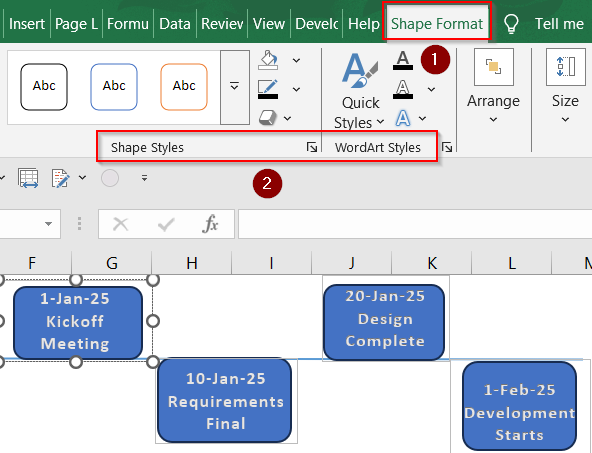
This approach is great for simple visual timelines but not ideal for larger or frequently updated projects.
Track Events Interactively via PivotTable Timeline
Pivot Tables work well when your data is structured in logs or transactions across dates. You can filter by timeline using a slicer.
Steps:
➤ Prepare a dataset with at least one column containing dates.
➤ Select your dataset and go to Insert tab >> PivotTable under the Tables group.
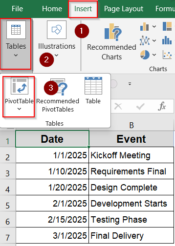
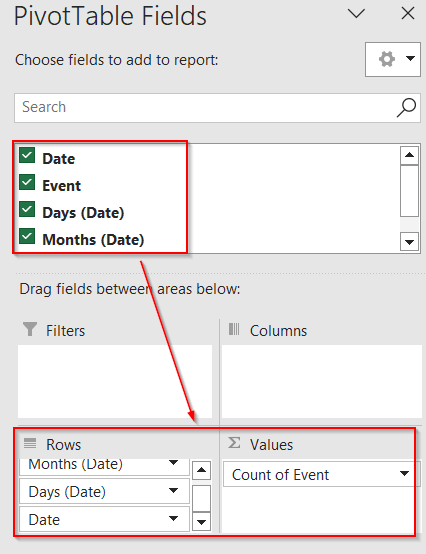
➤ Drag a date field to the Rows area and other fields (like Event) to Values.
➤ Click inside the PivotTable >> Go to PivotTable Analyze tab.
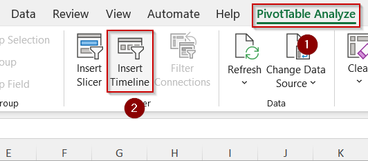
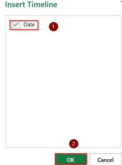
➤ Click Insert Timeline, then select your date field and hit OK.
➤ Your timeline will be visible on your sheet.
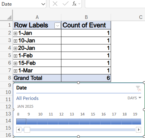
➤ You can drag the slider to zoom in/out on specific date ranges and use the filter option at top to filter out your data easily.
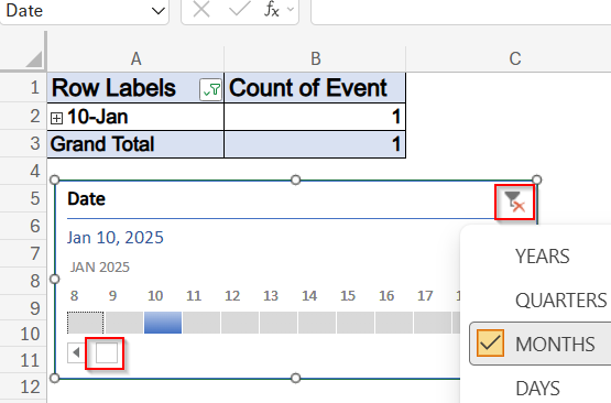
This works best for filtering and exploring project history or event logs.
Build a Scatter Plot Timeline
If you want a dynamic chart that updates automatically, use a scatter plot. It plots each event along a timeline based on date.
Steps:
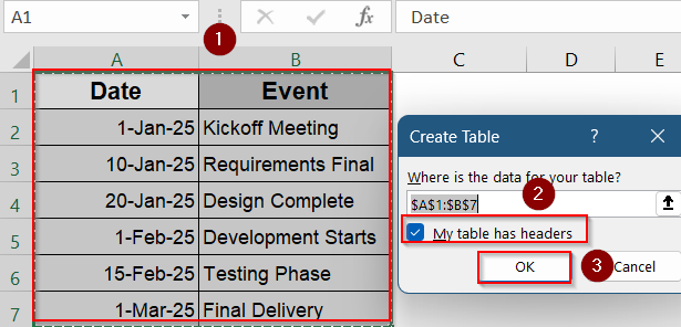
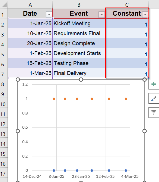
➤ Create a table with two columns: Event Name and Date. Press Ctrl + T and check your headers, then click OK.
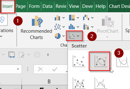
➤ Go to Insert >> Charts >> Scatter Plot >> Scatter with smooth lines and markers.
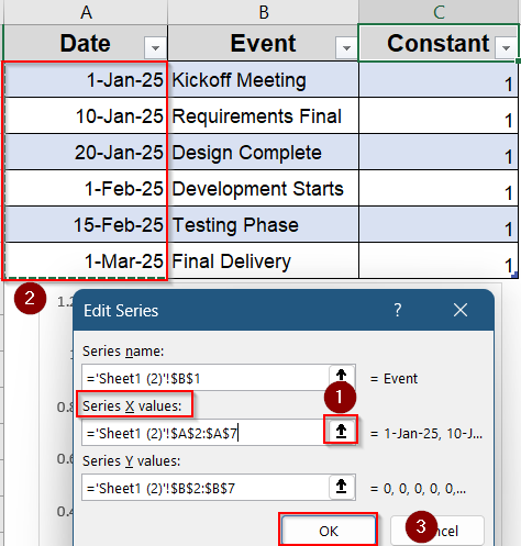
➤ Add a new column called Constant and fill it with number 1. This tells Excel to plot each event at the same vertical level in the scatter plot.
➤ In the blank chart, right-click and choose Select Data.
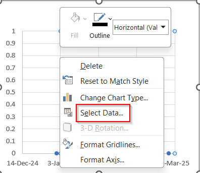
➤ Click on Edit under Legend Entries.
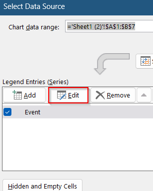
➤ Set X values as your date column using the small button at the right and click OK.
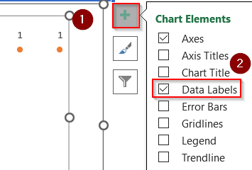
➤ Format the chart by removing gridlines and Y-axis. To do this, Go to Chart Elements >> Uncheck Gridlines and hover over Axes to uncheck the Primary vertical option.
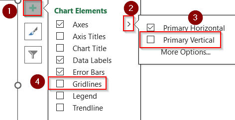
➤ Check Data Labels to show event names on each dot from Chart Elements.
➤ Adjust marker size, label position, and color for clarity.
➤ Click on one dot to select all >> Right-click and choose Format Data Labels.
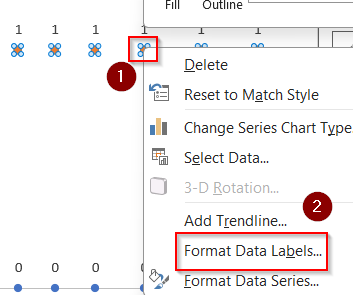
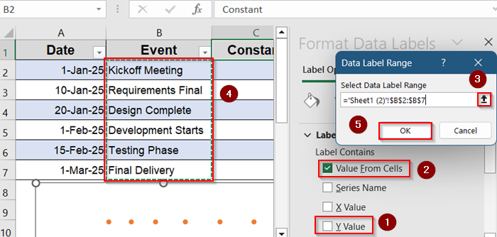
➤ In the sidebar, uncheck the box for Y value and check box for Value From Cells.
➤ Use the small arrow to select your Event range which you want to appear and hit OK.
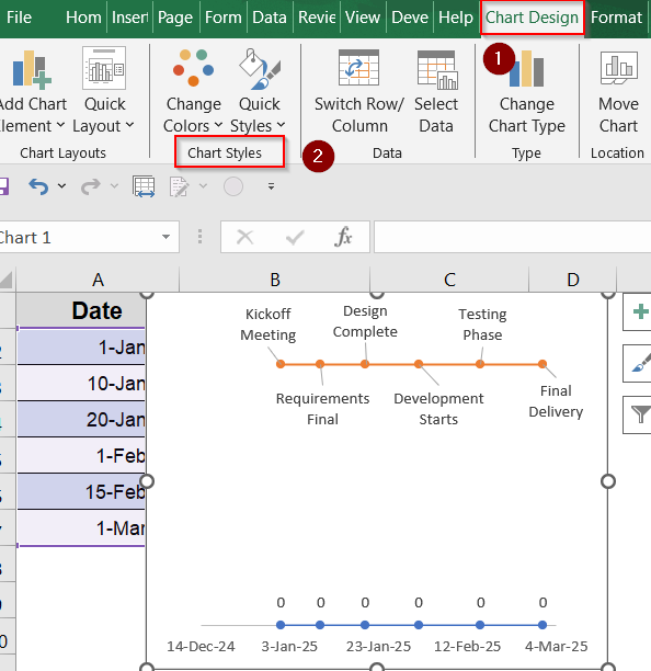
➤ The values may appear congested. Move them around manually or you can head to the Chart Design tab and pick Chart Styles.
This technique is best for automatically updating timelines using Excel chart engine.
Create a Gantt Chart Timeline in Excel
A Gantt chart uses horizontal bars to show how long tasks take and when they overlap. It’s one of the clearest ways to display project schedules in Excel.
Steps:
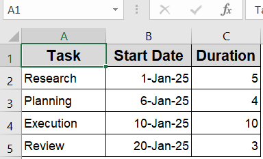
➤ Set up a dataset with columns for Task, Start Date, and Duration (in days). You can calculate Duration using a formula like =End Date – Start Date.
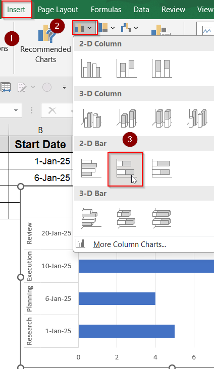
➤ Go to the Insert tab >> Choose Bar Chart >> Click Stacked Bar. A blank chart box will appear.
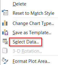
➤ Right-click the chart >> Choose Select Data.
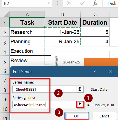
➤ Click Add under Legend Entries to create a new series.
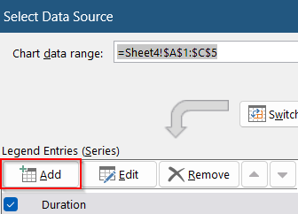
➤ For Series Name, select the Start Date header. For Series Values, select the full Start Date column (e.g., B2:B5) using the small arrow button at the right and click OK.
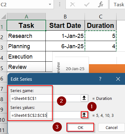
➤ Click Add again to add the Duration series. This time select the Duration header and its values. Hit OK to insert both series into the chart.
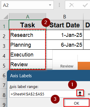
➤ Still inside Select Data, click Edit under Horizontal Axis Labels.
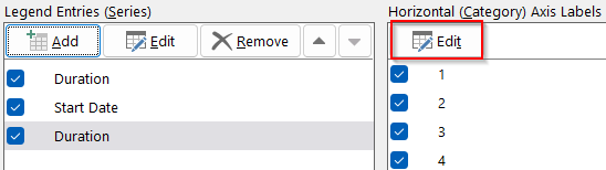
➤ Select your list of Task Names using the small arrow button at the right and press OK twice to update your chart.
➤ Your chart should now look like this. You can use the Chart Design tab to change your Chart Styles.
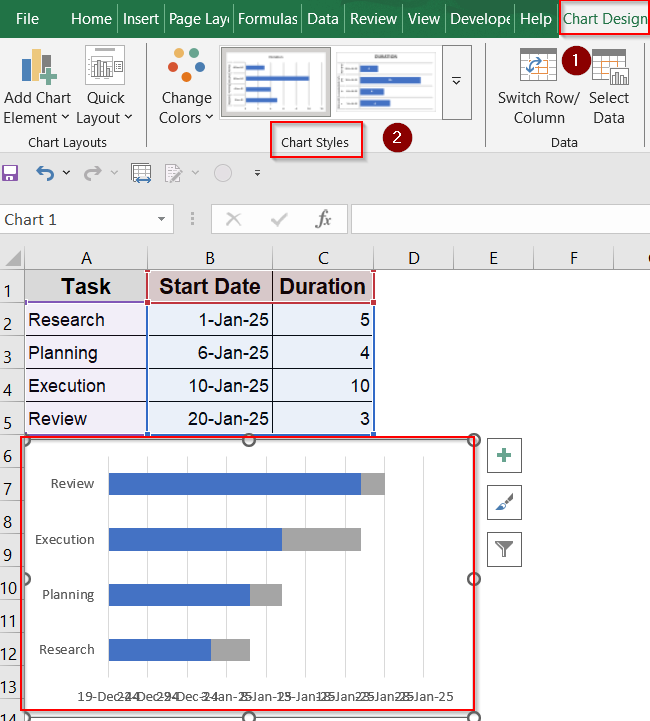
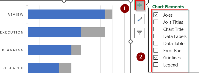
➤ Customize your chart with chart styles, color fill, add Data Labels and Legend for visibility, and remove gridlines from Chart Elements for better presentation.
➤ Customize your chart with chart styles, color fill, add Data Labels and Legend for visibility, and remove gridlines from Chart Elements for better presentation.
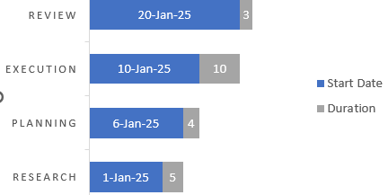
Now your Gantt-style timeline is created using a stacked bar chart to visually map tasks against their start dates and durations.
Frequently Asked Questions
Can I make a timeline that updates automatically with new dates?
Yes. Use Excel tables, named ranges, and formulas to build timelines that automatically refresh when you add or update date entries in your dataset.
Is there a timeline chart type in Excel by default?
No. Excel doesn’t offer a built-in “timeline” chart type, but you can create timelines manually using Scatter plots, SmartArt graphics, stacked bars, or conditional formatting methods.
Can I add milestones on a timeline chart?
Yes. You can add milestones using markers, shapes, or data labels within your chart. These help highlight key events or deadlines visually across your timeline.
Is PowerPoint better for timelines than Excel?
PowerPoint is ideal for presentations with design flexibility. However, Excel is better for timelines based on real data, enabling auto-updates, calculations, and dynamic visuals.
Wrapping Up
In this tutorial, we learned multiple effective methods to create a timeline in Excel with dates using built-in templates for speed, SmartArt for visuals, manual timelines for full control, Scatter plots for automation, PivotTable slicers for interactive filtering, and Gantt charts for structured project tracking. Feel free to download the practice file and share your feedback