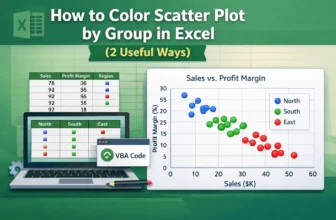
Scatter plots in Excel are useful for visualizing relationships between variables. Coloring the scatter plot based on groups, such as regions or categories, highlights patterns or trends. Let’s say ...
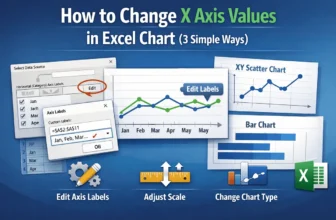
The X-axis in Excel charts plays a crucial role in organizing and displaying your data visually whether you're working with categories, dates, or numerical values. Depending on your dataset, you ...
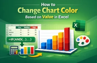
Coloring a chart by value assigns a unique color to each data point according to its value. To change the chart color based on value in Excel, we need to split the source data into different series ...
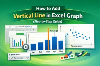
A vertical or horizontal line is the benchmark or reference to highlight a specific point. To add a vertical line in an Excel graph, we need to either modify a combo chart or a vertical error bar.
...
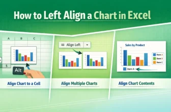
Left alignment is the alignment of an object on the left of some reference. “Left-align” in an Excel chart may indicate aligning a chart to a cell, aligning multiple charts, or aligning the elements ...
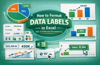
Data labels are part of the chart area that provide more context about data points or areas. It can be numeric values, series names, percentages, etc. In Excel, "Format data labels" can refer to text ...
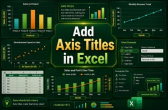
Axis titles are labels that appear alongside the horizontal or vertical axis.Axis titles provide context on what the axes represent. They provide more clarity to the chart, which is the point of ...
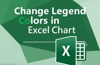
A legend is the section of a chart representing the data series. It indicates different shapes, colors, fills, etc.By default, Excel names the legend after the column header or label of the data ...
The legend is a section of the chart that indicates what different colors, lines, and areas mean in the chart.The legend always shows the color of the data series. So, to change the legend ...