Trending
Excel Pro Tips
How to Show Percentage Change in Excel Graph (2 Simple Ways)
Learn how to show percentage change in an Excel graph using error bars and helper columns for clear, accurate data visualization
Read article

13 articles tagged with “Excel Chart Formatting”
Learn how to show percentage change in an Excel graph using error bars and helper columns for clear, accurate data visualization
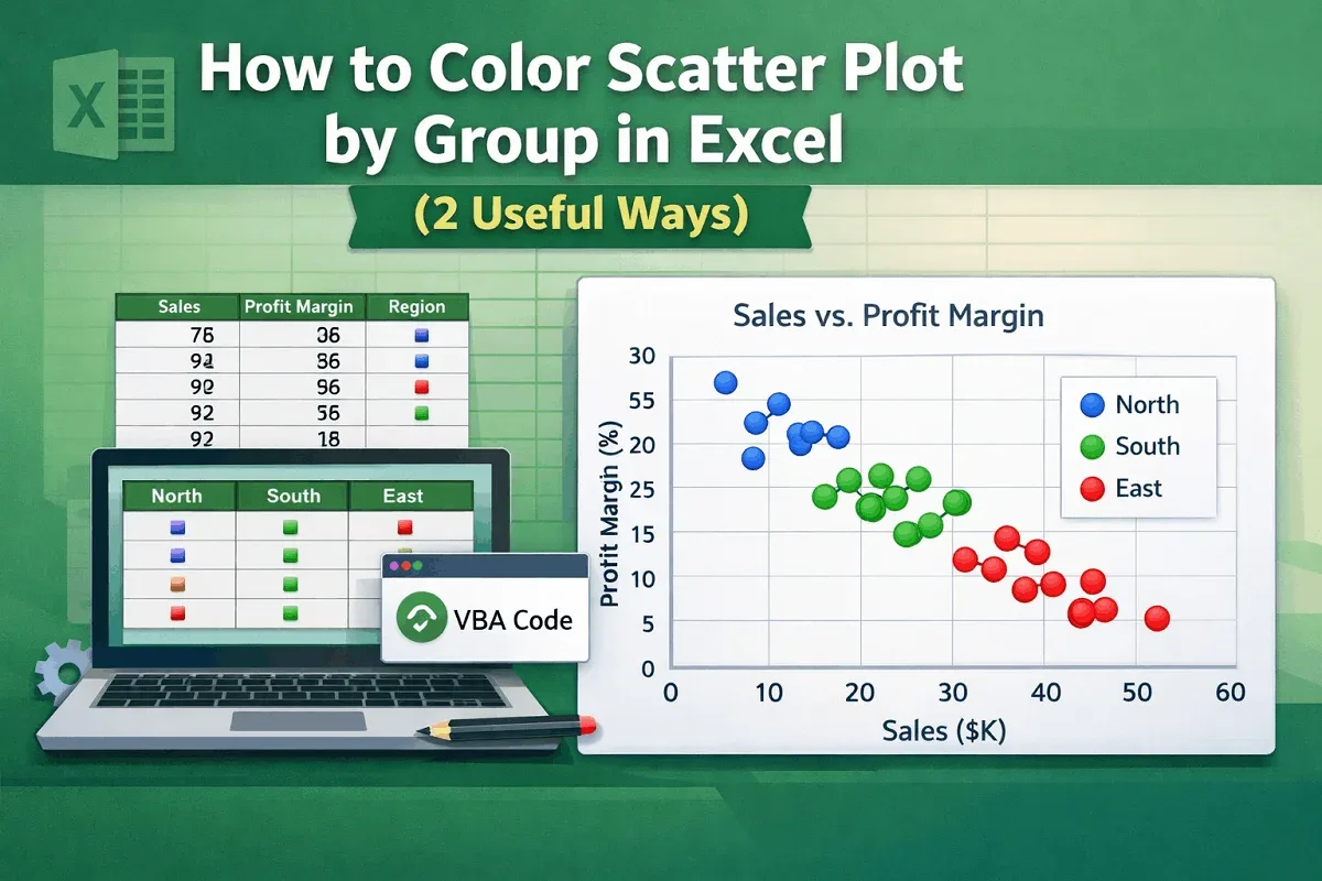
Learn how to color a scatter plot by group in Excel using helper columns or VBA code for clearer and more insightful data visualization.
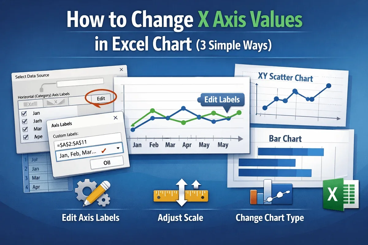
Learn how to change X-axis values in Excel charts by updating labels, adjusting scale and formatting, or switching to a different chart type.
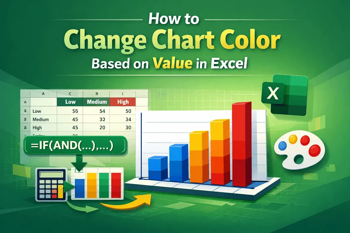
Step-by-step guide to change Excel chart color based on value using formulas for creating dynamic, visually impactful data visualizations.
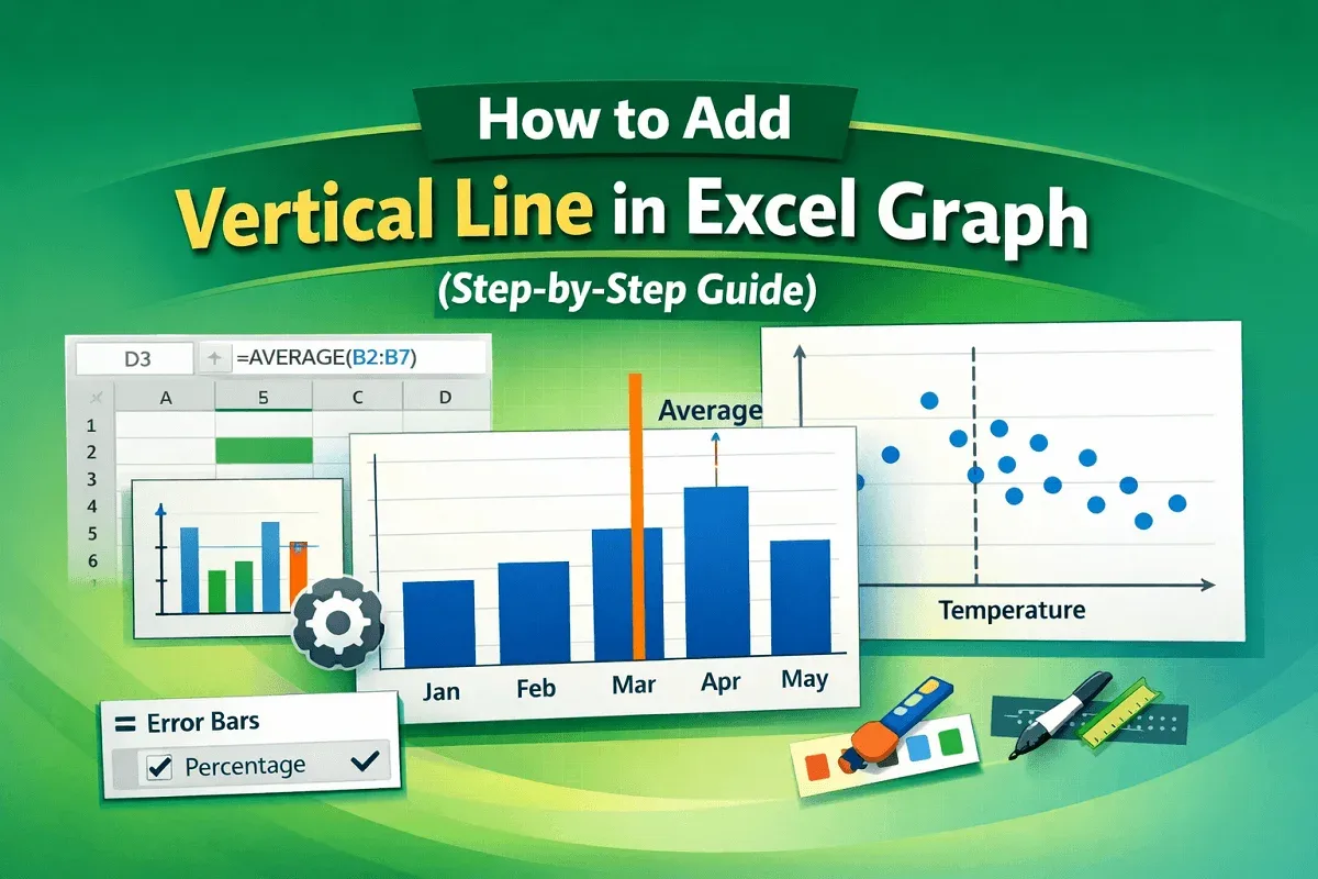
A step-by-step guide to add a vertical line in an Excel graph using error bars and combo charts for highlighting benchmarks.
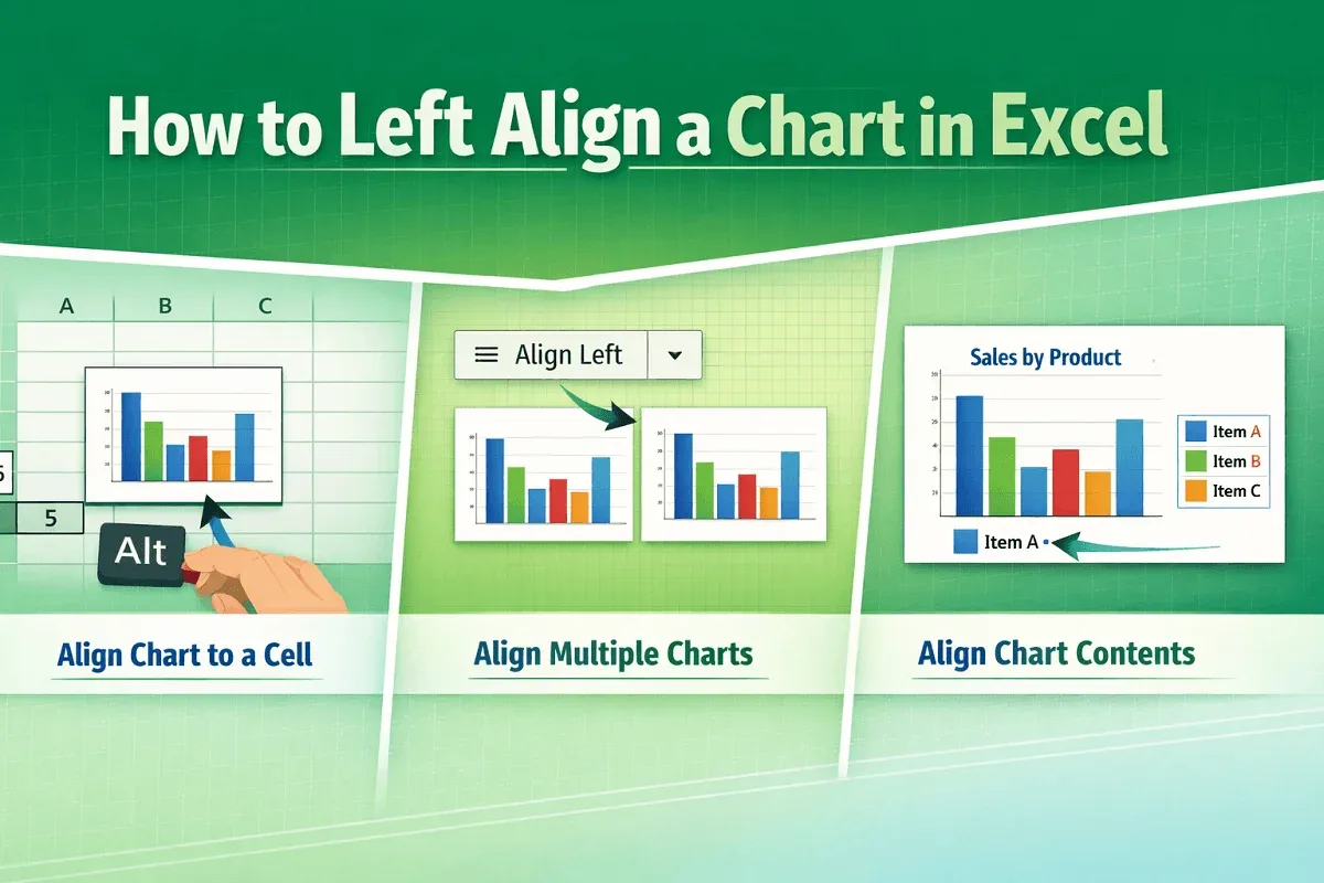
Learn how to left-align a chart in Excel: Align charts to cells, multiple charts together, or chart elements with easy steps.
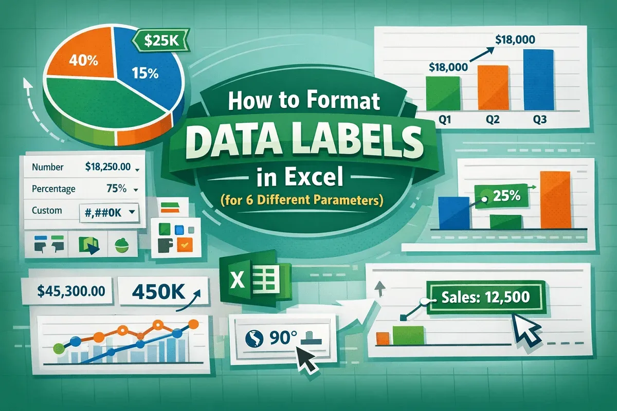
Learn how to format data labels in Excel with custom fonts, colors & positions, formatting, leader lines & text rotation for clear charts.
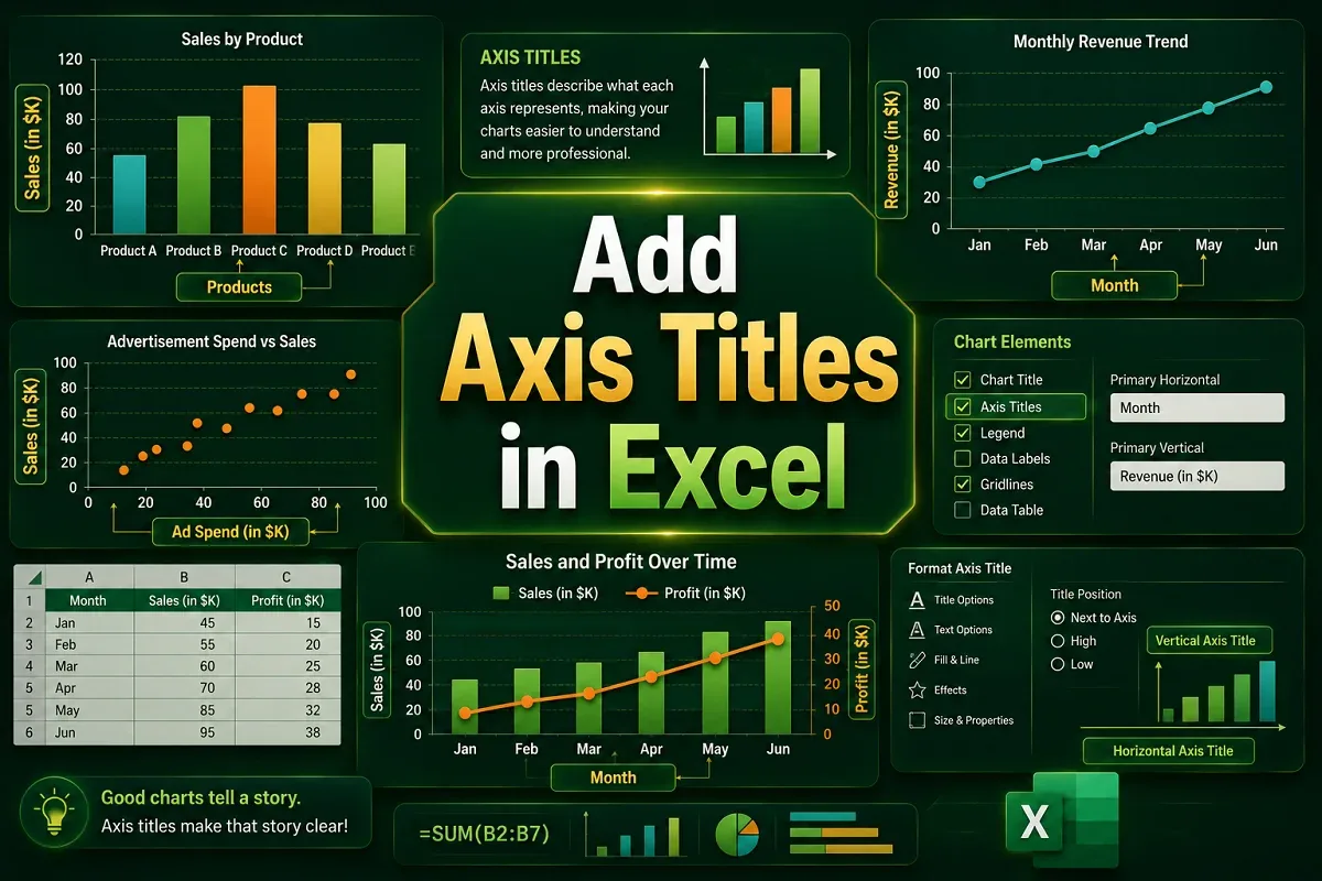
Learn to add Excel axis titles using Chart Elements or Design tab. Simple steps to label charts clearly for better data presentation.
Learn how to rename Excel chart legends by editing data series names. Step-by-step guide for both dynamic and static legend renaming methods.
Change Excel legend colors by editing data series colors. Simple steps to customize chart appearance for clearer data visualization.
Reorder Excel legend without changing chart data. Simple steps to customize legend sequence while preserving your chart.
Learn how to add a legend in Excel charts using the Chart Elements button, Chart Design tab, or manual methods.