
Showing percentage change in an Excel graph helps you visualize growth, decline, or overall performance trends clearly. Whether you’re tracking monthly revenue, sales, or expenses, adding percentage change to your chart gives immediate insights into how values are shifting over time.
In this article, you’ll learn a simple, structured way to calculate and display percentage changes in an Excel chart. We’ll build the dataset first, create a helper column, and then use a clustered column chart combined with error bars and data labels to display percentage changes accurately. Let’s get started.
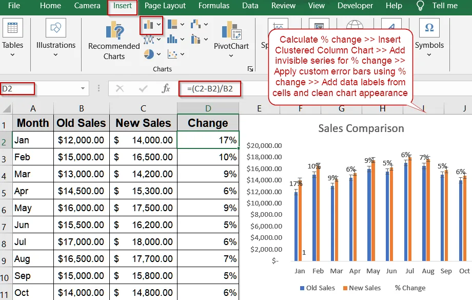
➤ Calculate percentage change in a new column using the formula =(C2-B2)/B2 and format as %.
➤ Insert a Clustered Column Chart with Month, Old Sales, and New Sales.
➤ Add the percentage change column as a new series and set No Fill to make it invisible.
➤ Add Custom Error Bars using the percentage change for both positive and negative values.
➤ Add Data Labels >> Value from Cells >> Select the percentage column >> Uncheck “Value” for a clean display.
Display Percentage Change Using Error Bars
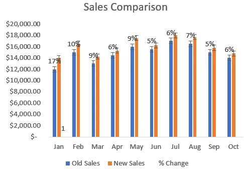
Using error bars is a smart and professional way to show percentage change in an Excel graph. This method works by calculating the percentage difference between two values, adding it to the chart as a hidden data series, and then using custom error bars to display the change visually. It’s ideal for dashboards and financial reports.
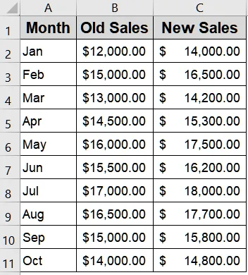
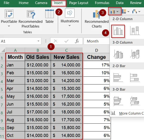
We’ll use the following dataset showing monthly sales for two periods:
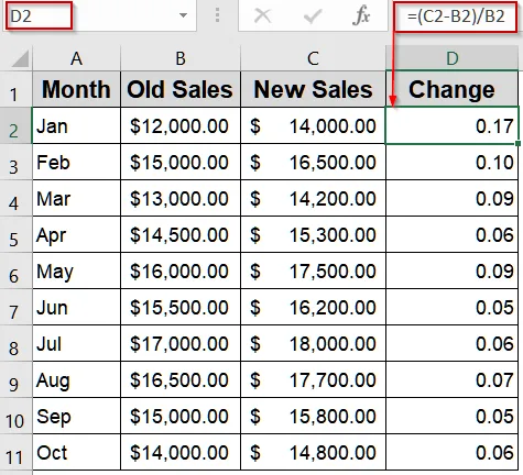
➤ Select the first cell for your percentage change, for example D2.
➤ Enter the formula:
=(C2-B2)/B2This calculates how much the new value has changed compared to the old value.
➤ Press Enter, then drag the fill handle down to apply the formula for all rows.
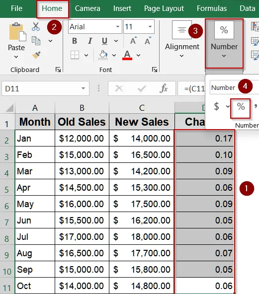
➤ Select the entire percentage column, go to the Home tab, and click the % button to format the results.
➤ Now select the Month, Old Sales, and New Sales columns and insert a Clustered Column Chart from the Insert tab.
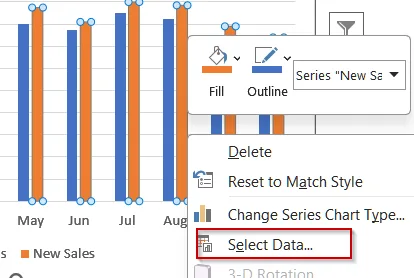
➤ Right-click the chart >> Click on Select Data.
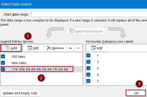
➤ Click on Add under Legend Entries >> Choose your percentage column as a new series and hit OK.
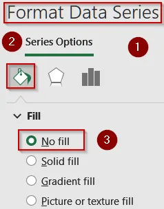
➤ Right-click the new (percentage) series >> Format Data Series >> set No Fill to make it invisible.
➤ Click the invisible series >> + icon >> Error Bars >> More Options
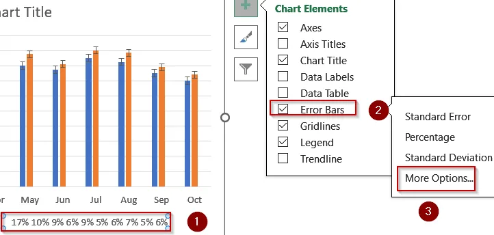
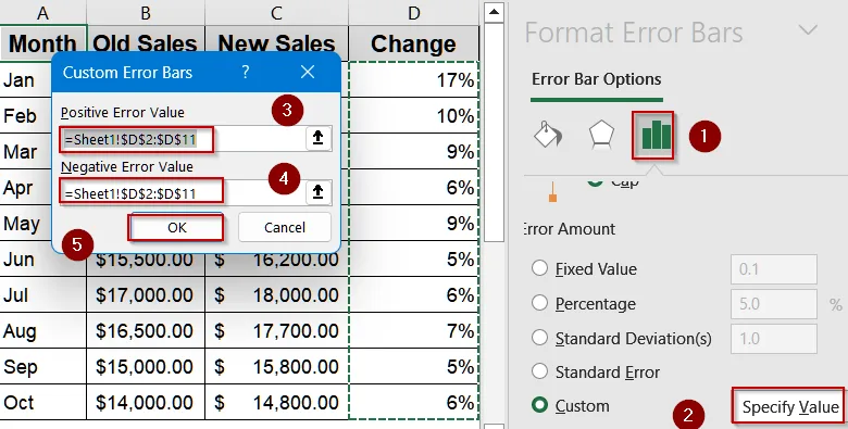
➤ Select Custom >> Specify Value >> use your percentage change column for both positive and negative values.
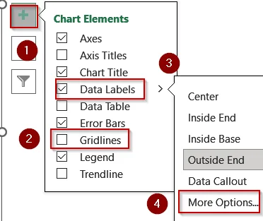
➤ Finally, add Data Labels from Chart Elements and turn off Gridlines for clarity.
➤ Click on More Options to open the Format Data Labels pane.
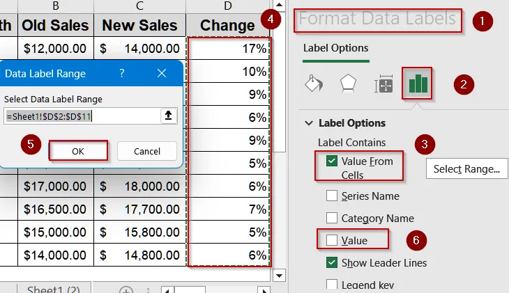
➤ Choose Value from Cells >> Select your percentage column >> Uncheck “Value” to remove unnecessary text.
Now, your chart will show the percentage change values above each column through customized error bars, making your data comparison easy to read and visually appealing.
Visualize Percentage Change Using Helper Columns
Helper columns offer a detailed and formula-driven approach to display percentage change. This method uses several supporting columns to separate positive and negative changes, then plots them in a customized column chart. It’s a great method for intermediate Excel users who want full control over how increases and decreases appear.
We’ll use the following dataset to demonstrate this method:
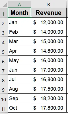
➤ In C2, type the following formula to create the Helper column and press Enter.
=B3➤ In D2, enter the following formula to calculate the Difference between the two periods.
=C2-B2➤ In E2, type the following formula to capture positive differences only:
=IF(D2>0,-D2,"")➤ In F2, type the following formula to capture negative differences:
=IF(D2<0,-D2,"")➤ In G2, type the following formula to calculate the percentage change and format it as a percentage:
=D2/B2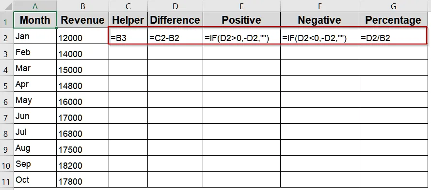
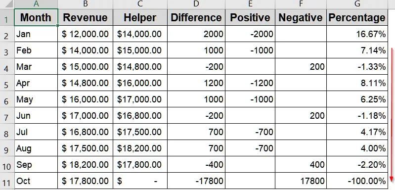
➤ Drag each formula down through all rows.
➤ Select the Month, Revenue, and Helper columns >> Go to Insert tab >> Clustered Column Chart.
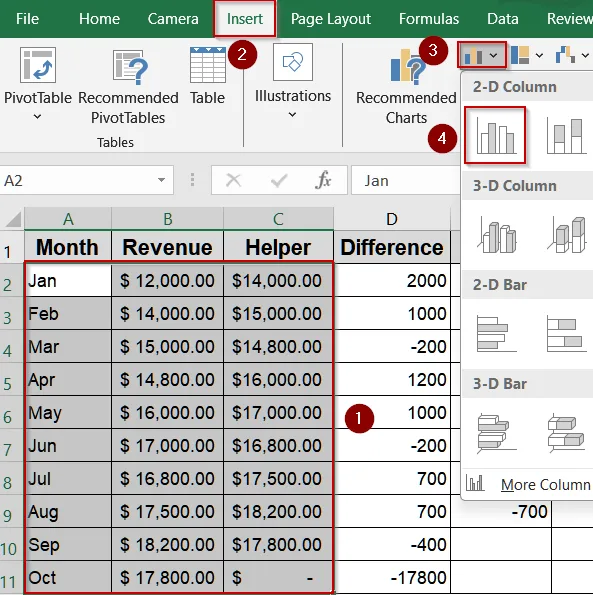
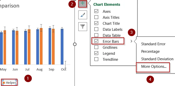
➤ Double-click the Helper bars >> Click the + icon >> Error Bars >> More Options.
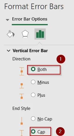
➤ Choose Both and Cap as Direction and End Style.
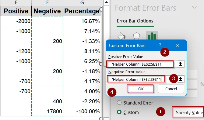
➤ Under Custom Error Amount, select the Positive column for Positive Error Value and Negative column for Negative Error Value and hit OK.
➤ Click the Helper bars again >> Click on + icon >> Data Labels >> More Options.
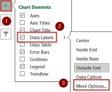
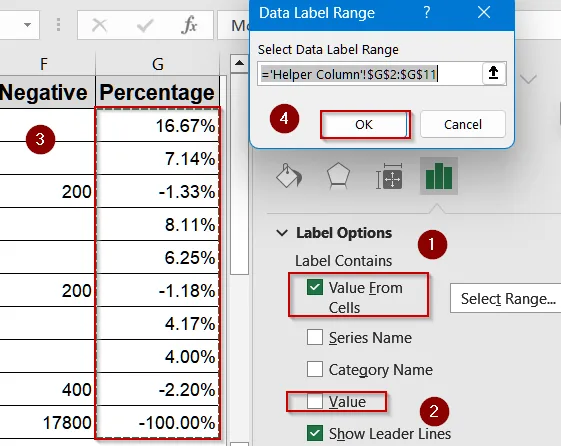
➤ Check Value from Cells and select the Percentage column >> Hit OK >> Uncheck “Value”.
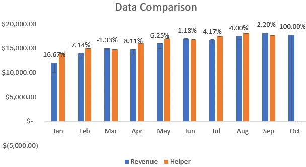
Now, your graph will display both the positive and negative percentage changes directly over each bar, giving a clear visual of where performance improved or declined.
Downloadable Resources
Get our practice workbook or necessary files that we have worked with to prepare this article.
Show Percentage Change in Graph.xlsx
Frequently Asked Questions
How can I calculate percentage change easily in Excel?
Use the formula =(New Value - Old Value)/Old Value. This compares the difference between two numbers and expresses it as a percentage change, helping visualize increases or decreases in values across your dataset effectively.
Can I show both positive and negative percentage changes in a chart?
Yes. By using custom error bars and separating positive and negative columns, Excel displays both increases and decreases, making the graph more informative for performance or trend-based data visualization.
Why make the series invisible in the percentage chart?
The invisible series acts as a base for adding custom error bars and labels. This approach makes your chart clean while still providing a space for displaying percentage change visually and accurately.
Can I use this method for sales or financial reports?
Absolutely. This technique works perfectly for sales growth, revenue comparison, profit margins, or any metric showing progress over time which offers a clear way to highlight increases or declines visually.
Is there a faster way to show percentage change in Excel?
Yes. If you only need numeric comparison, add a helper column using the formula =(New-Old)/Old and format it as a percentage. For visual tracking, follow this guide to enhance the chart presentation.
Wrapping Up
In this tutorial, you learned how to show percentage change in an Excel graph using error bars and data labels. From calculating percentage change to creating invisible helper series and custom error bars, each step helps you present data trends clearly. Feel free to download the practice file and share your feedback.