Visualizing data is crucial for better analysis, and a clustered column Pivot Chart is one of the best charts for it. It is a type of bar chart that displays data in vertical columns, where related data series are grouped next to each other. It also allows for direct comparison of multiple variables within a single category. This dynamic chart type is ideal for comparing performance metrics, such as actual sales versus target sales, across different time periods or categories. Since it’s linked directly to a PivotTable, any changes or filters you apply will instantly reflect in the chart.
In this article, we will guide you through the process of creating a professional clustered column Pivot Chart from scratch.
To create a clustered column Pivot Chart, here is one simple solution by using the Insert tab.
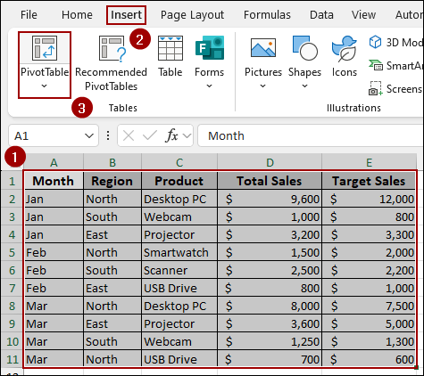
➤ Select any cell from the Pivot Table and go to Insert > Pivot Chart.
➤ From All Charts, choose Column > Clustered Column and click OK.
➤ Edit the chart according to your preference to create a clustered column Pivot Chart in Excel.

Steps to Create a Clustered Column Pivot Chart in Excel
Here, we will use a step-by-step process to create a clustered column Pivot Chart in Excel. We have broken down the process into three simple steps: Preparing the Dataset, Creating the Pivot Chart, and Editing the Chart for a professional look.
Step 1: Preparing the Dataset
In this initial step, we will organize our raw sales data and use it to construct a PivotTable. The PivotTable will summarize the data into the structure necessary for a clustered column chart.
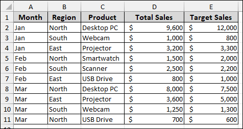
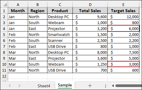
For our example, we will use a sales record that includes Month, Region, Product, Total Sales, and Target Sales columns.
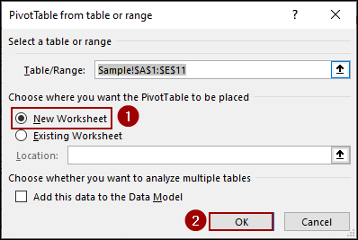
➤ Select the entire dataset, go to the Insert tab on the ribbon, and then click the PivotTable option.
➤ In the Create PivotTable dialog box, select the New Worksheet option to place the PivotTable on a clean sheet, and then click OK.
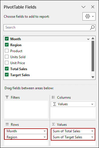
➤ In the PivotTable Fields pane, drag Month and Region to the Rows area and Total Sales and Target Sales to the Values area.
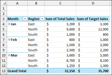
The resulting PivotTable summarizes the Total Sales and Target Sales by Month and Region, which is the exact data structure needed to visualize the comparison in a clustered column chart.
Step 2: Creating Clustered Column Pivot Chart
Now that our summarized data is ready in the PivotTable, we will use the PivotChart tool to generate the initial clustered column chart instantly.
➤ Select any cell within your PivotTable.
➤ Go to the Insert tab and click on the PivotChart option, located within the Charts group.
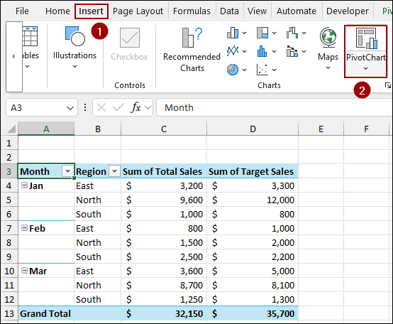
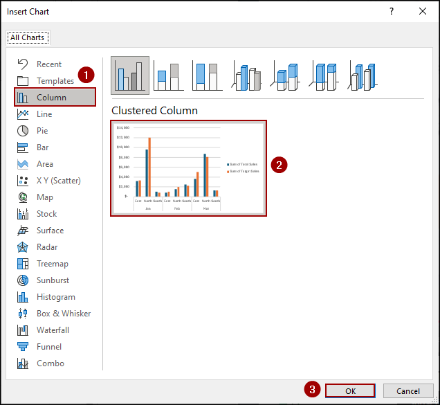
This will open the Insert Chart dialog box.
➤ In the left panel, click on Column.
➤ From the available Column chart subtypes, select the Clustered Column option.
➤ Click OK to insert the chart.
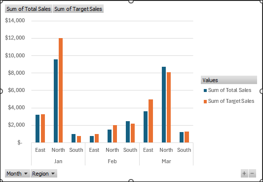
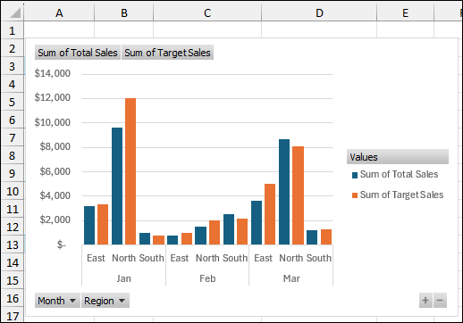
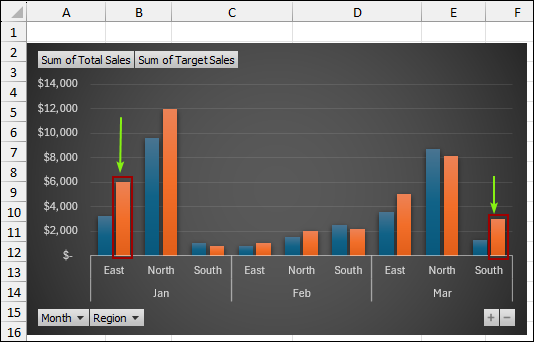
The new chart will be inserted directly onto your worksheet, immediately visualizing the data from your PivotTable. The chart currently displays the Sum of Total Sales and Sum of Target Sales clustered side-by-side for each Region within each Month.
Step 3: Editing the Clustered Column Pivot Chart
In this final step, we will change the chart’s appearance by adjusting the column spacing and applying a professional look. For this, we will use some simple formatting and design changes.
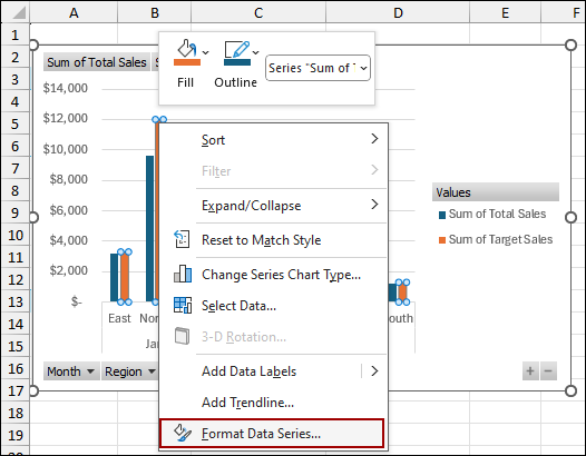
First, let’s adjust the spacing between the columns.
➤ Right-click on any of the data series columns and select Format Data Series from the context menu.
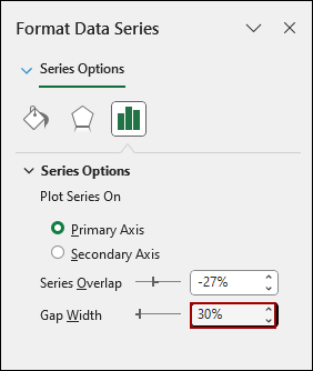
➤ In the Format Data Series pane that appears, go to Series Options and change the Gap Width to a smaller value, such as 30%.
This makes the columns thicker and reduce the space between the clusters.
The chart should now display with tighter, bolder columns, making the data easier to compare visually.
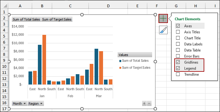
➤ Click on the Chart Elements icon (the plus sign) next to the chart.
➤ Uncheck the Gridlines option to remove the background lines, as well as the Legend option to remove the legend.
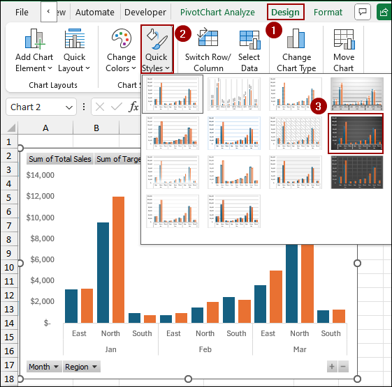
➤ To change the appearance, go to the Design tab.
➤ In the Quick Styles group, select a different Chart Style.
For example, choosing a style with a dark background can add a professional look.
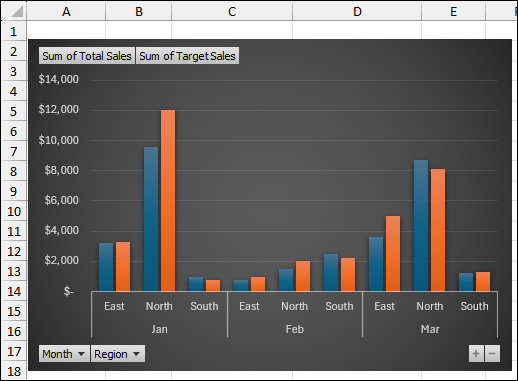
As a result, we will get a clustered column Pivot Chart in Excel.
Finally, we will test the dynamic nature of your chart by changing the source data.
➤ Go back to your source data sheet (Sample) and update a few key figures, such as changing the Target Sales for ‘Projector’ in January from $3,300 to $6,000, and for ‘Webcam’ in March from $1,300 to $3,000.
Since the Pivot Chart is linked to the PivotTable, which is linked to the source data, you will notice that the corresponding columns for those data points have automatically updated after refreshing. This confirms the chart is fully dynamic.
Frequently Asked Questions
Can I create a Pivot Chart without a Pivot Table?
No, Pivot Charts in Excel are always linked to a Pivot Table. If you try to create one without a Pivot Table, Excel will automatically create a Pivot Table for you.
Can I add a secondary axis to a clustered column Pivot Chart?
Yes. If you have multiple value fields, you can right-click a series and click Format Data Series > Plot on Secondary Axis to make comparisons easier.
How do I handle overlapping data when there are too many series?
You can filter series using the Pivot Table field filters, or group certain categories together to reduce clutter and make the chart readable.
Concluding Words
Above, we have covered all the steps to create a perfect clustered column Pivot Chart in Excel. The PivotChart feature is a fast way to generate a clustered column pivot chart that dynamically links to your PivotTable data. Adjusting the Gap Width and applying a Chart Style provides a unique look to the chart. If you have any questions, please don’t hesitate to share them in the comments section below.