
Excel Charts
How to Make an Area Chart in Excel (3 Different Examples)
Learn how to make an area chart in Excel, including simple 2D, stacked 2D, and 3D area charts with clear step by step guidance
Read article

74 articles
Learn how to make an area chart in Excel, including simple 2D, stacked 2D, and 3D area charts with clear step by step guidance
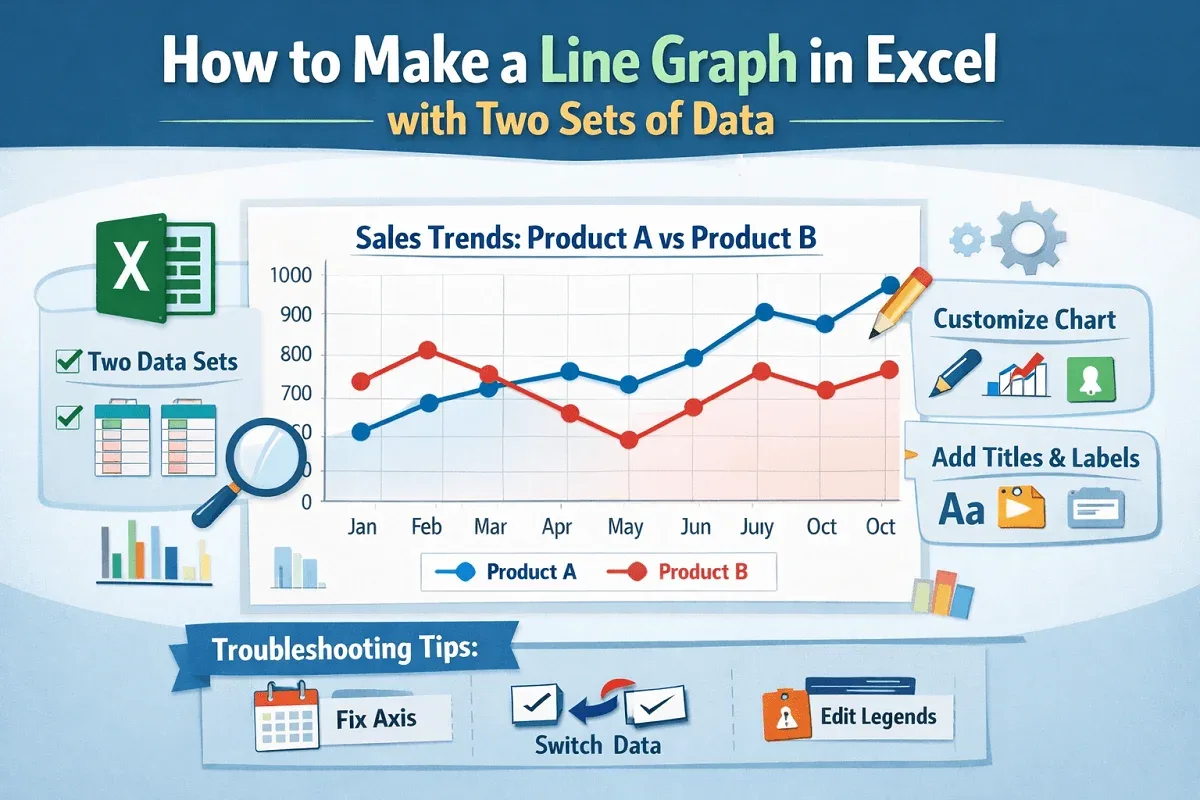
Learn how to make a line graph in Excel with two sets of data, clear steps, axis checks, customization, and quick tips easily.
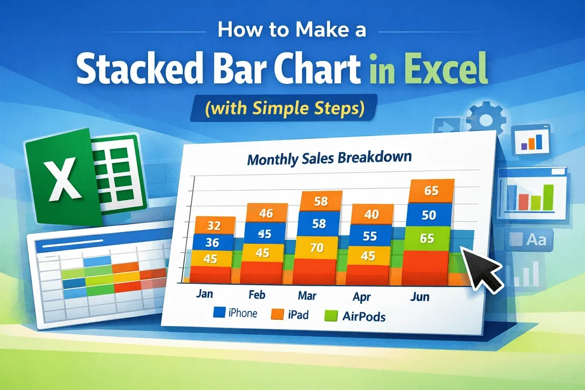
Learn how to make a stacked bar chart in Excel with step-by-step instructions, chart overview, and useful tips for clear data visualization.
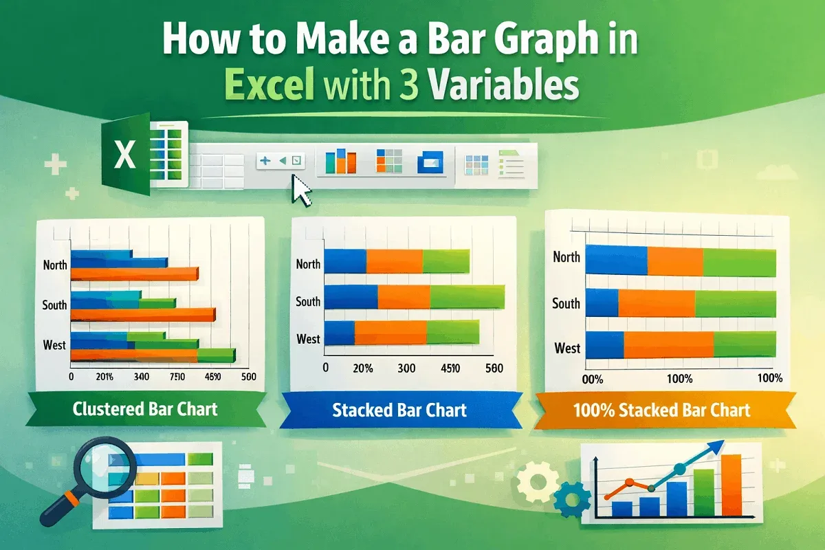
Learn how to make a bar graph in Excel with 3 variables using clustered, stacked, and 100% stacked bar charts in 2-D or 3-D formats.
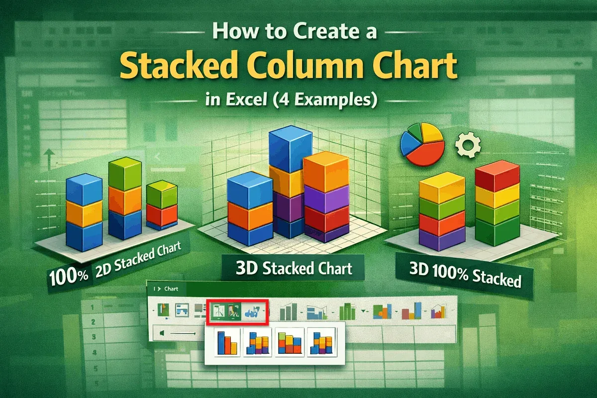
Learn how to create 2-D and 3-D stacked column charts in Excel, including standard and 100% types, to visualize your data effectively.
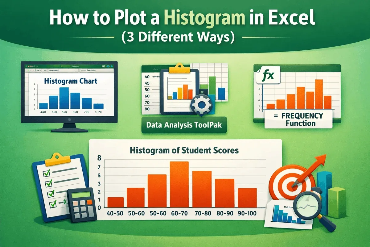
Learn how to plot a histogram in Excel using built-in charts, the Data Analysis ToolPak, or the FREQUENCY function, plus formatting tips.
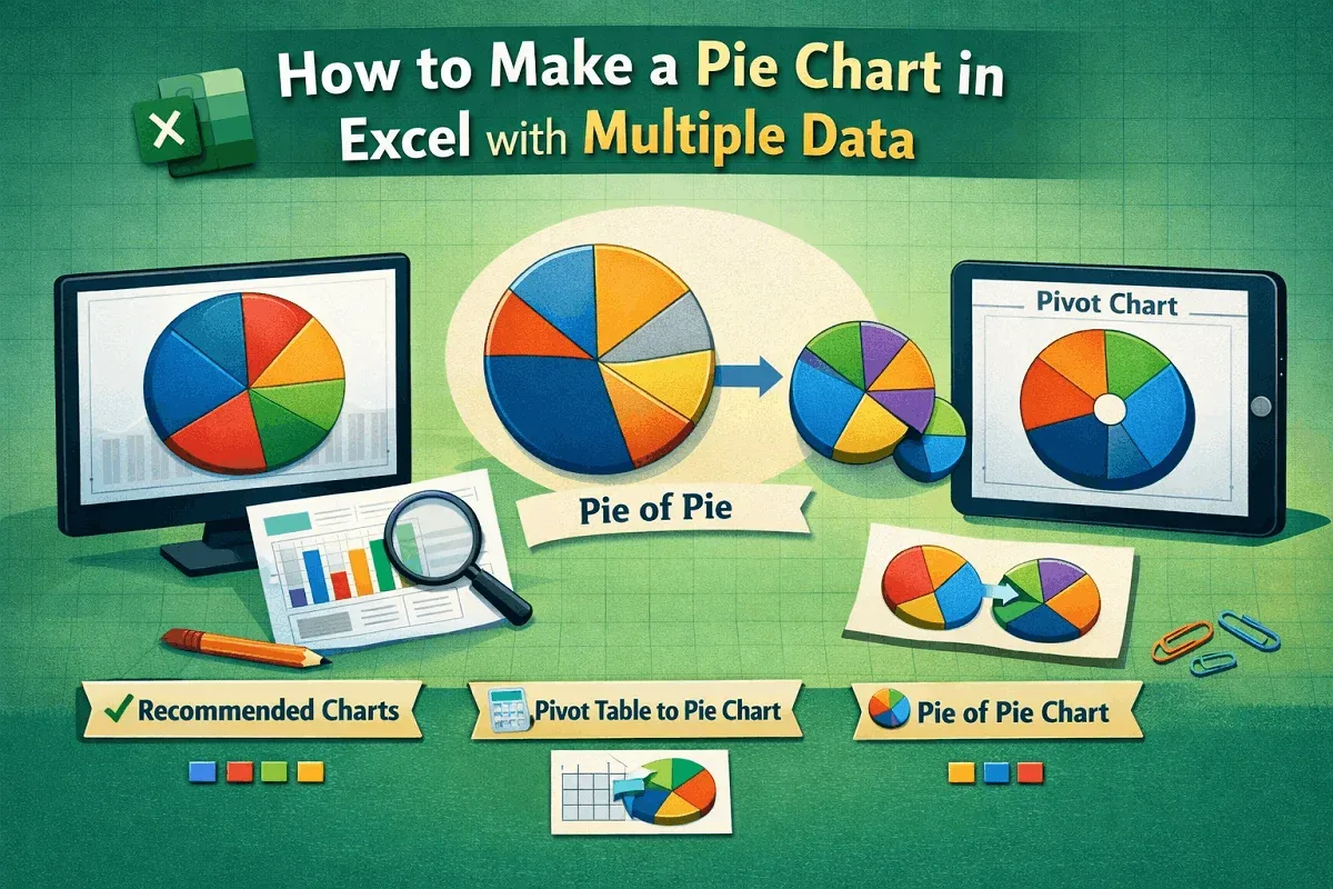
Learn how to make a pie chart in Excel with multiple data using charts, pivot tables, and formatting options like labels and colors.
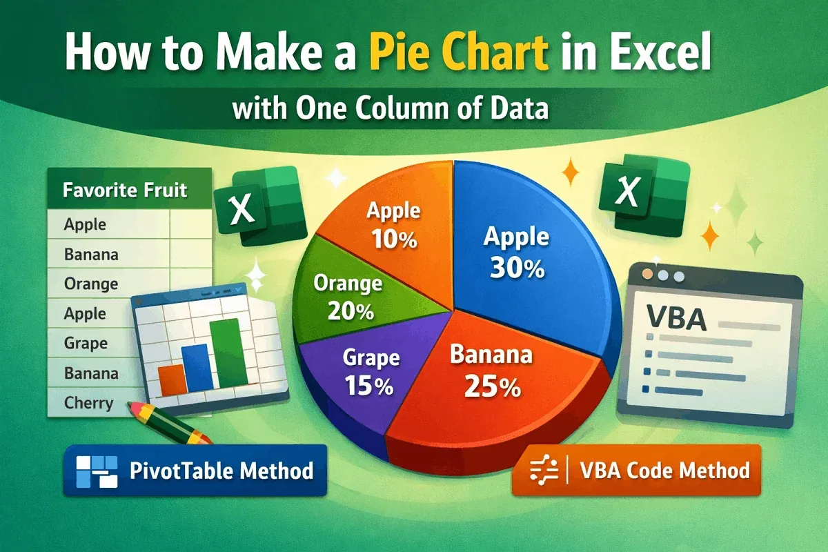
Learn how to create a pie chart in Excel from one column of data using Insert, PivotTable, or VBA code with simple, clear steps.
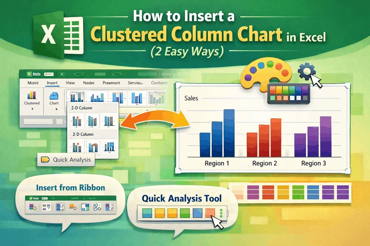
Learn how to insert a Clustered Column Chart in Excel using ribbons, the Quick Analysis Tool, and customize it to suit your data.
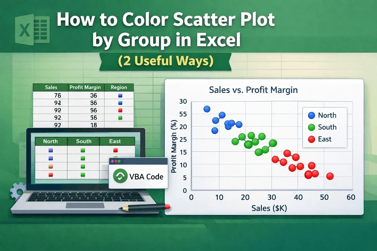
Learn how to color a scatter plot by group in Excel using helper columns or VBA code for clearer and more insightful data visualization.
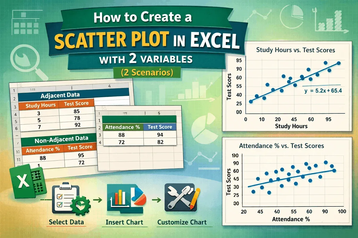
Learn how to create a scatter plot in Excel with two variables—adjacent or non-adjacent—using simple steps and customization tips.
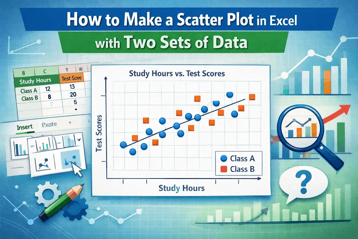
Learn how to create a scatter plot in Excel with two sets of data using easy steps for clear and effective data visualization.