
Area charts in Excel are a simple yet powerful way to visualize how different categories contribute to a total over time. It doesn’t matter if you are tracking monthly sales, website traffic, or departmental budgets; area charts help highlight both individual trends and overall growth. This method is commonly used in marketing, finance, and operations to compare performance across time periods.
To make an area chart in Excel, follow these steps:
➤ Select the dataset you want to visualize.
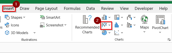
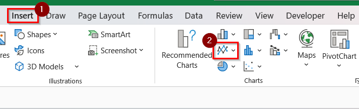
➤ Go to the Insert tab on the Excel ribbon.
➤ In the Charts group, click on the Insert Area or Line Chart icon and choose Area Chart or Stacked Area Chart based on your preference.
➤ Format the chart using colors, labels, and layout options under the Chart Design tab.
In this article, we will explain how to create an area chart (2-D, 3-D chart) in Excel using the built-in chart tools.
What Is an Area Chart in Excel?
An area chart in Excel is a graphical representation that displays quantitative data using shaded areas under a line. This helps us to visualize cumulative totals over time or compare the contribution of multiple categories. Area charts are particularly useful when we want to emphasize volume or change magnitude between data points.
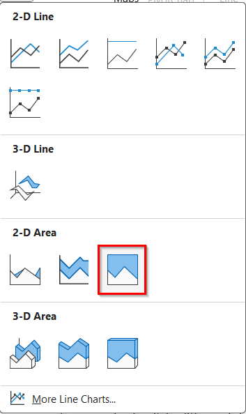
Make a Simple 2-D Area Chart in Excel
A 2-D Area Chart is a good way to visualize how different categories contribute to a total over time. Compared to line or column charts, it provides a clearer view of cumulative trends by filling the space beneath each data series. We use it when we want to highlight both growth and proportion in a single visual. This works by stacking filled areas for each category along a shared timeline and allows us to quickly grasp distribution patterns and changes across periods.
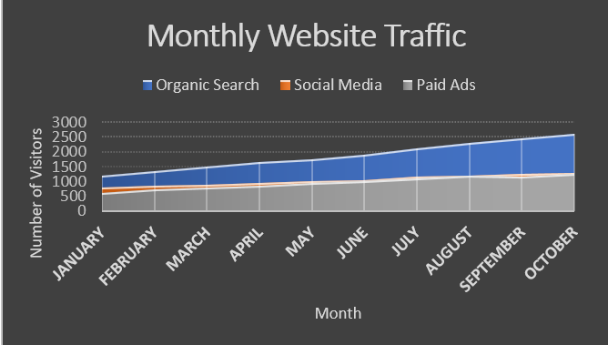
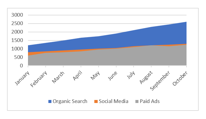
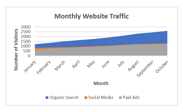
We have a dataset that contains the total monthly website traffic throughout the year of a digital marketing agency. We will track visitors coming from Organic Search, Social Media, and Paid Ads over ten months to analyze growth patterns and seasonal changes using a 2-D Area Chart in Excel.
Steps:
➤ Open your Excel sheet that contains your data. For example, we have taken a dataset that contains Month Name in Column A, Organic Search in Column B, Social Media in Column C, and Paid Ads in Column D.
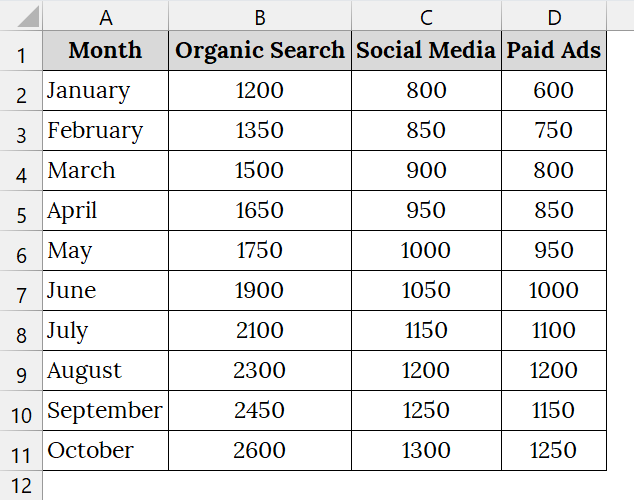
➤ Select the data range including the header. For example, select A1:D11.
➤ Go to the Insert tab on the Excel Ribbon. In the Charts group, click the Insert Line or Area Chart icon.
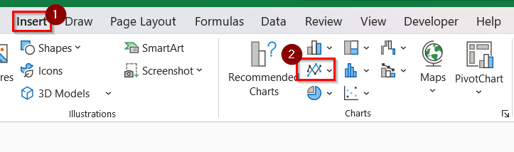
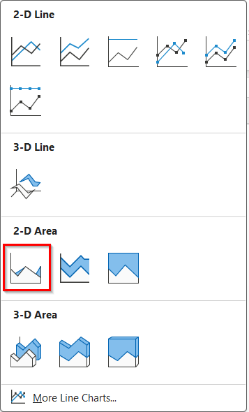
➤ Under the 2-D Area section, click on Area to insert a basic area chart.
➤ This will make a colored area chart that visualizes the monthly web traffic trends.
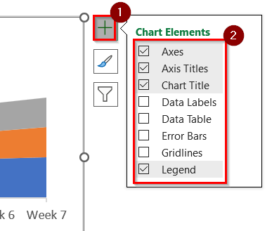
➤ To customize, click on the chart. Then, click on the Chart Elements (+) icon beside your chart. Check that you want to add in your chart.
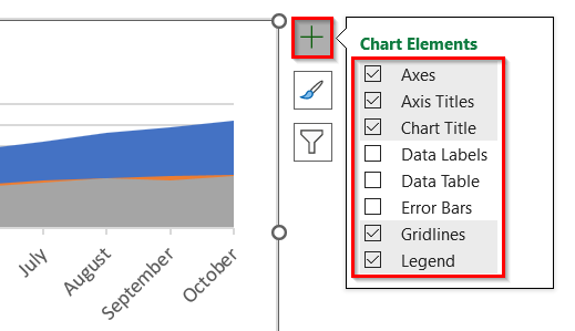
➤ You will see the Chart Title, and Axis Title to set names.
➤ To rename, double click on the Chart Title, and Axis Title.
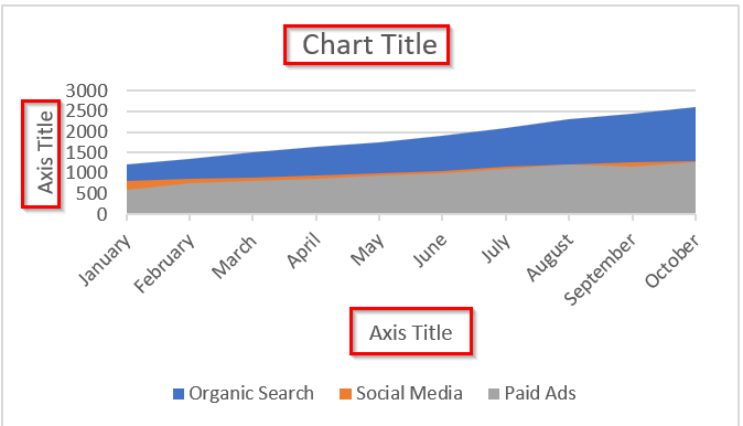
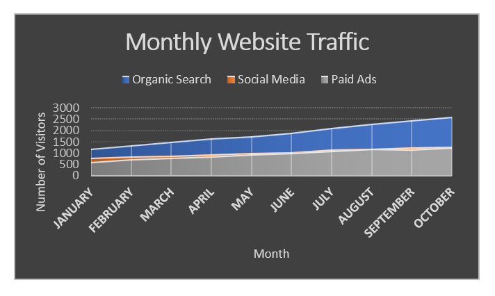
➤ For example, rename the Chart title as Monthly Website Traffic, the X-axis title as Month, and Y-axis title as Number of Visitors.
➤ To change the theme color, click on the chart. Then, click on the Chart Style icon beside your chart. Choose the theme that you want. For example, we have taken the black theme.
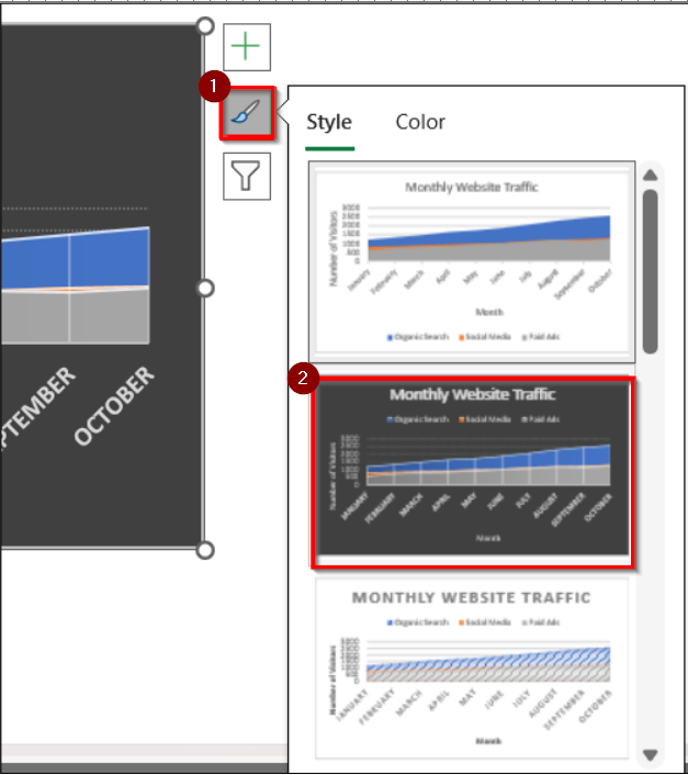
➤ The chart will appear with the selected theme.
Create a Stacked 2-D Area Chart in Excel
A stacked 2-D area chart in Excel displays quantitative data graphically and shows how different data series contribute to the total value over time. Compared to regular area or line charts, it emphasizes the cumulative effect of each data series by layering them visually. This method is good when we compare product-wise performance, revenue breakdowns, or category growth. This works by stacking filled areas for each series and allows us to see both individual contributions and overall trends in a single view.
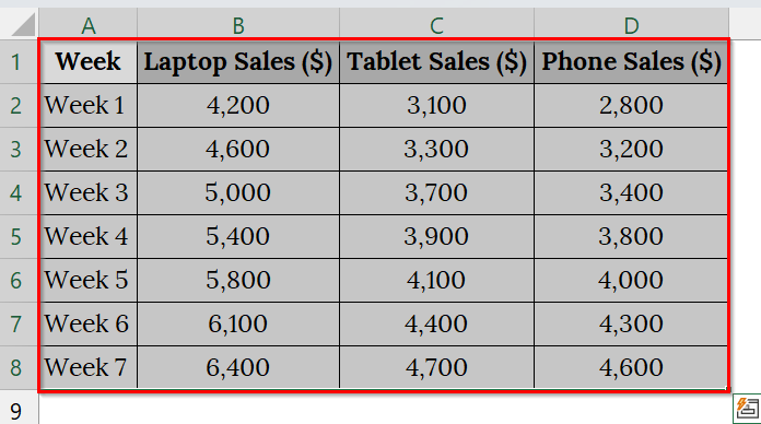
We have a dataset that contains product-wise weekly sales of TechWorld Electronics. We will use Stacked 2-D area charts to visualize overall revenue growth. The stacked area chart will help us to see which product line contributes most to the company’s total sales over time.
Steps:
➤ Open your worksheet that contains your data. For example, we have taken a dataset that contains Week Name in Column A, Laptop Sales ($) in Column B, Tablet Sales ($) in Column C, and Phone Sales ($) in Column D.
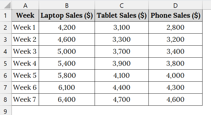
➤ Select the data range including the header. For example, select A1:D8.
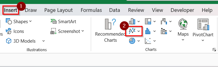
➤ Click on the Insert tab on the Excel ribbon. In the Charts group, click on Insert Line or Area Chart.
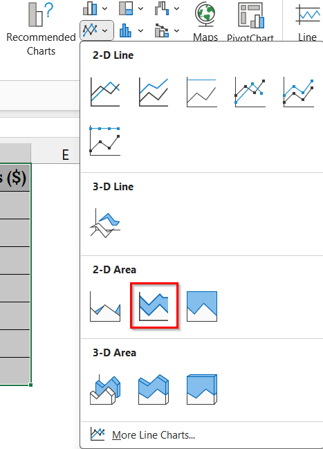
➤ From the dropdown, select Stacked Area under 2-D Area.
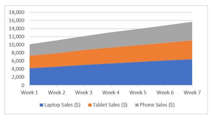
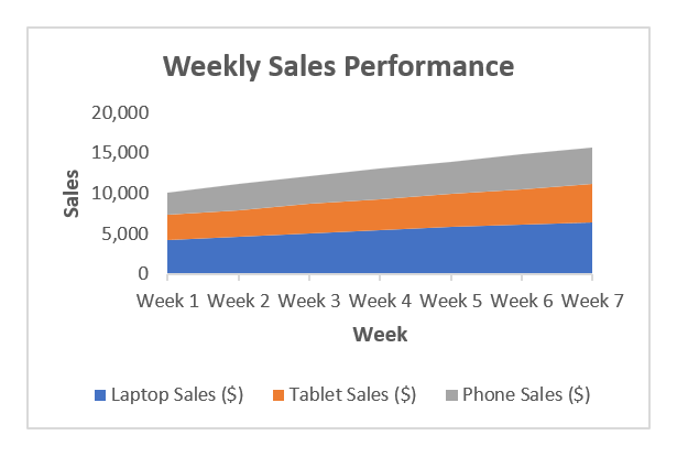
➤ Excel will insert a Stacked 2-D Area Chart representing Laptop, Tablet, and Smartphone sales trends over 7 weeks.
➤ To customize, click on the chart. Then, click on the Chart Elements (+) icon beside your chart. Check that you want to add to your chart.
➤ You will see the Chart Title and Axis Title to set names. To rename, double-click on the Chart Title and Axis Title.
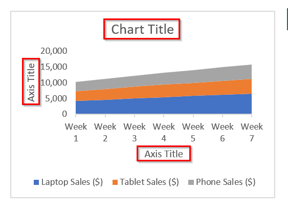
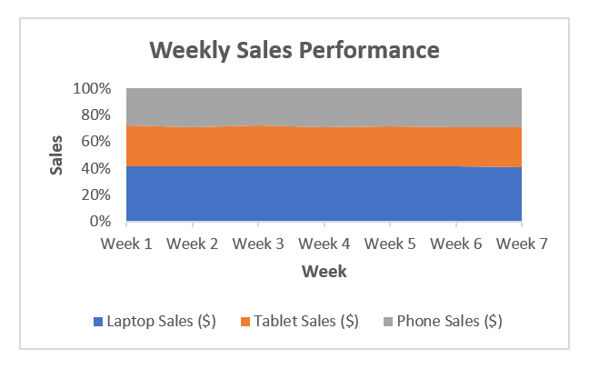
➤ For example, rename the Chart title as Weekly Sales Performance, the X-axis title as Week, and the Y-axis title as Sales.
➤ Optional: If you want to make a 100% stacked 2-D area chart, first click on the Insert tab on the Excel ribbon. In the Charts group, click on Insert Line or Area Chart.
➤ Under the 2-D Area section, click on 100% Stacked Area to insert a 100% stack area chart.
➤The chart will appear.
Note:
➥ Make sure all numeric columns are formatted as “Number” or “Currency” before inserting the chart.
➥ If the data has blanks or text, clean them before creating the chart for accurate results.
➥ You can switch the chart type anytime using Change Chart Type from the “Chart Design” tab.
Make a Simple 3-D Area Chart in Excel
A 3-D Area Chart is an upgraded version of a regular area chart that uses depth and perspective to emphasize cumulative trends over time. Compared to 2-D charts, it provides a more engaging and layered look when the data changes smoothly.
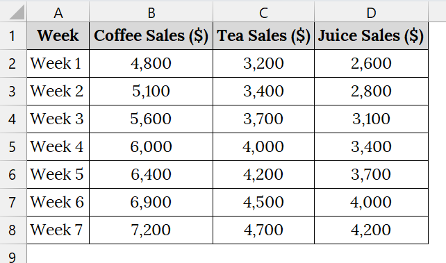
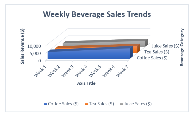
We have a worksheet that contains weekly beverage sales of a cafe. We will use a 3-D Area Chart to compare Coffee, Tea, and Juice revenue over 7 weeks.
Steps:
➤ Open your Excel sheet that contains your data. For example, we have taken a dataset that contains Week in Column A, Coffee Sales ($) in Column B, Tea Sales ($) in Column C, and Juice Sales ($) in Column D.
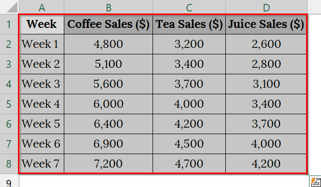
➤ Select the data range including both headers and numeric values.
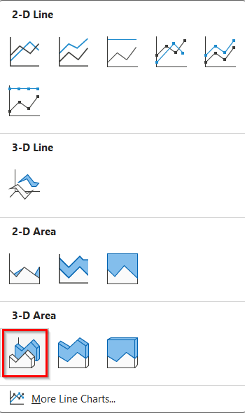
➤ Go to the Insert tab on the Excel ribbon. In the Charts group, click on Insert Line or Area Chart.
➤ From the dropdown, select 3-D Area under 3-D Area to insert a simple 3-D area chart. You can choose any as your preference.
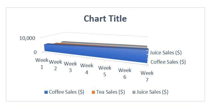
➤ Excel will instantly display a 3-D Area Chart showing all three beverage categories across 7 weeks. Check, only 2 beverage items are showing. To see all the items. Read up to the end.
➤ To customize, click on the chart. Then, click on the Chart Elements (+) icon beside your chart. Check that you want to add to your chart. For example, check Axis Title and Chart Title.
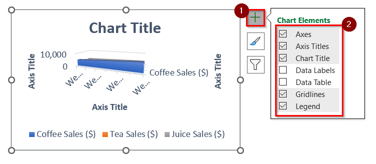
➤ You will see the Chart Title, and Axis Title to set names. To rename, double click on the Chart Title, and Axis Title.
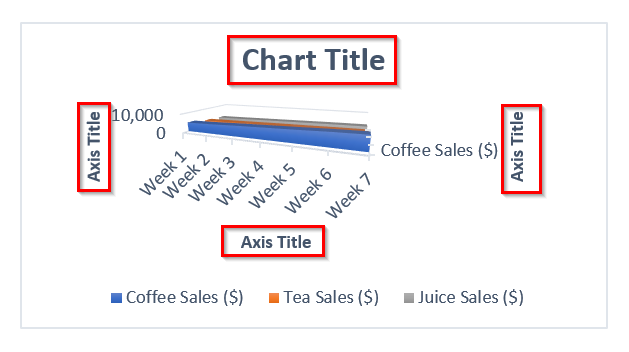
➤ For example, rename like these:
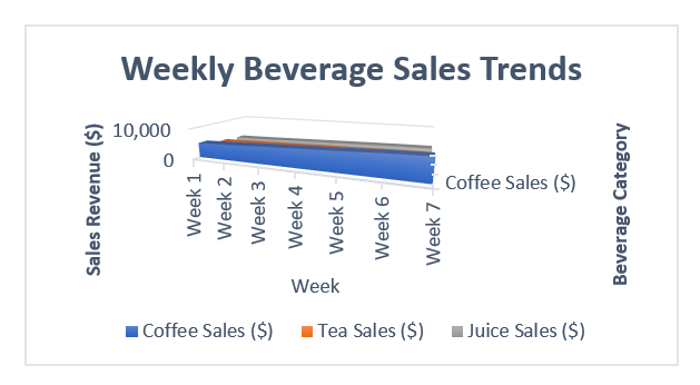
- Chart title as Weekly Beverage Sales Trends,
- X-axis title as Week,
- Y-axis title as Sales Revenue ($)
- Z-axis as Beverage Category.
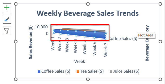
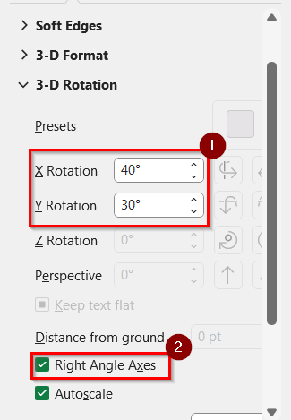
➤ To customize, right-click the chart (marked area).
➤ Choose 3-D Rotation.
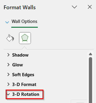
➤ Set X Rotation = 40°, Y Rotation = 30° for a balanced 3D depth.
➤ Check the “Right Angle Axes”
➤ Resize the chart. Now your 3-D Area Chart beautifully displays the gradual growth of beverage sales each week.
Note:
➥ Keep consistent color tones for each beverage to maintain clarity.
➥ A 3-D Area Chart works best when data shows gradual change (like sales, temperature, or performance over time).
Frequently Asked Questions
Can I make a stacked area chart in Excel?
Yes, Excel allows you to create stacked area charts to show the contribution of each data series to the total.
How do I change colors in an area chart?
Click on the colored area, go to Format → Shape Fill, and select your preferred color.
What’s the difference between an area chart and a line chart?
A line chart focuses on data trends, while an area chart emphasizes the magnitude of change with shaded color under the line.
Can I add labels to my area chart?
Yes, go to Chart Elements → Data Labels to display values on the chart.
Concluding Words
Creating an area chart in Excel using the Insert Area Chart method is a simple yet powerful way to visualize cumulative data. This method helps you present growth patterns, category comparisons, and overall progress more effectively, making your reports easier to understand at a glance. Also, you can download the text files and datasets we have used in this article to practice on your own.