
When we work with datasets of various categories, we often need a quick visualization method to see how differently these values or categories are distributed. For this purpose, using a pie chart is one of the easiest yet effective ways. It also helps with visualizing the differences and highlights the most and least contributed categories.
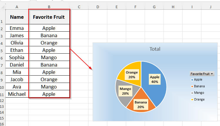
Suppose you did a survey on a group of people’s favorite fruits and kept the responses in a single column. Now, you want to see the distribution of different fruits among the people. In such a case, if you use a pie chart, it will instantly show you the proportion of each fruit. Also, you can easily see the most and least favorite fruits of that group.
In this article, we will discuss two methods for creating a pie chart in Excel using a single column of data, including the Insert function with PivotTable, and VBA code.
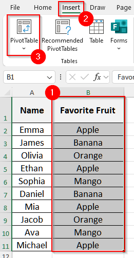
➤ First, select the Favorite Fruit column, i.e., cell B1 to B11.
➤ Then, click on the Insert tab on the upper menu bar, and choose PivotTable from the Tables group.
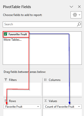
➤ A pop-up will come up, and click on OK. Now, drag Favorite Fruit into the Rows area in the PivotTable Fields section.
➤ Then, drag Favorite Fruit into the Values area too, and it will show the count of each fruit.
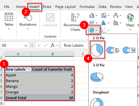
➤ Now, you will see a summary table appear. Select the table and click on the Insert tab again.
➤ Then, some options will appear under the Insert tab. Click on the Pie Chart drop-down in the Charts group and choose a chart under 2-D Pie.
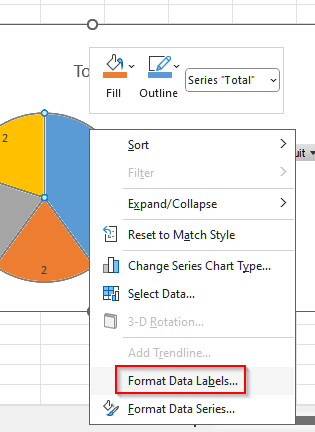
➤ Now, right-click on the chart and select Add Data Labels. It will show the counts.
➤ To customize the data label, right-click on the chart again and choose Format Data Labels.
➤ It will open up another window. Select Category Name and Percentage from the options, and finally, click on the x sign on the top right corner of that pop-up, and your pie chart with one column of data is ready.
Make a Pie Chart Using PivotTable for One Column of Data
The Insert function in Excel automatically converts our values into chart slices, providing a clear visual representation of the distribution.
We will use the dataset below to explain how you can make a pie chart in Excel with the Insert function and PivotTable for just one column of data.

This is a survey dataset on a group of people’s favorite fruits.
Steps:
➤ First, select the Favorite Fruit column, i.e., cell B1 to B11.
➤ Then, click on the Insert tab on the upper menu bar, and some options will appear under it.
➤ Now, choose PivotTable from the Tables group.
➤ A pop-up will come up, and click on OK.

➤ Now, drag Favorite Fruit into the Rows area in the PivotTable Fields section.
➤ Then, drag Favorite Fruit into the Values area too, and it will show the count of each fruit.
➤ Now, you will see a summary table appear. Select the table and click on the Insert tab again.
➤ Then, some options will appear under the Insert tab. Click on the Pie Chart drop-down in the Charts group and choose a chart under 2-D Pie.
➤ Now, right-click on the chart and select Add Data Labels. It will show the counts.

➤ To customize the data label, right-click on the chart again and choose Format Data Labels.
➤ It will open up another window. Select Category Name and Percentage from the options, and finally, click on the x sign on the top right corner of that pop-up.

➤ Now, your pie chart with one column of data is ready.

Insert VBA Code to Make a Pie Chart with One Column of Data
With a simple VBA code, we can easily create a pie chart without going through a lot of steps. Let’s take a look at how you can make such a pie chart for one column of data.
Steps:
➤ First, press Alt + F11 on your keyboard to open the VBA editor.
➤ Then, right-click on the sheet your data is on.
➤ Now, select Insert and then choose Module. It will open up a new window.
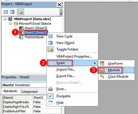
➤Paste the following VBA code into the module window.
Sub PieChartFromOneColumn()
    Dim ws As Worksheet, co As ChartObject
    Dim lastRow As Long, lastDRow As Long
    Set ws = Worksheets("Sheet1")
    ' Find last row in column B (Favorite Fruit)
    lastRow = ws.Cells(ws.Rows.Count, "B").End(xlUp).Row
    ' Clear previous summary
    ws.Range("D:E").Clear
    ws.Range("D1:E1").Value = Array("Fruit", "Count")
    ' Copy unique fruits to D column (AdvancedFilter needs header)
    ws.Range("B1:B" & lastRow).AdvancedFilter Action:=xlFilterCopy, _
        CopyToRange:=ws.Range("D1"), Unique:=True
    ' Count each fruit
    lastDRow = ws.Cells(ws.Rows.Count, "D").End(xlUp).Row
    ws.Range("E2:E" & lastDRow).Formula = "=COUNTIF(B:B,D2)"
    ' Insert Pie Chart
    Set co = ws.ChartObjects.Add(300, 50, 350, 250)
    With co.Chart
        .SetSourceData ws.Range("D1:E" & lastDRow)
        .ChartType = xlPie
        .HasTitle = True
        .ChartTitle.Text = "Favorite Fruits"
        .ApplyDataLabels
    End With
End Sub
➤ Now, press F5 or click on the run icon from the top menu bar.

➤ Finally, you will see the pie chart in your original worksheet.

Frequently Asked Questions
Do I Always Need to Summarize the Category Data Counts Before Making a Pie Chart?
No, you do not need to summarize data before making a pie chart every time. If your data is numeric, you can create a pie chart directly. However, if your data is categorical or text, like favorite fruits or survey answers, then you need to summarize the counts for each category. It is because Excel needs counts for each category to determine slice sizes.
Can I Make a Pie Chart With One column of Data in Excel 2007?
Yes, you can make a pie chart from one column of data in Excel 2007 or any other older versions. However, these older versions have limited options for customization and thus may not support all the formatting you like to do in your pie chart. Regardless of this, you can still make the basic pie chart in any version of Excel.
Wrapping Up
In this article, we have explained two methods to create a pie chart in Excel with only one column of data. While using the PivotTable and Insert functions, you can perform all the steps yourself, using VBA, you can save time. Give these methods a try and reach out to us if you have any inquiries.