Need to forecast values outside of the current data range? You can extrapolate the trend graphically by using Excel’s Trendline and Forecast feature. This article explains how to extrapolate a graph in Excel with examples of linear and nonlinear datasets. Whether you’re monitoring sales, analyzing user behavior, or predicting growth, Excel’s Trendline and Forecast features offer an easy way to extrapolate and quickly get results.
➤ Extrapolating a graph predicts values or trends beyond the known data range. In this article, we’ll learn about extrapolation and how to extrapolate a graph in Excel using the Trendline and Forecast features for both linear and nonlinear data.
➤ Extrapolate a graph: Insert chart >> Setup horizontal axis titles >> Trendline (Linear/Nonlinear) >> Forecast periods (Forward/Backward) >> Enable equation >> Copy the equation >> Plug in the x value.
➤ The steady growth use the linear Trendline. For accelerating growth, use exponential, logarithmic, etc. Trendlines.
➤ For capturing variations (peaks and troughs), use a polynomial Trendline.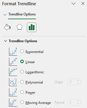
What Is Extrapolation?
Extrapolation predicts values outside known data points by extending the dataset’s trend based on historical data.
Extrapolating a Linear Graph in Excel
The monthly sales dataset contains the month no., Month, east region, west region, central region, and total units sold from columns A through F.
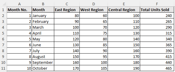
This dataset shows a steady linear growth that we’ll visualize through a Scatter chart. Assuming this trend continues, we’ll add a Trendline and then extrapolate this Trendline by forecasting for a certain number of periods. Note that Excel can forecast in both forward and backward direction.
Let’s consider the month number as the independent variable (x) and the total units sold as the dependent variable (y) to plot the Scatter chart.
Steps:
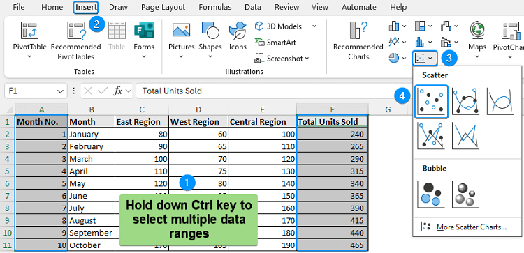
➤ Select the cells containing month no. (A2:A11) >> Hold down the Ctrl Key >> Choose total units sold (F2:F11) >> Insert >> Scatter or Bubble Chart >> Scatter.
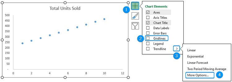
➤ Click Chart Elements (plus icon) >> Uncheck Gridlines >> Trendline >> More Options.
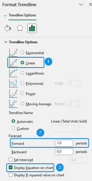
➤ Select Linear >> Feel free to choose other options that fit the data trend >> Forecast >> Forward >> 1 period >> Enable Display Equation on chart.
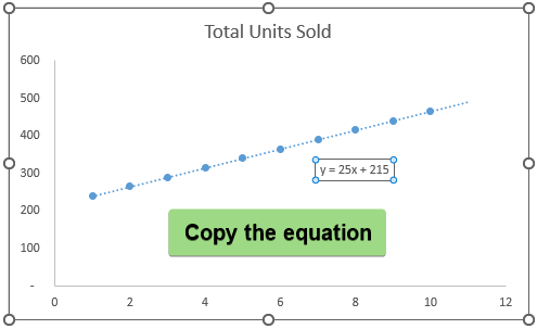
➤ The Trendline has been extended by 1 period forward (Month 11) >> Click on the equation >> Select and copy the equation.
➤ Paste the equation in cell C14 >> Plug in the x value (Month 11) to extrapolate the total units sold in November.
=25*C13+215
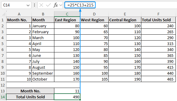
The estimated total units sold in November is 490.
Extrapolate a Nonlinear Graph in Excel
Datasets with increasing growth are nonlinear and are best modeled by exponential, logarithmic, polynomial, etc. Trendlines.
Exponential Trendline
The website visitor dataset contains the day no., day, organic users, paid users, referral users, and total active users from columns A through F.
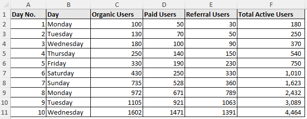
Once again, the basic idea will the similar to the previous method. The day no. is the independent variable (x) and the total active users is the independent variable (y). First, we’ll plot a Scatter chart and select the Trendline that best fits the data. Next, we’ll extrapolate the Trendline to forecast forward.
Steps:
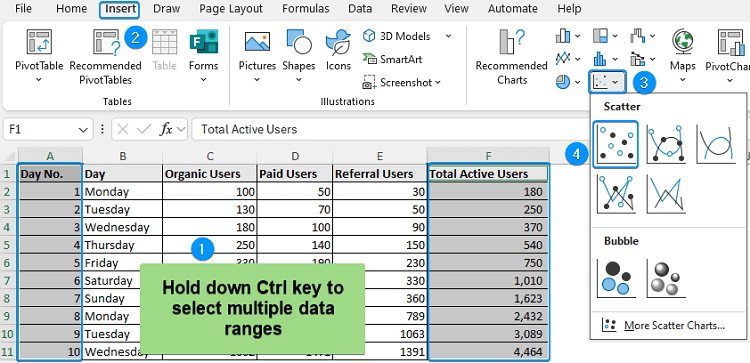
➤ Choose the cell range containing day no. (A2:A11) >> Hold the Ctrl Key >> Choose total active users (F2:F11) >> Insert >> Scatter or Bubble Chart >> Scatter.
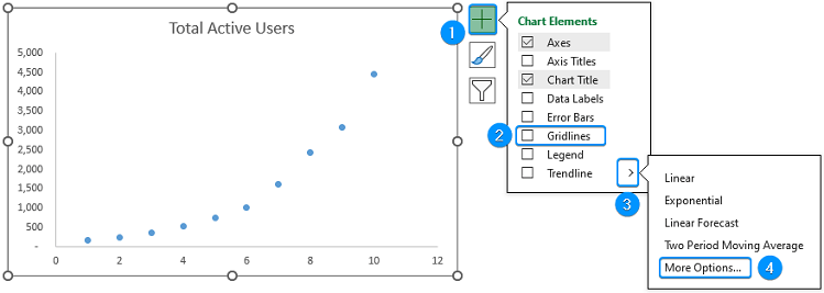
➤ Chart Elements >> Disable Gridlines >> Trendline >> More Options.
➤ Select Exponential Trendline >> Forecast >> Forward >> 2 periods >> Check Display Equation on chart option.
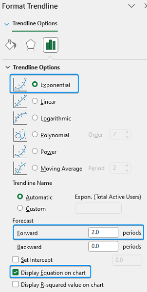
➤ The Trendline has extrapolated 2 periods forward >> Click on the equation >> Highlight and copy the equation.
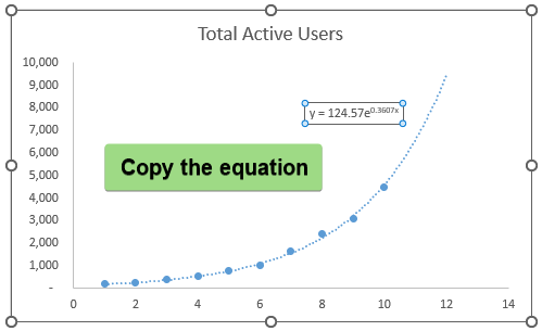
➤ Paste the equation in cell C14 >> Replace “e” with the EXP function >> Plug in the x value (Day 12) to project the total active users in December.
=124.57*EXP(0.3607*C13)
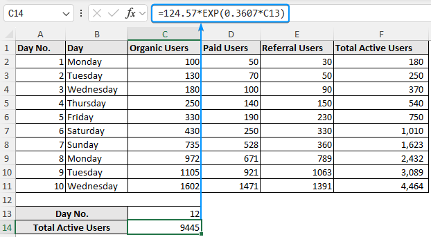
The projected active users on day 12 will be 9445.
Polynomial Trendline
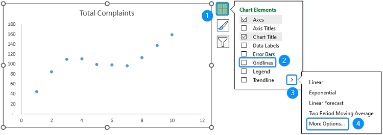
The software complaints dataset contains the quarter no., quarter, software bugs, UI issues, performance complaints, and total complaints from columns A through F.
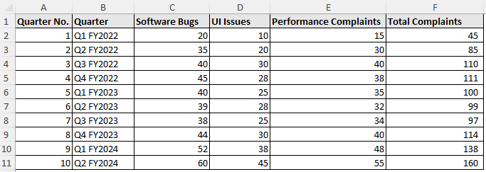
Considering the quarter no. as the independent variable (x) and total complaints as the dependent variable (y), we’ll extrapolate to determine the total complaints in quarter 12.
Steps:
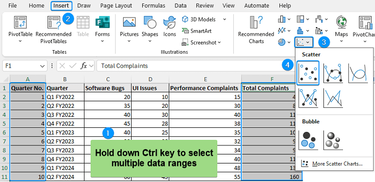
➤ Choose the cells containing quarter no. (A2:A11) >> Hold Ctrl Key >> Choose total complaints (F2:F11) >> Insert >> Scatter or Bubble Chart >> Scatter.
➤ Chart Elements >> Uncheck Gridlines >> Trendline >> More Options.
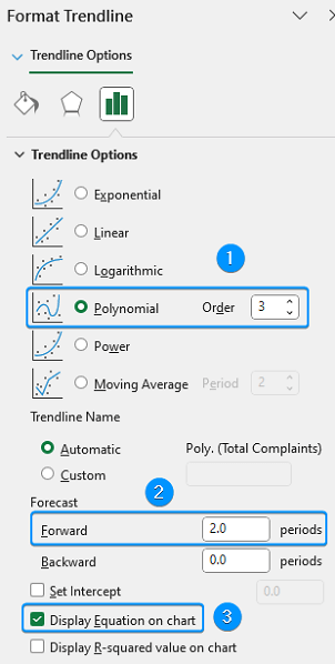
➤ Select Polynomial >> Order 3 >> Forecast >> Forward >> 2 periods >> Enable Display Equation on chart.
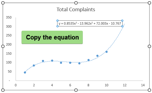
➤ Forward extrapolation by 2 periods can be seen in the graph >> Click on the equation >> Select and copy the equation.
➤ Paste the equation in cell C14 >> Plug in the x value (Quarter 12) to estimate the total complaints.
=0.8535*C13^3-13.962*C13^2+72.003*C13-10.767
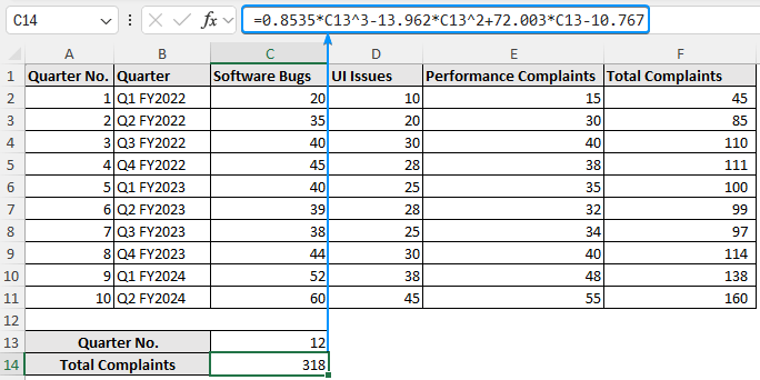
The forecasted total complaints in quarter 12 will be 318.
➥ For rapidly increasing growth, use the exponential Trendline.
➥ The polynomial Trendline captures the variations during the product lifecycle.
➥ Selecting the right model helps prevent overfitting or underfitting of the data.
➥ The estimated total units sold in November is about 490.
➥ The projected active users on day 12 will be around 9445.
➥ The forecasted total complaints in quarter 12 should be about 318.
FAQ
What is data extrapolation?
Data extrapolation estimates values beyond the known data points based on the assumption the trend of the data continues.
How do you extrapolate a plot in Excel?
Insert a plot with the available data >> Add Trendline (Linear/Nonlinear) >> Forecast (Forward/Backward) >> Apply formatting.
What is the formula for extrapolation?
Formula: y = y1 + (x - x1) * (y2 - y1) / (x2 - x1)
How can you extend the trendline in Excel?
Double click on the Trendline to open Format Trendline pane >> Forecast >> Enter the periods Forward/Backward to extend the line.
How to tell if the trendline fits the data?
Enable the R squared option in the chart. The closer it is to 1, the better the fit.
Can I extrapolate beyond 2 periods?
Yes, you can set any number of periods in the Forecast Forward/Backward fields. However, the further you forecast (forward/backward), the less reliable the results will be.
Wrapping Up
In this tutorial, we’ve learned about extrapolation and how to extrapolate a graph in Excel using the Trendline feature for both linear and nonlinear data. Feel free to download the practice file and share your thoughts and suggestions.