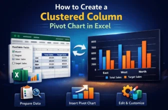
Visualizing data is crucial for better analysis, and a clustered column Pivot Chart is one of the best charts for it. It is a type of bar chart that displays data in vertical columns, where related ...
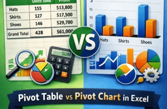
We use pivot tables to analyze and summarize large datasets while using pivot charts to visualize that summary.Suppose you want to check monthly sales by region of a store. You can make a pivot ...
Charts are extremely useful for statistical analysis. In Excel, charts are often used in conjunction with tables to visualize data. In a pivot table, charts become even more useful as they provide a ...