When looking at survey answers in Excel, you can transform and extract useful information from them. Whether you are a researcher, student, or marketing analyst, you can use Excel to clean, summarize, and visualize data. This article provides a comprehensive guide on how to analyze survey data in Excel. You will learn to summarize, visualize, explore, and draw insights from your data, using various Excel tools and features. By the end of this post, you can confidently assess your survey data.
➤ Frequency: ➤ Variability: ➤ Cross Tables: PivotTable >> Independent variable to Rows area >> Dependent variable to Columns area >> Dependent variable to Values area >> Value Field Settings >> Count >> % of Column Total or % of Row Total. In this article, we’ll learn how to analyze survey data in Excel by calculating frequency and percent, measuring central tendency and variability, creating cross tables, and plotting charts.=COUNTIF(cell_range,criteria) OR PivotTable >> Value Field Settings >> Count.
➤ Percent: PivotTable >> Value Field Settings >> Count >> % of Grand Total.
➤ Central Tendency:AVERAGE(cell_range)=MEDIAN(cell_range)=MODE(cell_range)=MAX(cell_range) − MIN(cell_range)=STDEV.P(cell_range)=VAR.P(cell_range)
➤ Correlation: =CORREL(array_1,array_2)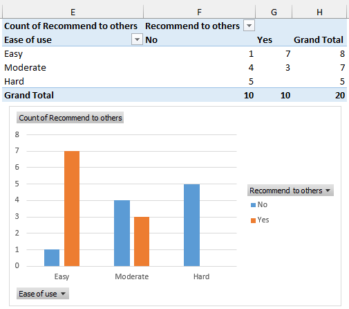
What Is Survey Data Analysis?
The process of arranging, summarizing, and evaluating survey results is known as survey data analysis. To draw insights from the data, various statistical measures, like central tendency, variability, frequency, cross tabulations, correlation, charts, etc. are used.
Analyzing Survey Data
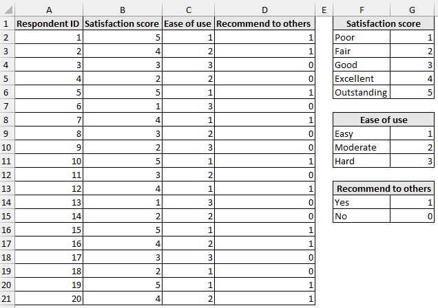
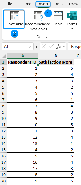
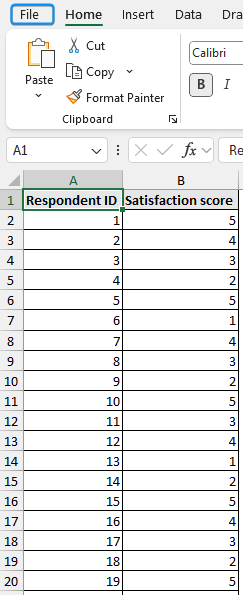
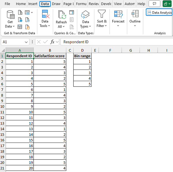
Consider conducting a poll to survey consumer feedback of a new product. Responses were gathered from 20 participants about satisfaction scores, ease of use, and recommending it to others.
- Satisfaction Score (1=Poor to 5=Outstanding)
- Ease of Use (1=Easy, 3=Hard)
- Recommend to Others (1=Yes, 0=No)
Let’s use this dataset to analyze survey data in Excel and identify trends, focusing on areas that need improvement.
Analyzing Survey Data in Excel: Frequency and Percent
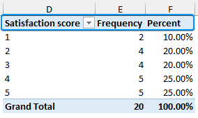
Frequency is the number of times something has occurred. Let’s create a frequency table with percentages for the “satisfaction score” column. It will help us understand how many respondents chose various satisfaction levels based on their user experience.
You can use Excel’s COUNTIF function or the Pivot Table feature to calculate the frequency and percent.
Using COUNTIF Function
The COUNTIF function counts the number of times something has occurred, given that it matches the criteria. We can calculate the frequency with the COUNTIF function.
Steps:
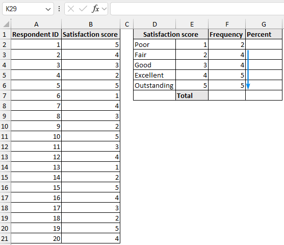
➤ Select the output cell (F2) and enter the formula.
=COUNTIF($B$2:$B$21,E2)
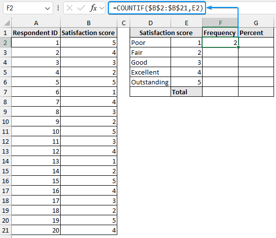
➤ Use the Fill Handle tool to copy the formula to the cells below.
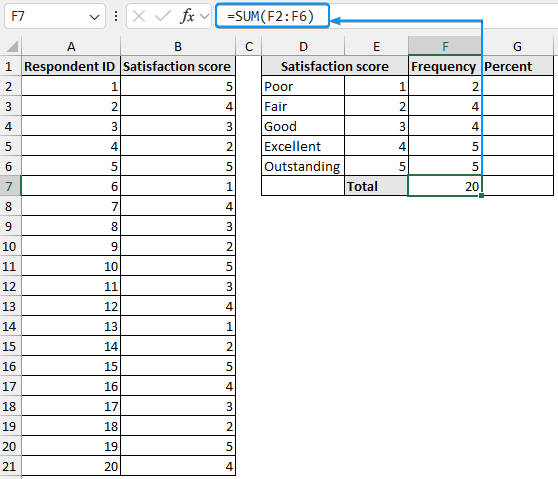
➤ Use the SUM function to calculate the total frequency. This should add up to the total number of respondents (20).
=SUM(F2:F6)
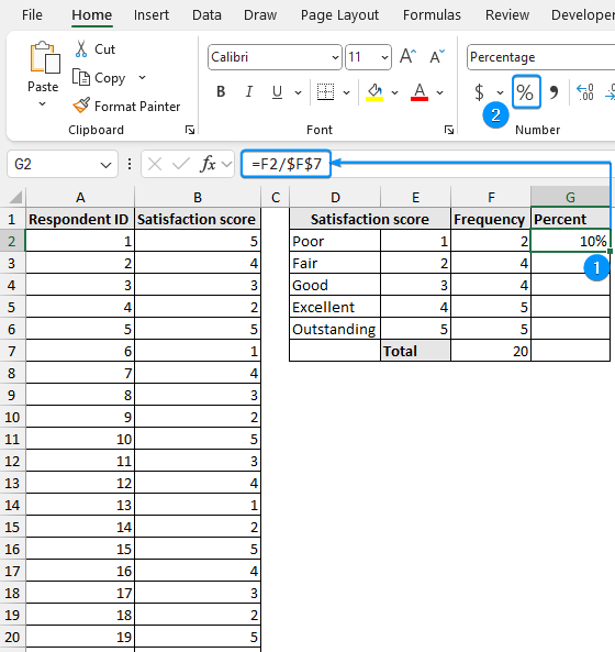
➤ Divide the frequency for each category by the total frequency >> Apply percentage formatting.
=F2/$F$7
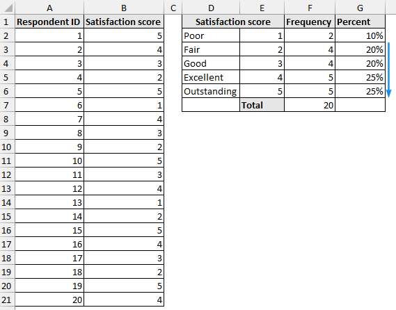
➤ Copy the expression to the cells below to complete the frequency table with percentages.
Using PivotTable
Excel’s PivotTable feature offers an interactive way to summarize complex data and draw conclusions. In addition, you can also visualize the results with PivotCharts. To create the same frequency table with percentages using PivotTable, follow the steps.
Steps:
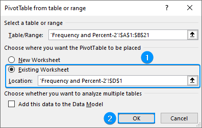
➤ Select any cell within the data >> Insert >> PivotTable.
➤ Choose Existing Worksheet >> Location (D1) >> OK.
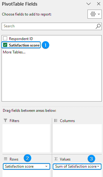
➤ Drag the satisfaction score field in the Rows and Values area.
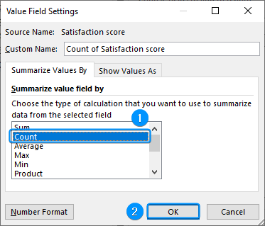
➤ Click the drop-down arrow >> Value Field Settings.
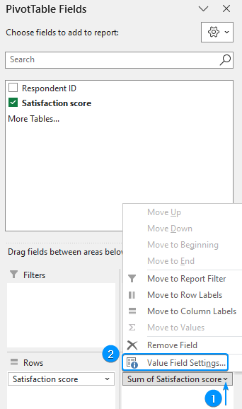
➤ Select Count for the Summarize Values By calculation >> OK.

➤ Again drag the satisfaction score field in the Values area and go to Value Field Settings.
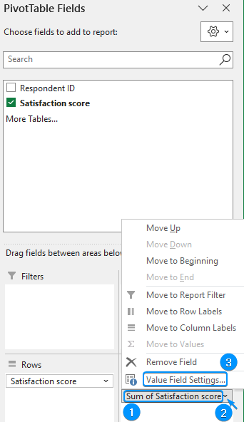
➤ Select Count >> OK.
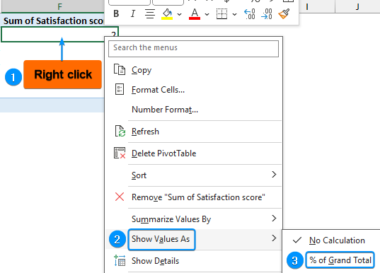
➤ Right-click on any cell with the sum >> Show Values As >> % of Grand Total.
➤ You can set suitable column headers to complete the frequency table.
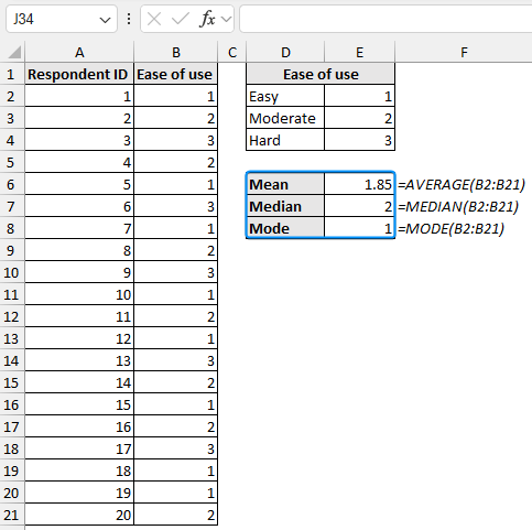
Measuring Central Tendency
Measures of central tendency represent the mean, median, and mode of the distribution. It helps us understand the overall product rating by the users.
Let’s measure the central tendency for the “ease of use” column using the AVERAGE, MEDIAN, and MODE functions.
Steps:
➤ Use the AVERAGE, MEDIAN, and MODE functions to successively calculate the measures of central tendency.
Mean: =AVERAGE(B2:B21)
Median: =MEDIAN(B2:B21)
Mode: =MODE(B2:B21)
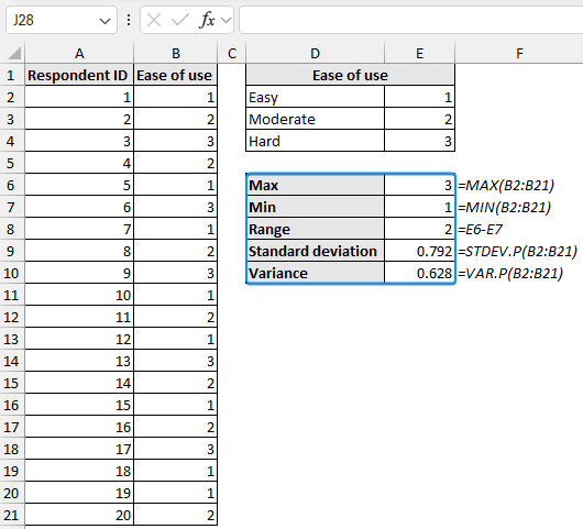
Measures of Variability
Measures of variability explain how far spread out or dispersed the values are in a dataset. Let’s measure the variability for the “ease of use column” to see if it shows a large variation, which may indicate the product is not user friendly.
Steps:
➤ The measures of variability can be calculated with the MAX, MIN, STDEV.P, and VAR.P functions. Range is the difference between the maximum and minimum value of the dataset.
Max: =MAX(B2:B21)
Min: =MIN(B2:B21)
Range: =E6-E7
Standard deviation: =STDEV.P(B2:B21)
Variance: =VAR.P(B2:B21)
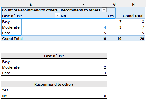
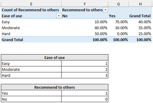
Analyzing Survey Data in Excel with Cross Tables
Cross tables (contingency tables) compare and summarize the relationship between two or more variables, like whether those who reported the product was easy to use also recommended it to others.
Frequency in Cross Tables
We want to investigate the effect of “ease of use” on “recommend to others”.
Steps:
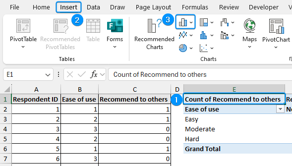
➤ Create a PivotTable as shown earlier >> Drag the independent variable (ease of use) to the Rows area.
➤ Move the dependent variable (recommend to others) in the Columns area.
➤ Now drag “recommend to others” in the Values area and set the Field Value Settings to Count.
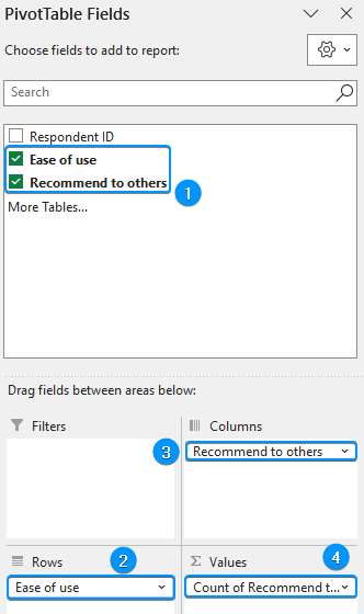
➤ Add descriptive labels to the cross tab. Make sure the top left corner shows the count this ensures the cross table is showing frequencies.
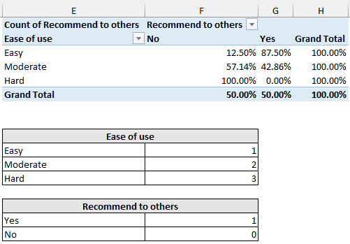
Percent of Column and Row Total in Cross Tables
You can also display percentages in the cross table.
Steps:
➤ Create a copy of the worksheet or make the same PivotTable in a new worksheet.
➤ Right click on any frequency value >> Show Value As >> % of Column Total.
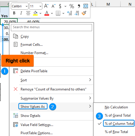
➤ The image below shows the percentage (%) of Column Total.
➤ You can also show the results as a percentage (%) of Row Total.
Analyzing Survey Data in Excel by Determining Correlation
The correlation coefficient shows the strength and direction of the relationship between two variables. Here, we’ll calculate the correlation coefficient between “satisfaction score” and “recommend to others”, to check if a greater satisfaction score influences the decision to recommend to others.
Steps:
➤ Enter the formula in cell (F12).
=CORREL(B2:B21,C2:C21)
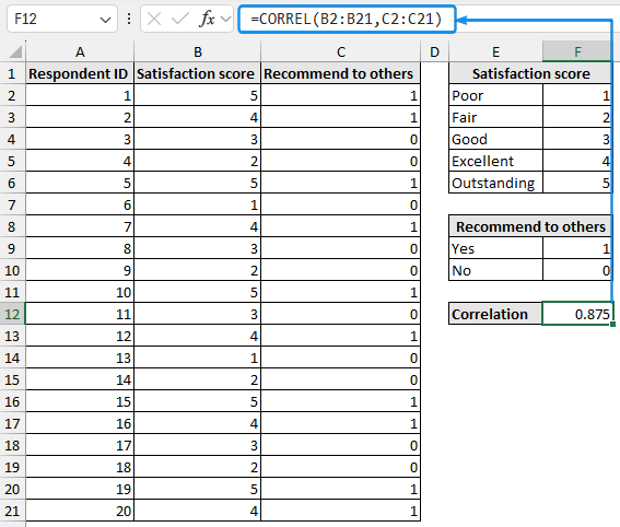
We can observe a strong positive correlation between “satisfaction score” and “recommend to others”. A higher satisfaction score increases the likelihood of recommending the product to others.
Using Charts to Analyze Survey Data
Charts help to visualize the findings of an analysis, making trends in the data easy to understand. We’ll plot a histogram and a clustered column chart.
Histogram
The histogram shows the distribution of data grouped into bins. Let’s plot a histogram for the distribution of satisfaction scores. Before starting, we need to enable the Data Analysis add-in.
Steps:
➤ Click on the File tab.
➤ Select Options. You can also use the shortcut Alt + F + T to open Excel Options.
➤ Select Add-ins >> Choose Excel Add-ins from the dropdown >> Go.
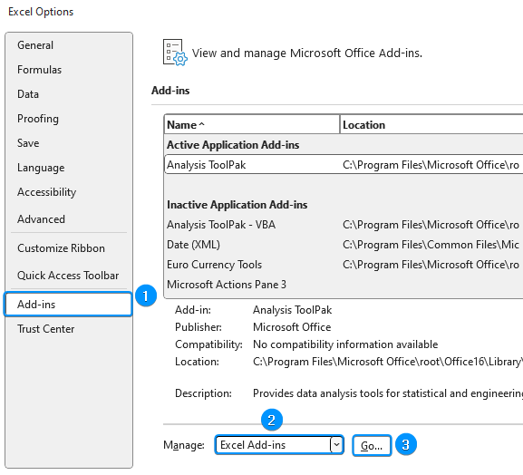
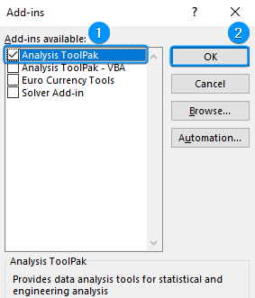
➤ Check the Analysis ToolPak option >> OK.
The Data Analysis option will be available in the Data tab whenever you open a new workbook.
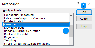
➤ Go to the Data tab >> Click Data Analysis.
➤ Select Histogram >> OK.
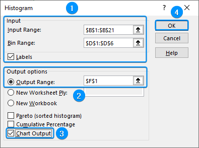
➤ Select the Input Range (B1:B21) >> Bin Range (D1:D6) >> Check the Labels option.
➤ Choose the output cell (F1) >> Tick Chart Output option >> OK.
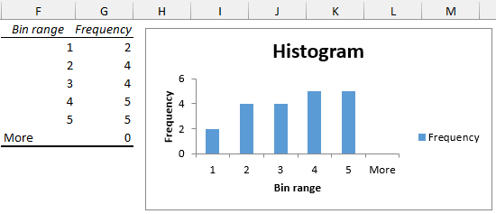
➤ The results are shown below.
Clustered Column Chart
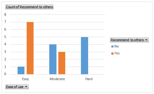
A clustered column chart compares different categories. For example, we can plot a clustered column chart to understand how ease of use impacts whether the product gets recommended to others.
Steps:
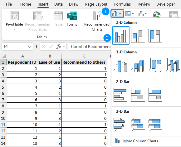
➤ Select any cell in the PivotTable >> Insert >> Column or Bar chart.
➤ Column or Bar chart >> Clustered Column.
➤ The result is shown below.
➤ 50% of the respondents rated a satisfaction score of 4 or 5 (excellent or outstanding).
➤ A mean of 1.85 and a median of 2 suggest the ease of use of the product ranges from easy to moderate. Additionally, a mode of 1 indicates that the most frequently occurring value corresponds to easy.
➤ A range of 2 and a standard deviation of 0.792 indicates low variability for the ease of use variable.
➤ Out of 20, 10 respondents found the product easy or moderate and would recommend it to others.
➤ 75% of the respondents rated the ease of use as easy or moderate.
➤ There is a strong positive correlation (0.875) between satisfaction score and recommending it to others. A higher satisfaction score influences the decision to recommend to others.
➤ The histogram shows the distribution of the satisfaction scores. 50% of the respondents gave a satisfaction score of 4 or 5.
➤ The clustered column chart shows how ease of use affects whether the product gets recommended to others. Only respondents who reported the ease of use as easy or moderate recommended the product to others.
FAQ
How to use Excel to analyze data?
If you use Excel 365 or Excel for the web you can use the Analyze Data feature to get answers, summaries, and insights from your data. Just select your data and click on Analyze Data at the top right corner of the Home tab.
How do I handle missing survey data in Excel?
➤ Use Excel’s Find & Select >> Go To Special >> Blanks to highlight missing data.
➤ Fill in missing values or use the Filter feature to hide blanks.
How do I filter responses based on specific criteria?
Go to the Data tab >> Filter >> Display only rows that meet a criterion (e.g., satisfaction scores greater than 3).
How do I analyze Yes/No responses in Excel?
Use the COUNTIF function to count specific Yes/No answers, for example:
=COUNTIF(range, "Yes").
Wrapping Up
In this tutorial, we’ve learned how to analyze survey data using Excel. We’ve covered frequency and percent calculations, measurement of central tendency and variability, creating cross tables, and plotting charts. Feel free to download the practice file and share your thoughts and suggestions.