
Charts are most useful when they reflect real-time changes in your data but static charts don’t update automatically when you add new entries. That’s where dynamic range charts come in. These charts are linked to flexible ranges that grow or shrink based on your dataset, saving you from having to manually update the chart every time new data is added.
In this article, we’ll learn several practical methods to build charts that automatically adjust as your data grows using Excel Tables, Named Ranges with OFFSET function, and the newer dynamic array functions. Let’s get started.
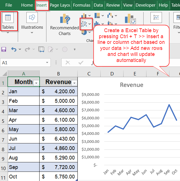
Steps to create a dynamic range chart in Excel:
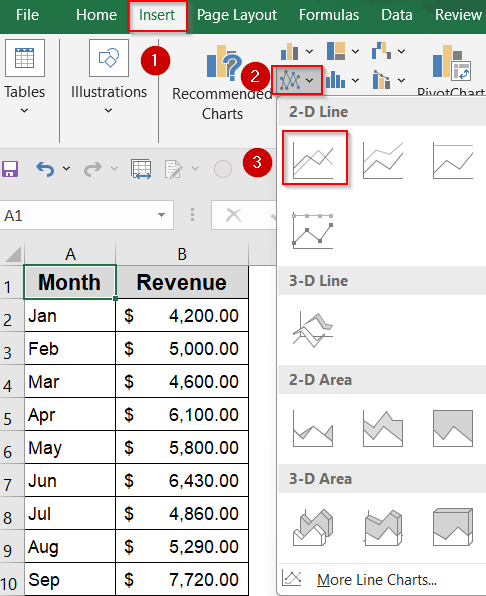
➤ Select the full dataset including column headers.
➤ Press Ctrl + T to convert it into an official Excel Table or go to the Insert tab and click on Tables. Make sure “My table has headers” is checked.
➤ Go to the Insert tab >> Click your preferred chart type (e.g., Line, Column).
➤ Excel will generate a chart linked directly to the Table.
Use an Excel Table to Create a Self-Updating Chart
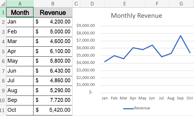
Dynamic charts built from Excel Tables are the most beginner-friendly way to ensure your visuals grow automatically with new data. By converting your dataset into a Table, Excel links the chart to a structured range that adjusts as you add more rows. This is ideal for tracking metrics like monthly revenue, sales, or inventory trends without needing to manually resize the chart each time.
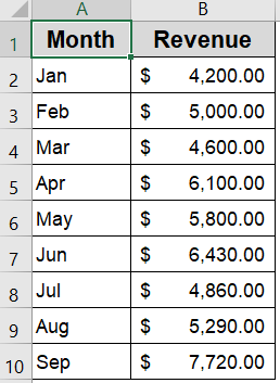
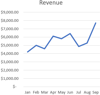
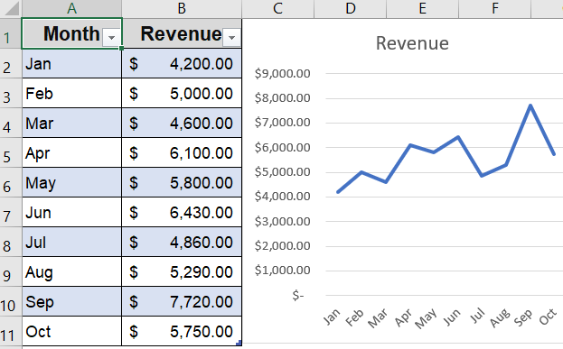
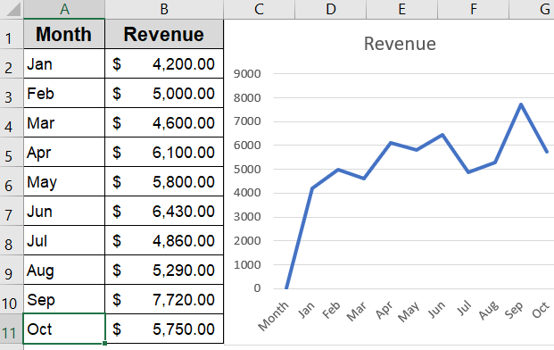
We’ll use a sample dataset that contains monthly revenue figures from January to September. It provides a simple time-series structure ideal for demonstrating how dynamic range charts adjust as new months and values are added.
Steps:
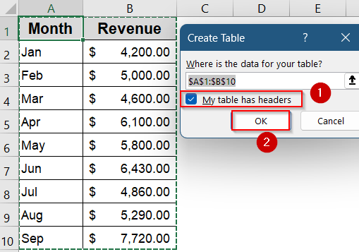
➤ Select the full dataset including column headers.
➤ Press Ctrl + T to convert it into an official Excel Table (make sure “My table has headers” is checked).
➤ Go to the Insert tab >> Click your preferred chart type (e.g., Line, Column).
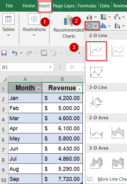
➤ Excel will generate a chart linked directly to the Table.
Now, whenever you add a new month or update values below the table, the chart refreshes automatically without needing extra steps.
Apply OFFSET Function with Named Ranges for Flexible Dynamic Charts
If you’re not using Excel Tables and prefer to stick with standard cell ranges, the OFFSET function combined with Named Ranges is an effective way to make your chart dynamic. By creating dynamic Named Ranges for both your X-axis (Months) and Y-axis (Revenue), Excel will automatically update your chart each time you add new data without manually selecting a new range.
Steps:
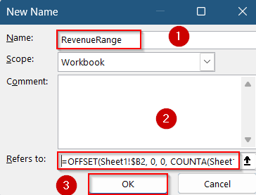
➤ Press Ctrl + F3 to open the New Name dialog from Name Manager.
➤ Create a name like RevenueRange, and use this formula:
=OFFSET(Sheet1!$B2, 0, 0, COUNTA(Sheet1!$B2:$B100), 1)
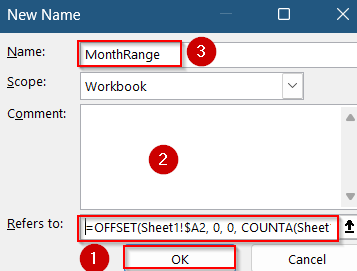
➤ Repeat to create MonthRange with this formula:
=OFFSET(Sheet1!$A2, 0, 0, COUNTA(Sheet1!$A2:$A100), 1)
➤ Insert a chart (e.g., Line chart) from the Insert tab.
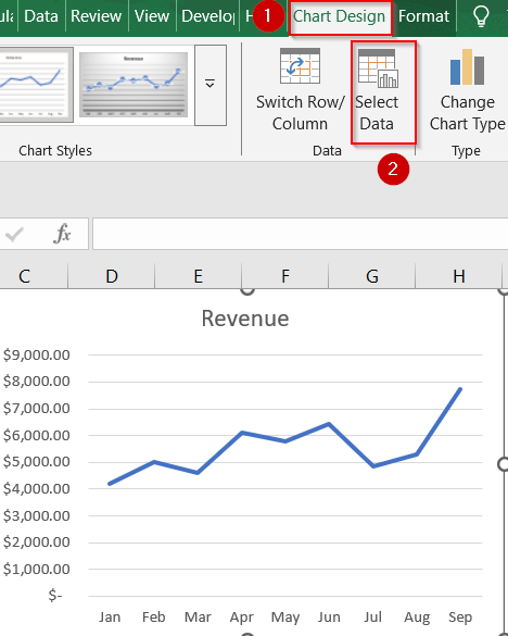
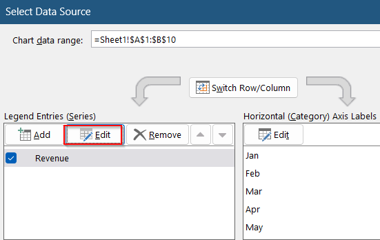
➤ Click Select Data from the Chart Design tab.
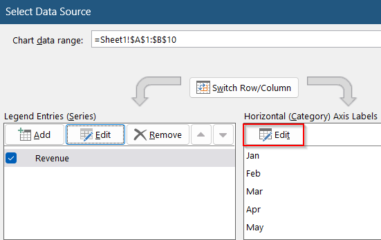
➤ To edit X-axis, click Edit under Horizontal (Category) Axis Labels.
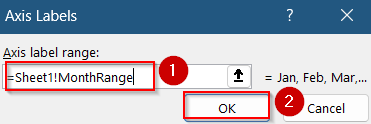
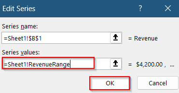
➤ For X values, enter this formula:
=Sheet1!MonthRange
➤ Click OK to confirm.
➤ You will be again directed to the same dialog. This time click Edit under Legend Entries for Y-axis.
➤ For Y values, enter this formula:
=Sheet1!RevenueRange
➤ Click OK to confirm.
Now the OFFSET formula defines a starting cell and adjusts its height based on the number of non-blank cells, keeping your chart always in sync with your expanding data.
Create Dynamic Charts Using FILTER with Dynamic Arrays (Excel 365 Only)
This method leverages Excel 365’s dynamic array functions like FILTER to automatically generate dynamic helper columns based on your dataset, which can then be used to create charts that update instantly as data changes. For example, using the dataset below with months in column A and revenue in column B, our goal is to build a chart that only includes months where revenue exists, ignoring any blanks or gaps.
Steps:
➤ In a new column (e.g., D2), enter the formula to extract only the months that have non-blank revenue cells:
=FILTER(A2:A11, B2:B11<>"")
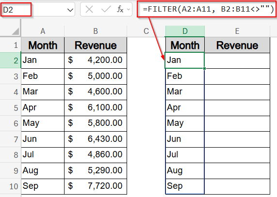
This will dynamically create a spill range listing all months where the revenue cell is not empty.
➤ Next to it (e.g., E2), extract the corresponding revenue values for those months using:
=FILTER(B2:B11, B2:B11<>"")
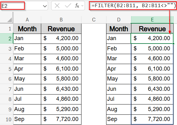
This ensures only revenue amounts linked to the filtered months appear, maintaining alignment.
➤ Now, select these two dynamic helper columns (D2:E10 or however far they spill), then go to the Insert tab and choose Line Chart (or any chart type you prefer).
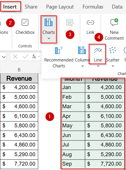
➤ Excel will build the chart based on these filtered, dynamic ranges.
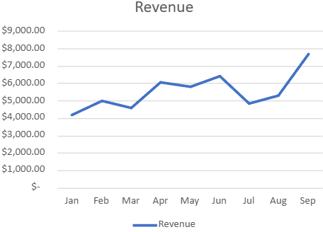
Now when you add new data to your original Month and Revenue columns or clear existing data, the FILTER functions automatically adjust the spill range. Consequently, your chart updates instantly without any manual range adjustment.
Frequently Asked Questions
Why should I use dynamic range charts instead of static charts?
Dynamic charts automatically reflect any changes made to your data, making them ideal for ongoing analysis. They reduce manual effort, prevent errors, and ensure your charts remain up to date as your dataset grows.
Do dynamic charts work with all chart types in Excel?
Most standard chart types like line, bar, area, column, and scatter fully support dynamic ranges. While pie and combo charts can also work, they may require extra setup, especially when using formulas like OFFSET or FILTER.
What’s the most beginner-friendly option?
Using an Excel Table is by far the easiest method. It doesn’t involve writing formulas, and charts linked to a table expand automatically whenever new rows are added, making it perfect for Excel beginners.
What happens if I delete a row in my data table?
In Excel Tables or FILTER-based charts, deleted rows are automatically excluded. With OFFSET formulas, the chart may still reserve space unless the formula adjusts properly using functions like COUNTA or similar range counters.
Wrapping Up
In this tutorial, we learned how to create dynamic range charts in Excel using three reliable methods using Excel Tables, OFFSET formulas, and the FILTER function. Each method offers a different level of flexibility and control. Whether you’re building a simple dashboard or tracking long-term metrics, dynamic charts help ensure your visuals always stay accurate and up to date. Feel free to download the practice file and share your feedback.

