
A trendline is a line showing the data movement along an axis. Adding multiple trendlines in Excel can show different trends for a single series or trends of each one for multiple series.
You can use any of the element-adding options to add a single trendline in Excel. To add multiple trendlines, you need to repeat the process by selecting a series over and over again.
To add multiple trendlines in Excel:
➤ Select a series or chart.
➤ Go to Chart Elements >> Trendline >> More Options.
➤ Select a trendline type from the Format Trendline pane.
➤ Cancel the selection and select the series or chart again.
➤ Go to Chart Elements >> Trendline >> More Options again.
➤ Select a different trendline type from the Format Trendline pane.
➤ Repeat the process for the number of trendlines you want.
The general method to add a trendline is through the Chart Element button, the Chart Design tab, and the context menu.
We have divided adding multiple trendlines in Excel into two sections: adding multiple trendlines for a single series and multiple trendlines for multiple series.
Download Practice WorkbookWhy Add Multiple Trendlines in a Series?
Adding multiple trendlines over one can have multiple benefits:
- Multiple trendlines can compare different types of trends.
- You can compare which type suits your data best.
- More effective analysis of data.
- Higher possibility of getting the full behavior of the data.
How to Add Multiple Trendlines to a Series in Excel
The way to add multiple trendlines in Excel is by adding trendlines over and over again. However, you need to make some tweaks each time.
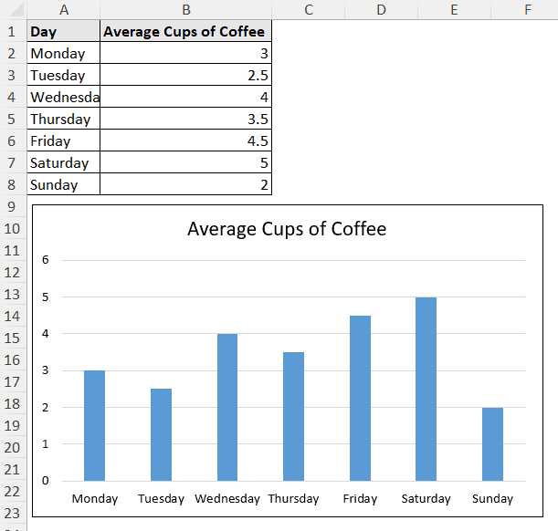
This is a column chart displaying the average cup of coffee consumption over a week.
We are going to add multiple trendlines to the series using three different methods.
Using Chart Elements Button
The Chart Element button is the plus icon at the top-right of the chart. It appears after selecting the chart.
The Chart Element button is a quick way to add, remove, and customize different elements in a chart. We can use this button to add multiple trendlines.
Steps:
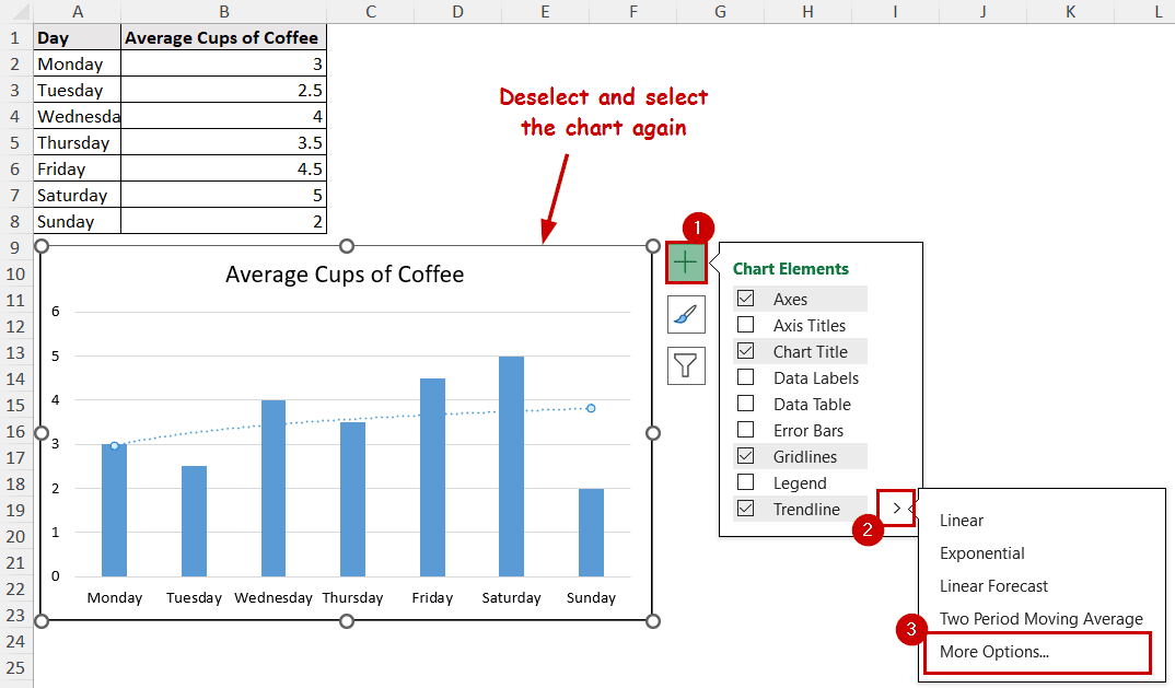
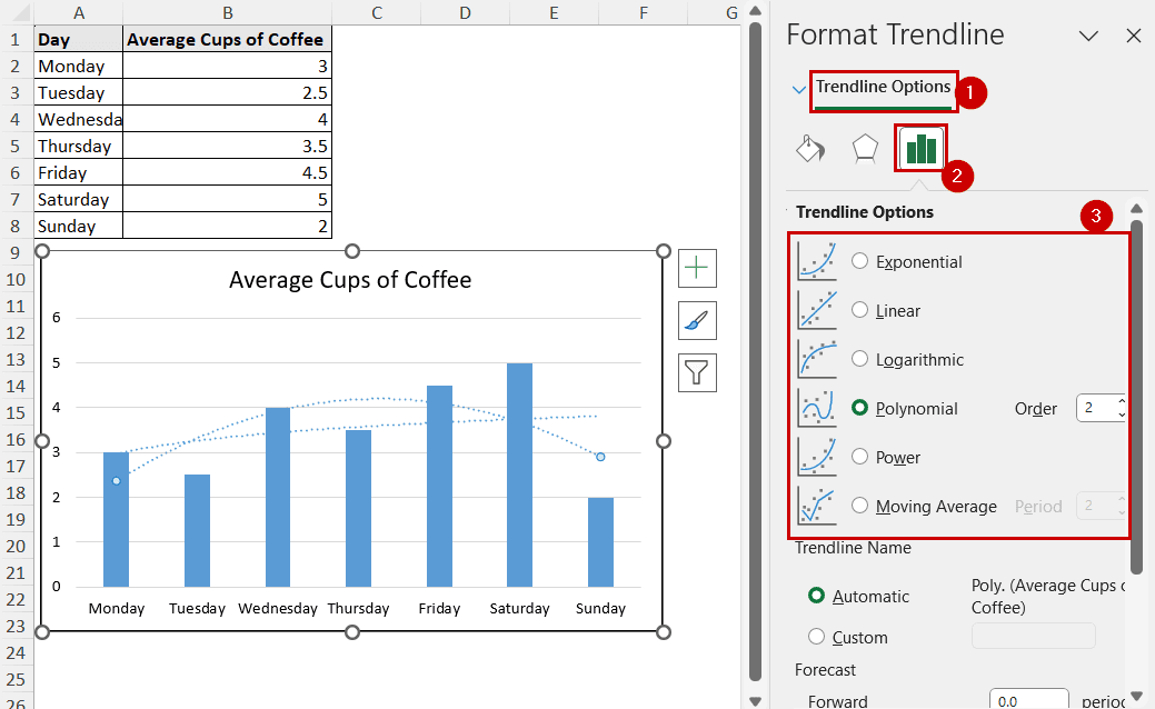
➤ Select the chart.
➤ Go to Chart Elements >> Trendline >> More Options.
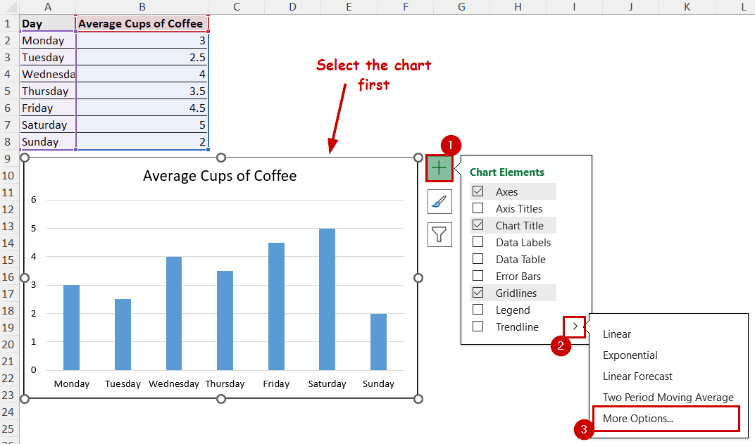
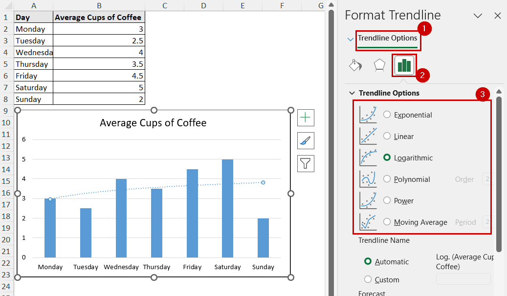
➤ In the Format Trendline pane, select the trendline type under Trendline Options.
➤ Close the Format Trendline pane.
➤ Now deselect and select the chart again.
➤ Go to Chart Elements >> Trendline >> More Options again.
➤ Select a different type of trendline in the Trendline Options of the Format Trendline pane.
➤ Format the trendlines to make them more visually presentable.

Using Chart Design Tab
After selecting a chart, two tabs are accessible in the ribbon: Chart Design and Format.
The same options to add, remove, and customize different chart elements can also be found on the Chart Design tab.
Steps:
➤ Select the chart.
➤ Go to Chart Design >> Chart Layouts (group) >> Add Chart Element.
➤ Select Trendline >> More Trendline Options from the dropdown.
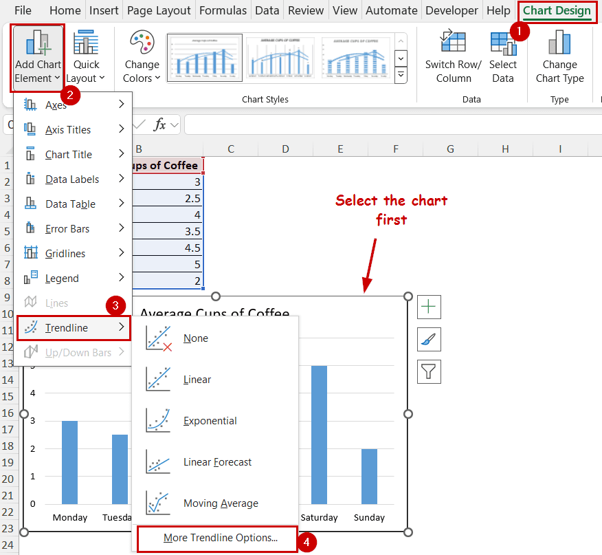
➤ In the Format Trendline pane, select the trendline type under Trendline Options.
➤ Close the Format Trendline pane.
➤ Deselect (by clicking on a cell) and select the chart again.
➤ Again, go to Chart Design >> Chart Layouts (group) >> Add Chart Element >> Trendline >> More Trendline Options.

➤ Select a different type of trendline in the Trendline Options of the Format Trendline pane.
➤ Make changes to the trendline to make it visually appealing.
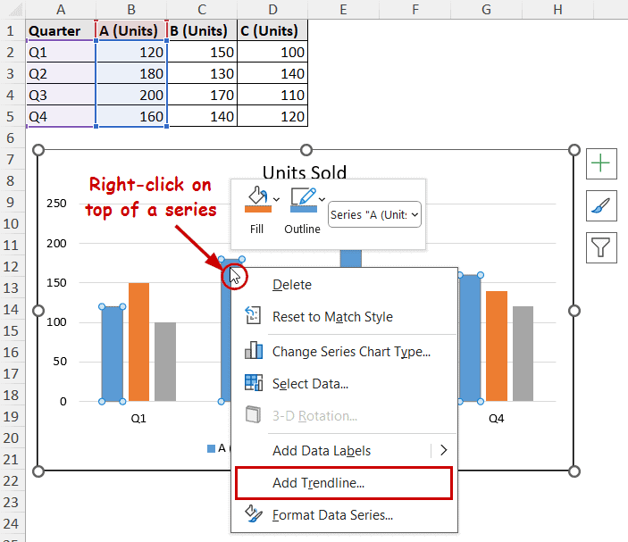
Using Context Menu
You can access the option to add a trendline from the context menu if you right-click on a series. Repeat the process multiple times to add multiple trendlines in a series in Excel.
Steps:
➤ Right-click on a series.
➤ Select Add Trendline from the context menu.
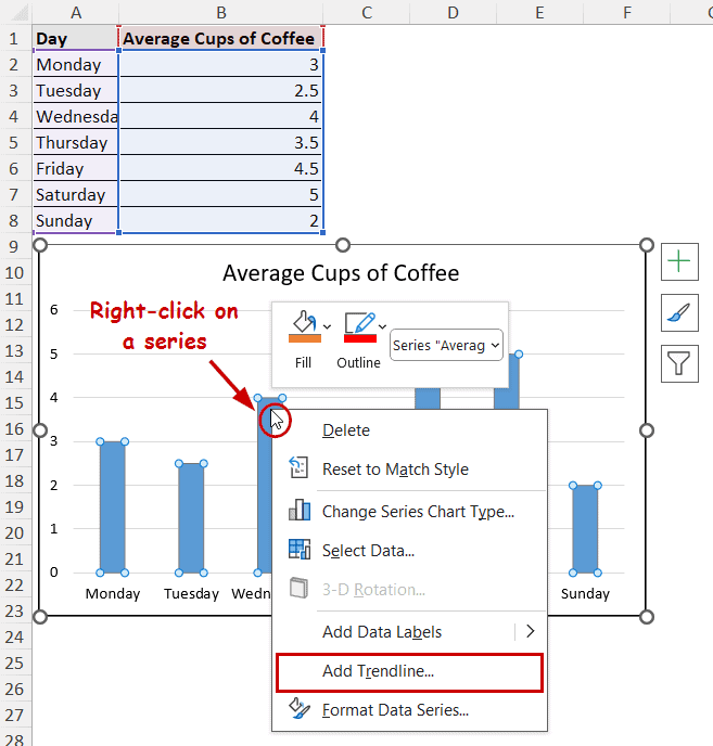
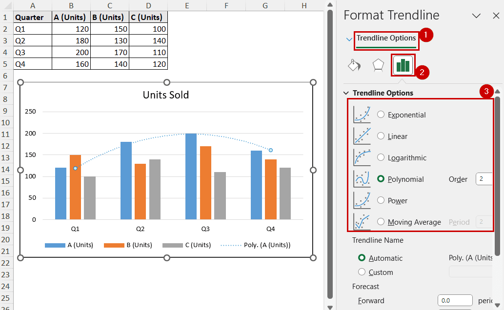
➤ Select a trendline type under the Trendline Options of the Format Trendline pane.
➤ Right-click on a series again and select Add Trendline from the context menu.
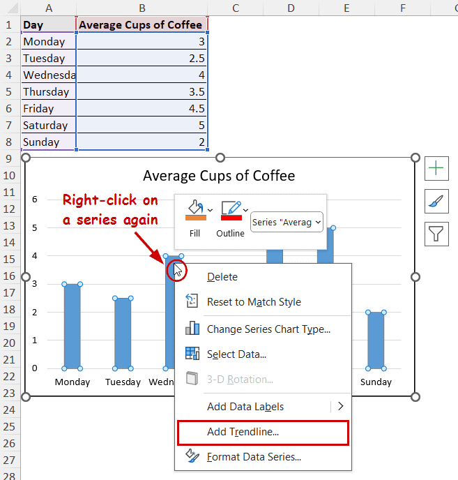
➤ Select a different trendline from the Format Trendline pane.
➤ Format the trendlines to make them stand out.
Adding Multiple Trendlines to Different Series in Excel
Adding multiple trendlines for different series, a line for each, can be helpful in judging each series.
For example, this is a clustered column chart of different unit sales data for different quarters.
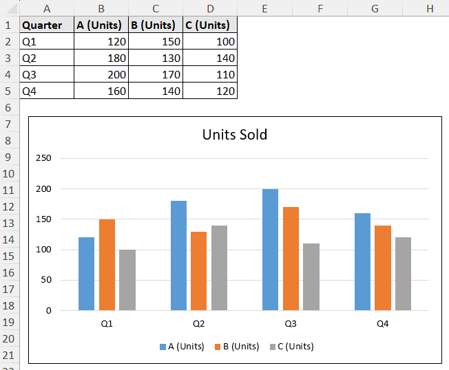
Adding a trendline for each product will help us see how each product sale fluctuates.
Adding multiple trendlines for these types of charts is quite straightforward. You need to select each series and use any of the methods from the previous part (Chart Element, Chart Design, or context menu).
We are using the context menu for the demonstration.
Steps:
➤ Right-click on a series.
➤ Select Add Trendline from the context menu.
➤ Select a trendline type from the Trendline Options of the Format Trendline pane.
➤ Now right-click on another series and select Add Trendline. Then select the trendline type again from the Format Trendline pane for that series.
➤ Repeat the process for all series.
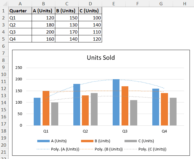
So, to add multiple trendlines in Excel with multiple series, select each one and follow any of the methods to add trendlines.
Note: You don’t need to cancel the selection and re-select to repeat the process.
FAQ
How do I add different types of trendlines to a chart in Excel?
To add different types of trendlines, select the type in the Format Trendline pane under the Trendline Options.
You can open the Format Trendline pane by selecting Chart Element >> Trendline >> More Options.
Why doesn’t Excel let me add a trendline?
Excel doesn’t support adding trendlines to all types of charts. Some charts, like scatter, line, bar, etc., can contain trendlines. If the Trendline option is unavailable in any of the element-adding methods, chances are you are probably using the wrong type of chart.
What if I want one trendline for all series instead of individual ones?
As of the latest version of Excel, the application doesn’t support adding one trendline for all series instead of individual ones. But you can combine data in the source and modify your source to manipulate such a feature in some cases.
How to remove a trendline from a chart in Excel?
To remove a trendline, select the trendline and press Delete on your keyboard. You can also right-click on the trendline and select Delete from the context menu.
Conclusion
In this tutorial, we have covered how to add multiple trendlines in Excel. We have covered that in two sections- adding multiple trendlines for one series and multiple series.
The general methods are the same for both. You need to work on deselecting and selecting the series if you want multiple trendlines for the same series. For different series, you can just select one and keep on adding trendlines.
Feel free to download the practice workbook and give us your feedback.